Page MenuHomePhabricator

Thank You-Banner
Closed, ResolvedPublic

Description

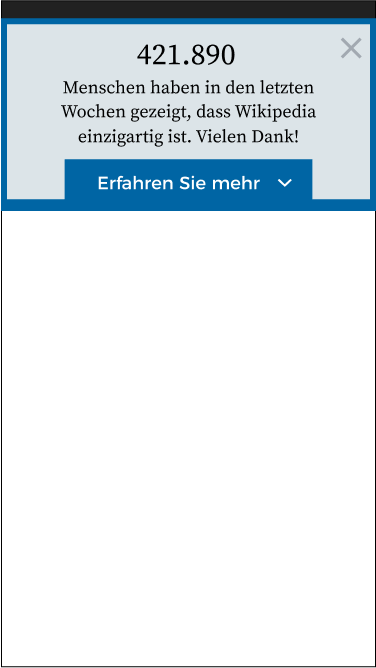
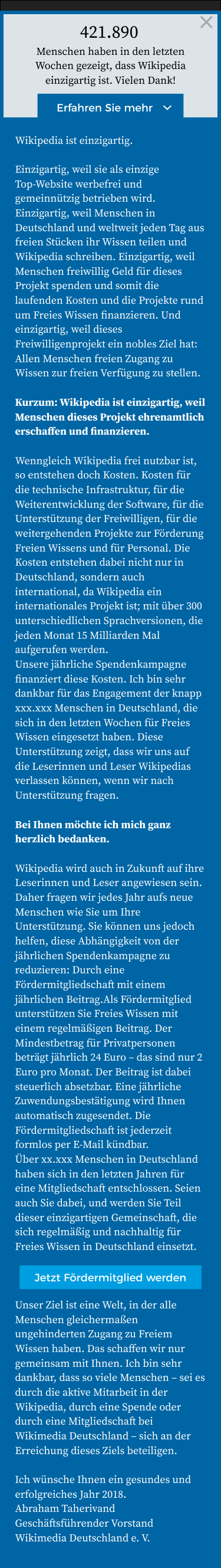
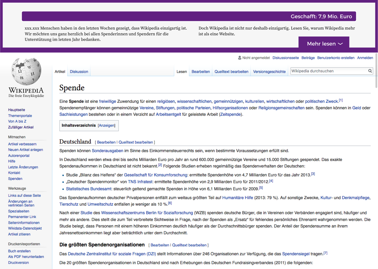
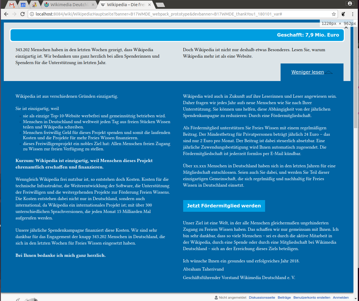
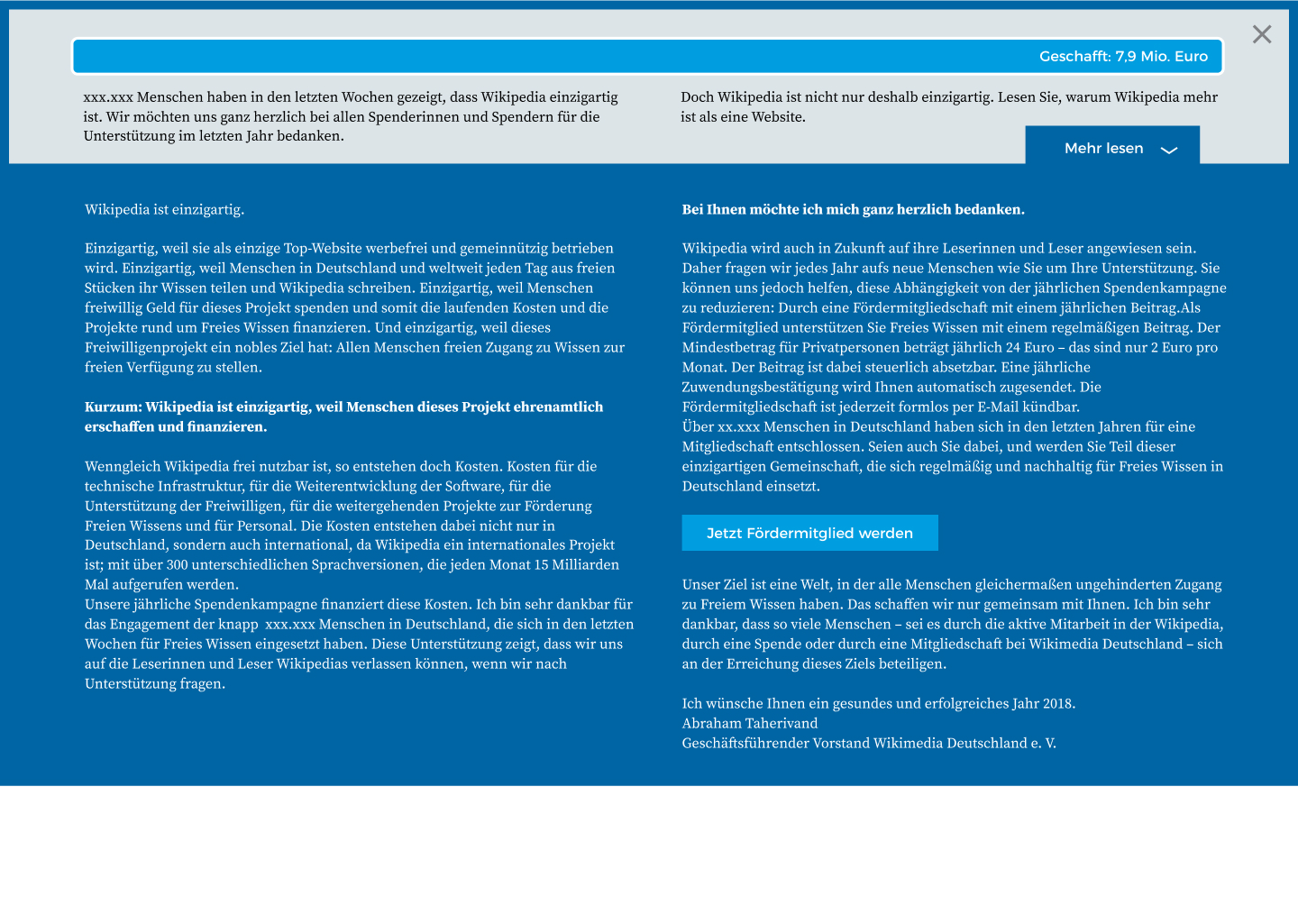
The design proposed by our internal UX-/Design-Team for the Thank You-Banner.
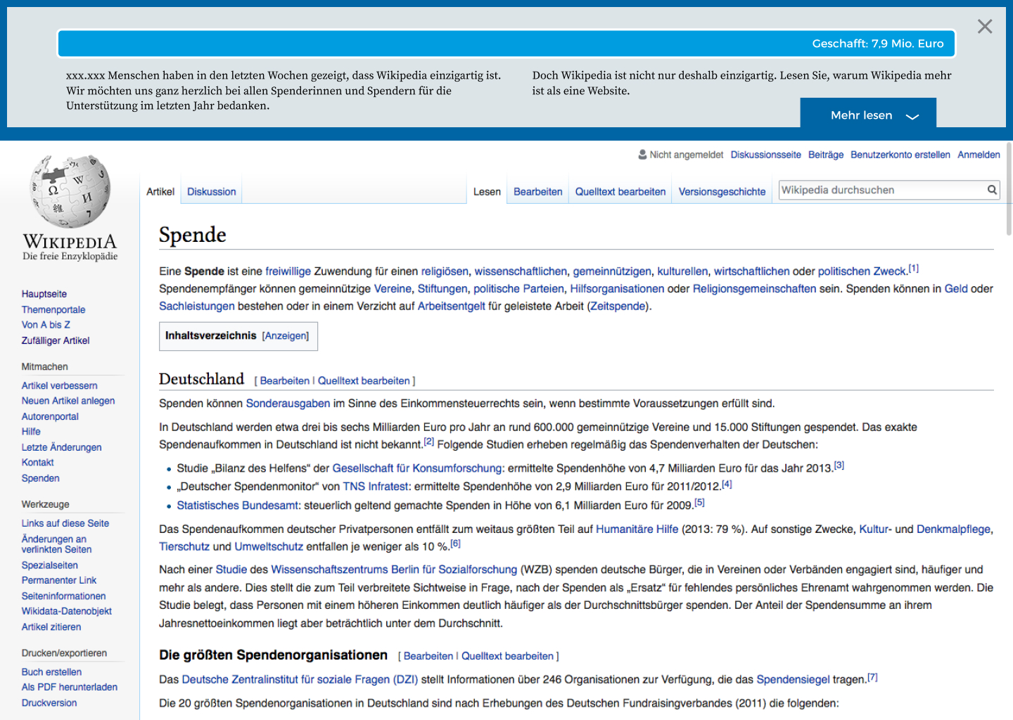
Collapsed Banner

  • Short Text
  • completely filled progress bar
  • CTA to expand the banner and read more – "Mehr lesen" with a dropdown arrow
  • "x" to close the window
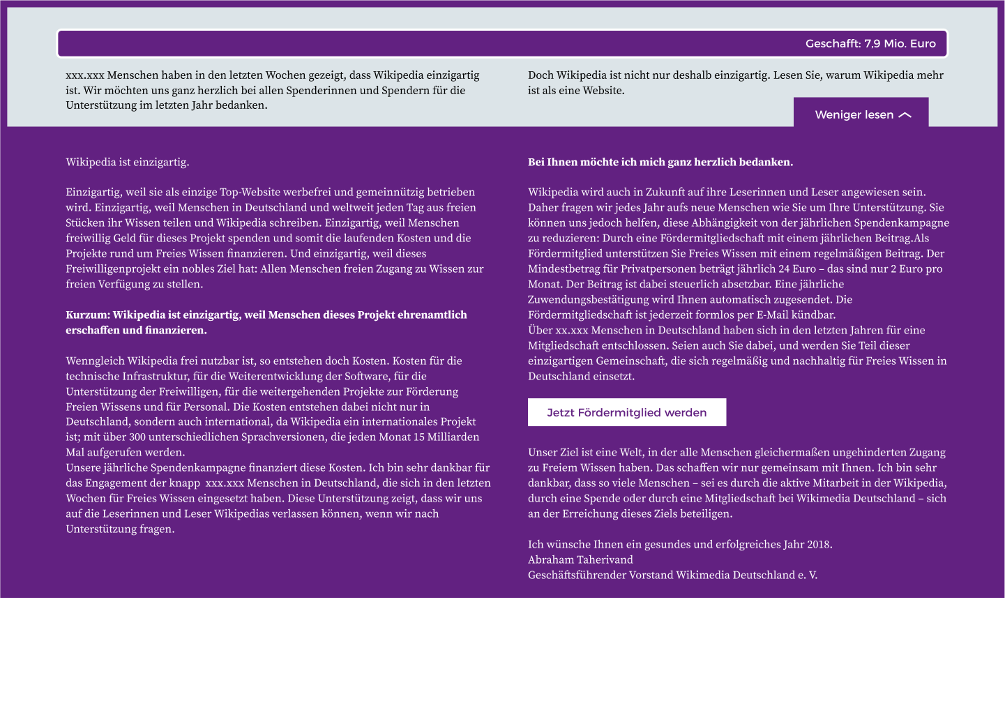
Expanded Banner

  • behaves like a dropdown not as an overlay
  • the lower part of the banner expands and shows the long text
  • CTA embedded in the text saying "Fördermitglied werden"
  • the CTA from the collapsed version changes to "Weniger lesen" and an upside down dropdown arrow

Mobile Banner

  • shortened version of the short text
  • no progress bar
  • numbers are counting up in 2-3 seconds without easing

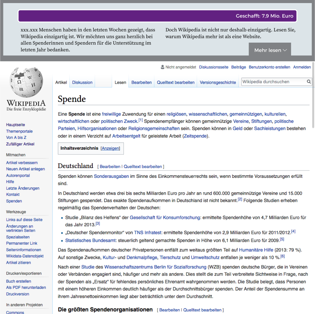
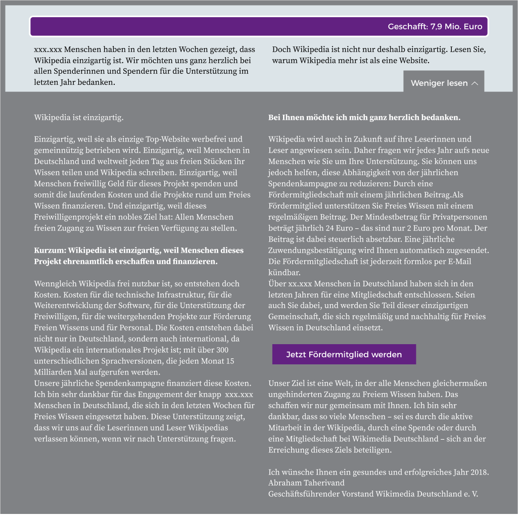
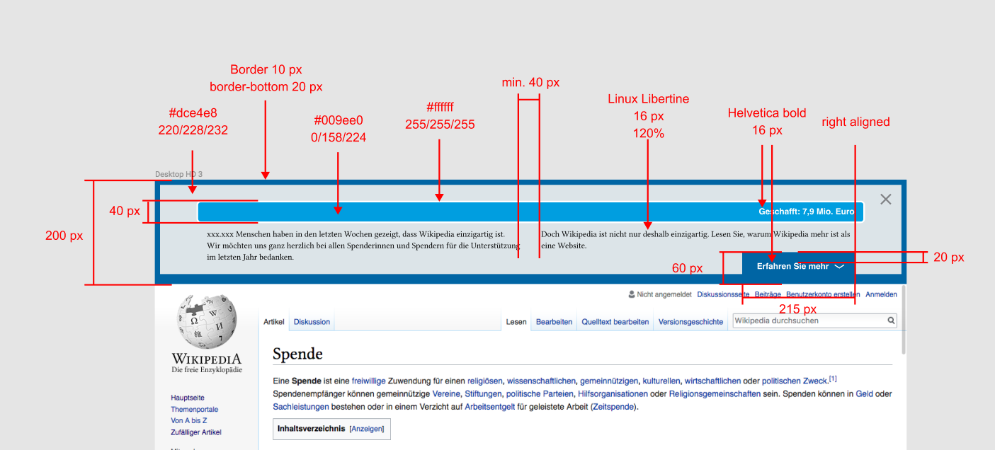
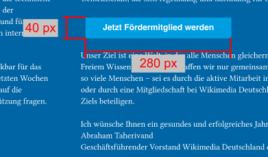
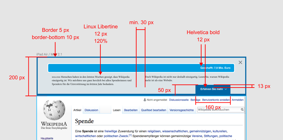
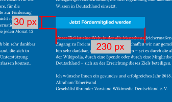
Current Layout for desktop

Desktop HD 3.0.jpg (1×1 px, 1 MB)

Desktop HD 3.1.jpg (1×1 px, 1 MB)

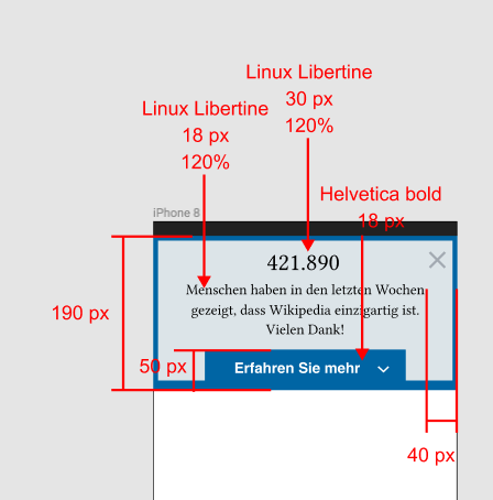
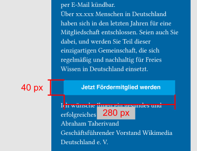
Current layout for mobile

iPhone 8.0.png (668×376 px, 15 KB)

iPhone 8.2.png (2×375 px, 277 KB)

Event Timeline

Restricted Application added a subscriber: Aklapper. · View Herald Transcript

@tmletzko I guess we should shorten the text for mobile. Probably to a version in which the "Fördermitglied werden" CTA is a little higher on the site.

Also here are two more versions with different color coding to be able to switch banners during the "Dankeskampagne".

Desktop 2.2.png (1×1 px, 563 KB)

Desktop 2.3.png (1×1 px, 264 KB)

Desktop HD 3.2.png (1×1 px, 648 KB)

Desktop HD 3.3.png (1×1 px, 249 KB)

@Hanna_Petruschat_WMDE the copy will be a lot shorter. see the shorter version in the google doc

@tmletzko Could you give me some feedback on this? If you do it until tomorrow I could prepare the specs (colors, sizes etc.), so it's ready to be developed.

I like it. if @kai.nissen does not find any concerning issues you can provide the specs. But I doubt that we will change colour during the campaign. I rather have a landingpage test. So I propose to prepare the specs for the first variant.

Looks pretty straight forward to me. No concerns from my side.

@kai.nissen to shorten the text we are thinking about "hiding" the costs in a mouse over. For that, we would have a "mouse-over-link" on "Kosten für" and moving over it, the appearing field would display the copy

Kosten für

  • die technische Infrastruktur, Server, Sicherheitstechnik usw.
  • die Weiterentwicklung der Software “hinter” der Wikipedia, die leichtes Schreiben, Gliedern, Quellen verwalten, Medien einbinden usw. ermöglicht
  • die Unterstützung der Freiwilligen, etwa durch Literatur, Fort- und Weiterbildungen, Förderung persönlicher Kontakte
  • weitergehende Projekte zur Förderung Freien Wissens, etwa Zusammenarbeit mit Museen, um deren Bestände über die Wikipedia digital zugänglich zu machen oder auch politische Lobbyarbeit für Freies Wissen
  • Personal, das diese inhaltliche Arbeit leistet, den Kontakt zu den Freiwilligen hält und auch die Trägerorganisation gemäß den Richtlinien für gemeinnützige Organisationen
  • Die Kosten entstehen dabei nicht nur in Deutschland, sondern auch international.

For mobile we already deleted this abstract.

So here are the specs. I think we just need one breakpoint for desktops.

  • Progress bar on top of the banner counts up and is fully filled
  • Text is shown in 2 coloumns
  • CTA-button is on the lower right
  • clicking the CTA will expand the banner from the thicker bottom border

Big version:

Screen Shot 2017-12-21 at 16.15.44.png (636×1 px, 179 KB)

Banner outlines

  • heights: 200 px
  • bg-color: #dce4e8, 220/228/232
  • border: 10 px
  • border bottom: 20 px
  • border color: #0065a4, 0/101/164
  • font: Linux Libertine, 16 px
  • line spacing: 120 %
  • min spacing between coloumns: 40 px

Progress bar

  • heights: 40 px
  • bg-color: #009ee0, 0/158/224
  • border: 3 px
  • border color: #fff, 255/255/255
  • font: Helvetica bold, 16 px

CTA button

  • heights: 60 px
  • width: 215 px
  • bg-color: #0065a4, 0/101/164
  • font: Helvetica bold, 16 px
  • font color: #fff, 255/255/255
  • padding to the top of the button: 20 px

CTA in the expanded banner:

Screen Shot 2017-12-21 at 16.16.40.png (229×391 px, 29 KB)


Small version:

Screen Shot 2017-12-21 at 16.15.54.png (472×955 px, 102 KB)

Breakpoint

  • 960 px

Banner outlines

  • heights: 180 px
  • bg-color: #dce4e8, 220/228/232
  • border: 5 px
  • border bottom: 10 px
  • border color: #0065a4, 0/101/164
  • font: Linux Libertine, 12 px
  • line spacing: 120 %
  • min spacing between coloumns: 30 px

Progress bar

  • heights: 40 px
  • bg-color: #009ee0, 0/158/224
  • border: 3 px
  • border color: #fff, 255/255/255
  • font: Helvetica bold, 12 px

CTA button

  • heights: 50 px
  • width: 160 px
  • bg-color: #0065a4, 0/101/164
  • font: Helvetica bold, 12 px
  • font color: #fff, 255/255/255
  • padding to the top of the button: 13 px

CTA in the expanded banner:

Screen Shot 2017-12-21 at 16.16.57.png (200×337 px, 26 KB)


Mobile Banner (in this case with a screensize of 375*667 px):

  • no progress bar
  • instead a counter which counts up to the number of donators in 2-3 seconds
  • the counter has no easing

Screen Shot 2017-12-21 at 16.16.08.png (454×448 px, 28 KB)

Banner outlines

  • heights: 190 px
  • bg-color: #dce4e8, 220/228/232
  • border: 6 px
  • border bottom: 12 px
  • border color: #0065a4, 0/101/164
  • font number: Linux Libertine, 30 px
  • font text: Linux Libertine, 18 px
  • text padding to the borders on the left and right: 40 px
  • line spacing: 120 %

CTA button

  • heights: 50 px
  • width: 250 px
  • bg-color: #0065a4, 0/101/164
  • font: Helvetica bold, 18 px
  • font color: #fff, 255/255/255

CTA in the expanded banner:

Screen Shot 2017-12-21 at 16.17.10.png (309×403 px, 33 KB)

In case of a color switch of the banner, I would recommend to switch the progress bar to #622181, 98/33/129 and the border and the CTA to #808285, 165/165/165.
(Sorry for the very lang but therefor very detailed post)

  • generally used a line height of 140% to achieve the spacing as seen in the screens (as opposed to the specified 120%)
  • how should list bullets be shown? Are not contained in the screens but in the text doc
  • are there hosted versions of the up/down arrow?
  • which number are we using for the amount of new memberships created in the past year? ("Über xx.xxx Menschen in Deutschland haben sich in den letzten Jahren für eine Mitgliedschaft entschlossen."). Would it be worth/right to add this to our projections? (compare CampaignProjection)
  • do we have a link target for the "become member" CTA already?
  • is there a min-width for the "desktop version"? There is a differentiation between a "Small version" and a "Big version", but the specified differences do surprisingly little to address the challenge of banner height at the 960px width. It has a lot of text, the banner covers the entire screen (height) starting at as high as 1500px (depending on which font my browsers use), 1200px in the most optimistic scenario, from which point on we'd need to use the "Small version", which in turn seems feasible until around 660px, before we would need to further strip out text / decrease font size / allow scrolling inside the banner.

thankyou1_1200px.png (1×1 px, 318 KB)

thankyou1_660px.png (1×666 px, 236 KB)

I answer what I can (the rest goes to @kai.nissen

how should list bullets be shown? Are not contained in the screens but in the text doc

I think having white bullet points is ok.

which number are we using for the amount of new memberships created in the past year? ("Über xx.xxx Menschen in Deutschland haben sich in den letzten Jahren für eine Mitgliedschaft entschlossen."). Would it be worth/right to add this to our projections? (compare CampaignProjection)

This number will be provided on Dec. 31st (since this numbers changes every day during the campaign). I guess @kai.nissen will change numbers after discussing the last test. If you need a number to work with: take 64.334

is there a min-width for the "desktop version"? There is a differentiation between a "Small version" and a "Big version", but the specified differences do surprisingly little to address the challenge of banner height at the 960px width. It has a lot of text, the banner covers the entire screen (height) starting at as high as 1500px (depending on which font my browsers use), 1200px in the most optimistic scenario, from which point on we'd need to use the "Small version", which in turn seems feasible until around 660px, before we would need to further strip out text / decrease font size / allow scrolling inside the banner.

We need to make sure the reader can read the entire text on smaller screens. Therefore, making it scrollable is a good thing. We do not have smaller text lengths for "mid-size-screens". But if the user decides to read it and klicks the banner, having a full screen text is ok.

btw. I have posted a comment with a mouse over above. Is that doable? With that we would be able to shorten text a little bit.

  • are there hosted versions of the up/down arrow?

We don't have that image, it seems. I suggest to use https://commons.wikimedia.org/wiki/File:Ic_expand_more_48px.svg instead.

  • which number are we using for the amount of new memberships created in the past year? ("Über xx.xxx Menschen in Deutschland haben sich in den letzten Jahren für eine Mitgliedschaft entschlossen."). Would it be worth/right to add this to our projections? (compare CampaignProjection)

This number will be provided on Dec. 31st (since this numbers changes every day during the campaign). I guess @kai.nissen will change numbers after discussing the last test. If you need a number to work with: take 64.334

Sure, I can take care of putting the final numbers before the campaign starts. This value will not be projected, but fixed and final.

  • do we have a link target for the "become member" CTA already?

@tmletzko We restrict the membership type to Fördermitgliedschaften, right?
In that case, it's https://spenden.wikimedia.de/apply-for-membership?skin=cat17&type=sustaining.

  • is there a min-width for the "desktop version"? There is a differentiation between a "Small version" and a "Big version", but the specified differences do surprisingly little to address the challenge of banner height at the 960px width. It has a lot of text, the banner covers the entire screen (height) starting at as high as 1500px (depending on which font my browsers use), 1200px in the most optimistic scenario, from which point on we'd need to use the "Small version", which in turn seems feasible until around 660px, before we would need to further strip out text / decrease font size / allow scrolling inside the banner.

As far as I remember, the post-campaign banners were never fixed/"sticky". Thus, scrolling should not be a problem.

yes, only Fördermitgliedschaft. even with stickyness, there is always a way out after clicking on the banner. we might change stickyness if the conversions are too low.

please note that the provided link is for VAR only. CTRL will be redirected to 10h16 skin.

Thanks for the answers.

What about the mentioned mobile layout? Should this become a dedicated banner for the mobile channel only, or are we building a truly responsive banner which would also cover desktops below the discussed 660px mark? Thanks

@Pablo-WMDE as you see fit. we can target the devices using centralnotice, so it's fine to not have it fully responsive.

Pablo-WMDE moved this task from Doing to Review on the WMDE-Fundraising-Funban-2 board.
  • made 660px the break point for "Mobile Banner", kept it in the same code

PR https://github.com/wmde/fundraising-banners/pull/102

I'm blind to the details of this banner by now - please double check.

At viewport widths below 960px, the font size is quite small (as defined here). @tmletzko Please check, if you want the font size to be bigger.

Preview: https://de.wikipedia.org/?banner=B17WMDE_thankyou_p1

I checked on different smaller viewports and to me it looks fine. So, I say no.

kai.nissen claimed this task.