The expand icon arrow should align with the arrow in the general pane layout.
Description
Description
Details
Details
| Subject | Repo | Branch | Lines +/- | |
|---|---|---|---|---|
| Align indicators | mediawiki/extensions/AdvancedSearch | master | +5 -0 |
Related Objects
Related Objects
Event Timeline
Comment Actions

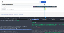
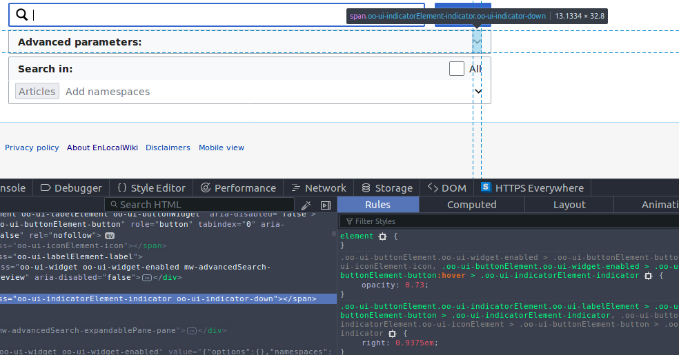
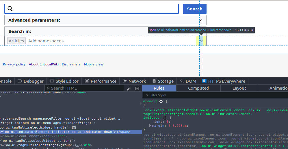
So looking at the alignment of the indicator elements in the button of the AdvancedSearch ExpandablePane and the MenuTagMultiselectWidget for the namespace selection it differs by a few pixel.
See screenshots attached. I would assume this is something that needs to be harmonized in the OOjs UI world, right?
Comment Actions
Change 399787 had a related patch set uploaded (by WMDE-Fisch; owner: WMDE-Fisch):
[mediawiki/extensions/AdvancedSearch@master] Align indicators
Comment Actions
Change 399787 merged by jenkins-bot:
[mediawiki/extensions/AdvancedSearch@master] Align indicators