Page MenuHomePhabricator

Align notification icons with the icon styleguide
Closed, ResolvedPublic

Description

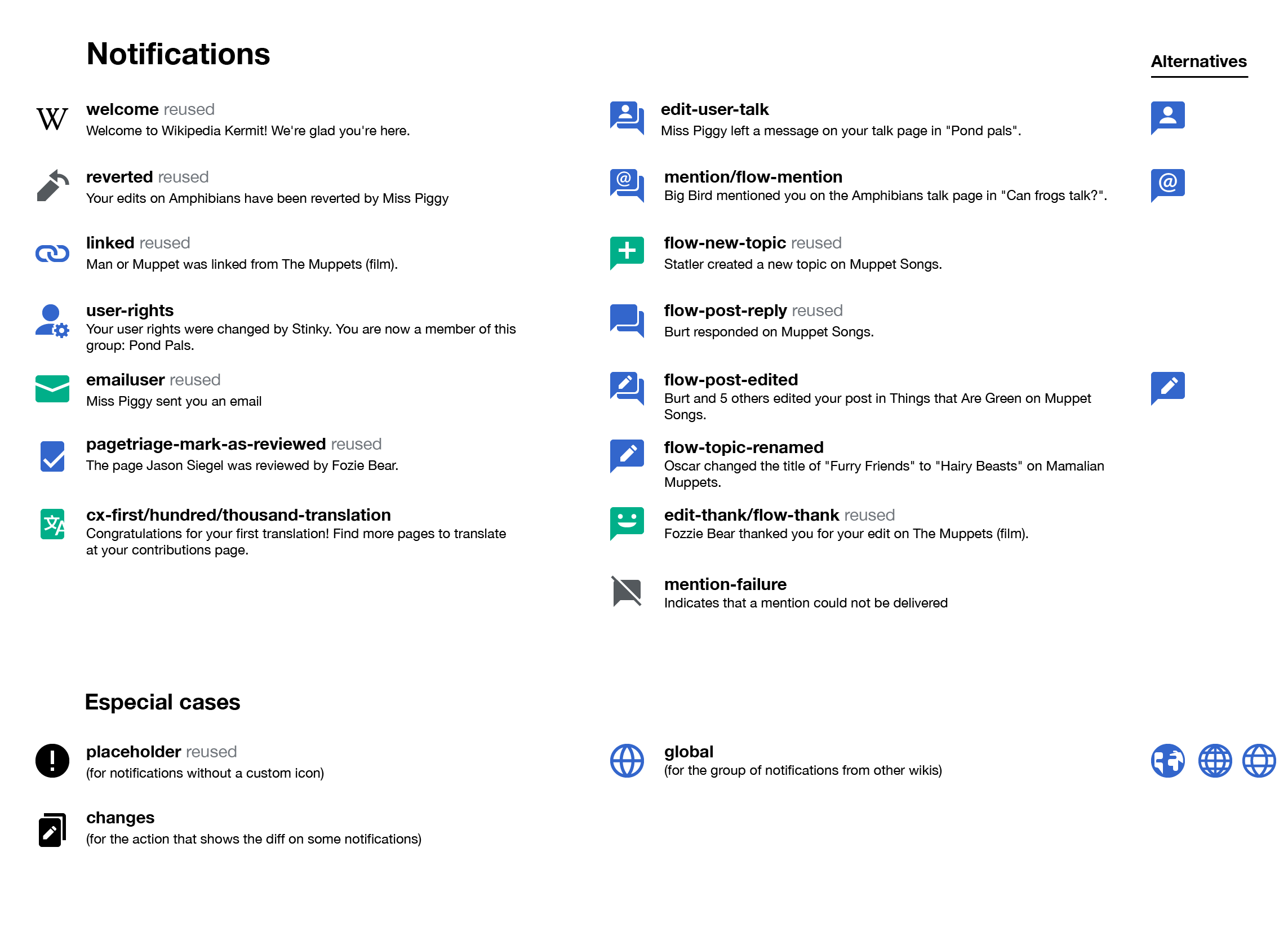
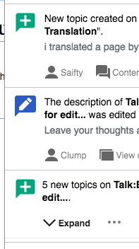
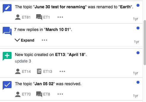
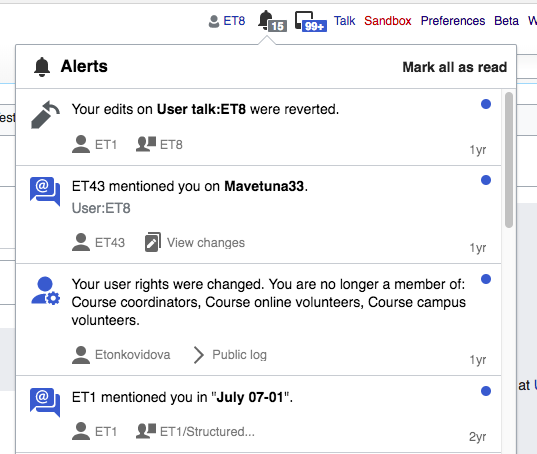
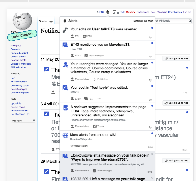
There is an initiative in progress to update the general icon set (M229) to better align to the design guidelines.
Since the icons used for notifications, reuse several of the concepts defined in the general icons, we need to update the notification icons to match the new style. That will also solve the current inconsistency where icons based on the speech bubble shape point to different directions (T161330).

An initial proposal for adjustment is shown below. Icons marked as "reused" are existing icons from the general repo.

notifications-overview@3x.png (1×2 px, 151 KB)

Event Timeline

@Rammanojpotla For now there's a Gerrit patch with the overhauled icons at https://gerrit.wikimedia.org/r/#/c/400091/
We're also planning on making the icons downloadable as SVGs in the https://wikimedia.github.io/WikimediaUI-Style-Guide/ in near future after the patch got merged.

Change 426122 had a related patch set uploaded (by Esanders; owner: Esanders):
[mediawiki/extensions/Thanks@master] Update icon to latest from OOUI

https://gerrit.wikimedia.org/r/426122

Change 426123 had a related patch set uploaded (by Esanders; owner: Esanders):
[mediawiki/extensions/Echo@master] Update icons to latest WMUI designs

https://gerrit.wikimedia.org/r/426123

Change 426124 had a related patch set uploaded (by Esanders; owner: Esanders):
[mediawiki/extensions/Flow@master] Redraw notification icons based on latest WMUI icon set

https://gerrit.wikimedia.org/r/426124

I adjusted several of the icons based on feedback, and updated the image in the ticket description.

I think the new cog icon is little harder to read at smaller sizes, the old version was clearer:

image.png (66×122 px, 1 KB)

30x30

image.png (34×71 px, 1 KB)

20x20

@Pginer-WMF Few comments:

  • user rights: I agree with Ed, the cog on user rights is really hard to identify, even in a 30x30 canvas
  • global: As I've added in a different channel, I think the globe's inner latitudes could be centered a tad more, similar to Firefox mobile's globe. (We should also rename the icon to 'globe')
  • edit-user-talk/flow-mention/flow-post-edited Old representation has advantage of emphasizing more people have been involved in action, newer has advantage of featuring less detail. No strong preference in one or other direction from my side…
  • flow-post-edited and changes still feature “old” pencil

Thanks @Esanders and @Volker_E for your feedback. My comments below:

I think the new cog icon is little harder to read at smaller sizes, the old version was clearer:

  • user rights: I agree with Ed, the cog on user rights is really hard to identify, even in a 30x30 canvas

I tried to apply the guideline of having the modifiers inside the main shape, as opposed to having multiple shapes. However, unlike the article shape, the user icon does not provide much surface to be used as a canvas. I think it makes sense to go with the old approach and have separate shapes (human + cog) for this case unless/until anyone has a better suggestion for integrating them. I've updated it.

  • global: As I've added in a different channel, I think the globe's inner latitudes could be centered a tad more, similar to Firefox mobile's globe. (We should also rename the icon to 'globe')

I already adjusted it with respect to the previous version. Bringing the latitudes together make it look a bit more dense to me, but I added the comparison between previous, current, and the one you suggested (as I interpreted it):

At 1x:

world-alternatives.png (41×129 px, 2 KB)

At 4x:

world-alternatives.png (164×516 px, 11 KB)

As a reference, the current one has their lines separated at regular intervals:

Screen Shot 2018-04-17 at 11.31.36.png (673×896 px, 49 KB)

  • edit-user-talk/flow-mention/flow-post-edited Old representation has advantage of emphasizing more people have been involved in action, newer has advantage of featuring less detail. No strong preference in one or other direction from my side…

Yes. Both have pros and cons. I have a slightly preference for the new representation (with less elements and bigger shapes), but decided to keep the current one as the default since the change also involves using the same symbol for "flow-post-edited" and "flow-topic-renamed". So I opted for being conservative and consider the merging of symbols later once there is stronger support for the alternate symbols.

  • flow-post-edited and changes still feature “old” pencil

Good catch. The simplified version was useful for small sizes when the main pencil shape was more complex. With the new one there is no need for it. I've updated it.

Can you attach SVGs?

I created the icons in an illustrator file, my idea was to let @Volker_E to export them as SVGs since he may do some SVG optimization and cleanup.

There seems to be a small misunderstanding, which globe I was referring to – I was referring to the alternative with just two inner latitudes on the right of your proposal.
As comparison the Firefox Mobile one, that I think is working very well:

image.png (182×514 px, 26 KB)

Change 428155 had a related patch set uploaded (by Esanders; owner: Esanders):
[mediawiki/extensions/ContentTranslation@master] Update notification icon to latest design

https://gerrit.wikimedia.org/r/428155

The only icon in the repo not updated by this is 'mention-failure':

image.png (66×151 px, 2 KB)

Change 428155 merged by jenkins-bot:
[mediawiki/extensions/ContentTranslation@master] Update notification icon to latest design

https://gerrit.wikimedia.org/r/428155

I updated the "globe" and "mention-failure" icons. Thanks for the feedback @Volker_E and @Esanders

Change 426124 merged by jenkins-bot:
[mediawiki/extensions/Flow@master] Redraw notification icons based on latest WMUI icon set

https://gerrit.wikimedia.org/r/426124

Change 426122 merged by jenkins-bot:
[mediawiki/extensions/Thanks@master] Update icon to latest from OOUI

https://gerrit.wikimedia.org/r/426122

I got a "flow-topic-renamed" notification, and the icon looks different than expected. The pencil seems too close to the bottom edge of the speech bubble:

Screen Shot 2018-05-10 at 11.15.34 2.png (142×529 px, 23 KB)

This is a zoomed version of the reference icon in the design document, where a larger padding is used:

Screen Shot 2018-05-10 at 11.22.52.png (438×438 px, 11 KB)

@Volker_E, do you know if this may be due to some export issue?

Another inconsistency I noticed is that the speech bubble size for "flow-new-topic" and "flow-topic-renamed" is different:

Screen Shot 2018-05-10 at 11.15.34 3.png (352×197 px, 24 KB)

Change 434765 had a related patch set uploaded (by Esanders; owner: Esanders):
[mediawiki/extensions/Flow@master] Icon fixes

https://gerrit.wikimedia.org/r/434765

Change 434765 merged by jenkins-bot:
[mediawiki/extensions/Flow@master] Icon fixes

https://gerrit.wikimedia.org/r/434765

Change 426123 merged by jenkins-bot:
[mediawiki/extensions/Echo@master] Update icons to latest WMUI designs

https://gerrit.wikimedia.org/r/426123

As per @Pginer-WMF noticed

the speech bubble size for "flow-new-topic" and "flow-topic-renamed" is different

I checked the sizes for those icons - they have the same sizes - 30x30

Screen Shot 2018-05-28 at 4.19.14 PM.png (346×492 px, 36 KB)

But I agree with the following @Pginer-WMF comment:

"flow-topic-renamed" notification [...] the icon looks different than expected. The pencil seems too close to the bottom edge of the speech bubble

I checked the icons in betalabs (also checked them for IE and mobile (MinervaNeue)) - they look consistent across browsers/skins. Two very minor things:

  • the size of icons seems a little bit too big?

Screen Shot 2018-05-28 at 3.13.01 PM.png (454×537 px, 58 KB)

  • the globe icon has only one latitudinal line - is it ok?

Screen Shot 2018-05-28 at 3.20.36 PM.png (606×653 px, 160 KB)

@Volker - if all above seem to you ok, you may close the ticket.

Thanks @Etonkovidova, 'globe' was intended to feature such simplification. I don't see the other things as problematic or stoppers here. Let's resolve this and file follow-ups if other users see any issues.