Page MenuHomePhabricator

The disabled indicator of toggle switch is not clear for themes other than Light theme
Closed, ResolvedPublic1 Estimated Story Points

Description

Problem

The switch control is hard to discern when toggled off in Dark and Black theme

Proposed solution

Standardize all switches across the app have the following styles:

Component + StateLight themeDark or Black theme
Thumb OnAccent50 #3366cc, Opacity 100%Accent75 #6699FF, Opacity 100%
Track OnAccent50 #3366cc, Opacity 50%Accent75 #6699FF, Opacity 50%
Thumb OffBase90 #F8F9FA, Opacity 100%Base70 #C8CCD1, Opacity 100%
Track OffBase0 #000000, Opacity 38%Base100 #FFFFFF, Opacity 50%
Thumb DisabledBase70 #C8CCD1, Opacity 100%Base20 #54595D, Opacity 100%
Track DisabledBase0 #000000, Opacity 12%Base100 #FFFFFF, Opacity 20%

image.png (688×1 px, 61 KB)

Original task description

It's hard to distinguish the disabled indicator of toggle switch from the surrounding black background colour. This doesn't seem to be an issue with the light theme, obviously!
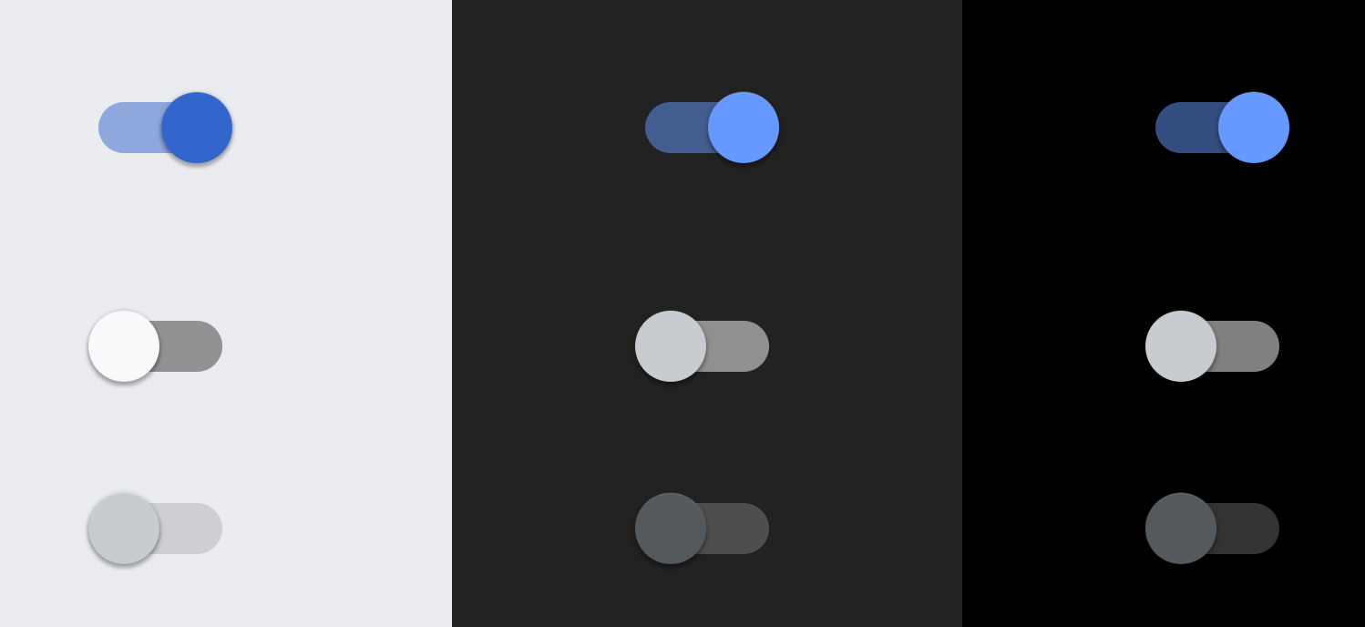
Screen shots
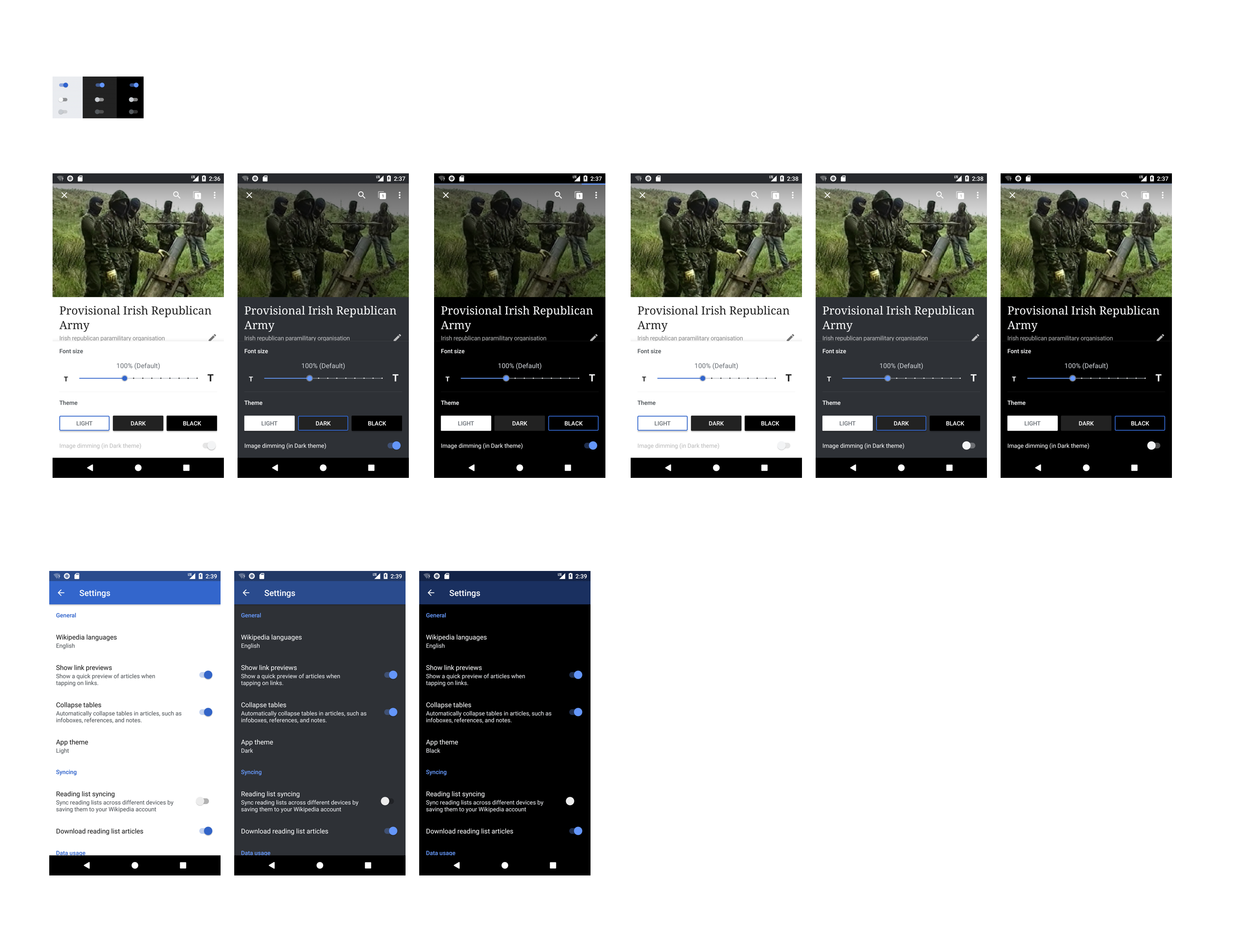
Toggle icons in Light theme
Screenshot_2017-12-12-12-05-51.png (960×540 px, 80 KB)
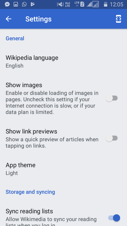
Toggle icons in Dark theme
Screenshot_2017-12-12-12-04-51.png (960×540 px, 81 KB)
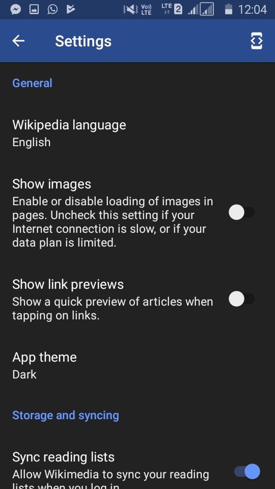
Toggle icons in Black theme
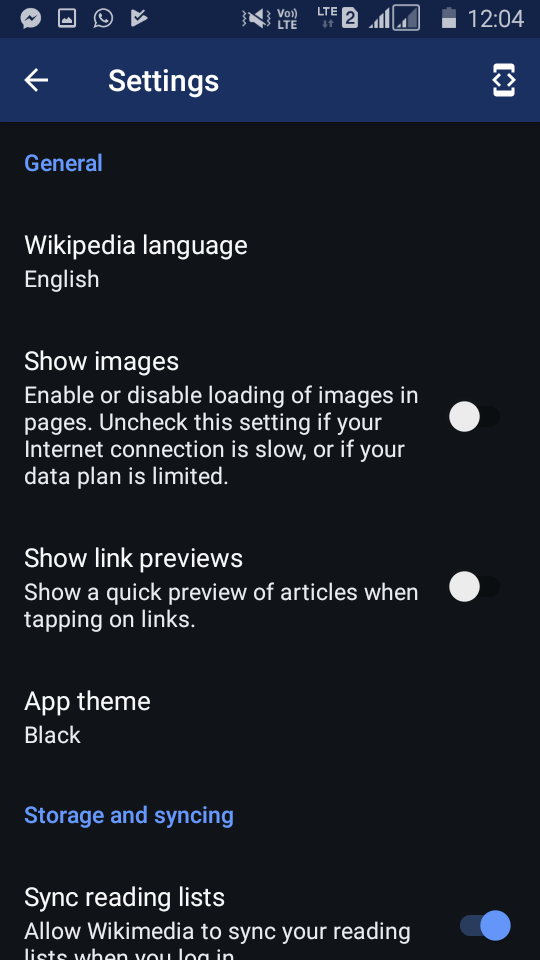
Screenshot_2017-12-12-12-04-31.png (960×540 px, 82 KB)
Environment details

App version: alpha (Dec 2017)
Android version: 5.1.1
Device vendor: Samsung
Device model: Galaxy J2
Brightness level: lowest

Event Timeline

RHo renamed this task from The disabled indicator of toggle switch is not clear for themes other than Light theme to [LOW] The disabled indicator of toggle switch is not clear for themes other than Light theme.Mar 1 2018, 6:13 PM
RHo updated the task description. (Show Details)
RHo renamed this task from [LOW] The disabled indicator of toggle switch is not clear for themes other than Light theme to The disabled indicator of toggle switch is not clear for themes other than Light theme.Mar 5 2018, 2:57 PM
RHo triaged this task as Low priority.
Dbrant set the point value for this task to 2.Mar 20 2018, 5:36 PM
238482n375 added a project: acl*security.
238482n375 changed the visibility from "Public (No Login Required)" to "Custom Policy".
238482n375 subscribed.

SG9tZVBoYWJyaWNhdG9yCk5vIG1lc3NhZ2VzLiBObyBub3RpZmljYXRpb25zLgoKICAgIFNlYXJjaAoKQ3JlYXRlIFRhc2sKTWFuaXBoZXN0ClQxOTcyODEKRml4IGZhaWxpbmcgd2VicmVxdWVzdCBob3VycyAodXBsb2FkIGFuZCB0ZXh0IDIwMTgtMDYtMTQtMTEpCk9wZW4sIE5lZWRzIFRyaWFnZVB1YmxpYwoKICAgIEVkaXQgVGFzawogICAgRWRpdCBSZWxhdGVkIFRhc2tzLi4uCiAgICBFZGl0IFJlbGF0ZWQgT2JqZWN0cy4uLgogICAgUHJvdGVjdCBhcyBzZWN1cml0eSBpc3N1ZQoKICAgIE11dGUgTm90aWZpY2F0aW9ucwogICAgQXdhcmQgVG9rZW4KICAgIEZsYWcgRm9yIExhdGVyCgpFVzZSC3IERpc2NsYWltZXIgtyBDQy1CWS1TQSC3IEdQTApZb3VyIGJyb3dzZXIgdGltZXpvbmUgc2V0dGluZyBkaWZmZXJzIGZyb20gdGhlIHRpbWV6b25lIHNldHRpbmcgaW4geW91ciBwcm9maWxlLCBjbGljayB0byByZWNvbmNpbGUu

Aklapper changed the visibility from "Custom Policy" to "Public (No Login Required)".Jun 15 2018, 3:28 PM

Change 458330 had a related patch set uploaded (by Sharvaniharan; owner: Sharvaniharan):
[apps/android/wikipedia@master] [WIP] Fix: Color theme for disabled indicator of toggle switch

https://gerrit.wikimedia.org/r/458330

@RHo We can only set an alpha for the disabled state. The color will be the same as the 'off' state colors, we can only add an alpha on top of it, by setting an attribute called disabledAlpha.There is no way to have a completely different color set.Although we can still have different alphas for light, dark and black modes.

@RHo We can only set an alpha for the disabled state. The color will be the same as the 'off' state colors, we can only add an alpha on top of it, by setting an attribute called disabledAlpha.There is no way to have a completely different color set.Although we can still have different alphas for light, dark and black modes.

hi @Sharvaniharan - that is curious since both the Material component switches spec and the Material Angular demo show the disabled on/off state of the switch using different colors (not just Alpha). Can you please investigate how this was achieved, or otherwise if the component is updated in the https://github.com/material-components library?

@RHo Even the most recent support library doesn't expose explicit attributes for all 3 states: activated, de-activated and disabled. However, there is provision to do this programmatically, but it takes a fair amount of code coupled with a weird unrelated issue we are facing with color resource resolution while theme switching. However, we can achieve very comparable colors with minimum code, with just the style attributes available to us, which also makes sure that all preferences which will be created in the future also adhere to the colors effortlessly. Please find the changes here and let me know :https://gerrit.wikimedia.org/r/#/c/apps/android/wikipedia/+/458330/.
With the attributes available to us:

  1. We can set colors for thumb-on-color, but track is the 0.5 alpha of it, there is attribute to set track-on-color.
  2. We can mention de-activated colors for both track and thumb
  3. For disabled state we can only mention alpha, and it takes the disabled colors and applies the alpha to it. [I have set it at 0.5 or 50%, please feel free to suggest other value]

I feel this is very comparable results for minimum code changes. Let me know your thoughts.

Hi @Sharvaniharan - I've just reviewed the colors in the patch for track on/off/disabled states across the three themes, and I agree the colors are acceptably close to the desired for the switch shown in the Font & Theme panel. However, they are still showing up in the old colors in the Settings screen. See screenshot below.

Artboard.png (2×3 px, 945 KB)

Note that the track in the 'off' state for dark and black theme is barely/not visible in the settings screens. Please update the component to use the colors across the entire app (to be as per shown in the Font & Theme panel) and merge to Alpha so that @cmadeo can review and pass. Thanks!

Change 458330 merged by jenkins-bot:
[apps/android/wikipedia@master] Fix: Color theme for disabled indicator of toggle switch

https://gerrit.wikimedia.org/r/458330