Page MenuHomePhabricator

Unable to hide diffs
Open, LowestPublic

Assigned To
None
Authored By
WikiPhoenix
Jan 29 2018, 12:07 AM
Referenced Files
F29219429: image.png
May 23 2019, 8:04 AM
F29218787: image.png
May 23 2019, 7:00 AM
F29218654: image.png
May 23 2019, 7:00 AM

Description

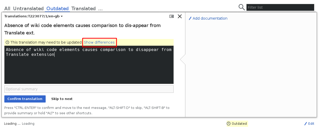
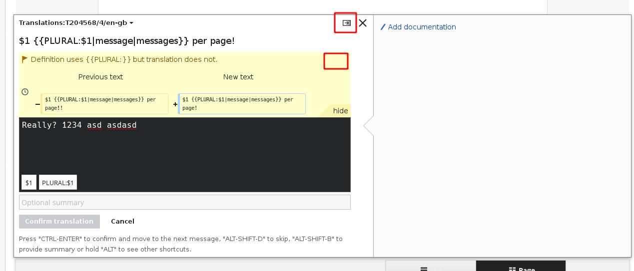
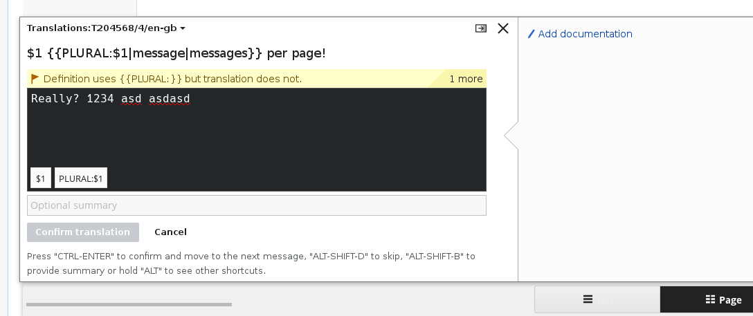
There is an option to view the diffs for the source text in fuzzy translations, but there is no option to hide it. This can take up a lot of space and make it tedious to scroll up and down to see the source text if it contains +20 lines.

If a hide feature gets implemented, an option to always display the diffs in the user preferences could be handy.

Event Timeline

Nikerabbit triaged this task as Lowest priority.Feb 1 2018, 9:17 AM
Nikerabbit moved this task from Backlog to tux on the MediaWiki-extensions-Translate board.

Hi @Pginer-WMF

While translating an outdated message, it is possible to see the "difference" between the previous message by clicking on Show difference. Currently it is not possible to Hide differences once expanded. Sometimes the difference can be very long and not being able to hide the difference is a problem.

image.png (498×1 px, 41 KB)

Currently on the UI we have these arrow icons that collapse various sections in the UI. I'm planning to add an icon on the top right of the difference section. Should we use a minimize icon, a close icon, or the arrow icon to collapse the section, and then display the Show difference button again.

image.png (543×1 px, 36 KB)

image.png (543×1 px, 36 KB)

Did you notice the "hide" option at the bottom-right corner of the yellow message area? Is that providing the desired functionality?

OK, so I should have clarified, the hide option is to collapse the messages themselves. So right now there are two notices shown to the users. The hide button will collapse the section and show only a single notice which in this case is Definition uses {{PLURAL:.... It does not the collapse the diff notice.

image.png (457×1 px, 29 KB)

Ok. I'm not completely convinced to add more controls to tweak different parts here since that could lead to confusion and UI clutter.
I expect the regular process to be for users to check the diff, update the translation if needed and move to the next.

If we want to achieve this level of control where users can expand/collapse both the list of messages and individual messages, we may need to reorganize the UI a bit to make sure that there is no confusion between these. For example. in the example provided in F29218787, a collapsing icon placed there may generate confusion about whether it affects the diff or the whole list of messages.