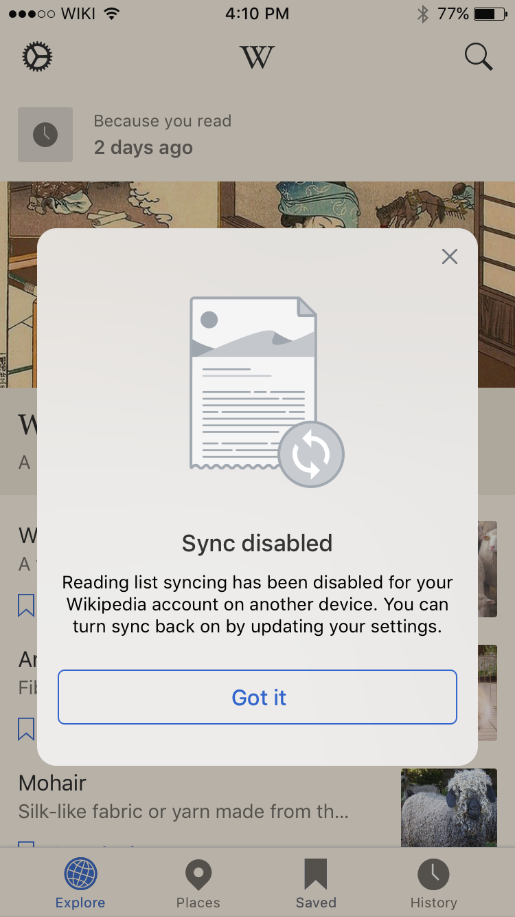
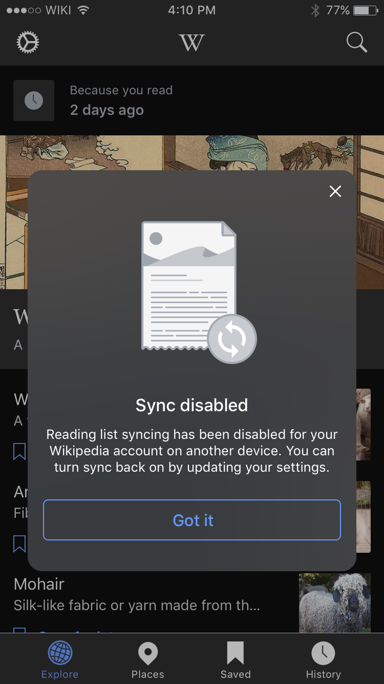
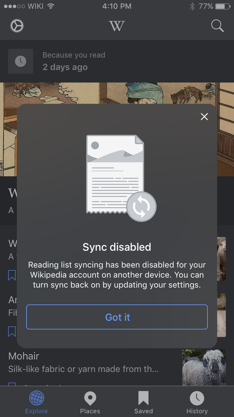
Presently pop-over panels (in Places and Reading lists) are not themed:

Popovers are currently using a translucency, so one option to preserve translucency with a darker presentation is setting the main view's background color to something like black with ~20% alpha (alpha in the color itself not the view's alpha):

(would also need to tweak text colors a bit)
Proposed solution
- Utilize the same overlay colors for Sepia mode
- Utilize new overlay colors for Dark and Black mode
- Change the base of the overlay to be B18: Mesosphere Gray (eg. #43464a) with alpha 80%
- Change the CTA button to A75: Stratosphere Blue (eg. #69F)
- Change text and close button color to B90: Snow White (eg. #F8F9FA)
Mocks and redlines
| Sepia | Black | Dark |
|---|---|---|
 |  |  |
| Zeplin: https://zpl.io/25gQex8 | Zeplin: https://zpl.io/aRN6oXe | Zeplin: https://zpl.io/25gQexj |