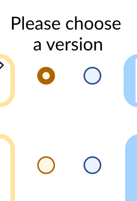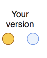
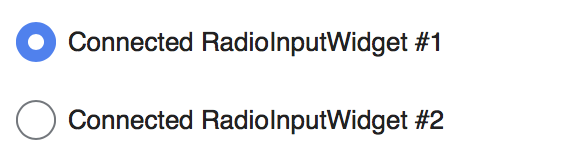
The highlighting of this to indicate 'selected' is not properly accessible for those who have visual impairments. Please use shape in some way to indicated the selected state:
| TheDJ | |
| Feb 9 2018, 12:55 PM |
| F18567387: MVP 1.3-choose_a_version--en-5.png | |
| Feb 4 2020, 8:58 AM |
| F13375600: Screen Shot 2018-02-09 at 13.48.45.png | |
| Feb 9 2018, 12:55 PM |
| F13375751: Screen Shot 2018-02-09 at 13.54.29.png | |
| Feb 9 2018, 12:55 PM |
| Status | Subtype | Assigned | Task | ||
|---|---|---|---|---|---|
| Open | None | T338318 Evaluate & improve accessibility of TechWish products | |||
| Open | None | T244206 Review accessibility requirements in TwoColConflict | |||
| Resolved | • Hanna_Petruschat_WMDE | T186875 Selected state of radio buttons for merge interface not accessible to those with visual impairments |
Based on the screenshot, this is a failure of WCAG 2.0 Level A guideline 1.4.1 "Color is not used as the only visual means of conveying information, indicating an action, prompting a response, or distinguishing a visual element."