Note how the three (i) icons in the "structure" group are shifted to the right.
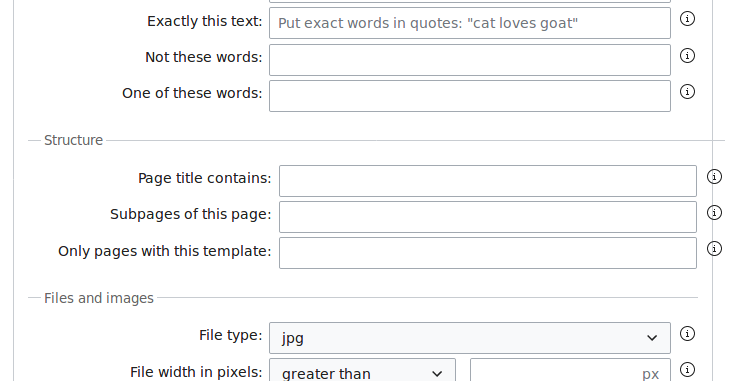
I dug a little bit in the CSS and believe this is because of the width: 35% used for the labels. This percentage value is calculated on a base, and it appears this base is larger than what is available. Maybe because one of the last label that is longer than all others?
I think it's worth picking this task up after T182125: Reposition the info (i) to match the standard OOUI look is resolved, because when we move the info icons back to the left the issue might disappear.