To improve the styling of landing Page for logged out users on Mobile.
| Sek2016 | |
| Mar 29 2018, 10:18 AM |
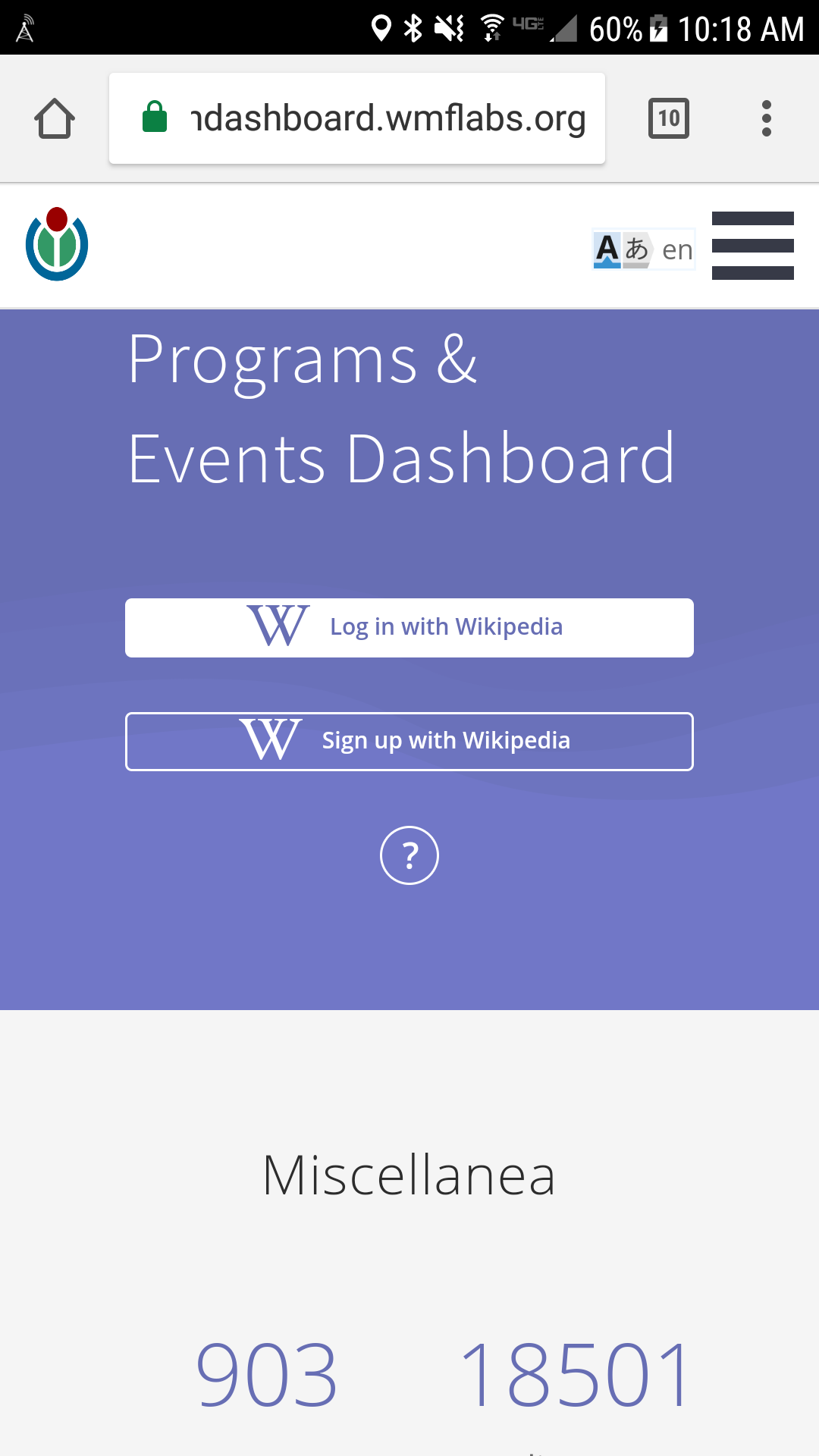
| F16435429: Screenshot_20180329-101833.png | |
| Mar 29 2018, 5:25 PM |
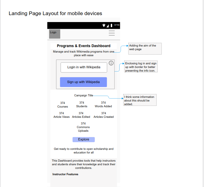
| F16418694: LandPage_mockup1.png | |
| Mar 29 2018, 10:18 AM |
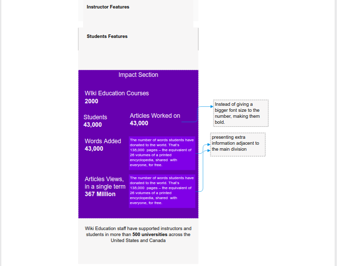
| F16418693: LandPage_mockup2.png | |
| Mar 29 2018, 10:18 AM |
To improve the styling of landing Page for logged out users on Mobile.
| Status | Subtype | Assigned | Task | ||
|---|---|---|---|---|---|
| Resolved | Sek2016 | T190509 Track progress of the Project Grant: Feature improvements to Wikimedia Programs & Events Dashboard | |||
| Resolved | Sek2016 | T191008 UX feedback on dashboard landing page wireframes |
These seem like good ideas. I'm not sure about enclosing the login buttons, but maybe that would be fine.
One of the things that bothers me about the mobile landing page is the spacing and proportions, which just seems 'off'.
The logo is a bit distorted, and the text on the login / signup buttons is very small. The small margin between the nav bar and the title — much smaller than the side margins — is also part of what feels weird about it.
Thanks, Sage for mentioning the details. I will work on standardizing the styling elements for mobile layouts.
Your redesign makes sense to me, @Sek2016. I like how you reduced the size of the metrics. I like how you present more information about the purpose of the dashboard in several distinct sections below the login prompt. Enclosing the login prompt section is logical, since that's the primary call to action on the screen so we really want users to focus on that.
Is the background of the login section going to be grey (as in your wireframe) or purple/blue, as in Sage's current screenshot? If it's going to be grey, I think we'll need to change the color of the "sign in/sign up" buttons, because we want the "sign in" button to be the one that stands out most.
The background of the login section is going to be purple/blue, as in Sage's current screenshots. I won't alter it as it makes the "sign in" button stand out.
Thanks,@Capt_Swing for the feedback. I'll go ahead and start implementing the changes.
It looks like this has been done in 89c5928070bc604bb5cf2189271b66a8a76b3131 / https://github.com/WikiEducationFoundation/WikiEduDashboard/pull/1967 hence resolving. Please reopen if I'm wrong.