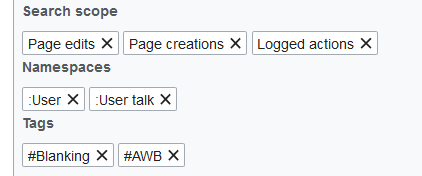
Page MenuHomePhabricator

Tags in Special:RecentChanges are misleading
Open, Needs TriagePublic

Assigned To
None
Authored By
Huji
Mar 29 2018, 4:47 PM
Referenced Files
F16440087: 2.PNG
Mar 29 2018, 11:06 PM
F16439990: 1.PNG
Mar 29 2018, 11:05 PM
F16439977: 2.PNG
Mar 29 2018, 11:05 PM
F16439659: Capture.PNG
Mar 29 2018, 10:55 PM
F16434553: Capture.PNG
Mar 29 2018, 4:47 PM

Description

Take this example:

Capture.PNG (121×689 px, 5 KB)

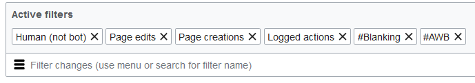
What it means is ("Human (not bot)") AND ("Page edits" OR "Page creations" OR "Logged actions") AND ("tag=#AWB" OR "tag=#Blanking") but the Boolean relationship is not there, and therefore it misleadingly looks like all those combinations are being combined with the same logic (whether it is AND or OR), which is untrue.

This is a design flaw.

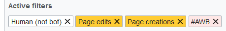
One way to fix it is to color code the tags. All tags that define the search scope (e.g. "Page edits" or "Page creations", etc.) can be in one color (say white), all that define other restrictions (e.g. tags, or "May have problems", etc.) in another color such as pink, and we can have multiple color groups corresponding to the multiple logical groups.

2.PNG (64×459 px, 3 KB)

Another approach is to separate the "Active Filters" section into several parts, each shown in a separate row: Search Scope (where conditions are always combined with OR), Tag Restrictions (where conditions are always combined with OR), namespaces, etc.

1.PNG (176×422 px, 5 KB)

Event Timeline

Huji updated the task description. (Show Details)

You cannot use color to assign meaning to something, as that poses an accessibility problem for those who are (color)blind.

I don't know if the tag feature has any accessibility for those who are blind. For colorblindness, we can try to use colors that are distinguishable by most color-blind people, but I get your point and think that color should not be our primary choice.

jmatazzoni subscribed.

You've identified an issue we talked about during the design phase @Huji. The idea of clarifying the various search relationships in effect is an attractive one, and your idea of using color is quite interesting. Question: were you thinking that each possible filter group would be permanently assigned a different color? Or that a more limited set of colors would be assigned n the fly, since users are unlikely to use more than a few different groups at one time?

During testing, user making filter selections generally understood their choices (though few could have analyzed them, as you have done). So we have no mandate at this time to dive back in to make what would be a fairly complicated change to an already complicated interface. But we'll save this ticket for a future situation in which this interface is up for review.