Page MenuHomePhabricator

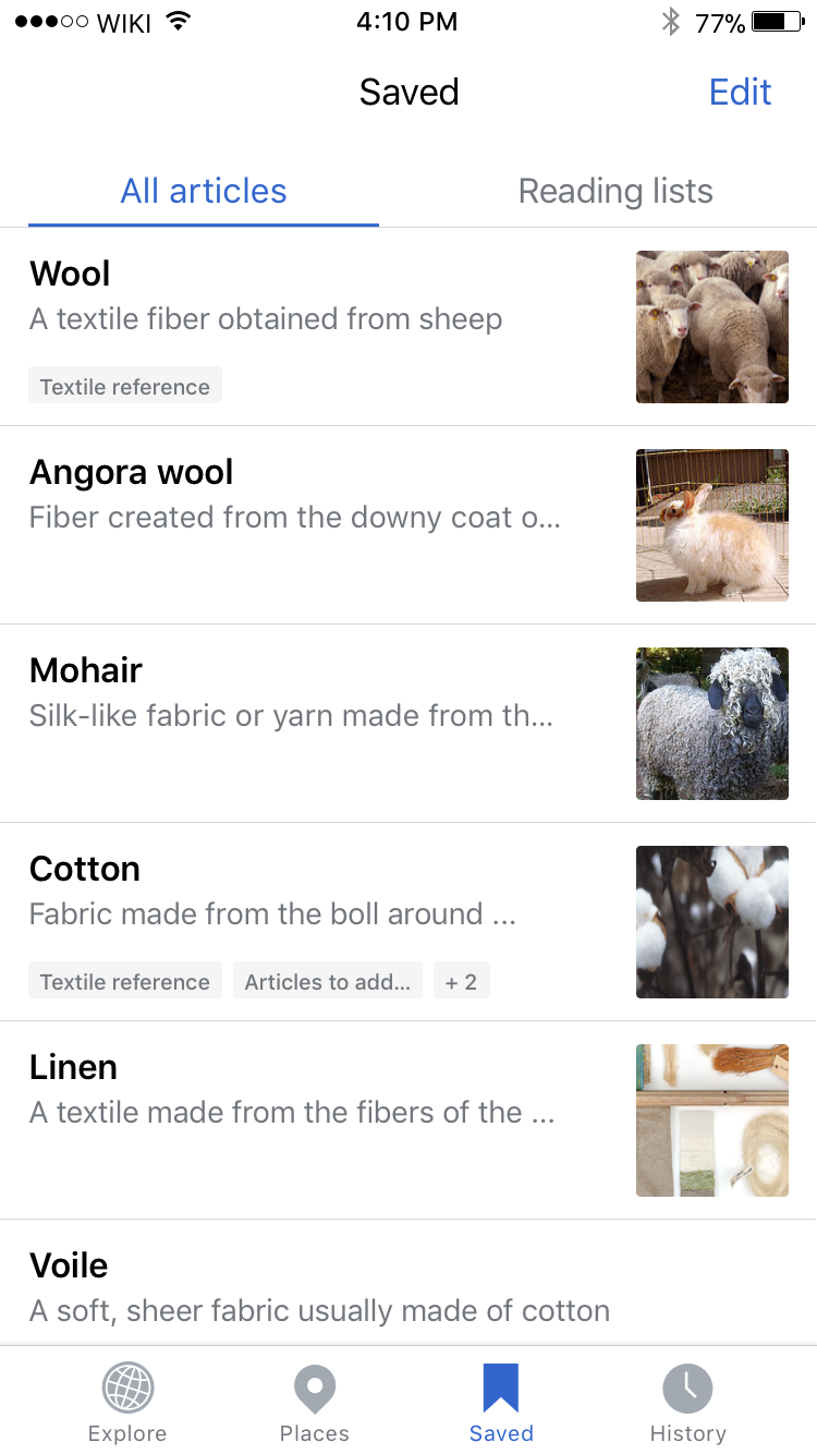
Improve legibility and hierarchy of the All articles view
Closed, ResolvedPublic

Description

Why are we doing this?

There are currently some small variations between the original designs and the implementation of the All articles view

Proposed solution

  • Update reading list labels to be lower case
  • Ensure that all list item text and background fills fit within the height of the thumbnail (see Zeplin for redlines and spacing)
  • Increase padding between list item text and thumbnail to 20pts
Event Timeline

cmadeo renamed this task from Improve legibility and hierarchy of the Individual All articles view to Improve legibility and hierarchy of the All articles view .Apr 2 2018, 11:17 PM
cmadeo triaged this task as Medium priority.
cmadeo updated the task description. (Show Details)

@NHarateh_WMF thanks for making these updates!
Would it be possible to have the bottom of the reading list label box be flush with the bottom of the thumbnail?
Also the background color for the reading list tags is looking a bit light, is it #f5f5f5? If it is already #f5f5f5, then perhaps we should darken it to #EAECF0.

Thank you!

@cmadeo it was using #F8F9FA 😱 do you want to adjust background color for other themes as well? right now we're using #F0E6D6 for sepia, #27292D for dark and #222222 for black

Oh! Nice catch @NHarateh_WMF! The dark and sepia mode colors are perfect (the 'mid background color') The 'mid background' color can stay the same for the default, but we may need to make a tweak just to this label color. If the label color could be #f5f5f5 on default that would be awesome.

Thanks so much!