Page MenuHomePhabricator

Mobile page issues - visual styling changes
Closed, ResolvedPublic5 Estimated Story Points

Description

Precursor

T193584 should have been completed before taking on this work. You can work on this in parallel with that task provided you have synced with whoever is implementing T193584.

Background

We will do the page issues work in a series of steps. The first step would be to adopt the new visual styles for all page issues. These styles will not distinguish issues based on type or severity of the issue. They will also only use the long-form version of the issue on issue text (using hide when compact will be implemented in a separate step). This task will reflect the default state for page issues.

User story

As a reader, I want the ability to know details about the issues the page I’m reading has so that I can take them into consideration while reading

Acceptance criteria

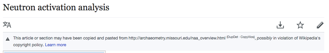
Page issues will display the following:

  • Issue description capped to a certain height. Use overflown hidden for the time being - it is okay for text to be clipped half way - a follow up will take care of this.
  • Learn more on a new line.
  • Icon
  • Link navigating to issue modal
  • Visual changes as defined below
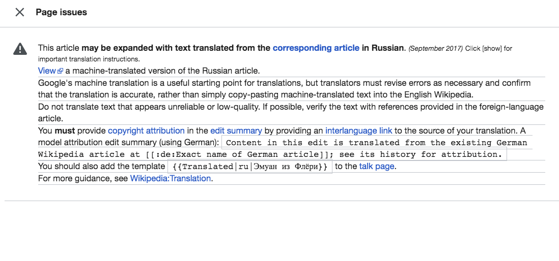
  • For all ambox templates containing hidable elements, display the "hide when compact" version of the issue decription
  • Apply the changes to the following wikis: English, Chinese, Russian, French, Japanese (inventory of hidable elements can be found here: https://www.mediawiki.org/wiki/Reading/Web/Projects/Mobile_Page_Issues#Inventory_of_mobile-friendly_page_issues)

Design Criteria

Generic page issue treatment (rationale for using the lower severity icon for all issue levels: in terms of keeping users trust, it seems like it'd be worse to raise too high an alarm for a low-level issue, than too raise too low an alarm for a high-level issue)

generic.jpg (1×750 px, 533 KB)

Developer notes

  • Once T193584 is done, this should simply be a case of adding the new CSS. Implementor should be wary of unused CSS and CSS bloat when working on this (but we may need to accept it as part of this change and to support the A/B test). The icon should not be render blocking CSS - reserve space for it in the stylesheet and load it via JavaScript (using last modified bar for inspiration)

Testing steps

The A/B test is setup on staging to turn on the new treatment for 50% of traffic.
http://reading-web-staging.wmflabs.org/wiki/Boi_(slang)?useformat=mobile

TO bucket yourself in the new design, you can either

  • Open an incognito window and close it and reopen until you are bucketed correctly - 50% chance!
  • Run the following code in the console and refresh the page until you are bucketed
mw.storage.session.remove('mwuser-sessionId')

Sign off steps

Ensure we've captured tasks for the following lingering issues:

  • [am]box templates on category page/talk page
  • truncating text of issues
  • concerns around late loading of icon and 'read me' captured in T191528

Event Timeline

There are a very large number of changes, so older changes are hidden. Show Older Changes
ovasileva edited projects, added Web-Team-Backlog; removed Web-Team-Backlog (Design).
ovasileva moved this task from Incoming to Needs Prioritization on the Web-Team-Backlog board.
ovasileva added a subscriber: Jdlrobson.
Jdlrobson moved this task from Needs Prioritization to Upcoming on the Web-Team-Backlog board.

@ovasileva I think this is ready for estimation but T193584 (which I've just created) should be done first to keep the scope down.

Change 432005 had a related patch set uploaded (by Jdlrobson; owner: Jdlrobson):
[mediawiki/skins/MinervaNeue@master] WIP: Mobile page issues - visual styling changes

https://gerrit.wikimedia.org/r/432005

Alex to take a gander and pass back to me in doing when he's done.

Alright, here's what I've got so far after looking at pages with some of the more common page issues:

Loading

Styling

Specific template issues

Open questions

For reference here are all of the pages I tested so far: collection of pages with page issues

In T191303#4275958, @alexhollender wrote:

Alright, here's what I've got so far after looking at pages with some of the more common page issues:

Loading

  • "learn more" link & icon loading after text

We can't avoid this. We need to do this in JavaScript... how big a problem is this? If it's a problem we will need to rethink our entire approach here.

Given we load this code in JavaScript this is hard to avoid. Is this just for single line issues (if so would a min-height be okay here?) as a similar jump will happen for multiple line issues too. If we need to make this work for variable heights we'll have to engage in some pseudo element hackery which I'd rather avoid but is possible..

Styling

Fixed.

  • If it ends up being possible to keep the notices to a total of 2 lines (including the "learn more" link)? e.g. Template:Multiple issues

(http://reading-web-staging.wmflabs.org/wiki/Ambiguity) or Template:More footnotes (http://reading-web-staging.wmflabs.org/wiki/M109_howitzer) - I know @Jdrewniak is working on this.
Not completely sure I understand the directive here, but if we do or don't impacts how we resolve the learn more load.

  • not yet using different icons for different issue types

Correct. This is out of scope for this task. That will be done in T191528

Specific template issues

Fixed.

  • Template:Copypaste is not truncating properly

What text are you expecting to truncate? The template doesn't really allow any further truncation of content then this:

Screen Shot 2018-06-12 at 3.49.45 PM.png (180×1 px, 40 KB)

We'll need to update the template if we want to make changes there. Can you open a ticket tagged Local-Wiki-Template-And-Gadget-Issues ?

  • Template:Article for deletion/dated is not truncating properly

Opened a bug: T197048

Opened T197049

Open questions

I suggest we leave open questions for another task - I'm keen to keep this task as focused as possible so we can have something to iterate off. Hope you don't mind me ignoring all of these.

For reference here are all of the pages I tested so far: collection of pages with page issues

@alexhollender looking at T191529 it looks like we want to truncate issues to two lines. Given the resolution and font size is variable this would be easier if the "learn more" was on its own line. I'd suggest breaking this out into a new task if it's intended behaviour. I'm going to not do that as part of this minimal first version.

Change 440255 had a related patch set uploaded (by Jdlrobson; owner: Jdlrobson):
[mediawiki/extensions/MobileFrontend@master] Restrict border-bottom to issue overlay rows

https://gerrit.wikimedia.org/r/440255

^ fixes underlines in this screenshot:

Screen Shot 2018-06-13 at 3.53.48 PM.png (514×1 px, 117 KB)

late loading of icon and 'read me' - I know the usual way of placing an icon is generating it via JS with mw-icon, but man... can't it just be a css background image? what would the downsides be to that?

truncating lines (i.e limiting the number of lines) - As we all know, this is tricky. Webkit (and Blink) have the proprietary line-clamp property, and given that most mobile browsers are either webkit or blink, I think it might actually be feasible on mobile. However... these templates may include more than 1 paragraph, and we wouldn't want to truncate multiple paragraphs (that would look weird), so I think we have to go with something similar to the 'fade' effect we used in Popups. like this:

Screen Shot 2018-06-14 at 12.21.53.png (273×450 px, 30 KB)

"read more" on it's own line - I think ideally we want to save space and have this message be near the template text. If we end up using the "fade" method outline above, I think it would be possible to absolutely position the "read more" on top of the fade, without fear that it would overlap text. Similar to the Popups fade & settings cog effect.

Screen Shot 2018-06-14 at 12.32.20.png (259×407 px, 29 KB)

late loading of icon and 'read me'

The late loading of "read me" is still going to happen. I'm open to the background-image but let's wait for work on T191528 to begin. There's plenty of time to rethink this.

"read more" on it's own line

This is nice. Can you upload a patch to show what that might look like (presuming youv'e not faked that screenshot?)

truncating lines

I think the line clamping needs a lot more thought and I'm concerned that it got obscure important messaging. I'd rather work with template editors to fix the problems we're seeing. @alexhollender can I rely on you to setup a task to investigate this?

Issues aside, I'm quite happy with the current state of things and am reluctant to add more complexity to this initial patch. I'd favor wrapping up the existing patch and iterating off there with specific problems as and when we find them. The sooner we start on T191528 the better!

late loading of icon and 'read me'

I'm fine waiting until we get a bit further to work on this. I'd say it's higher priority to get the icon to load with the page notice text, rather than the learn more text. Currently it's distracting because there are elements on either side of the text that load after it.

@Jdrewniak regarding clamping/truncation you mentioned:

However... these templates may include more than 1 paragraph, and we wouldn't want to truncate multiple paragraphs (that would look weird),

Can you explain why this would look weird? I'm worried about these notices taking up too much space relative to their importance, and pushing the beginning of the article down the screen. I'm less concerned about the text in the notices getting cut in an awkward/abrupt way.

@Jdrewniak I like the version where Learn more is on the same line. If it's not too much trouble could you put that in a codepen or something so I can play around with it a bit?

I'd rather work with template editors to fix the problems we're seeing. @alexhollender can I rely on you to setup a task to investigate this?

@Jdlrobson just to clarify, you mean setting up a ticket that documents problematic page issue templates, and attempts to figure out some kind of community-based solution for fixing them?

general question: I think I remember us saying that we were stripping all HTML from the content, so things like line breaks, super/subscript, etc. won't show up. Is that still the plan?

stripping all HTML from the content

@alexhollender that is not the case! we are leaving the HTML as is, and bending it to our will with CSS 🏋️‍♀️
I'll paste a link to the "read me" + fade shortly.

truncating lines
@Jdlrobson I see your concern with the line-clamping 🗜 -- that it would obscure important messaging -- but doesn't the "read more" button imply that some text is hidden? IMO, if we leave the content as-is, then I don't see the usefulness of the "read more" button. Clicking on it would just lead to an overlay that displays the same content, wouldn't it?

ut doesn't the "read more" button imply that some text is hidden? IMO, if we leave the content as-is, then I don't see the usefulness of the "read more" button. Clicking on it would just lead to an overlay that displays the same content, wouldn't it?

No, because clicking the button will show all the hidden content too (e.g. hide-when-compact). My concern is with truncating text that's not written to be truncated e.g. T197265. Either way, let's split that clamping work out into a new task and just focus on getting something we can iterate off, right now I feel like my patch is a blocker of other work.

I'm fine waiting until we get a bit further to work on this. I'd say it's higher priority to get the icon to load with the page notice text, rather than the learn more text. Currently it's distracting because there are elements on either side of the text that load after

Cool and understood. Let's see how the other task pans out. The main problem with this approach is going to be the introduction of render blocking styles (icons are quite expensive) which will slow down first paint so we need to be careful with that change and would be wise to specifically focus on that.

Change 440556 had a related patch set uploaded (by Jdrewniak; owner: Jdrewniak):
[mediawiki/skins/MinervaNeue@master] [POC] fade for placing learn-more button on same line as content.

https://gerrit.wikimedia.org/r/440556

Change 440255 merged by jenkins-bot:
[mediawiki/extensions/MobileFrontend@master] Restrict border-bottom to issue overlay rows

https://gerrit.wikimedia.org/r/440255

Change 432005 merged by jenkins-bot:
[mediawiki/skins/MinervaNeue@master] Mobile page issues - visual styling changes

https://gerrit.wikimedia.org/r/432005

Will put this on staging soon. We should be thorough and create any tickets for the outstanding work in particular those mentioned in sign off steps. We'll address problems in separate tickets from now on rather than as part of this task. @alexhollender over to you

Edit: this is now live on staging.

I'm noting these issues in a fairly quick manner (no screenshots, not a huge description) because I'm not sure if we're going to end of making all of these into tickets or not, so I'd rather wait and then go into further detail then

  • what’s our approach with Learn more currently? Are we putting on its own line, or are we using the gradient fade and fitting it on the same line when possible? It seems to be doing a bunch of different things, but I don't know how it's currently supposed to display so hard to QA.
  • sometimes the detail modal is rendering without the icon & close icon (inconsistent, hard to repro — one way to get it is to click a link in a page notice, then hit back)
  • should we QA section issues as well? They seem to be taking on the new styling but with some issues of their own
  • should we QA the detail modal? Not sure if anything we're doing here might be affecting that

Also I only QA’d this list and am wondering if I should QA more?

More information needed:

Could you share a screenshot? I'm not exactly sure what you mean by "notice text" here.

Template specific
These issues are best fixed by editors - doing so ourselves would introduce lots of technical debt. We might want to consider identifying and alerting editors about these problems instead:

If a page is not using multiple issues template then the page itself needs fixing like so. Per the template definition https://en.m.wikipedia.org/wiki/Template:Multiple_issues " it should be used with at least two other message boxes sandwiched inside it.".
Again we might want to explore flagging these issues to editors in some way.

No idea what this template is for, but it's rarely going to be seen (only really by editors disabling redirects). Note, staging doesn't follow redirects - see the same page on enwiki: https://en.m.wikipedia.org/wiki/Thundar
It's marked up as a page issue so we'd need to work with editors to distinguish it if needed.

  • Please open tasks **
  1. Correct truncation of text

Note there are 2 variants of the same template.

  • what’s our approach with Learn more currently? Are we putting on its own line, or are we using the gradient fade and fitting it on the same line when possible? It seems to be doing a bunch of different things, but I don't know how it's currently supposed to display so hard to QA.

For consistent truncating we should setup a new task that specifies how many words/lines to truncate and how to truncate. Right now we only truncate the "fix" and show the reason untruncated as provided by the template.

  • sometimes the detail modal is rendering without the icon & close icon (inconsistent, hard to repro — one way to get it is to click a link in a page notice, then hit back)
  1. Section handling
  • should we QA section issues as well? They seem to be taking on the new styling but with some issues of their own

Please setup a task around how section issues should be handled.

  • should we QA the detail modal? Not sure if anything we're doing here might be affecting that

Right now clicking an issue shows all the issues in the page. If this behaviour needs to change (in particular to relate to section handling) please fold it into this task.

  • No opinion **

Also I only QA’d this list and am wondering if I should QA more?

Up to you and Olga :)

@Jdlrobson re:

links need to be stripped from notice text - effecting seems to be affection most templates (e.g. Template:Refimprove - http://reading-web-staging.wmflabs.org/wiki/Microscope)

The page issue text (e.g. "This scientific article needs additional citations to secondary or tertiary sources") contains links. Here is a screenshot of me tapping on the word "verification"

IMG_0045.PNG (1×750 px, 111 KB)

In T191303#4306346, @alexhollender wrote:

@Jdlrobson re:

links need to be stripped from notice text - effecting seems to be affection most templates (e.g. Template:Refimprove - http://reading-web-staging.wmflabs.org/wiki/Microscope)

The page issue text (e.g. "This scientific article needs additional citations to secondary or tertiary sources") contains links. Here is a screenshot of me tapping on the word "verification"

IMG_0045.PNG (1×750 px, 111 KB)

Oh I see. Yeh, that is correct. Currently, we are unable to change the HTML structure of the message so we simply style links to not like links but I can see the problem with this. Can you create a task for us to discuss about this too? There are a few things to unpack here.

If a page is not using multiple issues template then the page itself needs fixing like so. Per the template definition https://en.m.wikipedia.org/wiki/Template:Multiple_issues " it should be used with at least two other message boxes sandwiched inside it.".
Again we might want to explore flagging these issues to editors in some way.

Isn't this something we can do as well? If we find a page with multiple issues then display the multiple issue template?

Created the following:
T197932: Display section issues modal
T197931: Truncate page issues - here, we still need some requirements around how truncation should work

In terms of links - not optimal, but if they're clickable, perhaps it's better to style them as links?

All follow-up tasks have been opened. Resolving this.

Mentioned in SAL (#wikimedia-operations) [2018-07-11T12:05:51Z] <pmiazga@deploy1001> Synchronized wmf-config/InitialiseSettings.php: SWAT: [[gerrit:445036|Remove ambox images on mobile wikis (T191303)]] (duration: 00m 57s)

Change 440556 abandoned by Jdlrobson:
[POC] fade for placing learn-more button on same line as content.

Reason:
See Id607dea537c212298c02a0e1639aef2a786eb424

https://gerrit.wikimedia.org/r/440556