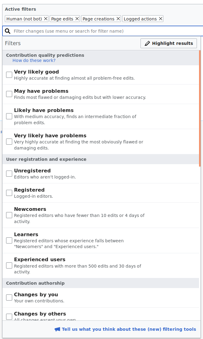
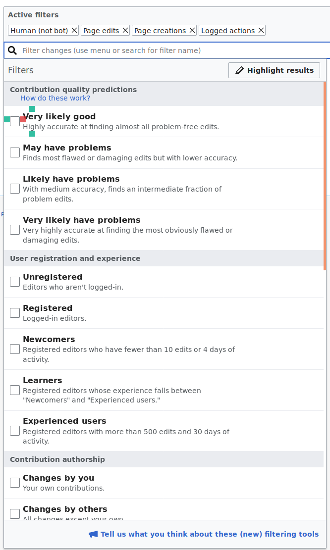
The filters menu in Recent changes page shows a list of elements that are scanned vertically. Recently the spacing became unbalanced as the result of some regression and no longer aligns with the original design (T149452).
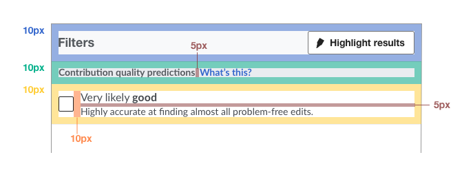
In the example below you can notice that the "Filters" label, filter group label (e.g., "Contribution quality predictions"), and the checkboxes is different. This also makes the spacing at both sides of the checkboxes to be unbalanced.
Based on the space modules used by the style guide we may want to adjust all these these elements to be at 12px from the left edge of the panel, and for the case of checkboxes to also have 12px distance to the filter labels to their right. If the use of ems is required, we may need to approximate such distance, but let's make it be the same in all cases.
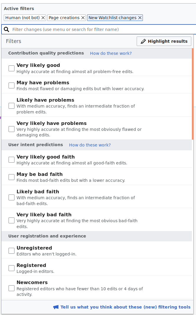
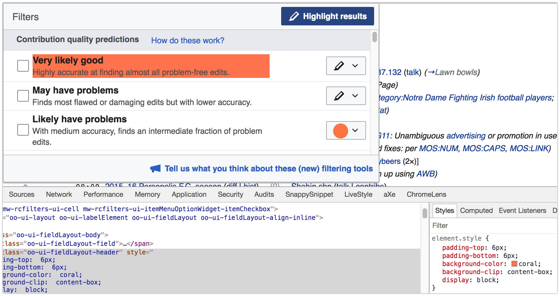
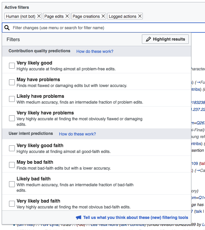
An example with the spacing adjusted to 12px is shown below (note that other alignment issues are present that will be addressed in separate tickets):