Page MenuHomePhabricator

Editing maps in VE - the marker area needs some adjustments
Closed, DeclinedPublic

Description

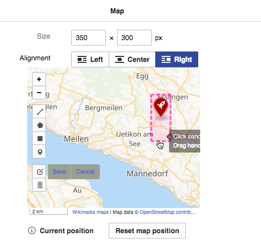
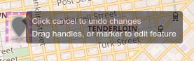
Split from T141750: <maplink> and/or <mapframe>: clickable marker area too big

  1. Have <mapframe> element on a page and open VE to edit the map.
  2. Click on editing the layer - the marker area is large and the pointing hand changes far away from the marker.

Screen Shot 2018-04-04 at 12.16.17 PM.png (503×528 px, 216 KB)

Event Timeline

Restricted Application added a subscriber: Aklapper. · View Herald Transcript

Change 425935 had a related patch set uploaded (by Mooeypoo; owner: Mooeypoo):
[mediawiki/extensions/Kartographer@master] Make the marker areas smaller in VE dialog

https://gerrit.wikimedia.org/r/425935

Copying my notes from the patch, because there's still a small visual bug that cannot be fixed:

This is a followup to making the marker areas smaller in general at T141750: <maplink> and/or <mapframe>: clickable marker area too big, now also implemented in VisualEditor's edit dialog.

There is an issue with Leaflet's marker images, where the images are extremely long and so the clickable areas are long. We fix this everywhere by adding a 'clip' rule to the CSS. However, when editing in VisualEditor with Leaflet.Draw, the system adds a dashed border to the <img> tags. When those are clipped, the border is clipped as well
missing its bottom). There is no way of fixing it short of rewriting the way these images are formatted and making those images smaller, or, better yet, rewriting Leaflet.Draw to output the markers as <div> elements with background image rather than <img> tags, so that we can solve the overlay/border with a :before rule.

So this is fixed, except that when the markers are active, in edit-map mode, the dashed line is chopped at the bottom.

@Pginer-WMF Do you have an opinion about which of the 2 options above is less bad? Resizing the marker seems to be impossible so we can leave it as is or chop the bottom half.

@Pginer-WMF Do you have an opinion about which of the 2 options above is less bad? Resizing the marker seems to be impossible so we can leave it as is or chop the bottom half.

Clipping the border makes it look broken. If I there are no other ways to adjust the border, I'm more inclined to use the version with the extra bottom space, which just looks disproportionated instead of broken.

(I was trying to reproduce this in beta, but no pink dashed borders were shown when I added some markers)

Closing as Declined.

@Pginer - the map you're referring to (https://en.wikipedia.beta.wmflabs.org/wiki/Map) is a very complicated (and broken in several ways - a familiar "Uncaught TypeError: Cannot read property 'lat' of null" is displayed - I need to look more into it) comparing to what I used, but it's possible to get it pink (though without a marker area):

Screen Shot 2018-05-10 at 3.35.11 PM.png (434×784 px, 55 KB)

I used a simple mapframe:

<mapframe width="500" height="400" zoom=8 latitude="46.9174" longitude="8.3002" align="left" />

Then, when editing in VE, add markers, and only then use an option 'Edit layers'.

Change 425935 abandoned by Mooeypoo:
Make the marker areas smaller in VE dialog

Reason:
Declined by design (see ticket)

https://gerrit.wikimedia.org/r/425935