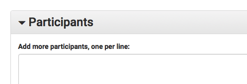
For a user wanting to add users into grant metrics, it may be unclear that they can copy paste rows from a spreadsheet, or from a wiki page directly.
Proposed solution
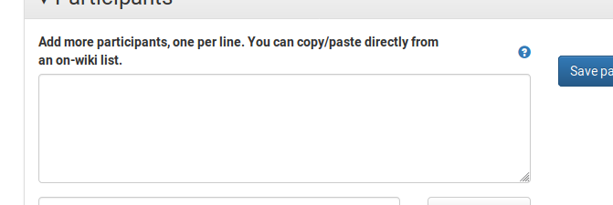
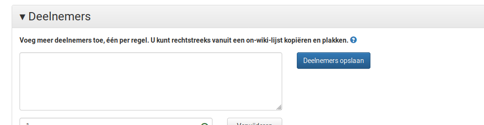
- Change the wording "Add more participants, one per line" to "Add more participants, one per line. You can copy/paste directly from an on-wiki list."
- At the end of that line, add a help (?) icon that on click, takes user to https://meta.wikimedia.org/wiki/Grant_Metrics_tool#Adding_participants in a new tab.