Hello. Could you, please, replace the LiveUpdates OOUI widget button icon on RTL wikis? It points to opposite direction.
LTR language:
RTL Language:

I think it should be . Thank you.
| IKhitron | |
| Apr 25 2018, 12:41 PM |
| F17938790: Cirlce-play-he.png | |
| May 5 2018, 9:42 PM |
| F17938755: Cirlce-play-en.png | |
| May 5 2018, 9:42 PM |
| F17938354: circle-play.svg | |
| May 5 2018, 9:42 PM |
| F17493967: playbutton.png | |
| May 1 2018, 7:06 PM |
| F17304481: Capture d’écran_2018-04-25_15-19-48.png | |
| Apr 25 2018, 1:22 PM |
| F17304475: Capture d’écran_2018-04-25_15-20-22.png | |
| Apr 25 2018, 1:22 PM |
Hello. Could you, please, replace the LiveUpdates OOUI widget button icon on RTL wikis? It points to opposite direction.
LTR language:
I think it should be . Thank you.
This is the "play" icon from OOUI.
@Mooeypoo what are your thoughts on whether this icon should be flipped in general, and/or in this specific case?
Ah, this is a fun one. I'll poke @Amire80 for this too, since we've been having this similar discussion several times, but since this was reported by @IKhitron who's a Hebrew speaker, I want to see other opinions here.
Overall, the buttons for media play (Play/Rewind/Forward/etc) are not flipping in Hebrew.
Hebrew interfaces still use the left-to-right media interface buttons, probably historically due to the original (ancient? ;) Walkmans where the cassette itself played in that direction (and if you had a pencil, you'd need to know which side to rewind in case the tape got unspooled... oh, the good ol' days :)
If you look at any video or audio interface in Hebrew, the "Play" button is still facing right, on its LTR version, even in Hebrew.
So, a couple of things here:
@Amire80 what do you think here? I am not sure whether it fits the "standard" (in which case we shouldn't flip?) or if it might be a different concept. Should we consider a different icon completely?
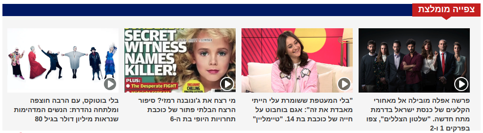
Following up, here's a screenshot from a Hebrew news site that uses video. See the "Play" buttons are all in LTR:
Hi, @Mooeypoo. If so, I suggest a second options, so the best can win. The icon will remain the same, but it will located at the left of the button, to look natural. I do not know which one is better.
The play icon is usually not reversed for RTL languages, as @Mooeypoo says.
But this does make me think:
Yeah, that's what I started wondering. Poking @Pginer-WMF on this, for his input. Do we really need a "play" icon here? It does seem a little counterintuitive, especially in RTL.
That said, I do see the merit of it, seeing as turning on live updates is a sort of "playing something live". But I think it is a bit of a stretch, honestly.
- Why is it placed beside the text? It's not much clearer beside in French than in Hebrew when it's beside the text. Maybe the text can be underneath it?
- Why is there an icon at all? A label would be enough.
I am actually for having both an icon and a label, I think it makes things clearer, faster to understand (with the icon) and yet get context (with the label) -- that said, I think if we changed the icon, this might look less weird.
That might be a good solution if we keep the current icon.
Also from looking at other websites that use the play icon in different languages, I think what bugs me the most about this RTL version is that it's kind of detached; most places I've seen, the play icon is either on its own in a button (so, it's "boxed") or it's inside a circle next to a label. There's something a little weird seeing it on its own and with a label -- and I think that's also true for the LTR version. @Pginer-WMF, I'm not sure if I'm spotting something real or imagined but for your consideration. I can probably find some examples if needed.
Gang, if this isn't wrong, I'm going to move it to medium term interest on our board. The play icon works fine for live update in our tests, and it works nicely in combination with the stop icon, which play turns into when you've clicked it.
I think the icon helps to anticipate the outcome of the action (and how to cancel it later). Play/stop metaphors take advantage on the expectations users have about media playback but they are used in other areas such as code debugging UIs or presentation software. During user research, this worked well to set the expectations of the data on the screen to start moving and disappearing, something that could be surprising for users otherwise.
Maybe a circle around the play button will make it more clear.
This is how it looks like with circle-play:

If we gonna view the icon out of context the task request and solutions about using a circle around the play icon might be seen as improvements. Given that on click the icon changes from 'play' to 'stop' the icon metaphor seems sufficiently understandable.