With the merger of T189688 article content now flows next to the infobox on the Minvera skin instead of below it. However, thumbnails that appeared beside a peice of content now appear below the infobox.
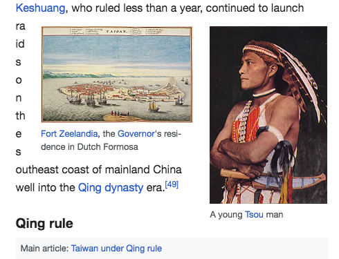
 |  |  |
| Minerva (before change) | Minvera (current) | Vector |
It's debatable whether this is an issue, because the Vector skin clears thumbnails in the same way.
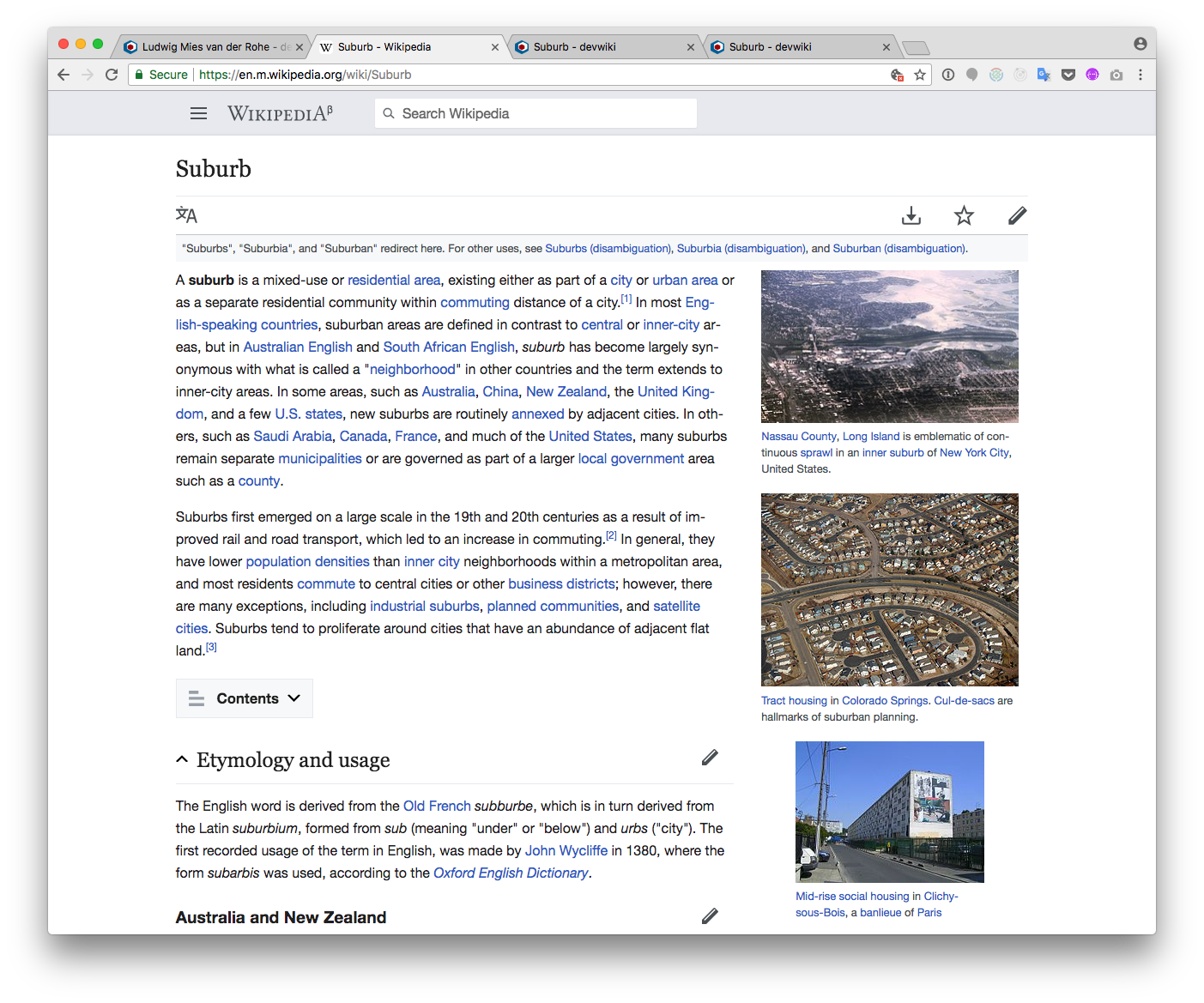
The thumbnails get pushed below the infobox because both elements have float: right; CSS rules and the thumbnails have the clear: right; rule, which means they don't allow any floated elements to appear on their right side (i.e. the clear:right makes sure the thumbnail is always at the right edge of the container).
My hypothesis is that it's better to remove the clear rule from the thumbnails so that they appear closer to the content they're associated with, which is probably the editors intent.
 |  |
| Current Minvera | Proposed change |
This change would only be visible on tablet devices, since the Minerva skin clears the floats at a narrow width anyway.
A patch with these changes (and a few more) was created by @Jdlrobson to illustrate the difference.
https://gerrit.wikimedia.org/r/#/c/430098/
A throw-away account on Wikipedia has also been set-up to show what these changes would look like.
username: noclearthumbnails
password: noclearthumbnails123
(this account will be deleted when this task is resolved)
The following file has been edited to explore these changes
https://en.m.wikipedia.org/wiki/User:Noclearthumbnails/minerva.css
side-effects may include...
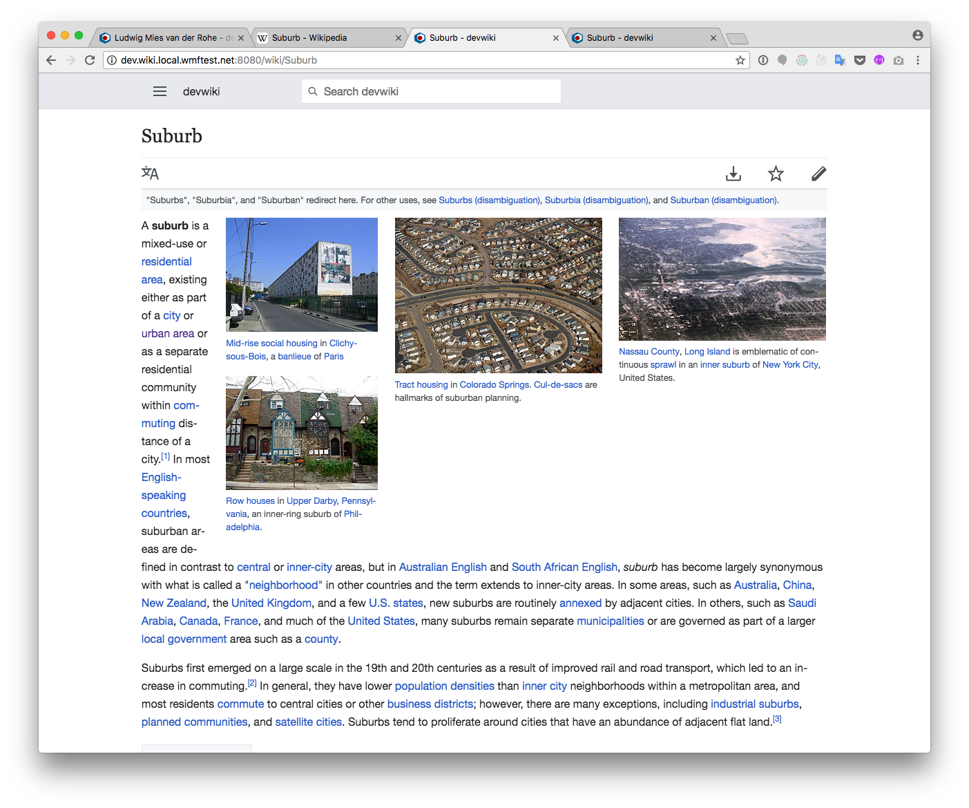
- When two thumbnails are placed beside each other, they won't stack vertically like they do now. Instead (space permitting) they would be placed beside each other.
 |  |
| Current | Proposed change |
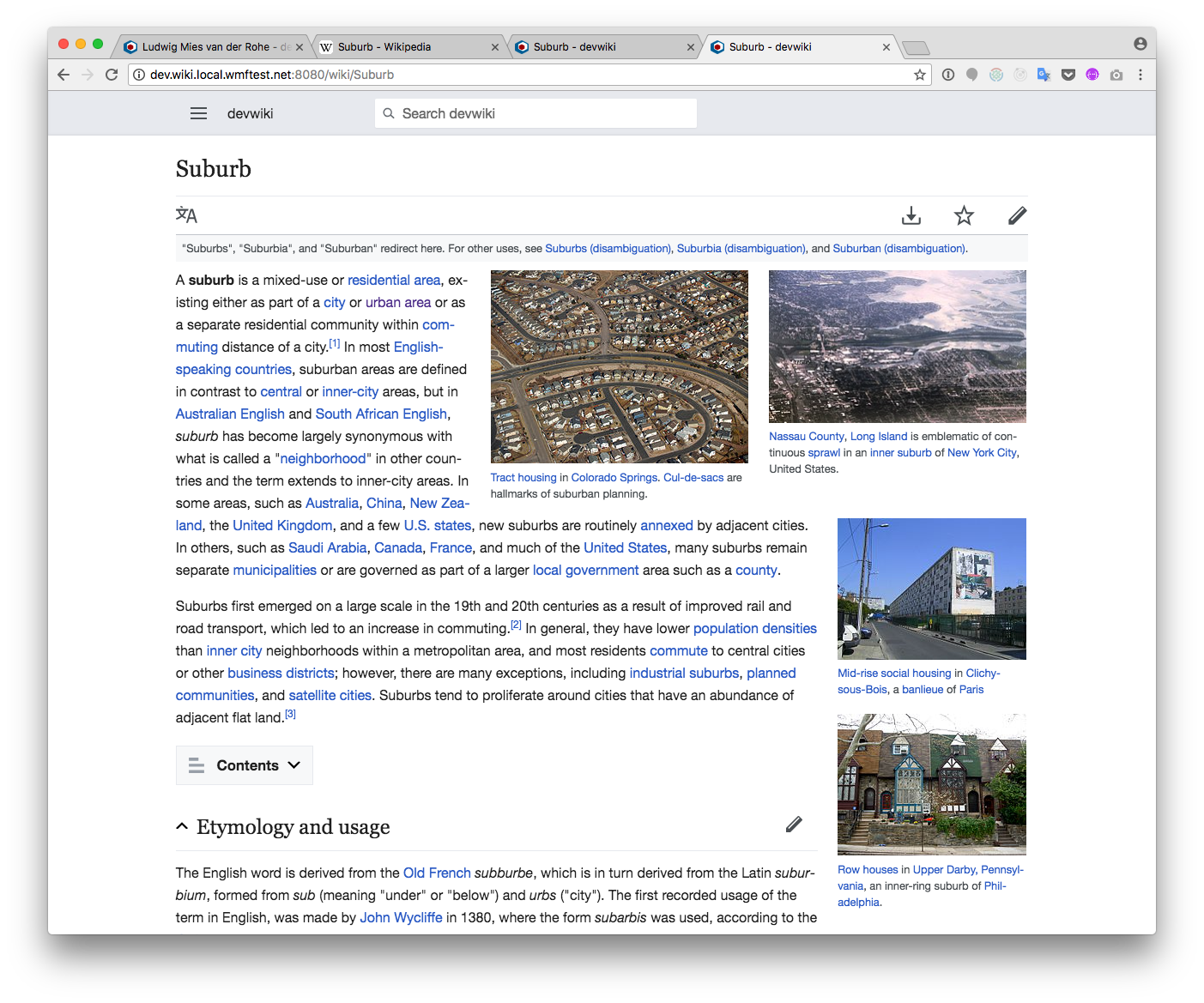
 |  |
| Current | Proposed change |
- thumbnails might "bump" into each other instead of aligning beside or below.
 |  |
| Current | Proposed change |
- Word-breaks will have to be addressed by preventing characters from flowing into the spaces between the thumbnails