Page MenuHomePhabricator

Special:Preferences-OOUI: distinguish titles and the values
Closed, DeclinedPublic

Description

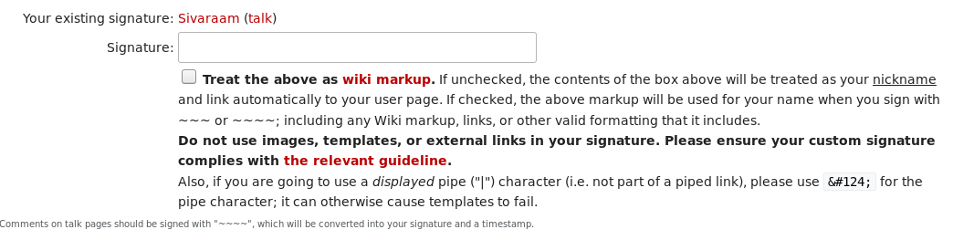
It's hard to distinguish the text that changes ("values" such as "Your existing signature") from those that do not change ("titles" such as the signature of the corresponding user). They should be distinguished in a better way in order to help the user find the current state of a value easily.

name and values should be distinguished. names-don't change, values-change.png (309×746 px, 42 KB)
name and values should be distinguished. names-don't change, values-change [1].png (146×756 px, 10 KB)
This wasn't the case with the old UI as they were in different columns.
name and values distinguished-old UI.png (263×1 px, 43 KB)

Event Timeline

Kaartic triaged this task as High priority.May 11 2018, 7:43 PM
Kaartic created this task.

Not fully convinced, that it's more unclear now by position.
My first approach would be to replace “Treat the above as wiki markup. If unchecked the contents of the box above” by “Treat the signature as wiki markup. If unchecked the contents of the input above”, or maybe “input box

Proposal:

image.png (684×1 px, 153 KB)

Another alternative would be “Customize signature”.

Kaartic renamed this task from k3caaaaaaa to Special:Preferences-OOUI: distinguish titles and the values .Jul 1 2018, 1:03 PM
Kaartic updated the task description. (Show Details)
Kaartic added a subscriber: Aklapper.

@Kaartic would you provide a closer insight in what is problematic to you? Even after revisiting, I really don't think that the position is problematic here?
My proposal earlier falls short, as the input can either be a nickname or a signature and making this explicable is just adding to the already overly length of the checkbox label.

The order of

  1. exisiting signature - your signature
  2. change signature/nickname
  3. alternating checkbox

is in my opinion clear and useful.

@Kaartic would you provide a closer insight in what is problematic to you? Even after revisiting, I really don't think that the position is problematic here?

Sorry for the delayed response. First of all to clarify, I wasn't speaking just about the signature field and the corresponding checkbox. I was speaking in general about the pair of preference titles (e.g. "Email (optional)", "Prohibit these users from emailing me:") and their values (e.g. "example@example.com").

I thought it was easier and quicker to search/locate for the preference titles (e.g. "Email") in the non-OOUI preferences page by means of quick scanning as the titles and the values were in different columns. In the OOUI version it's a little hard to search/locate them as they seem to be in the same column (which isn't a big deal) and seem to be using the same font styles (which seems to be the issue for me). I think distinguishing the titles and the values by styling them a bit differently might help in locating them easily.

Volker_E lowered the priority of this task from High to Low.Jul 9 2018, 4:19 PM

@Kaartic Thanks for the clarification! After revisiting this, I would like to share some arguments on why the changed layout is a superior treatment, even though it implies some habitual changes.

The main reason for the re-positioning of the labels above and the labeled preferences widgets/contents below is that in OOUI we follow a user-experience best-practice in regards of several factors, like ease-of-use/quick scanning, internationalization, and other more. You can find a comparison of different label position approaches and an extensive list of their advantages/disadvantages for example here.

image.png (678×1 px, 174 KB)

Let's take for a moment the specific example given on “Signature” section. And examine a different visual treatment, leaving the position as is. If we were to bolden the labels it would result in de-emphasizing the contents. There's no reason in putting emphasis on “Your existing signature“ vs the existing signature of the user. Also, the section is already set apart from above by the form legend and whitespace above.

Therefore I'd suggest to decline this.

I don't have a strong preference here. I just thought it might be better if there was a way to distinguish the preference titles and their values. If it does more bad than good, it's not worth it.

@Kaartic Ok, thanks. I will close this ticket for the time being and we'll keep this in mind in case we receive similar feedback from others as well to revisit the task.