Page MenuHomePhabricator

Monobook: drop down arrow hardly visible
Closed, ResolvedPublic1 Estimated Story Points

Description

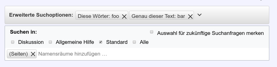
Based on feedback of user Billinghurst:

On Monobook the arrow indicating that you can expand the search-parameter-section is a bit lost in visual clutter. It might not be clear for everyone that this can be extended.
See screenshot below and in the link above.

Bildschirmfoto zu 2018-05-16 22-48-07.png (217×897 px, 29 KB)

Event Timeline

Restricted Application added a subscriber: Aklapper. · View Herald Transcript

Maybe a solution would be to move it to the right as on Vector-Skin?

I also think the 'x' to remove the pills are to big in monobook.

@MichaelSchoenitzer_WMDE you're absolutely right.

I would agree that moving the arrow to the right as well as reducing the size of the "x" as well as fixing the alignment. I don't know what's going on there but the alignment of the namespace x is correct whereas the tags stemming from the advanced search parameter form are sitting too low.

I would also increase the size of the checkboxes to be closer to be at least the size if the font, or even better a bit bigger, like in the vector skin.

kai.nissen set the point value for this task to 1.Jun 4 2018, 10:39 AM

@Charlie_WMDE @MichaelSchoenitzer_WMDE
I suggest not changing the size of the X and checkboxes. That's just the style of monobook. If you go to some other place which has those elements (like Recent Changes) you'll see they look the same. That being said, it only appears to be on Chrome, on Firefox it looks ok.

Change 443064 had a related patch set uploaded (by Tonina Zhelyazkova; owner: Tonina Zhelyazkova):
[mediawiki/extensions/AdvancedSearch@master] Fix minor issues with the UI on monobook

https://gerrit.wikimedia.org/r/443064

Vvjjkkii renamed this task from Monobook: drop down arrow hardly visible to nucaaaaaaa.Jul 1 2018, 1:09 AM
Vvjjkkii triaged this task as High priority.
Vvjjkkii updated the task description. (Show Details)
Vvjjkkii removed the point value for this task.
Vvjjkkii removed subscribers: gerritbot, Aklapper.
kai.nissen renamed this task from nucaaaaaaa to Monobook: drop down arrow hardly visible.Jul 2 2018, 7:05 AM
kai.nissen lowered the priority of this task from High to Medium.
kai.nissen updated the task description. (Show Details)
kai.nissen set the point value for this task to 1.
kai.nissen added a subscriber: Aklapper.

@Tonina_Zhelyazkova_WMDE you're right. The x looks really out of place for me though. Is that the standard monobook X or are we adding some OOUI X there?

On https://test.wikimedia.beta.wmflabs.org/w/index.php?search=&title=Special%3ASearch&profile=advanced&fulltext=1&advancedSearch-current={%22namespaces%22%3A[0]}&ns0=1&useskin=monobook
I still see the expand/collapse indicating arrow right next to visual clutter, and not on the right hand side. If this is not a 0 point task to fix, I would leave it out of the sprint, though, and treat it as a new ticket.

Change 443064 merged by jenkins-bot:
[mediawiki/extensions/AdvancedSearch@master] Fix minor issues with the UI on monobook

https://gerrit.wikimedia.org/r/443064

Lea_WMDE claimed this task.
Lea_WMDE moved this task from Test to Done on the WMDE-FUN-Sprint-2018-06-25 board.