Update [08/08]
We'd like to wrap up existing work here. There are remaining edge cases, which we'll document and assess separately. JR to talk to Alex about them and work out options.
Background
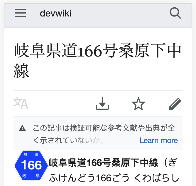
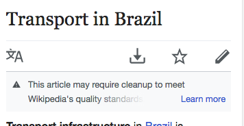
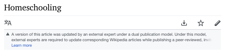
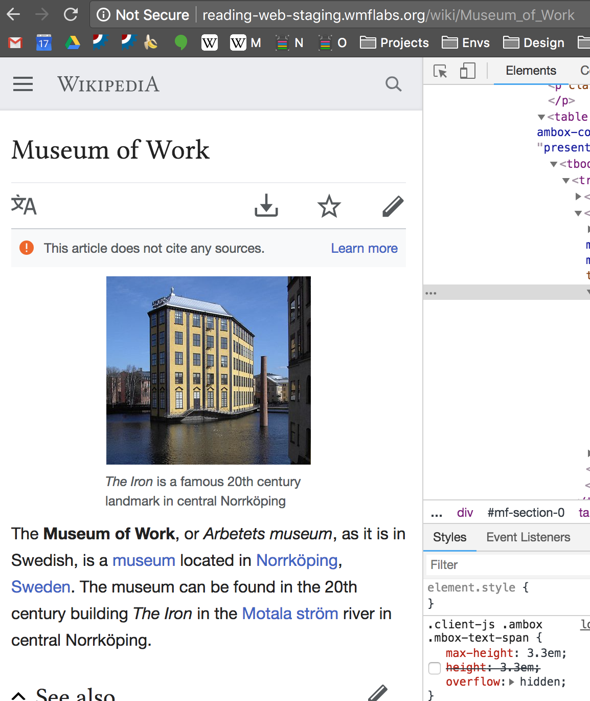
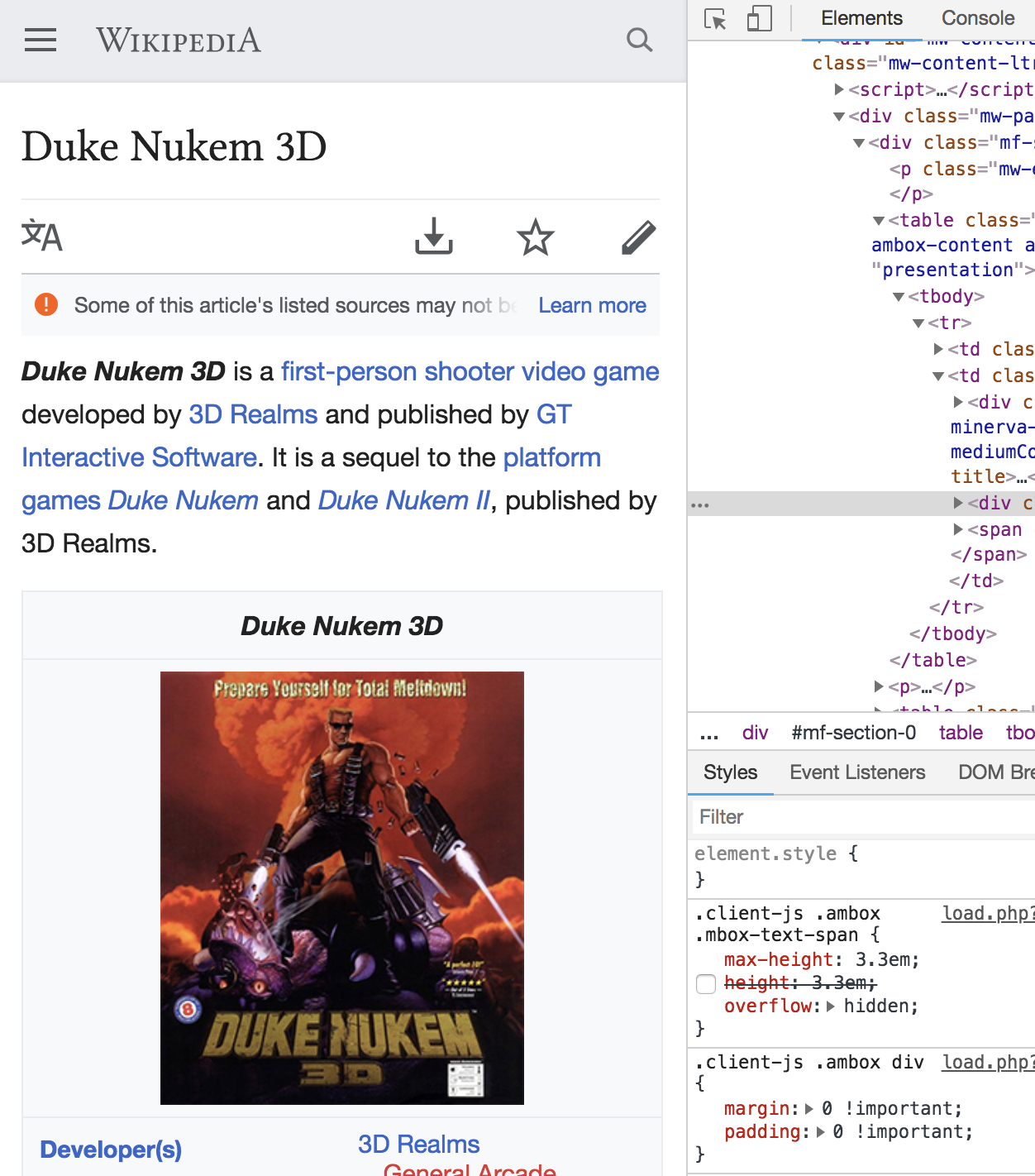
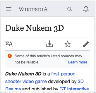
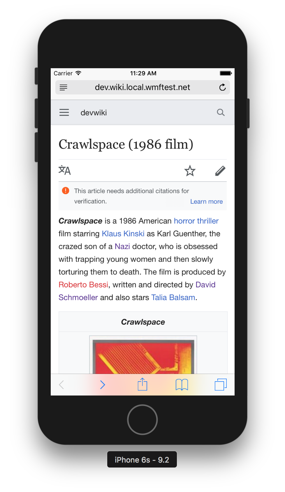
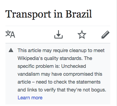
Sometime issues don't have short descriptions. Sometimes issues with short descriptions still have descriptions that are too long
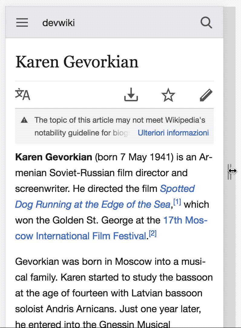
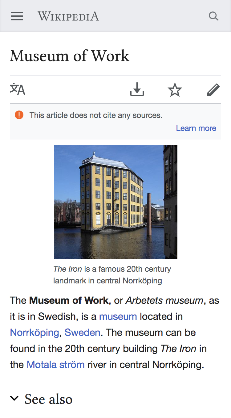
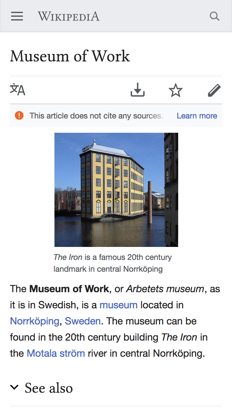
Currently looks like this:
Acceptance criteria
- Truncate all page issues (regardless of whether we are displaying a short or a long description) to 2 lines of text at 320px.
- learn more show appear in the bottom right corner of the issues box (backup plan should be invoked if we spend more than 8 hours trying to make this work - and we should put "Learn more" on its own line).
developer notes
Maybe we need a max-height that limits the element to two lines of text. https://codepen.io/alexhollender/pen/ZROzzE
examples
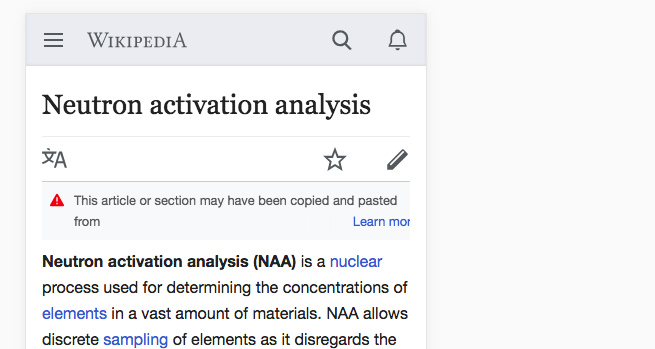
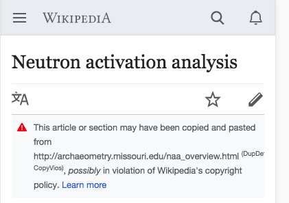
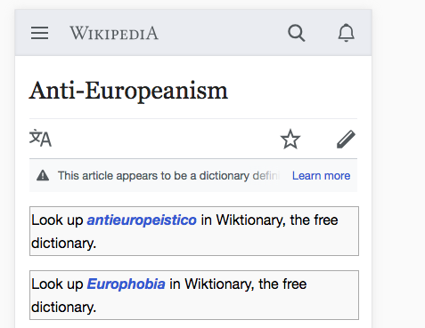
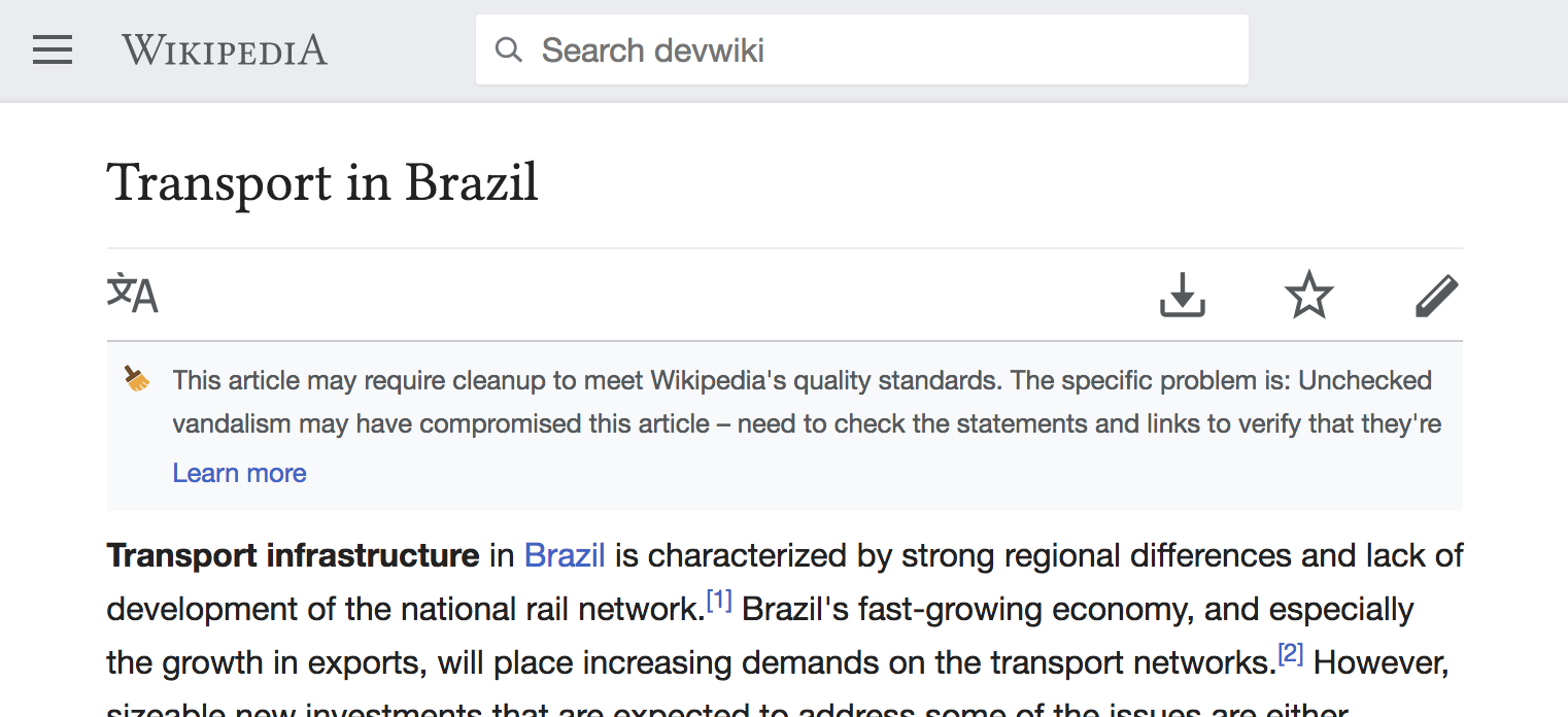
Here are some pages where issues are running long (on mobile):
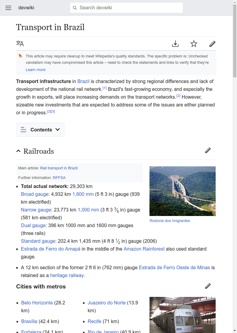
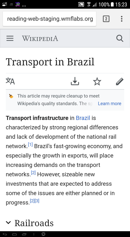
- http://reading-web-staging.wmflabs.org/wiki/Transport_in_Brazil
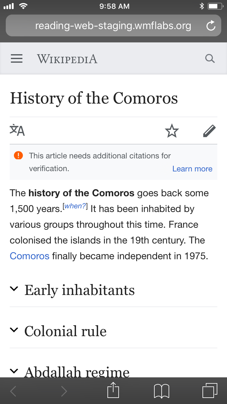
- http://reading-web-staging.wmflabs.org/wiki/Neutron_activation_analysis
- http://reading-web-staging.wmflabs.org/wiki/Anti-Europeanism
sign off
- document remaining edge cases and follow up with Olga on next steps
estimation notes
When estimating we will want to determine how much more effort it will be to put " learn more" on the 2nd line rather than on a new line. This will help us determine with alex and olga whether it is worth doing.
QA steps
- Visit a variety of pages with page issues (see list below) and verify that:
- the page issue text never exceeds two lines (not including the "Learn more" link)
- if your browser width is less than 719px the "Learn more" link is always in the bottom-right corner of the gray banner
- if your browser width is greater than 721px the "Learn more" link is always in the bottom-left corner of the gray banner
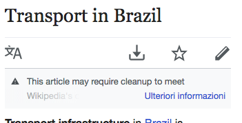
- Visit http://reading-web-staging.wmflabs.org/wiki/Transport_in_Brazil, set your browser width to 740px, and verify that the last word of the page issue text is faded out
Here are some pages to use for testing:
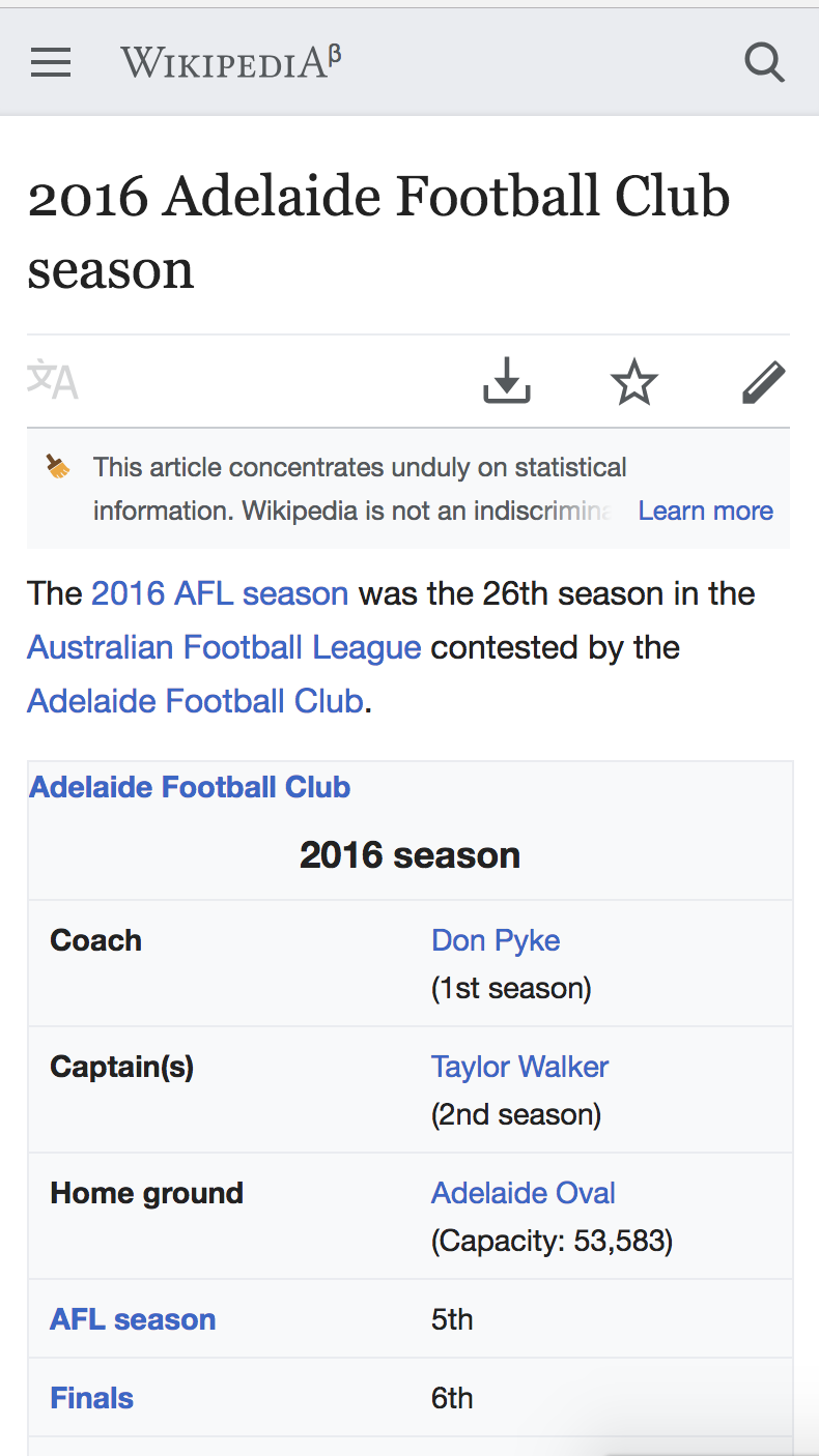
- http://reading-web-staging.wmflabs.org/wiki/2016_Adelaide_Football_Club_season
- http://reading-web-staging.wmflabs.org/wiki/Transport_in_Brazil
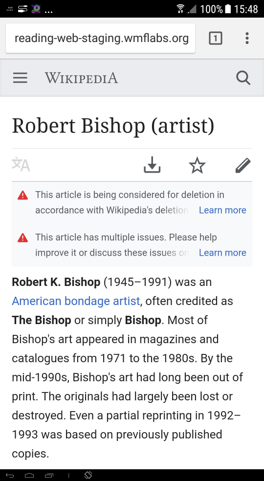
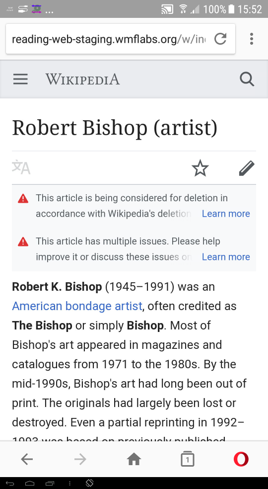
- http://reading-web-staging.wmflabs.org/wiki/Robert_Bishop_(artist)
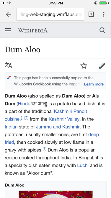
- http://reading-web-staging.wmflabs.org/wiki/Dum_Aloo
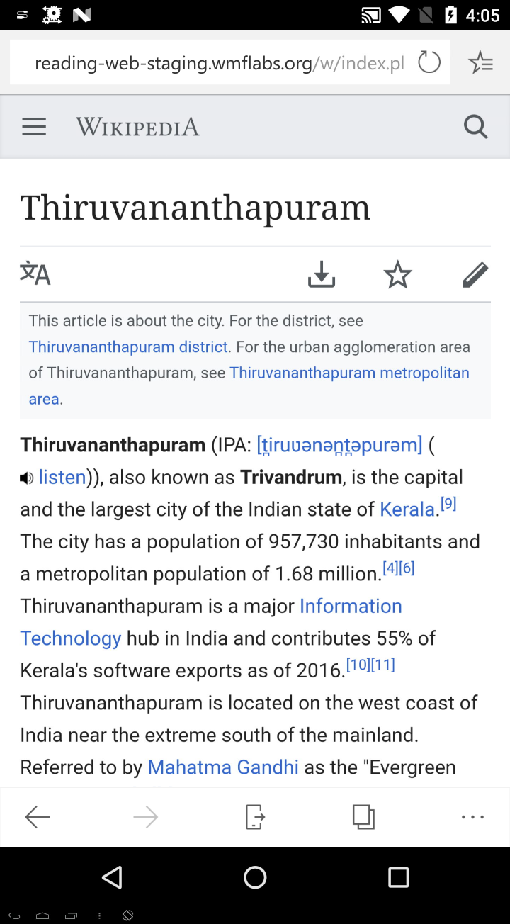
- http://reading-web-staging.wmflabs.org/wiki/Thiruvananthapuram
- https://en.wikipedia.org/wiki/Japan_Medical_Association_Journal
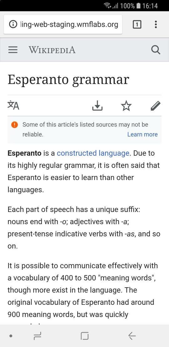
- http://reading-web-staging.wmflabs.org/wiki/Esperanto_grammar
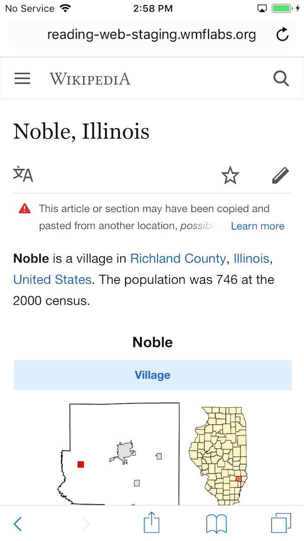
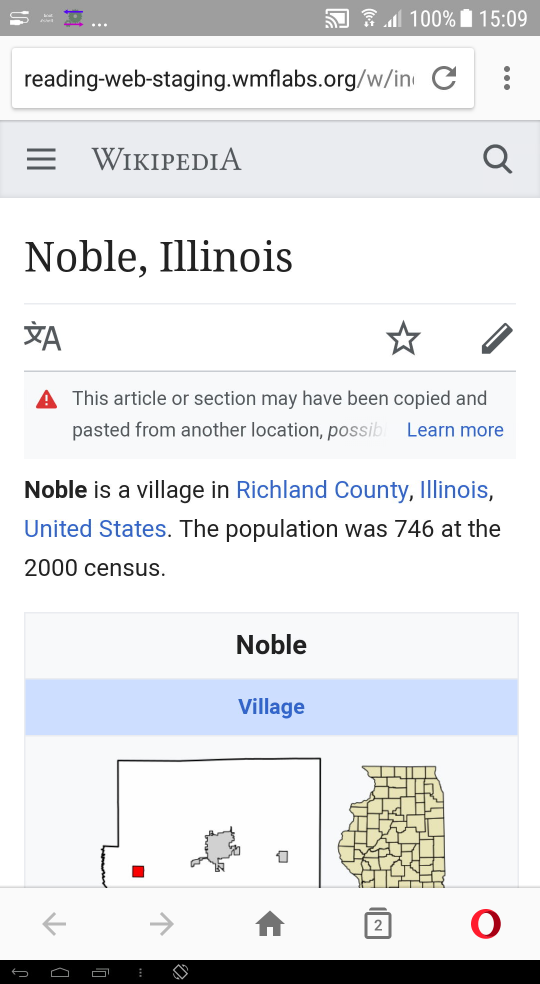
- http://reading-web-staging.wmflabs.org/wiki/Noble,_Illinois
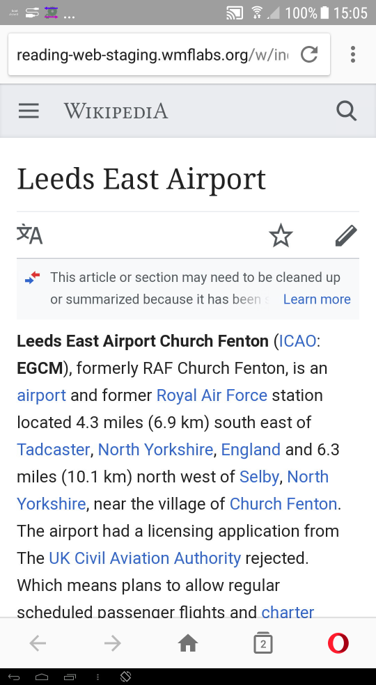
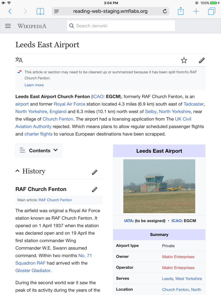
- http://reading-web-staging.wmflabs.org/wiki/Leeds_East_Airport
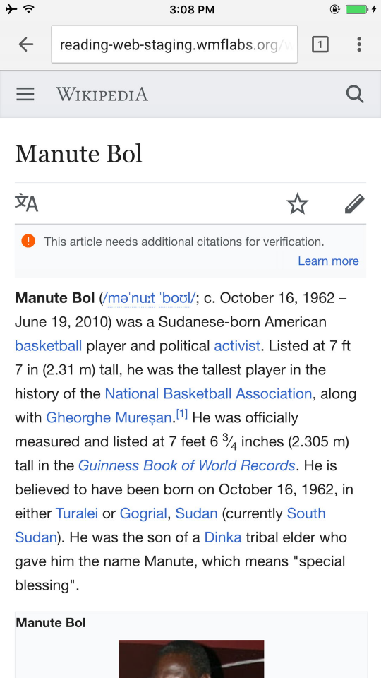
- http://reading-web-staging.wmflabs.org/wiki/Manute_Bol