Implement a prototype for searching depicts based off of these designs:
- https://wikimedia.invisionapp.com/share/PVKG6GXR3UE
- https://wikimedia.invisionapp.com/share/WGLFFGMAT5R
Acceptance criteria:
This can be tested on https://federated-commons.wmflabs.org/wiki/Main_Page
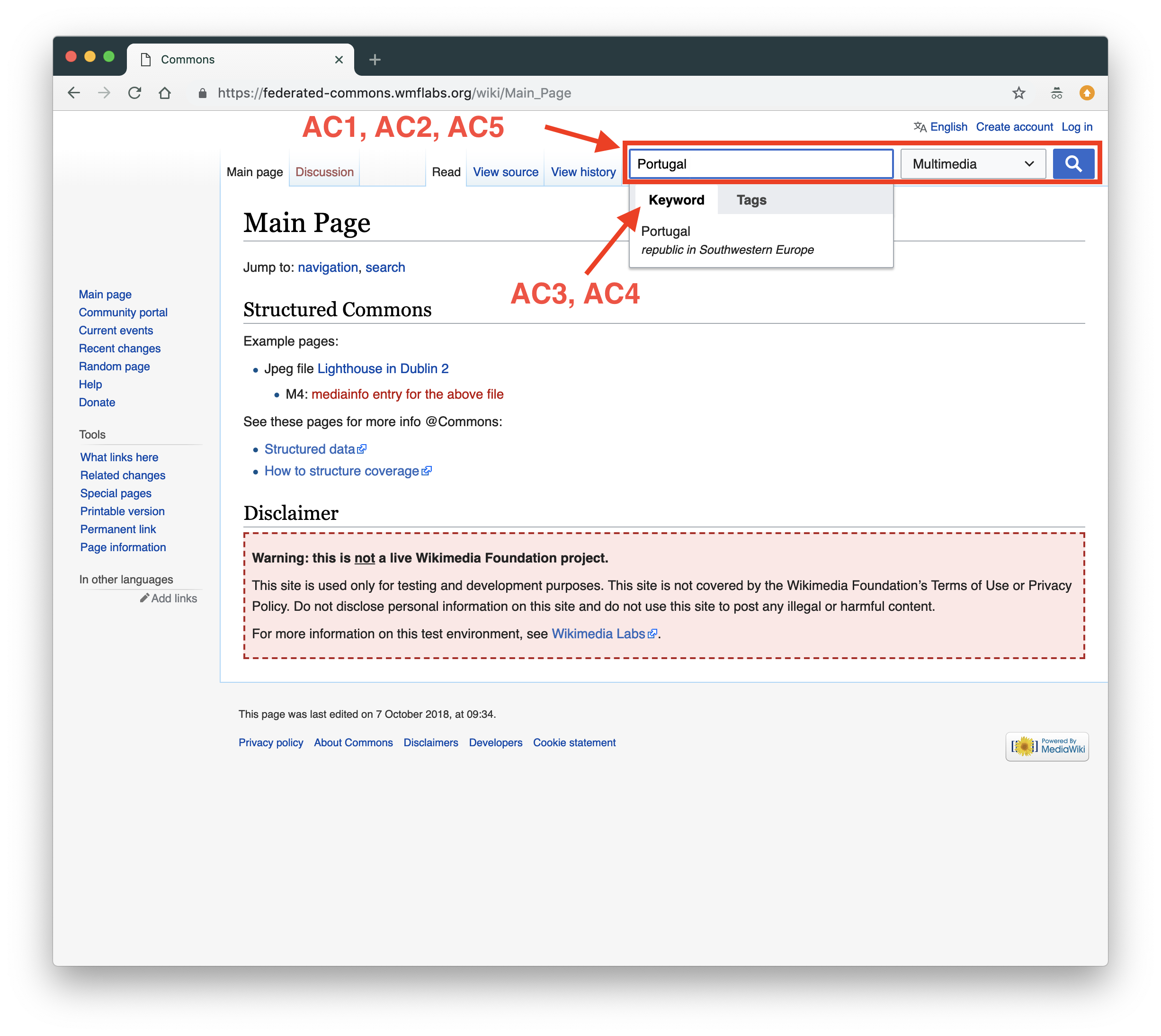
- The is a search widget (input field, media types dropdown, submit button) top-right
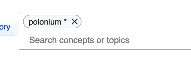
- Clicking input field reveals menu to toggle input modes (keywords & tags)
- Selecting on of the input modes changes the input field to said mode
- "keywords" input mode shows autocomplete after 2 or more characters have been input
- When selecting from autocomplete, "keyword" input field receives text from autocomplete; adding more characters fires new autocomplete results that replace the existing text
- "tags" input mode shows autocomplete after 2 or more characters have been input
- When selecting from autocomplete, "tags" input field receives text from autocomplete in a capsule; adding more characters fires a new autocomplete result to add a new capsule
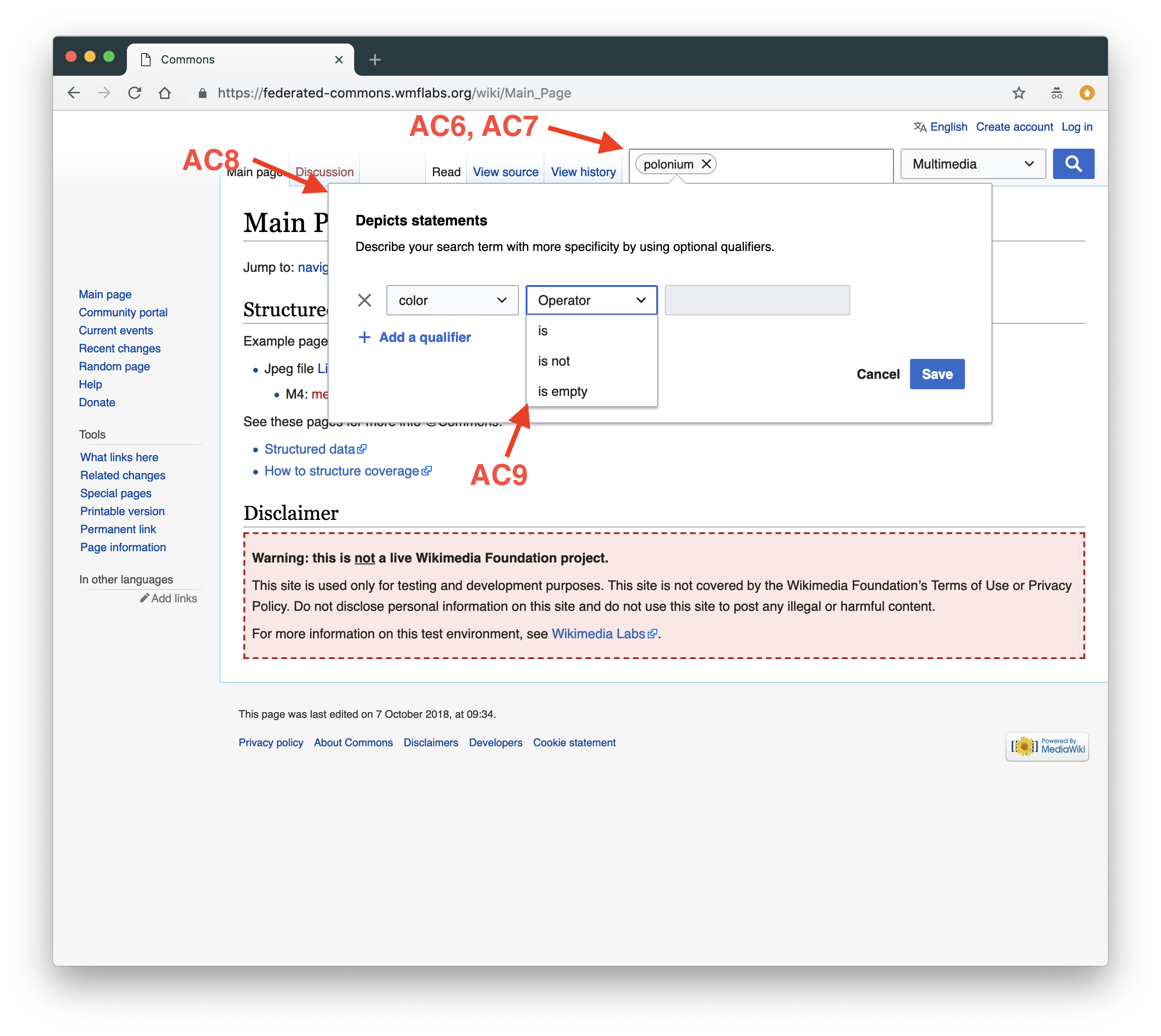
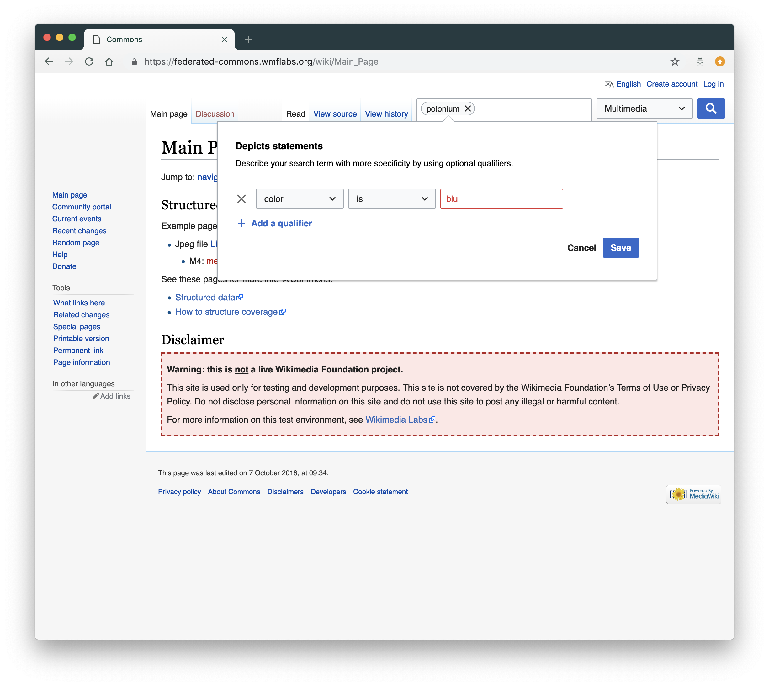
- Clicking a capsule in "tags" input mode opens a popover window
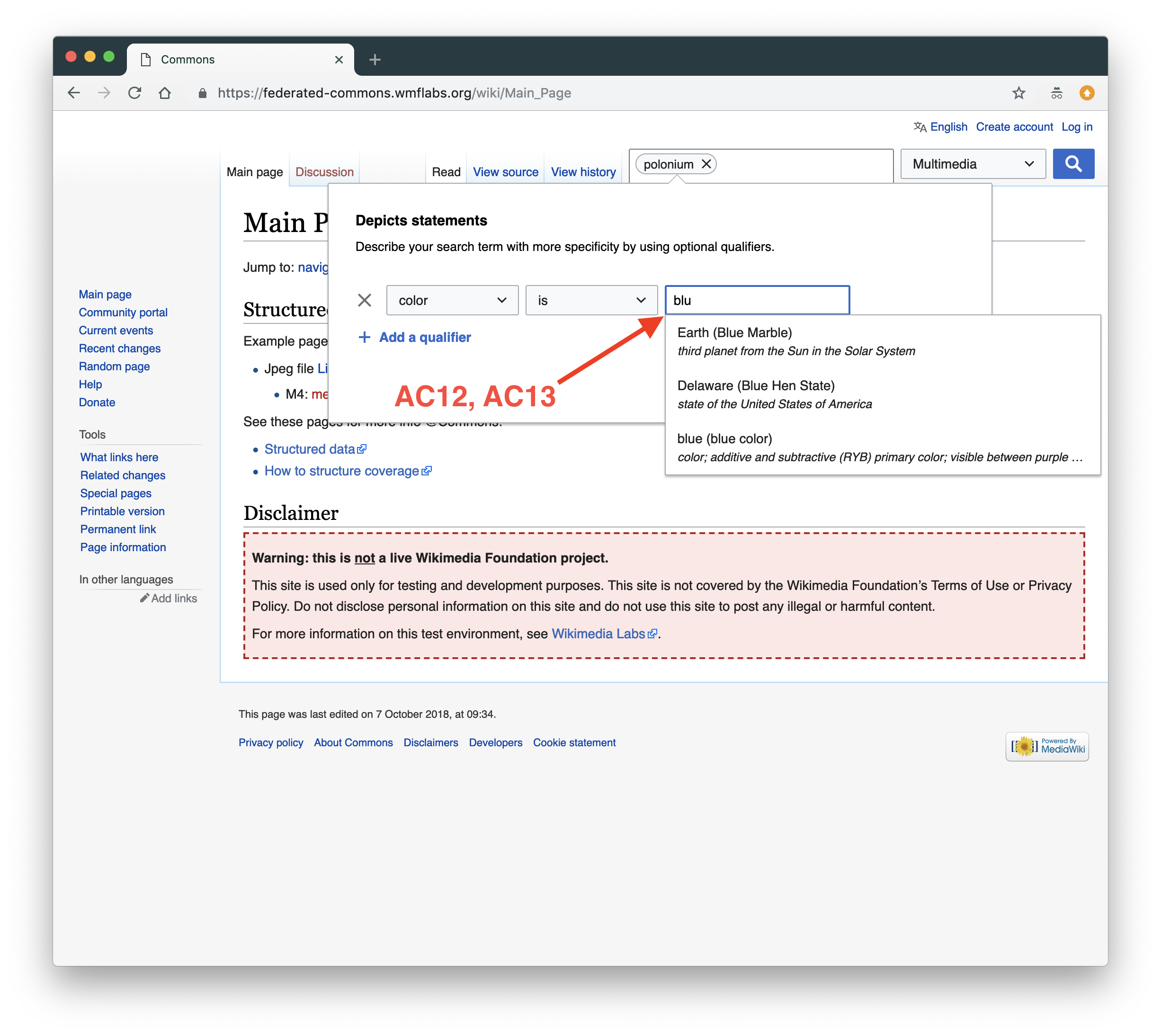
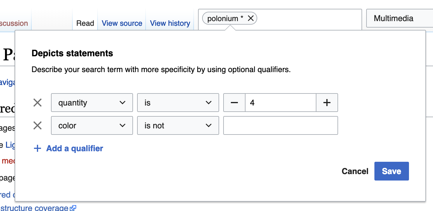
- A property can be selected, after which the operators dropdown is enabled with "is", "is not" and "is empty" options
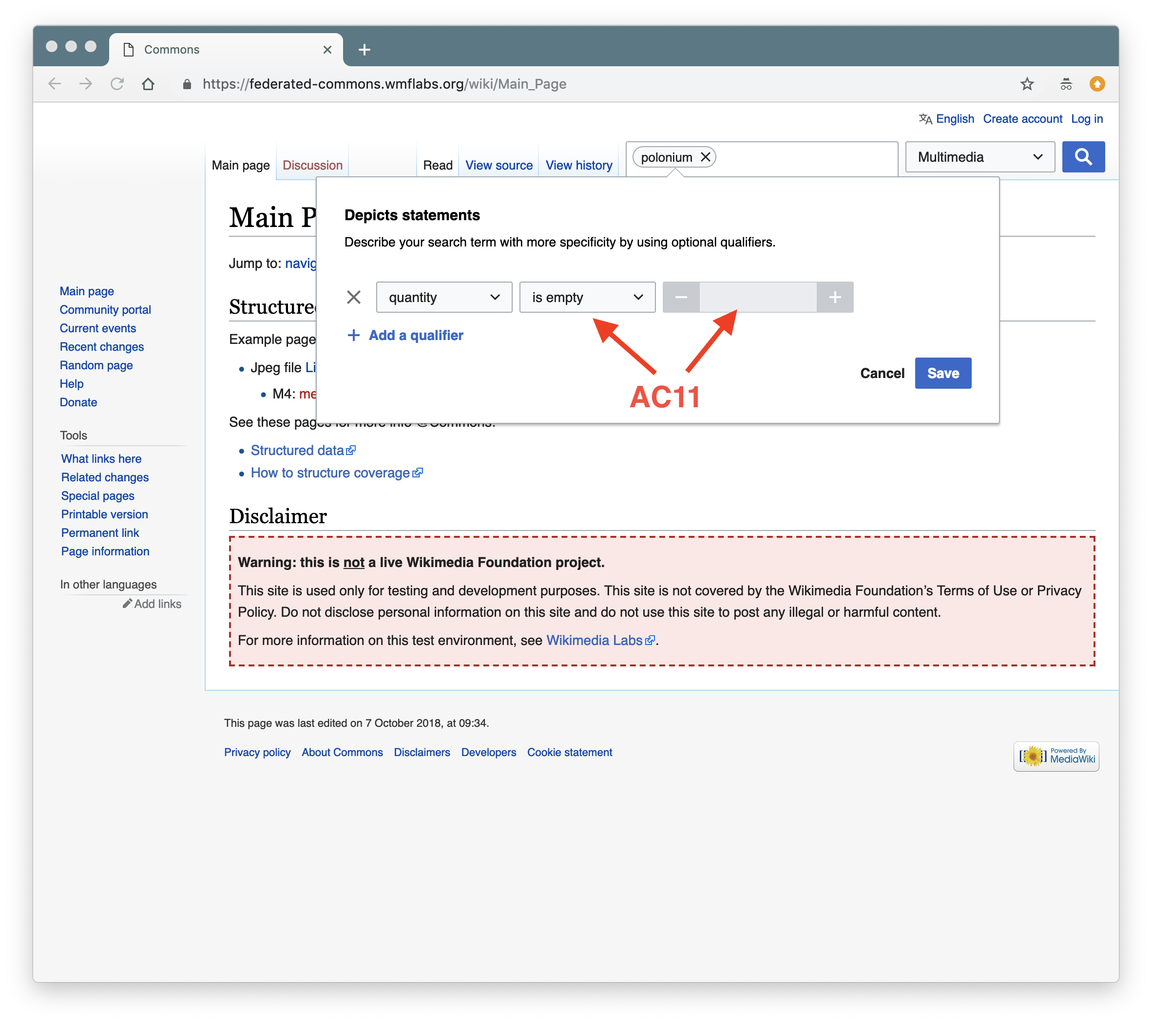
- When property "quantity" is selected, "is greater than" and "is less than" are additional options
- An operator can be selected, after which the value input field is enabled (except for "is empty", which requires no value)
- Typing a value behaves like the "keywords" dropdown (autocomplete, selecting from it fills the input field)
- Unless the value is something that has been selected from the autocomplete, the input field will indicate (red border & text) that the input is invalid when blurred
- For "quantity", the value can only be a number
- Clicking "Add qualifier" adds another property-operator-input line
- Clicking "save" closes the popover and adds an asterisk to the capsule in the search input field (if properties have been added)
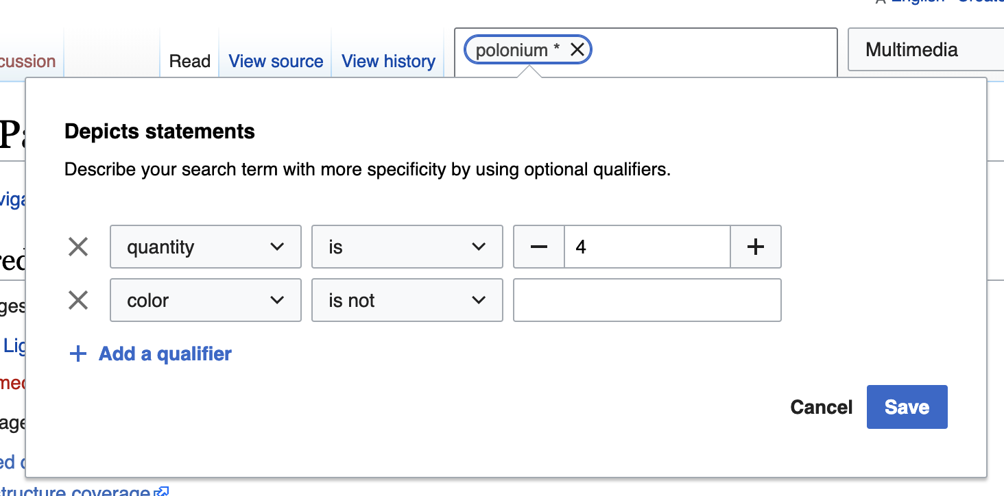
- After having clicked "save", clicking the capsule again opens the popover with any existing valid input
- Clicking "cancel" closes the popover
- After having clicked "cancel", clicking the capsule again opens the popover without the changes that were canceled (but may include earlier changes that had been saved)
- The media types dropdown allows selecting any combination of media types
- Hitting the return key inside the input field (both "keywords" and "tags") submits the search form, taking the user to Special:Search
- Clicking the submit button (search icon) submits the search form, taking the user to Special:Search
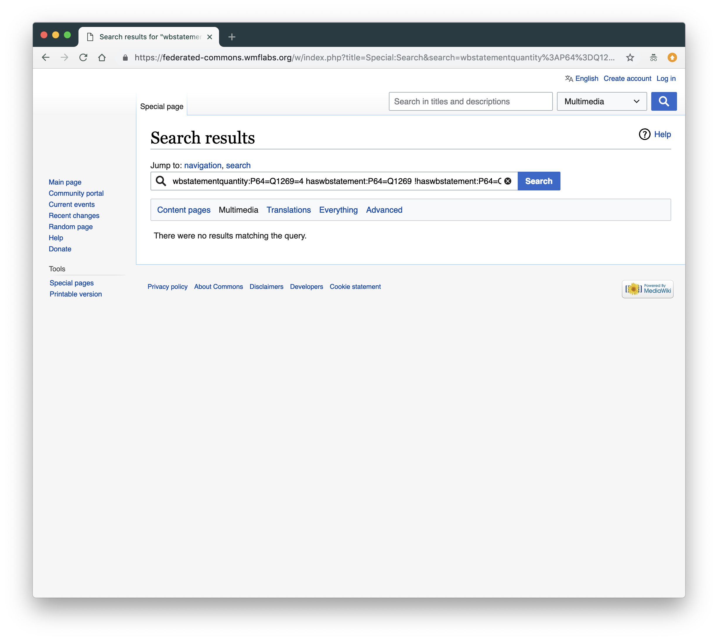
- The correct results are displayed (note: results for anything inside the properties popover can't really be tested ATM, since adding qualifiers to depicts statements has not yet been enabled)
QA Results
| AC | Status | Details |
| 1 | ✅ | T199120#5071546 |
| 2 | ✅ | T199120#5071546 |
| 3 | ✅ | T199120#5071546 |
| 4 | ✅ | T199120#5071546 |
| 5 | ✅ | T199120#5071546 |
| 6 | ✅ | T199120#5071546 |
| 7 | ✅ | T199120#5071546 |
| 8 | ✅ | T199120#5071546 |
| 9 | ✅ | T199120#5071546 |
| 10 | ✅ | T199120#5071546 |
| 11 | ✅ | T199120#5071546 |
| 12 | ✅ | T199120#5071546 |
| 13 | ✅ | T199120#5071546 |
| 14 | ✅ | T199120#5071546 |
| 15 | ✅ | T199120#5071546 |
| 16 | ✅ | T199120#5071546 |
| 17 | ✅ | T199120#5071546 |
| 18 | ✅ | T199120#5071546 |
| 19 | ✅ | T199120#5071546 |
| 20 | ✅ | T199120#5071546 |
| 21 | ✅ | T199120#5071546 |
| 22 | ✅ | T199120#5071546 |
| 23 | ✅ | T199120#5071546 |