Page MenuHomePhabricator

Improve display of long category names
Closed, ResolvedPublic

Description

Category suggestions with line-wrap don't look great:

grafik.png (558×567 px, 40 KB)

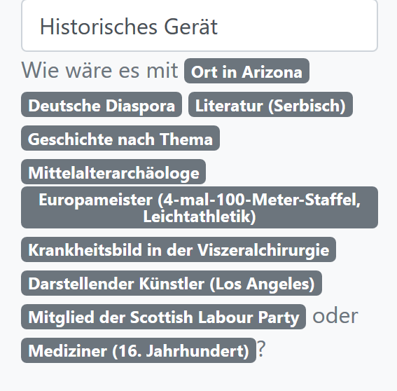
Either restrict the length of category names to N characters (either by omitting categories with long names or shortening the name) or find a better way to display the suggested categories.

Note that the categories look like badges to make it clear that one can click on them.

Event Timeline

Cirdan triaged this task as Low priority.Jul 9 2018, 6:05 PM
Cirdan created this task.
Cirdan moved this task from Backlog to UI and UX on the Mitmachen board.
Cirdan raised the priority of this task from Low to Needs Triage.Jul 14 2018, 6:35 AM
Cirdan triaged this task as Medium priority.
Cirdan lowered the priority of this task from Medium to Low.

I would see the suggestions mainly as a way to understand how the tool works – it is highly unlikely that a suggestion matches a special interest of the user (particularly for long, detailed category names). Thus, it is not essential to have a full name. We could either discard too-long-categories or we shorten them with an ellipsis (max-width and text-overflow: ellipsis; ). Bonus, if the title attribute has the full name, still, since it appears on hover in browsers.

Cirdan moved this task from UI and UX to Done on the Mitmachen board.

Implemented both the overflow and the title attribute.