Why are we doing this?
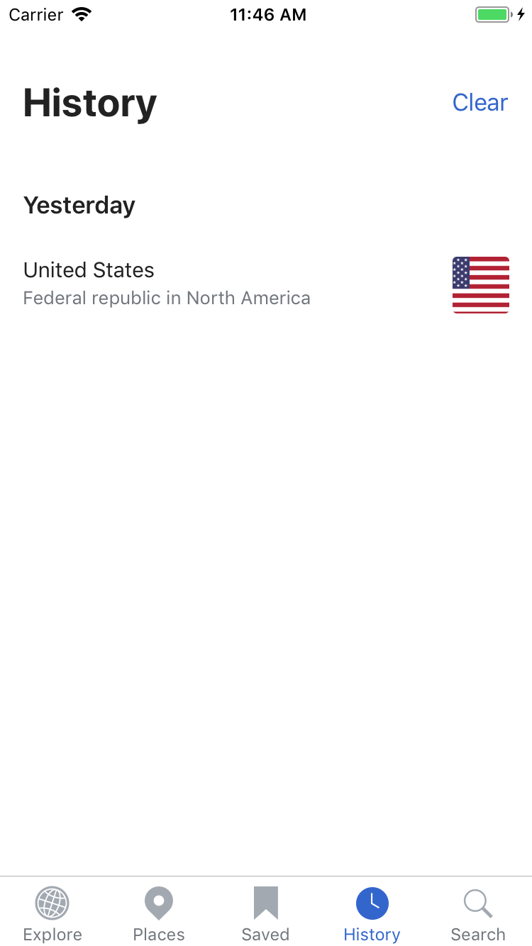
Currently the tab headers feel a bit close to the top of the screen on non iPhone X devices.
Proposed solution
Ensure that there is 30pts of padding between the status bar and the tab headers
| cmadeo | |
| Jul 24 2018, 11:44 PM |
| F25441619: T200300 Places.PNG | |
| Aug 27 2018, 7:15 PM |
| F25441621: T200300 Explore.PNG | |
| Aug 27 2018, 7:15 PM |
| F25441617: T200300 Search.PNG | |
| Aug 27 2018, 7:15 PM |
| F25441618: T200300 Saved.PNG | |
| Aug 27 2018, 7:15 PM |
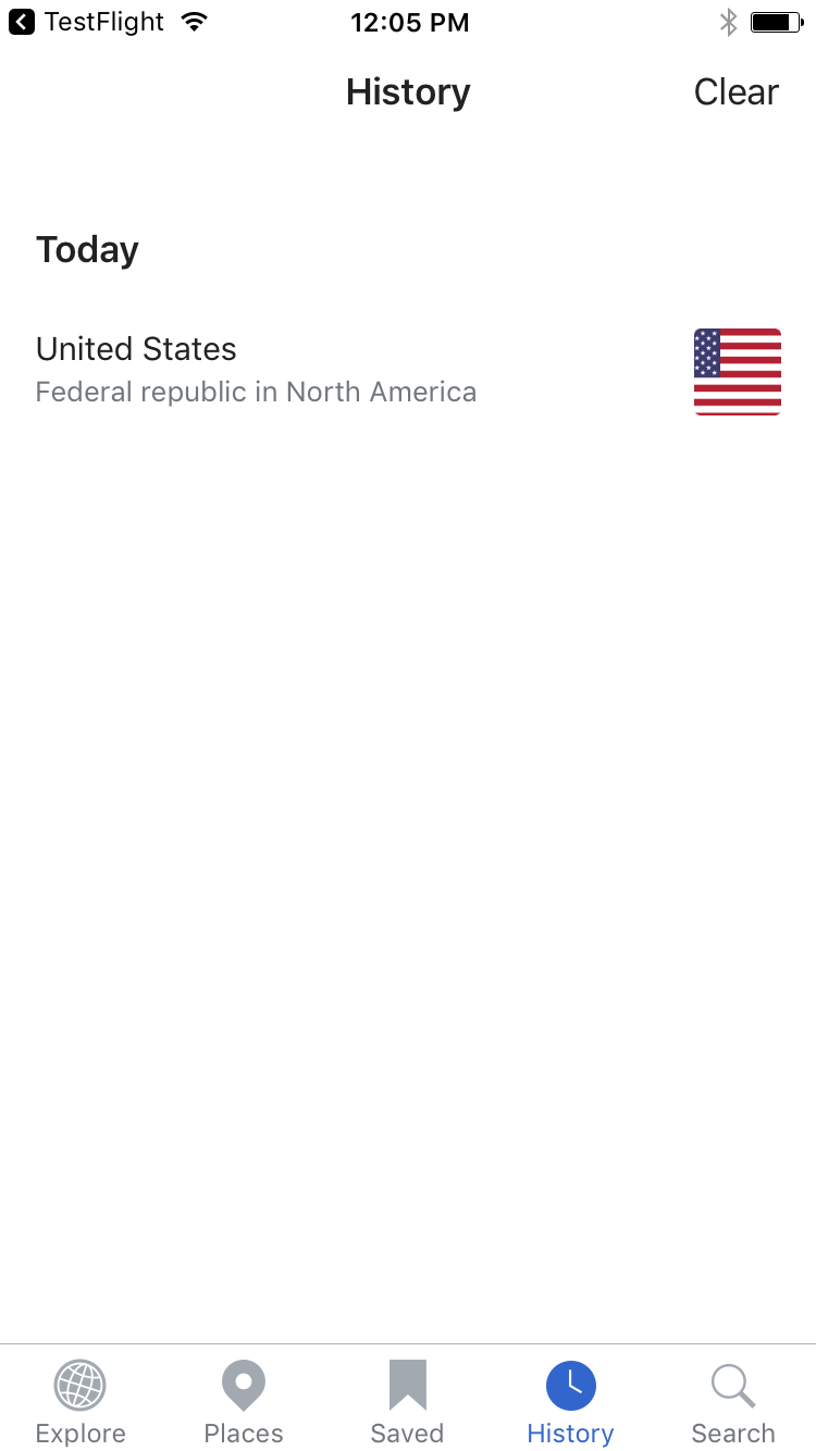
| F25441616: T200300 History.PNG | |
| Aug 27 2018, 7:15 PM |
| F25020772: Simulator Screen Shot - iPhone 6s - 2018-08-16 at 11.52.16.png | |
| Aug 16 2018, 3:52 PM |
| F25020759: Screen Shot 2018-08-16 at 11.48.02 AM.png | |
| Aug 16 2018, 3:52 PM |
Currently the tab headers feel a bit close to the top of the screen on non iPhone X devices.
Ensure that there is 30pts of padding between the status bar and the tab headers
| Status | Subtype | Assigned | Task | ||
|---|---|---|---|---|---|
| Resolved | cmadeo | T181856 [spike] Remove the navigation bar | |||
| Resolved | JoeWalsh | T195630 Update the tab headers and search bars to utilize iOS 11 styles | |||
| Resolved | • JMinor | T200300 Increase padding between status bar and tab hearders on non iPhone X devices |
Testing with Wikipedia 6.0.0 (1470) app and iOS 10.3.3 (iPhone 6S). Below are screencaps on the status bar/tab in its current state for the Explore, Places, Saved, History and Search tabs. It looks fine to me.