Page MenuHomePhabricator

Highlighter dots in New Filters are off-center
Closed, DeclinedPublic

Description

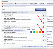
See the screenshot below. I see two display issues:

  1. The highlight dot is not centered vertically within the little button that calls the color selector (the margin appears to be about 1px below but 3 px above the dot).
  2. Inside the Highlight color menu, the check mark is not centered vertically within the highlight dot.

Screen Shot 2018-07-31 at 8.57.54 AM.png (693×751 px, 176 KB)

I see both issues in Mac Chrome and Mac Safari, though #1 looks worse in Chrome.For reference, here is a screenshot in the Help docs that shows how these used to look.
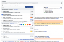
New_filters_for_edit_review_-_Highlighting_2_menu.png (666×1 px, 279 KB)

Event Timeline

SBisson renamed this task from Highlighter dots in New Filters are off-klter to Highlighter dots in New Filters are off-center.Sep 4 2018, 3:56 PM
MMiller_WMF subscribed.

Team has decided to decline this given other priorities.