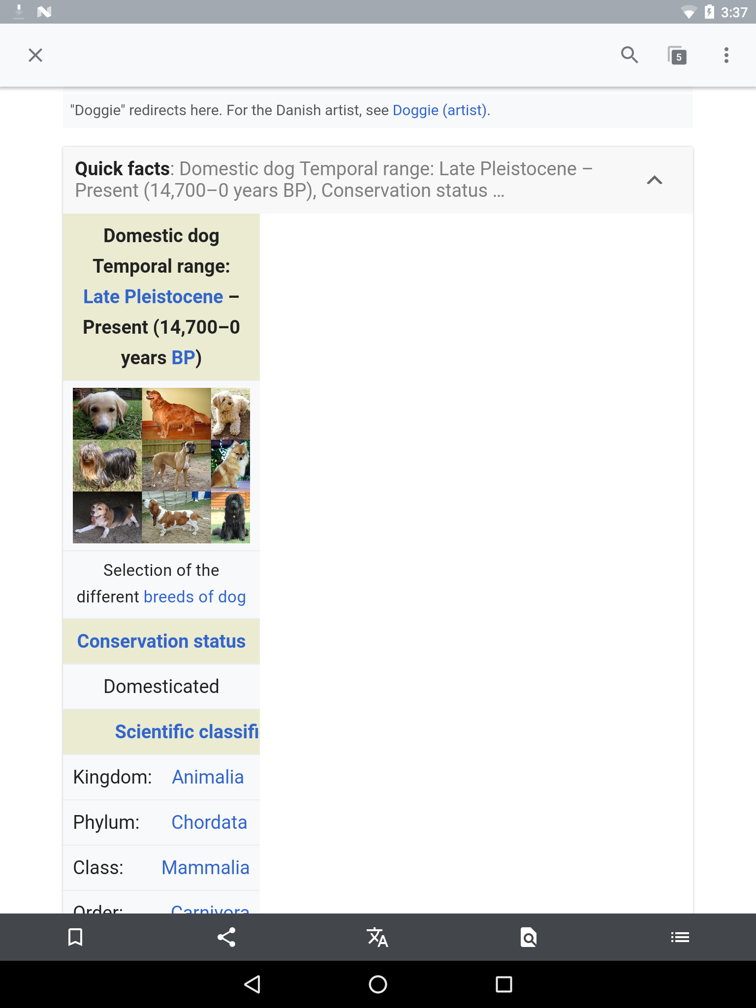
This affects recent versions of the iOS app and Android app. I first noticed it in the new mobile-html endpoint when the viewport is wider than 720px.
Depending on the width of the browser window or device, infoboxes appear too narrow. Most infobox tables (e.g. Template:Taxobox/core) specify a width of 200px inline. After making the window smaller than 720px a media query kicks in to make the table bigger.
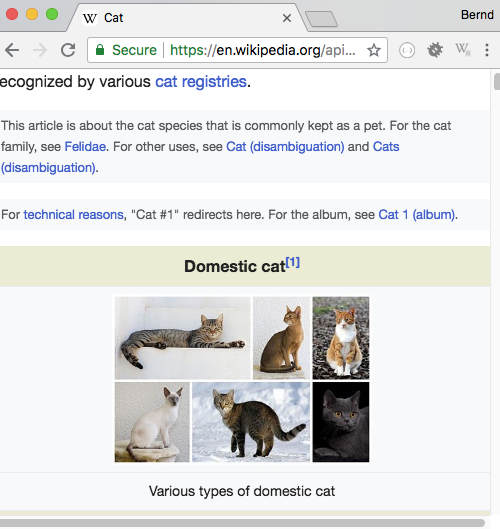
Example: https://en.wikipedia.org/api/rest_v1/page/mobile-html/Cat
<table class="infobox biota" style="text-align: left; width: 200px; font-size: 100%">
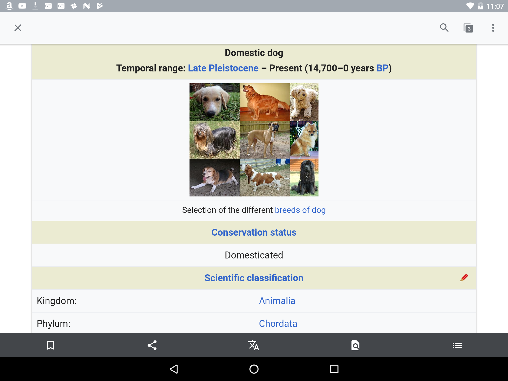
@media (max-width: 720px)
.content table {
    display: block;
    width: 100% !important;
}

The problem is that it leads to the table having a horizontal scrollbar:

(I'm not sure why the width of the table is set inline to 200px.)
This doesn't happen when the window is smaller: