the new page-issues style on mobile shouldn't be given a 100% width, because section issues might get weird when they're next to an infobox (on tablet widths anyway).
 |  |  |
| bad | better | Vector |
Fix: remove line #30 in ambox.less
QA steps
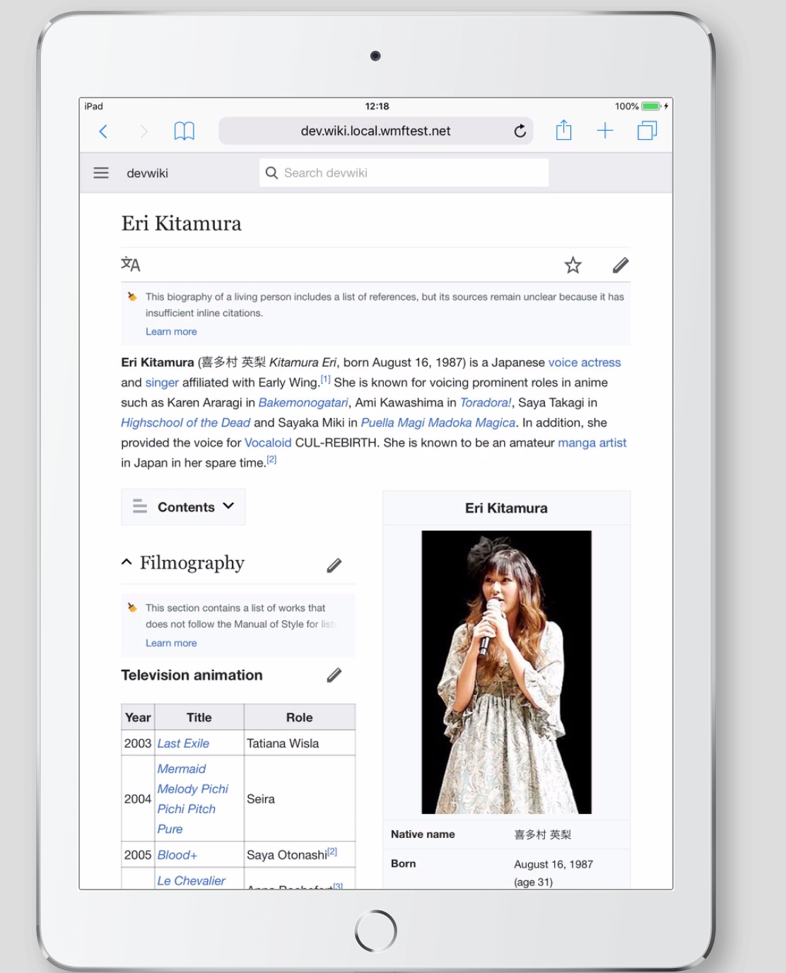
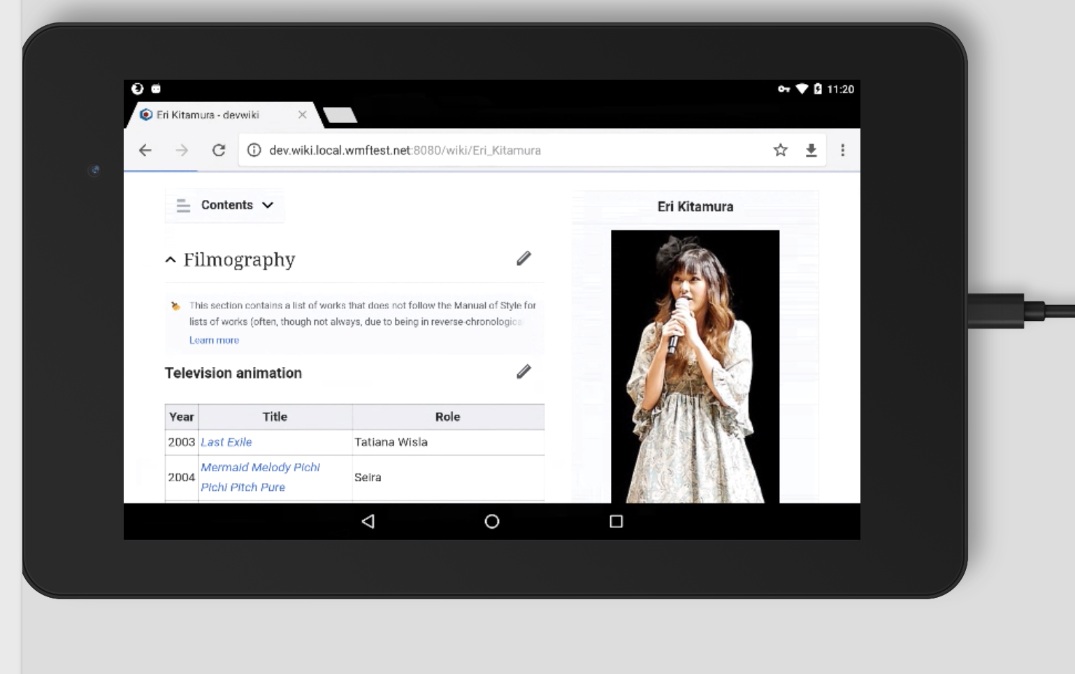
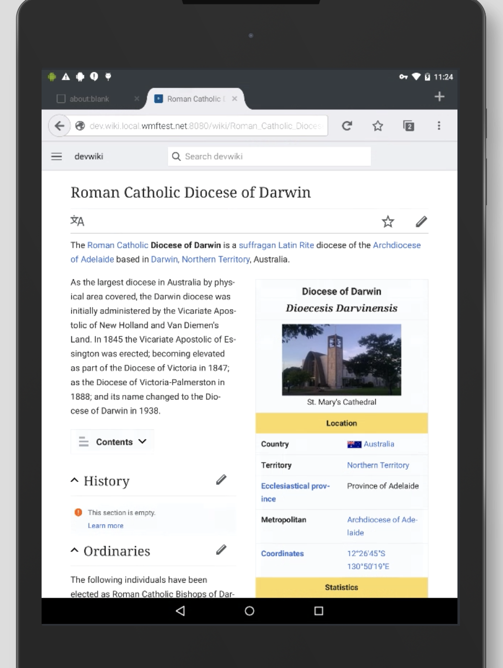
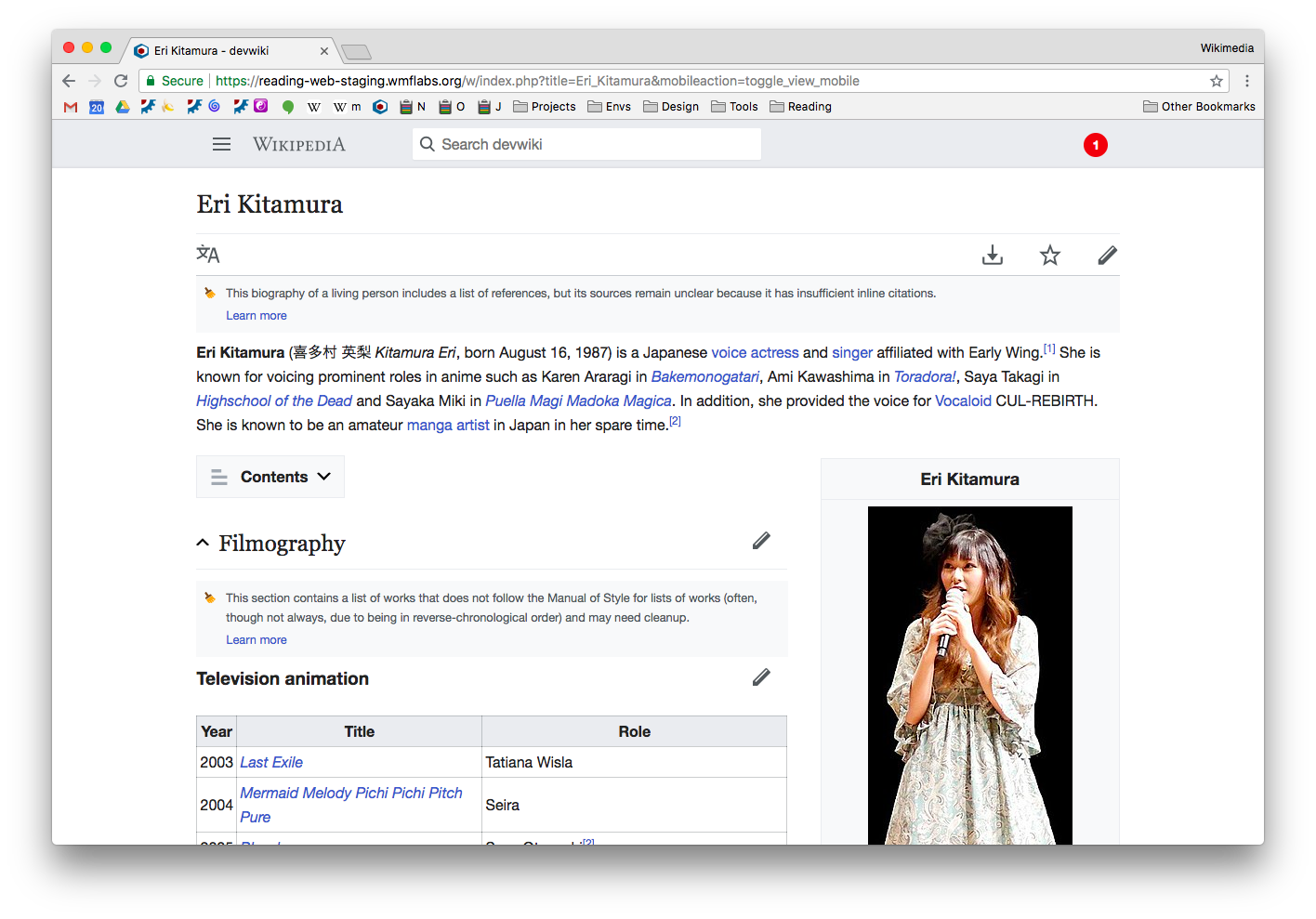
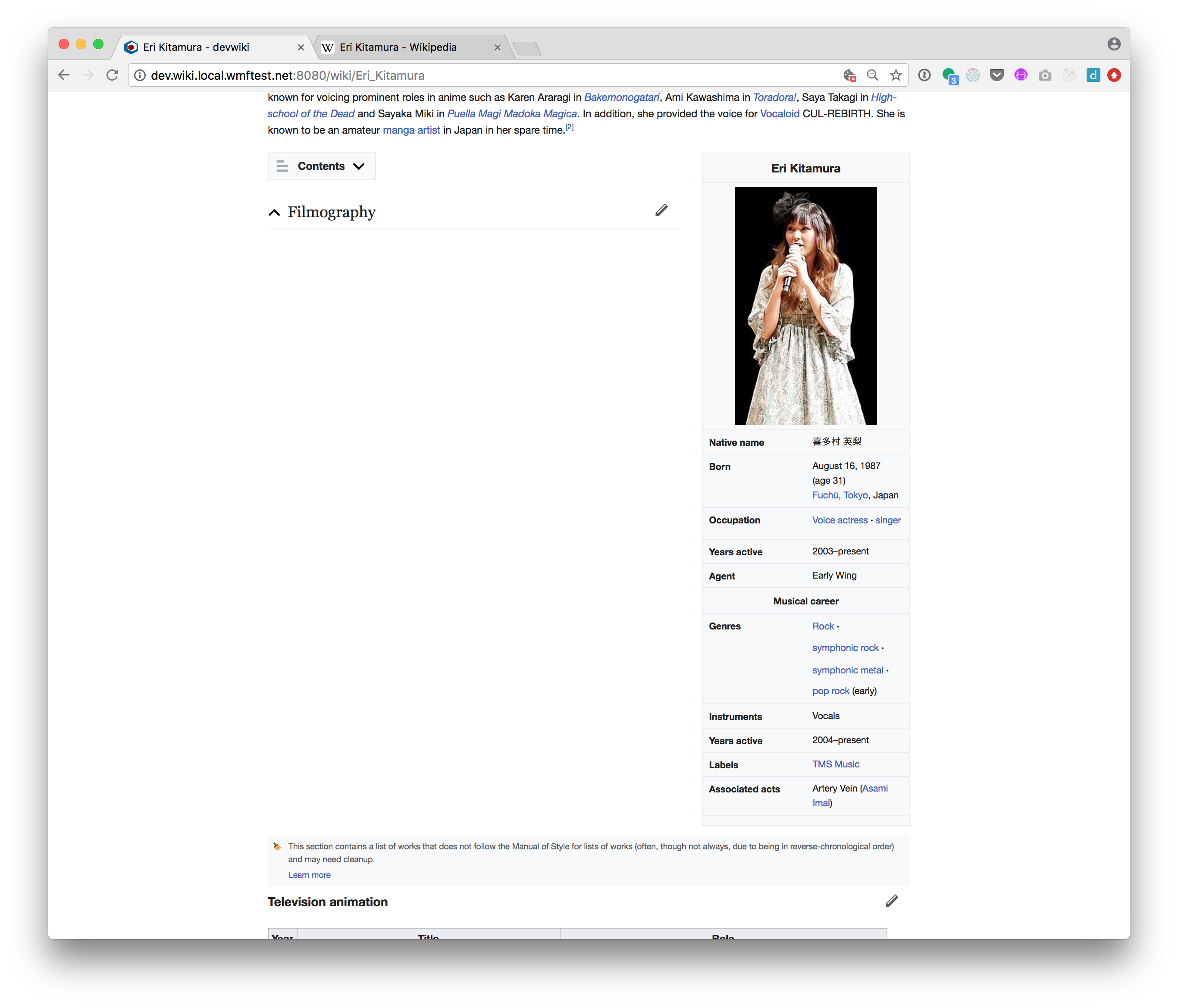
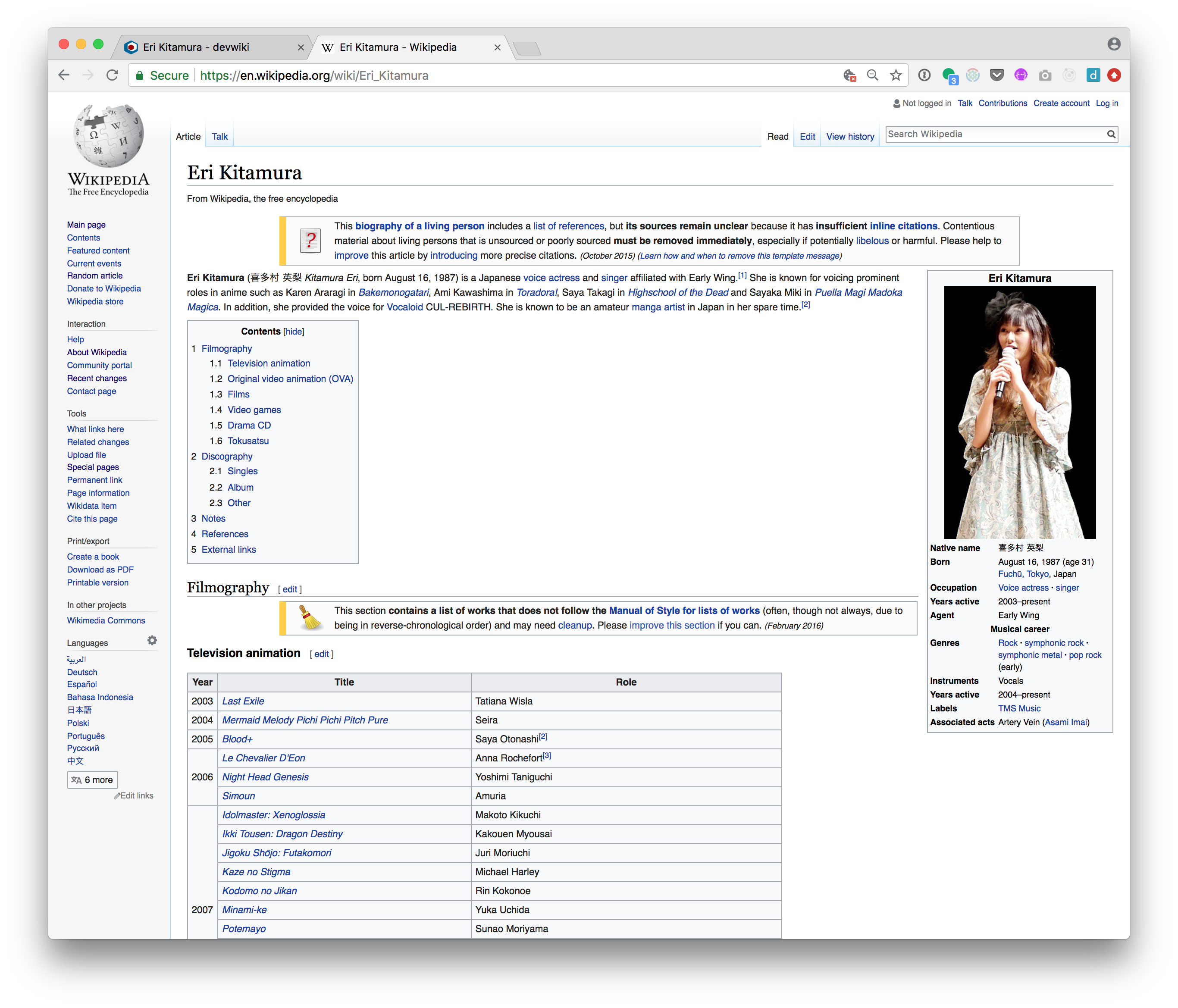
- Visit mobile version of http://reading-web-staging.wmflabs.org/wiki/Eri_Kitamura and inspect the issues at tablet resolution (720px) mobile resolution (320px) and desktop (1000px) in the new treatment
- Click the issues to open the issues overlay and check they display as expected in the overlay.
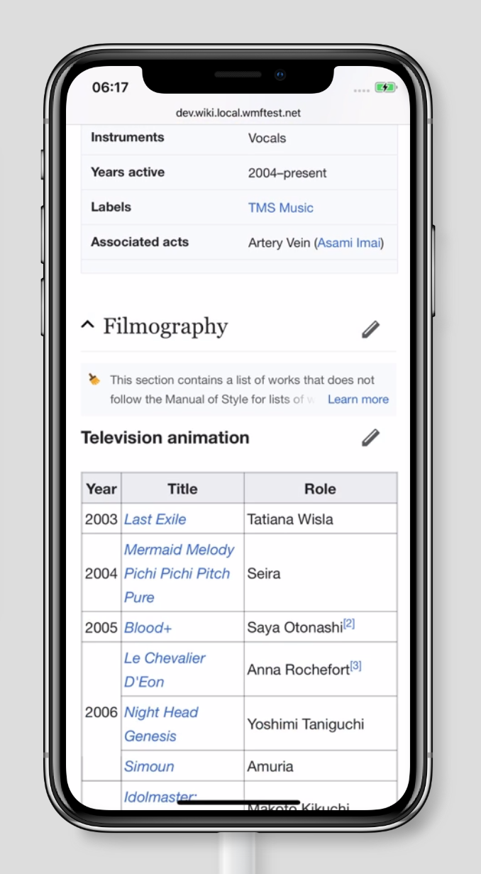
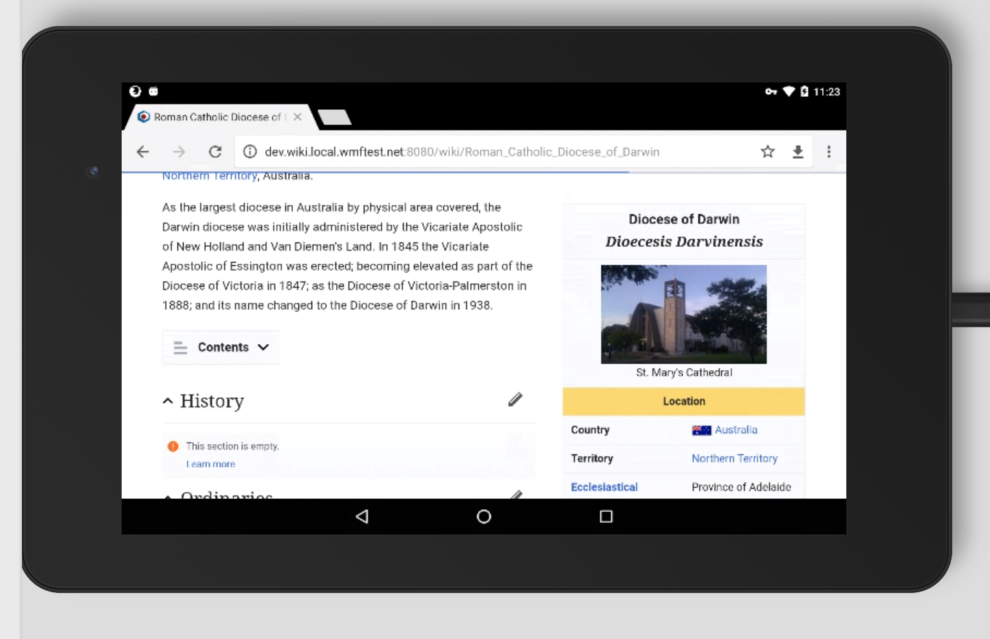
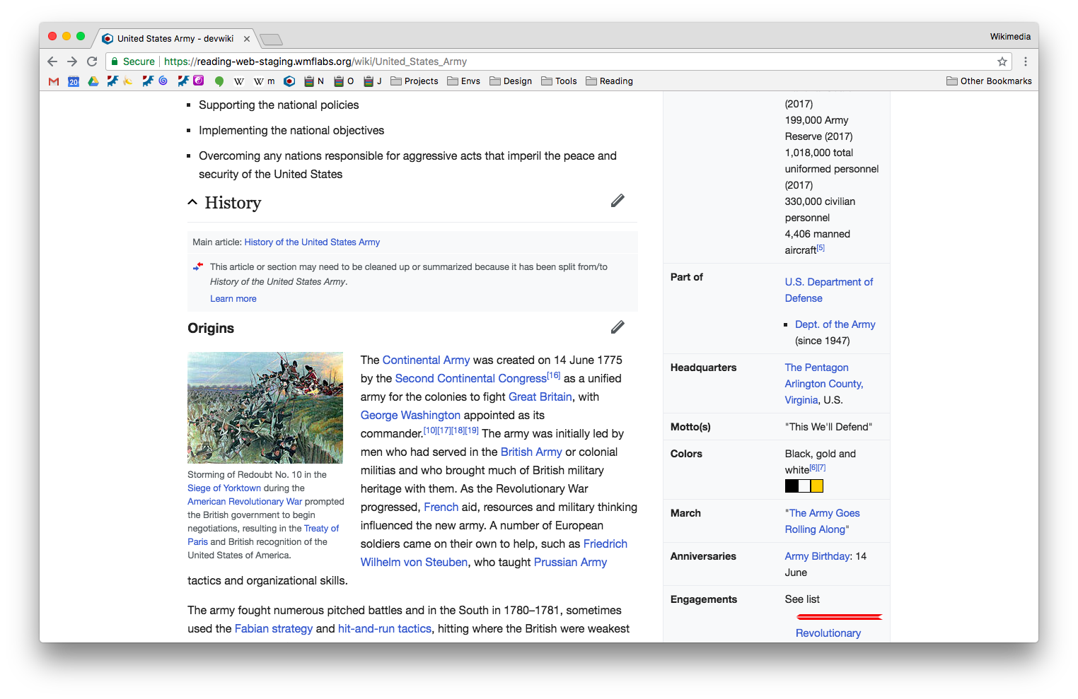
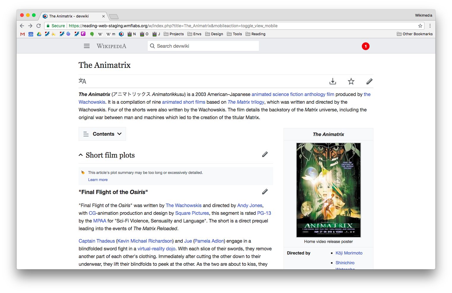
- Also inspect any tables in the article e.g. Filmography (amboxes are tables so there is a possible impact on table display). Also look at other articles with section issues:
- https://reading-web-staging.wmflabs.org/w/index.php?title=The_Animatrix&mobileaction=toggle_view_mobile
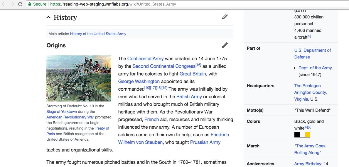
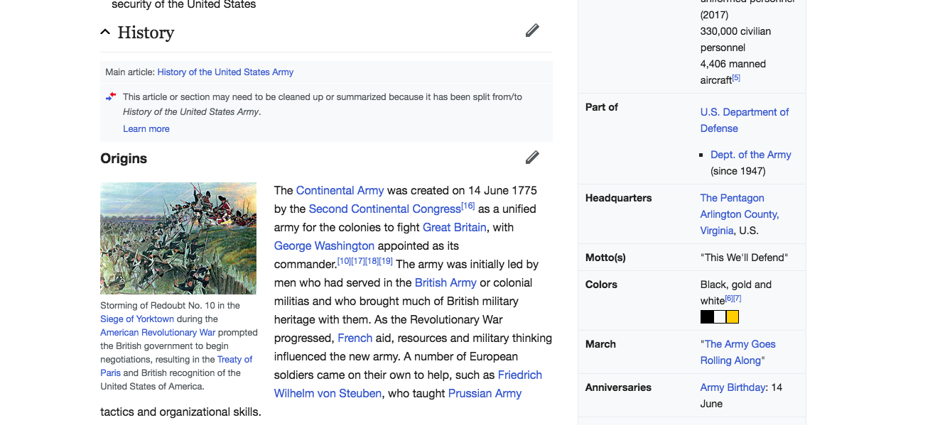
- https://reading-web-staging.wmflabs.org/wiki/United_States_Army