Extending the work from T200111:
For the purpose of exploring and vetting the planned new reader retention metric(s), we want to be able to quickly compare many different graphs of the following kind:
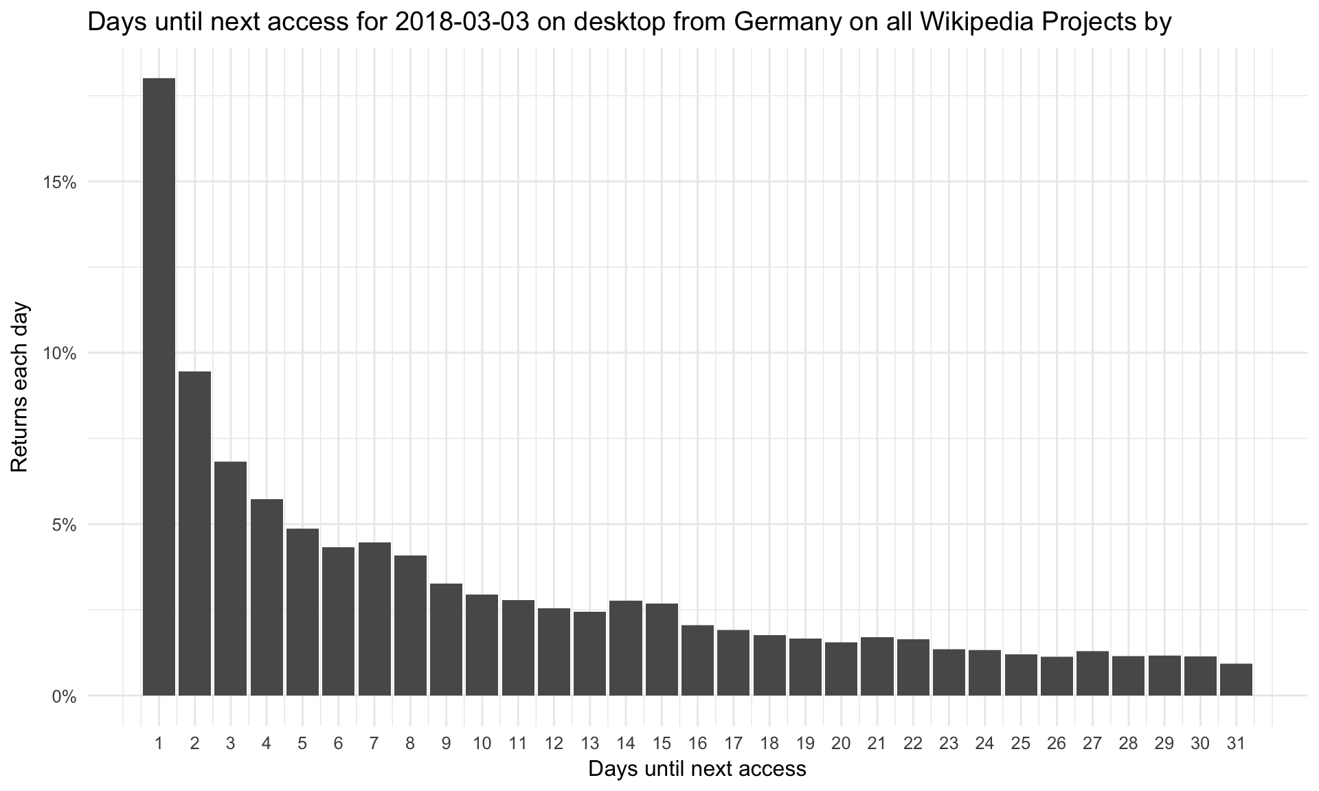
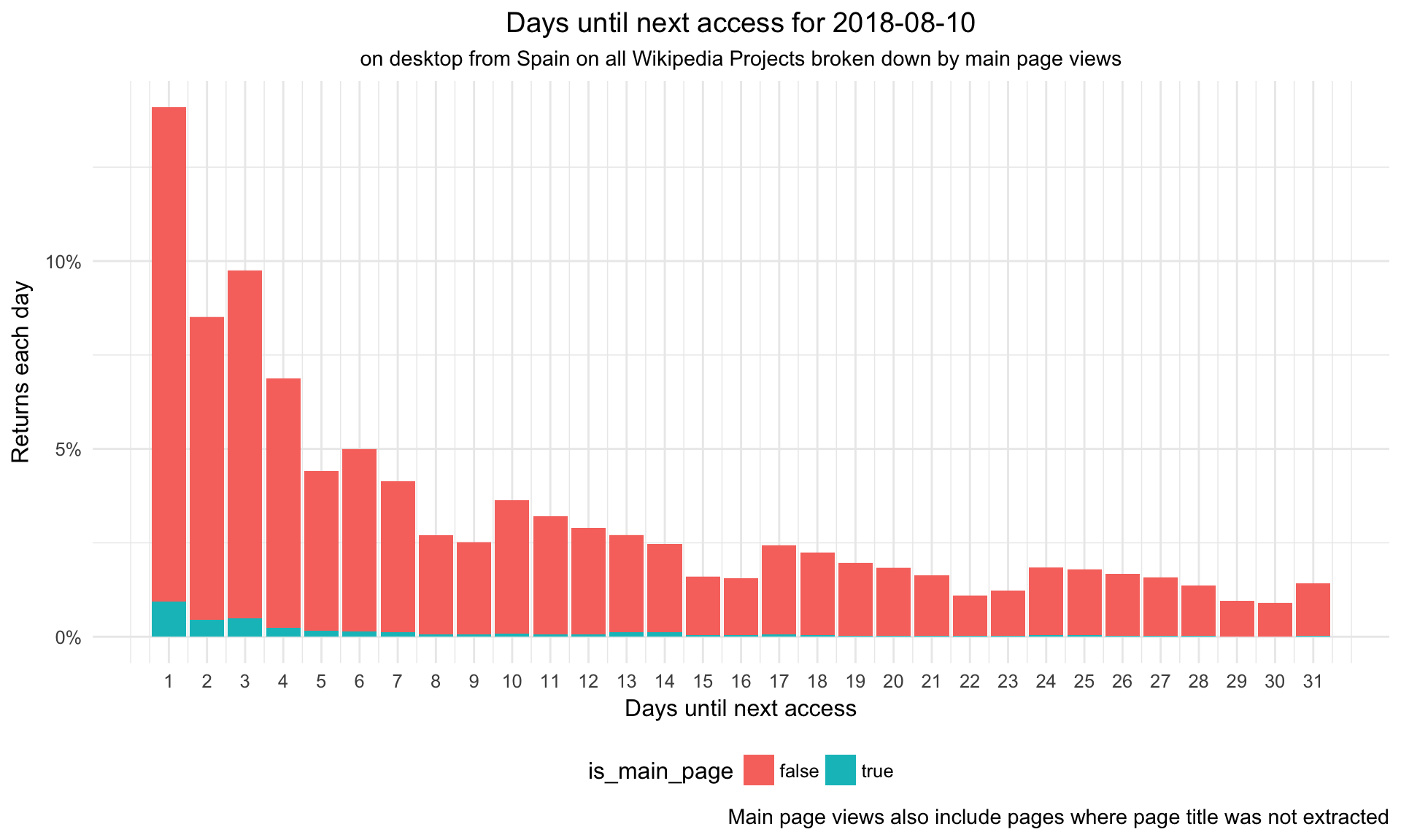
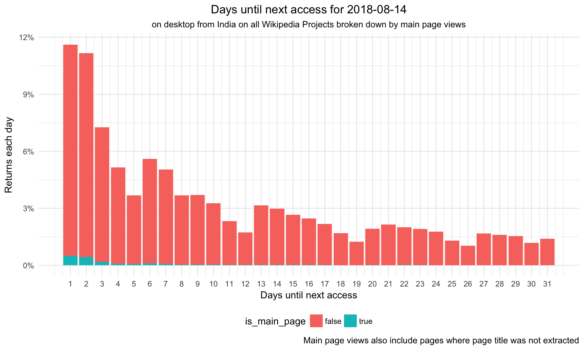
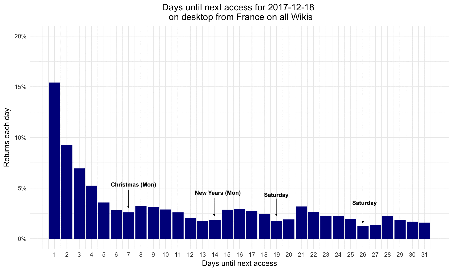
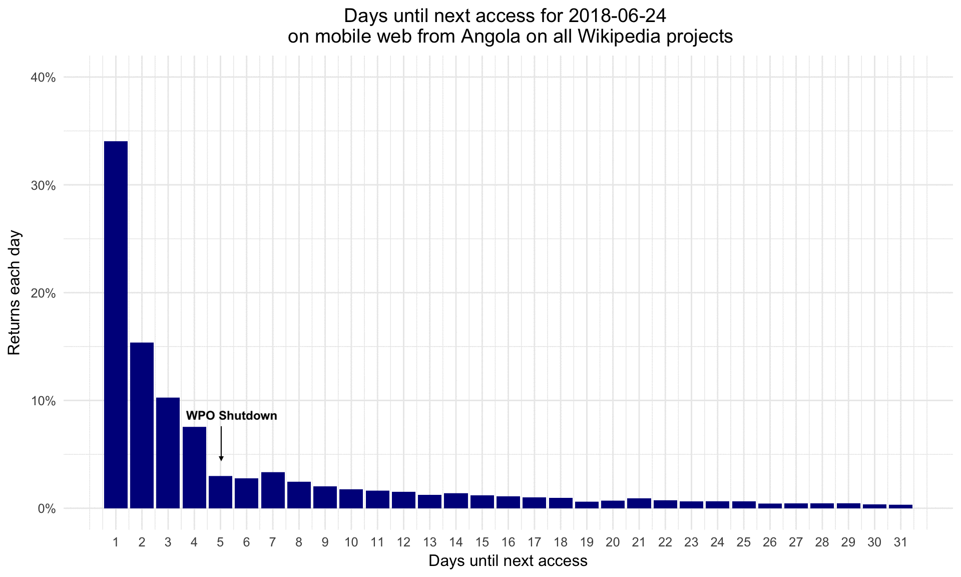
- Daily histograms of return time for several (e.g. +/-3) days around a date where the average next return metric shows spikes or other anomalies. Also (like in T200111#4539752 ) stacked by the following dimensions:
- project
- browser_family
- os_family
- whether the counted (return) request was a main page view or not (a frequent form of anomalous requests)
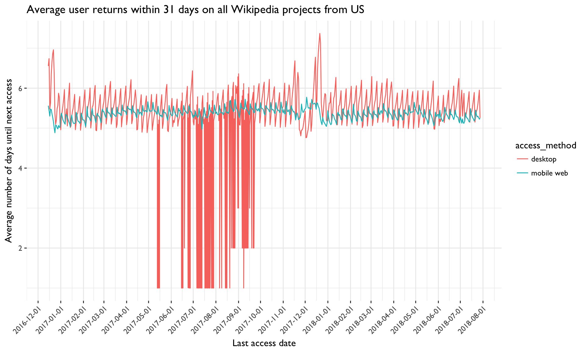
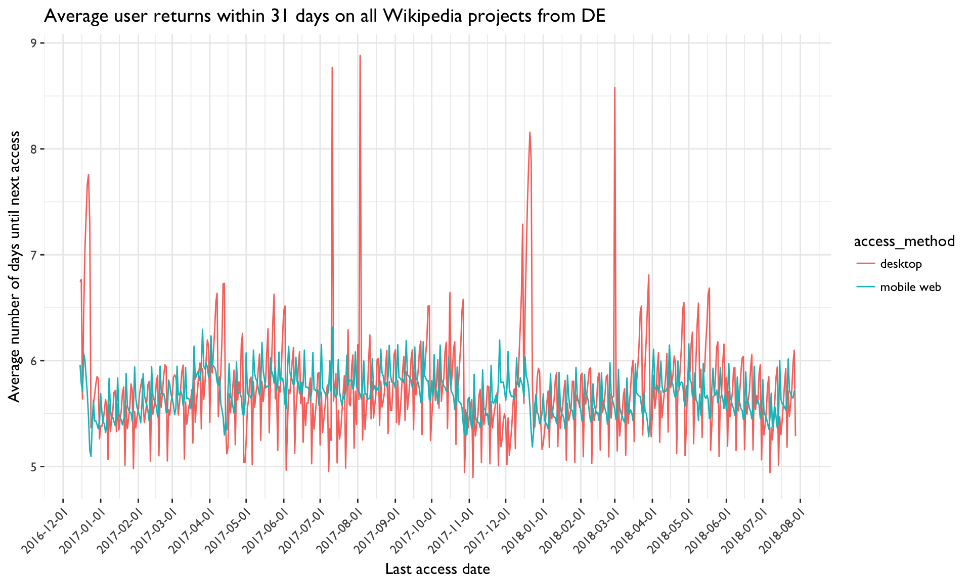
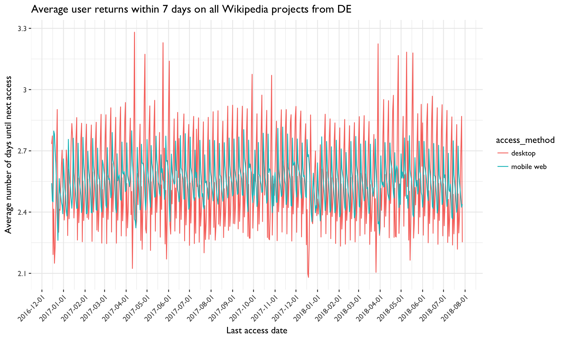
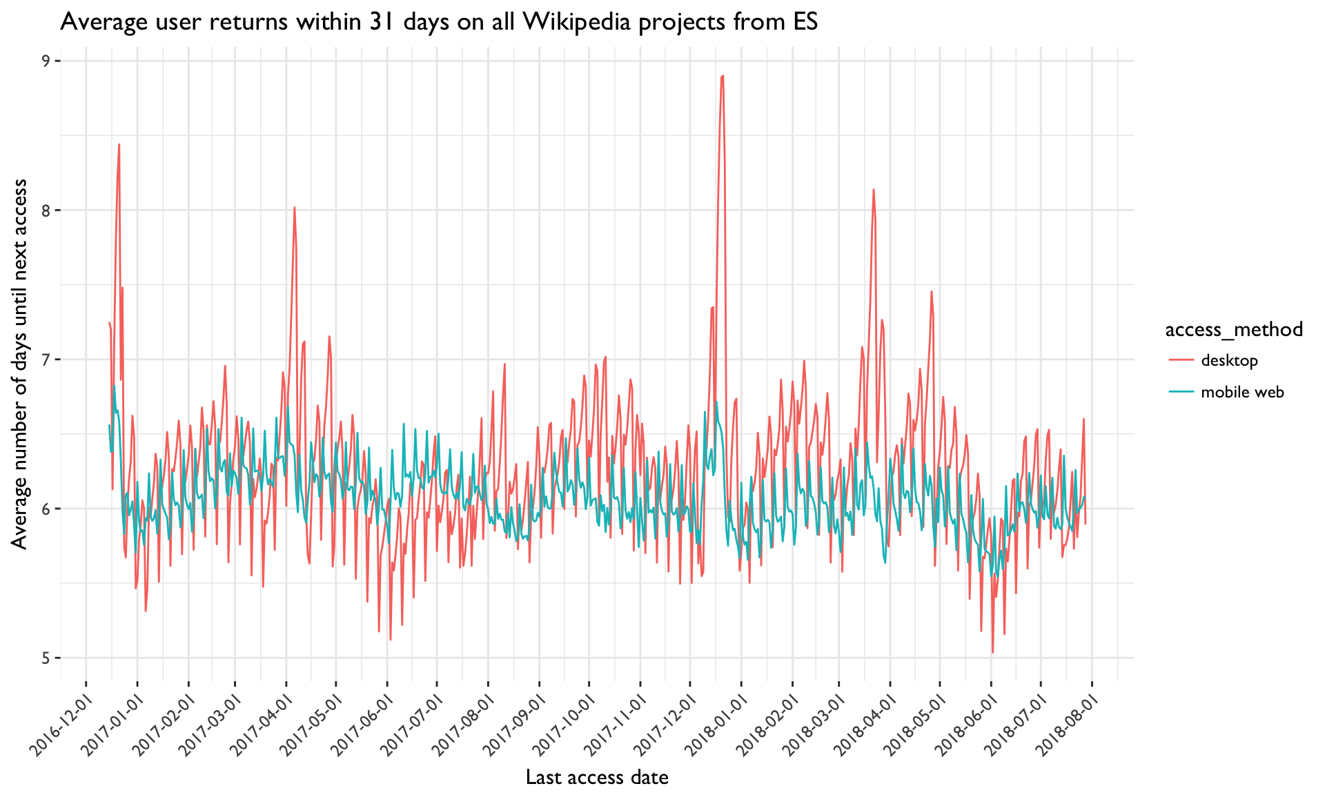
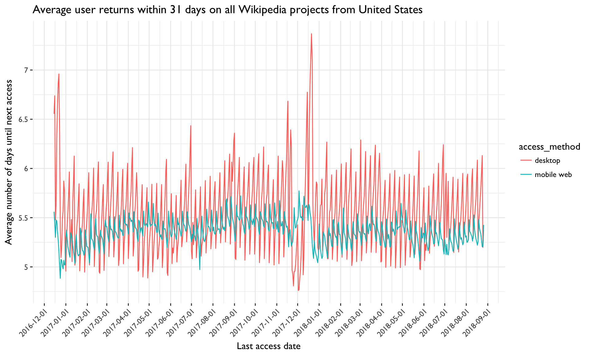
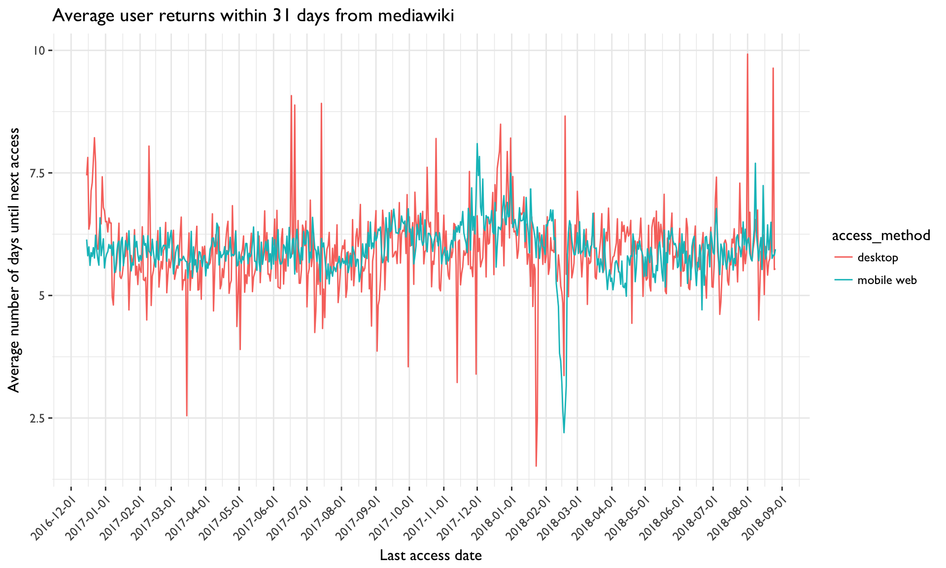
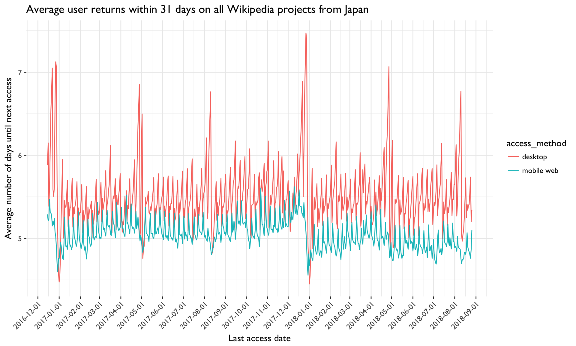
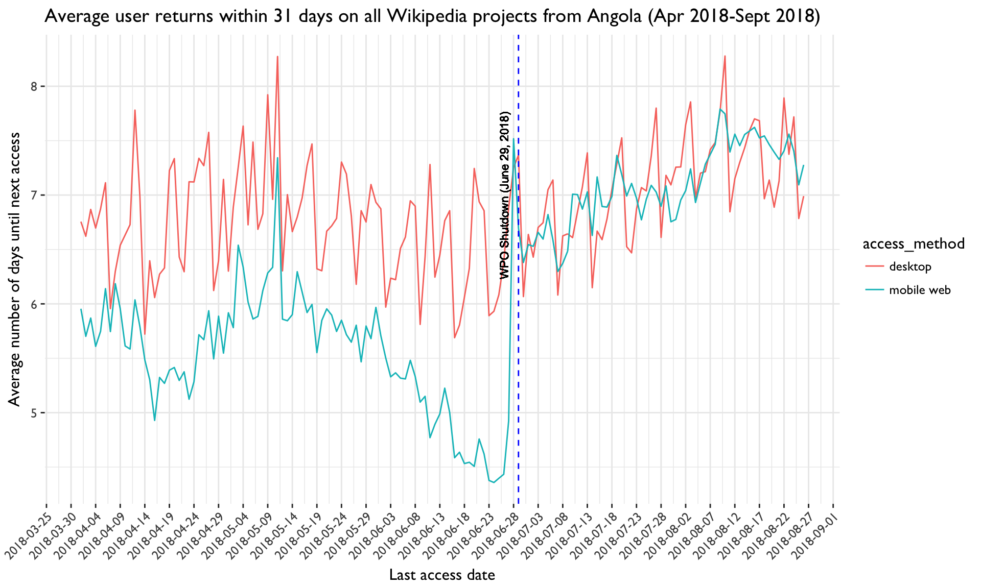
- Time series of the average next return time (within 7 days and 31 days) for a variety of countries and projects, using all the available data (from December 2016 to now)
Since we don't currently have a tool for exploring the underlying data (tbayer.webrequest_extract_bak) interactively, @MNeisler plans to come up with some R code allowing to quickly generate a sufficient amount of examples of these kind of graphs.