Page MenuHomePhabricator

Create technical debt heat map for VE codebase
Open, MediumPublic

Assigned To
None
Authored By
marcella
Sep 5 2018, 4:01 PM
Referenced Files
F26064211: techdebt3-compact.jpg
Sep 19 2018, 4:20 PM
F26062120: image.png
Sep 19 2018, 1:54 PM
F26062178: image.png
Sep 19 2018, 1:54 PM
F26062174: image.png
Sep 19 2018, 1:54 PM
F25777521: image.png
Sep 11 2018, 5:13 PM
Tokens
"Doubloon" token, awarded by marcella.

Description

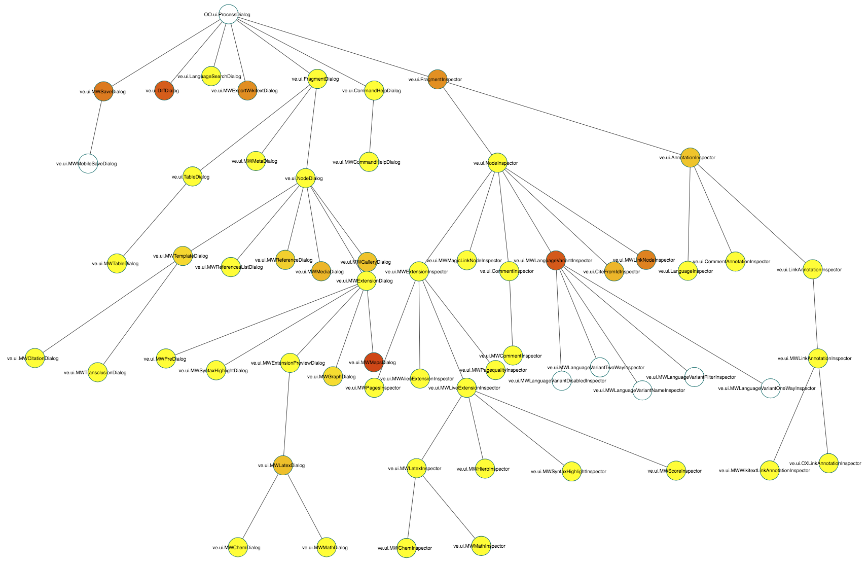
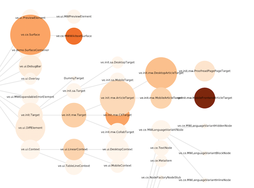
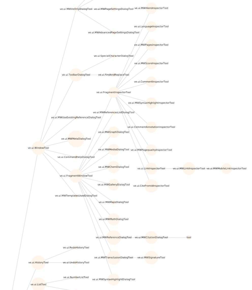
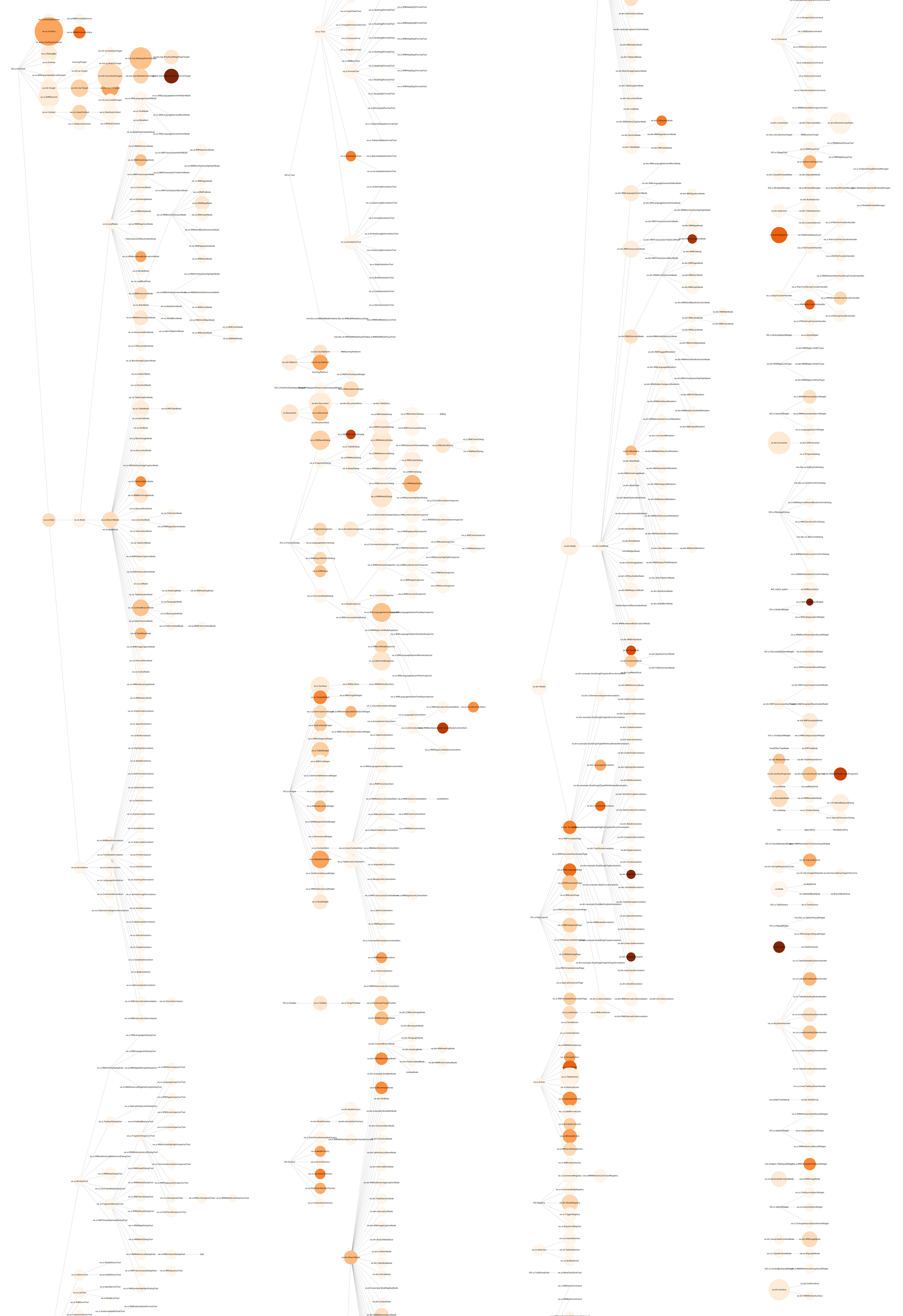
Create a heat map to better understand and visualize the technical debt for the visual editor.

Resource with some information and suggestions as well as an example: https://18f.gsa.gov/2015/10/05/managing-technical-debt/

Acceptance criteria up for discussion, but probably something like:

  • a schema with explanation
  • a map with labels for parts and relationships
  • areas colored to represent relative challenges and difficulties of working in that section of code

(cc: @Deskana )

Done

Event Timeline

Deskana triaged this task as Medium priority.Sep 5 2018, 4:16 PM
matmarex renamed this task from Create heat map for VE codebase to Create technical debt heat map for VE codebase.Sep 10 2018, 2:01 PM

It would be great to automate as much of this as possible, so it can be repeated in the future with minimal pain.

We can plot the VE codebase as inheritance trees (give or take mixins), and @dchan has been exploring ways to generate per-class technical debt scores, which we could represent with colour.

As an example, if we define tech debt as occurrences of "TODO", "FIXME" and "setTimeout" divided by number of lines, then the subtree for all the dialogs and inspectors looks like this:

image.png (1×1 px, 331 KB)

Yellow -> red is increasing tech debt score. Some of it makes sense (@matmarex won't be surprised to see that the maps dialog is red), but in places it underestimates tech debt (e.g. the graph dialog has a lot).

NB the VE codebase is really complex and I just chose the dialogs and inspectors to show here as a relatively straightforward (!) part of it.

@dchan and I have made a plot of the whole project* though it's too big to display here at any resolution where the class names are readable. Plotting inheritance sideways (parent -> child), it's very tall and narrow, but chopped into four columns, it looks like this:

image.png (1×856 px, 440 KB)

Colour represents tech debt, scored as above (darker means more debt), and size represents number of lines in the file. If we trust the score, then there appear to be areas of more tech debt...

image.png (616×830 px, 198 KB)

...and less:

image.png (1×992 px, 273 KB)

Is this view helpful, and if so, should we put the script somewhere in the repo so this can be generated on demand?

Of course the score we're using is quite crude at the moment - though from a cursory look over the plot, it seems to make sense to me. I think @Esanders had some thoughts on including test coverage in the score?

*minus mixin relationships and any classes that don't get passed to OO.inheritClass

Here's a version where the text is more or less readable, but JPEG compressed enough that Phabricator accepts it:

techdebt3-compact.jpg (6×4 px, 1 MB)

JTannerWMF added subscribers: dchan, JTannerWMF.

@marcella said that she is working on this task, in preparation for a meeting in May.

(Removing inactive task assignee)

@marcella said that she is working on this task, in preparation for a meeting in May 2020.

Does anyone know if that happened?