Setup instructions
See https://phabricator.wikimedia.org/project/profile/3689/
Skills
| HTML | ◾️◾️◽️◽️◽️ |
| CSS | ◾️◾️◾️◾️◽️ |
| Design | ◾️◾️◾️◾️◽️ |
| State | Current | Proposed |
|---|---|---|
| Closed | 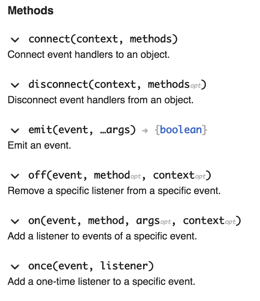 | 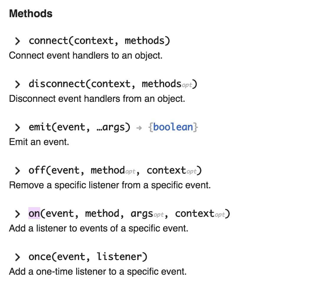 |
| Open | 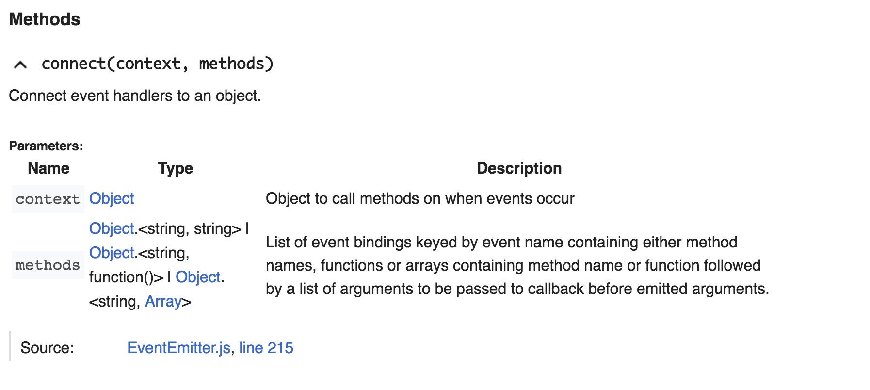 | 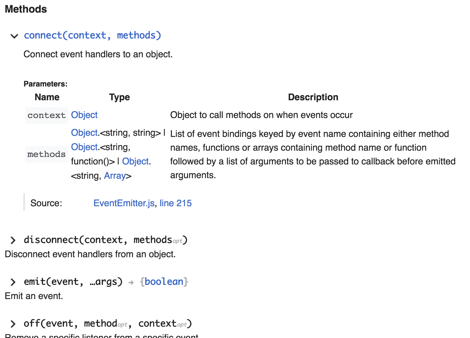 |
| • Prtksxna | |
| Oct 18 2018, 12:13 PM |
| F41596974: image.png | |
| Dec 12 2023, 9:01 PM |
| F41596534: Screenshot 2023-12-12 at 17.00.34.png | |
| Dec 12 2023, 4:01 PM |
| F41596526: Screenshot 2023-12-12 at 10.37.03 AM.png | |
| Dec 12 2023, 3:55 PM |
| F41596524: Screenshot 2023-12-12 at 10.48.49 AM.png | |
| Dec 12 2023, 3:55 PM |
| F41596522: Screenshot 2023-12-12 at 10.37.42 AM.png | |
| Dec 12 2023, 3:55 PM |
| F41596520: Screenshot 2023-12-12 at 10.36.16 AM.png | |
| Dec 12 2023, 3:55 PM |
| F41595213: Screenshot 2023-12-11 at 7.39.39 PM.png | |
| Dec 12 2023, 12:41 AM |
| F41594878: Screenshot 2023-12-11 at 2.42.40 PM.png | |
| Dec 11 2023, 7:56 PM |
See https://phabricator.wikimedia.org/project/profile/3689/
| HTML | ◾️◾️◽️◽️◽️ |
| CSS | ◾️◾️◾️◾️◽️ |
| Design | ◾️◾️◾️◾️◽️ |
| State | Current | Proposed |
|---|---|---|
| Closed | | |
| Open | | |
| Subject | Repo | Branch | Lines +/- | |
|---|---|---|---|---|
| Make attributes (static, protected) more visually distinct | jsdoc/wmf-theme | master | +33 -6 |
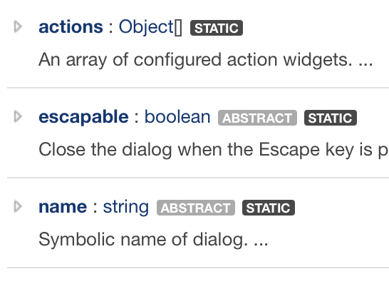
I don't see any visibiliy indicators in the screenshots, and hte before/after screenshots seem identical to me.
Change 982153 had a related patch set uploaded (by Anne Tomasevich; author: Anne Tomasevich):
[jsdoc/wmf-theme@master] Make attributes (static, protected) more visually distinct
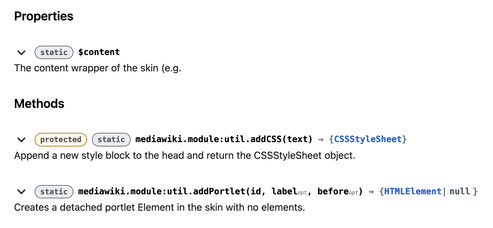
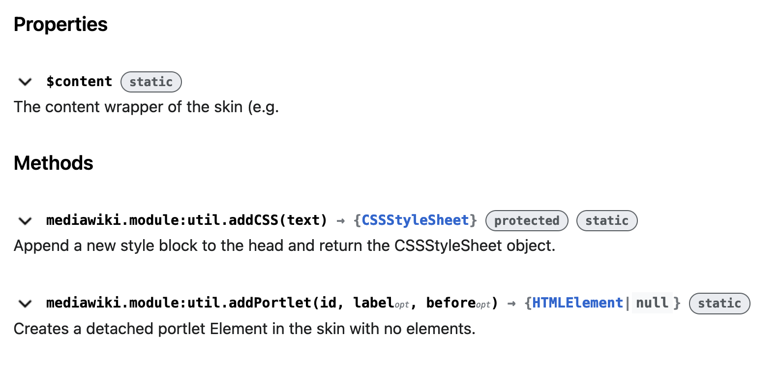
In my patch, I styled the indicators to look like chips/tags. I also used a yellow background and border color for protected and red for private. Thoughts?
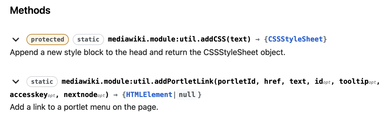
What do we think of the colors? Are there other indicators we should account for? @chainable doesn't work with JSDoc at the moment (see T214096).
I think this is a lot better @AnneT .
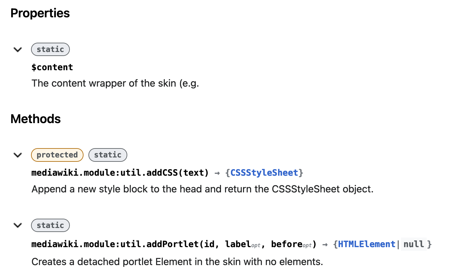
I do wonder if we should move the chips to their own line. Maybe above the function name ? That might require redoing that entire block with the hide/show with some flex box magic however.
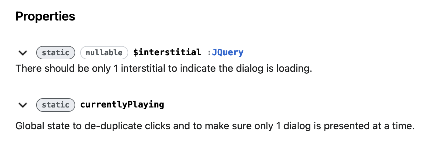
I also found: nullable https://doc.wikimedia.org/TimedMediaHandler/master/js/js/MediaElement.html
Thanks @TheDJ!
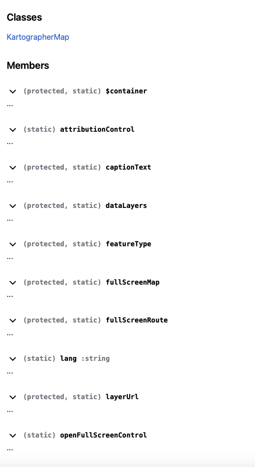
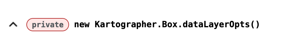
I looked through some more repositories and also found inner and constant. I think the design decision here is: which attributes, if any, should be distinguished via different colors? Just protected and private? I've also played around with making static look more...static:
But I'm not sure it really needs to be distinct from other attributes like nullable:
I do wonder if we should move the chips to their own line. Maybe above the function name ? That might require redoing that entire block with the hide/show with some flex box magic however.
I gave this a shot - it makes the tags much more prominent, but increases the space taken up by each accordion section. What do you think?
I also tried putting the tags on the end of the line:
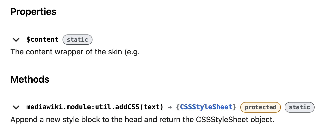
@TheDJ nice - so perhaps it is helpful to have static be distinguished from other things.
@egardner made the following suggestions:
I've made these updates in my patch, which now results in this:
Thanks, Anne. I think we can always introduce further refinements later but I believe this is a good update for now.
Change 982153 merged by jenkins-bot:
[jsdoc/wmf-theme@master] Make attributes (static, protected) more visually distinct
We've gone with the design in my last comment for now; please open a new task if you'd like to suggest changes or improvements!