Page MenuHomePhabricator

Re-test two-step banner
Closed, ResolvedPublic5 Estimated Story Points

Description

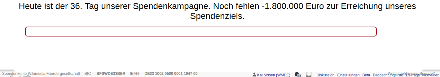
During last year's campaign we tested a two-step banner. The first banner contained a short text and the progress bar and was displayed immediately. With a delay of 7.5 seconds, the second banner was displayed, showing the usual text and form. We want to re-test this during this year's campaign.

Acceptance Criteria

  • The banners (ctrl and second step) are based on ctrl of test 8
  • The variant banner of T183748 is this test's variant.
  • The layout glitch of the bank data info line in B17WMDE_41_171230_var is fixed.
  • When resizing the window while the first banner is displayed, the banner size and the reserved space on top of the page change accordingly.

Notes

  • The code needs to be "recovered" from the git history.
  • There might be changes to the banner code, that also need to be applied to the old banner code (e. g. tracking functionality).

Related Objects

StatusSubtypeAssignedTask
ResolvedNone
ResolvedNone

Event Timeline

kai.nissen removed the point value for this task.Oct 28 2018, 10:17 PM
kai.nissen updated the task description. (Show Details)
kai.nissen set the point value for this task to 5.

Hey @kai.nissen, two things:

The ticket did not specify this but I assumed that I was supposed to return the progress bar to the blue area of both the var and ctrl banner, so I have done that. Let me know if this is not wanted and if you instead want to have the whitespace there.

I also noticed that for the double-banner, the first "instant banner" is never actually hidden from the DOM, so when you resize the window / make it larger, it will become visible again and kind of break out into the page. I thought simply hiding the instant banner after the slide-down animation of the actual banner has finished would solve the problem, however, since both banners do have a slight box shadow, you can see the drop shadow of the instant banner suddenly pop away which is kind of ugly. I can quickly show this to you in person and then we can discuss how to solve this. I could imagine that this could either be solved by either completely removing the box shadow from the banner or slowly fading it out alongside the drop animation of the main banner, but maybe this is not worth the hassle. It could potentially also be ignored if it's not a big deal.

Tim_WMDE moved this task from Doing to Review on the WMDE-FUN-Sprint-2018-10-29 board.
Tim_WMDE moved this task from Review to Test on the WMDE-FUN-Sprint-2018-10-29 board.
Tim_WMDE subscribed.

There is a layout glitch affecting the bank account data element on Chrome/Chromium. This seems to happen across operating systems:

desktop-09-var.png (249×1 px, 47 KB)

@kai.nissen Fixed that, the banner now also uses the new way of fetching banner data.

@kai.nissen I have changed the "late progress" style after our conversation on Monday. Can you check this one out again?

Thank you, looks good. Did you change the color of the text on the right side? The last time we had the progress bar like that the text was green.