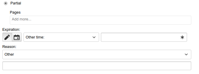
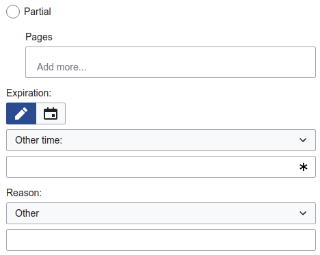
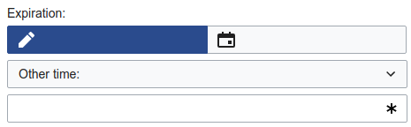
Page MenuHomePhabricator

Clean up Expiry field on Special:Block on Mobile
Closed, ResolvedPublic3 Estimated Story Points

Assigned To
Authored By
dbarratt
Oct 29 2018, 9:39 PM
Referenced Files
F27318753: image.png
Nov 27 2018, 5:16 PM
F27318819: image.png
Nov 27 2018, 5:16 PM
F27318759: image.png
Nov 27 2018, 5:16 PM
F27318756: image.png
Nov 27 2018, 5:16 PM
F27318749: image.png
Nov 27 2018, 5:16 PM
F27318768: image.png
Nov 27 2018, 5:16 PM
F27318766: image.png
Nov 27 2018, 5:16 PM
F27318770: image.png
Nov 27 2018, 5:16 PM

Description

On a mobile device:

Screen Shot 2018-10-29 at 17.29.00.png (470×313 px, 13 KB)

  1. The vertical spacing between the three "fields" should be increased so it looks like the Reason field.
  2. The toggle should be full-width (i.e. each button should occupy 50% of the width).

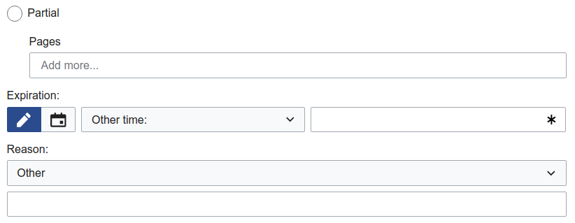
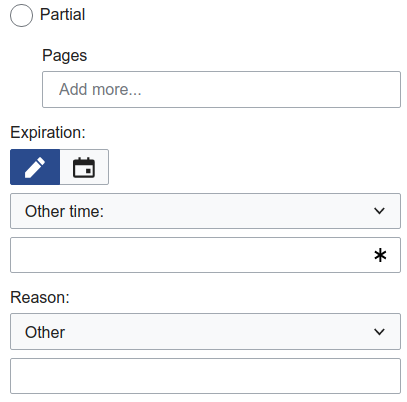
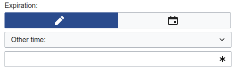
On a larger mobile device:

Screen Shot 2018-10-29 at 17.32.37.png (2×1 px, 140 KB)

  1. The vertical spacing between the three "fields" should be increased so it looks like the Reason field.
  2. The toggle should be full-width (i.e. each button should occupy 50% of the width).
  3. The drop-down field should line up with the text field.
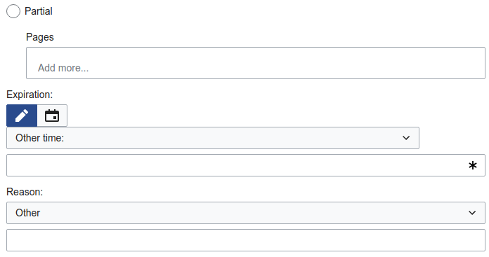
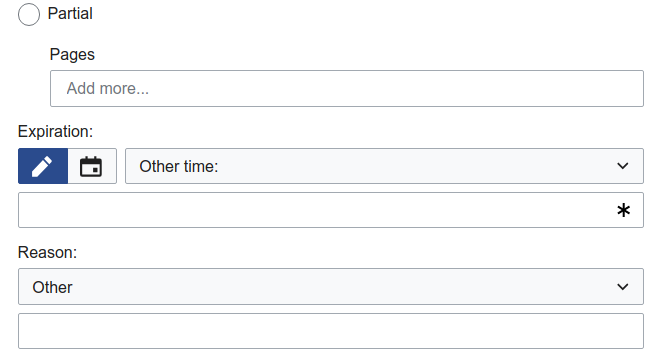
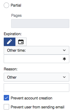
On a tablet device:

Screen Shot 2018-10-29 at 17.35.17.png (2×1 px, 124 KB)

  1. The vertical spacing between the three "fields" should be increased so it looks like the Reason field.
  2. The drop-down should occupy the remaining horizontal space.
  3. The text field should fill the remaining horizontal space.

Event Timeline

TBolliger added a subscriber: Prtksxna.

Assigning to @Prtksxna to evaluate and decide exactly how this should appear on Minerva

I think the points that @dbarratt has written are appropriate and we can go ahead with them. Do you need me to mock these up (I am guessing no, but still asking before un-assigning myself)?

I think the points that @dbarratt has written are appropriate and we can go ahead with them. Do you need me to mock these up (I am guessing no, but still asking before un-assigning myself)?

I don't think that's necessary unless @TBolliger wants it.

Thanks for your feedback!

Change 476048 had a related patch set uploaded (by Tchanders; owner: Tchanders):
[mediawiki/core@master] Improve layout of ExpiryInputWidget on mobile

https://gerrit.wikimedia.org/r/476048

Here are some screenshots in the different skins with that patch:

VectorMonobookMinerva
Desktop
image.png (274×716 px, 12 KB)
image.png (250×669 px, 11 KB)
image.png (319×822 px, 15 KB)
Tablet
image.png (367×696 px, 13 KB)
image.png (287×614 px, 11 KB)
image.png (357×658 px, 15 KB)
Mobile
image.png (373×468 px, 12 KB)
image.png (318×383 px, 10 KB)
image.png (402×407 px, 14 KB)

Tablet mode

I'm beginning to think we shouldn't have the tablet mode, and instead we should go straight to the mobile mode. Here's why:

  • In the proposed layout for tablet mode, it's tricky to get the dropdown to fill the remaining space next to the button group. At the moment, it's calculated based on the width of the button group, but this is different in different skins... In the example above, it works in Minerva, but breaks in the other skins. (NB for a similar reason, the widget is currently too narrow on desktop in Monobook.) We could improve on this by making it work for Vector and being a bit narrow in Minerva and Monobook, but it might be better to jump to the mobile layout, which works in all three.
  • The layout of this widget is complicated by the fact that the dropdown and text input are both contained within the "select with input" widget. Otherwise we could solve the problem with a table layout, for example.
  • I don't think we gain much from having the tablet mode. The dropdown is already wider than it needs to be in the proposed tablet layout - I don't think making it full-width is that different.

What do you think @Prtksxna?

Full-width buttons

I'm also not sure about the full-width buttons (see below). They don't feel very OOUI to me and I can't think of other examples in where we resize buttons like this - normally they fit to their content. @Volker_E and @Prtksxna what are your thoughts?

image.png (144×465 px, 4 KB)
image.png (139×469 px, 4 KB)

Definitely looks better, and I agree that we don't specifically need a tablet mode. I also agree that the stretched buttons look strange (and no longer look like buttons, really.)

Change 476048 merged by jenkins-bot:
[mediawiki/core@master] Improve layout of ExpiryInputWidget on mobile

https://gerrit.wikimedia.org/r/476048

Full-width buttons

I'm also not sure about the full-width buttons (see below). They don't feel very OOUI to me and I can't think of other examples in where we resize buttons like this - normally they fit to their content. @Volker_E and @Prtksxna what are your thoughts?

image.png (144×465 px, 4 KB)
image.png (139×469 px, 4 KB)

@Tchanders Not needed and not intended. We've got minimum size requirements baked into buttons for mobile. It is actually better to stay with smaller ones (except a few edge cases) as it's emphasizing more a button look. Thanks!