Problem statement
The language icon looks too similar to font settings icons in other popular software and could be improved. This task initially spikes considering alternatives and eventually implementing one.
Summary for declining task
Citing from
T210865#4837020: We have no reason to think that any language icon is actually effective. We need to define the goals for various scenarios of language selection, and find an effective solution by doing proper design research and testing.
T210865#7165248: An icon is as strong as its context, its consistent usage, onboarding for it and also, but not exclusively as its design.
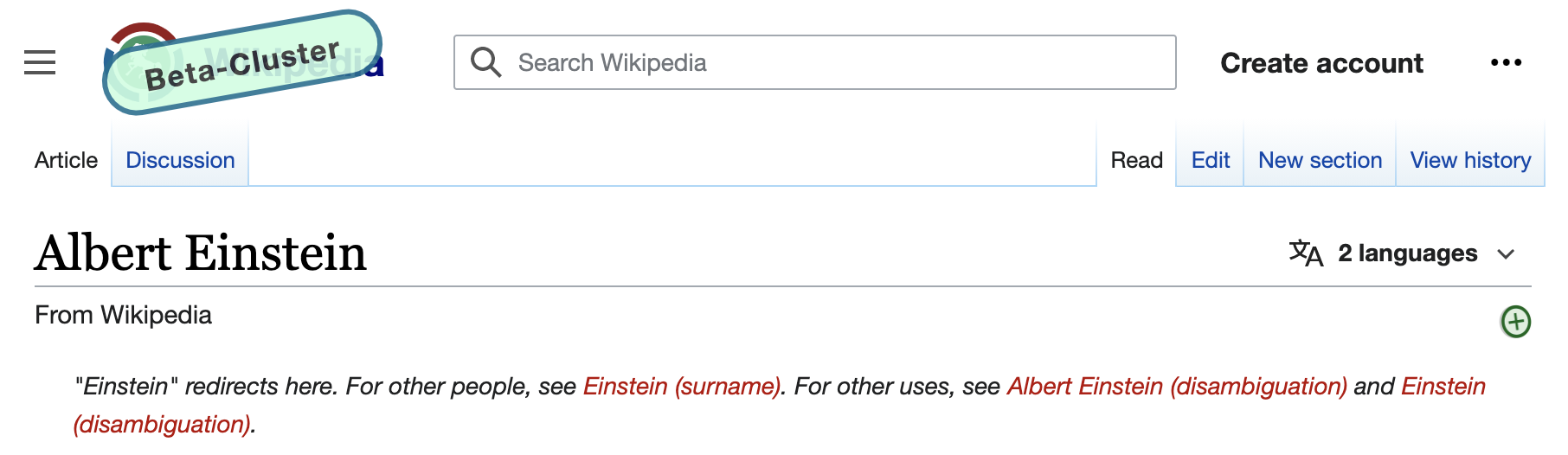
Current iconography
For me, I think the trouble is that the A is far too emphasized and there's no movement to suggest it's being transformed into another language. An accompanying text label would also fix this issue.
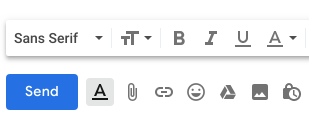
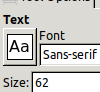
Conflicting font settings iconography in other software
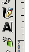
Alternative iconography for language settings in other software

Notes
- Related but distinct improvements discussed in T204839.
- an excellent history lesson T210865#4837020
- a possible way to improve things (but unlikely) T211985
- We used to show a button that said "read in another language" at the bottom of the page. When we replaced that with the icon at the top of the page, while intuitively moving to the top should make it more convenient and easier to find, the data we collected showed the opposite - that less people were clicking it (somewhere under T137932). Thus we do have evidence that the icon is fundamentally flawed for some.