Page MenuHomePhabricator

Mobile table editing should default to cell contents
Closed, ResolvedPublic

Description

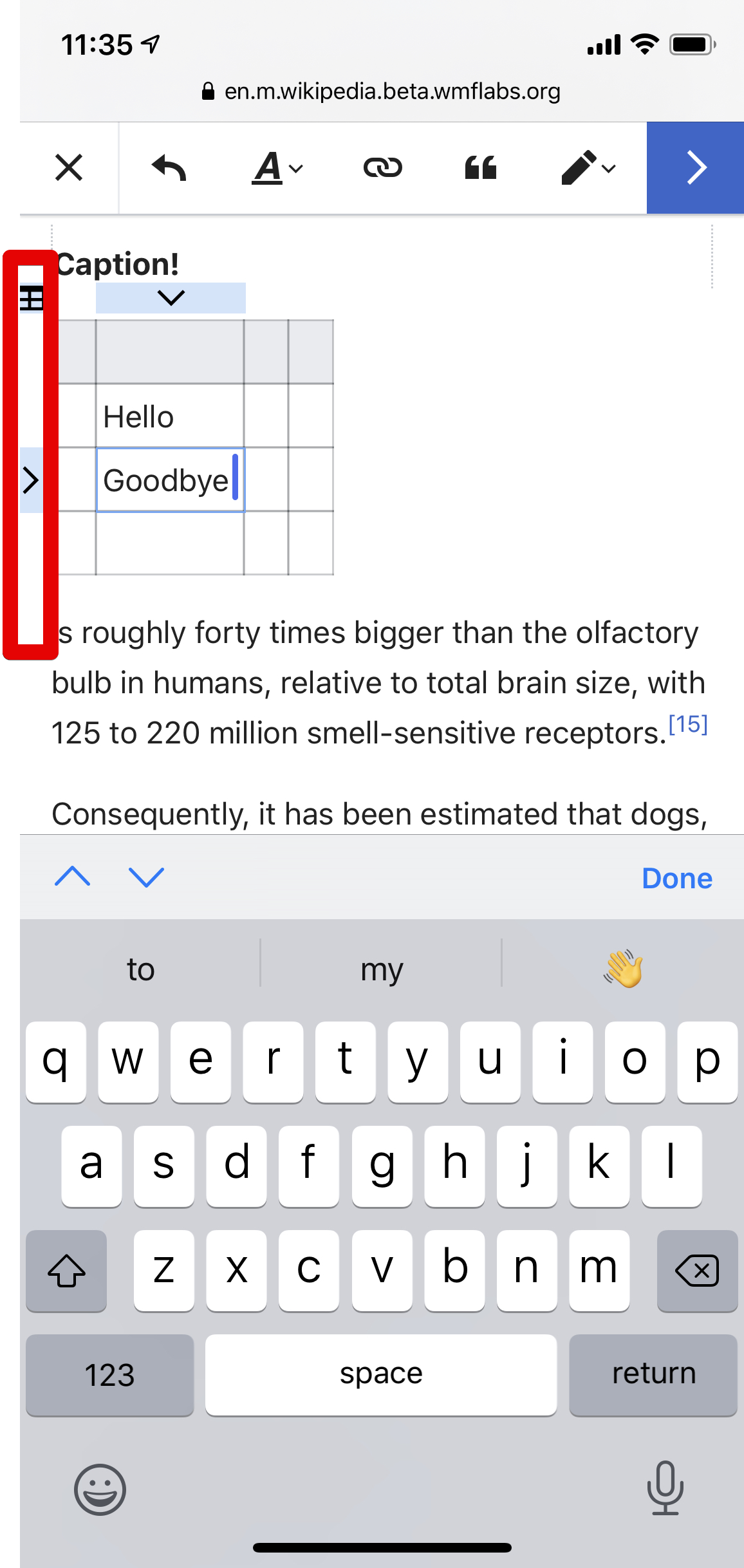
When using mobile VE, tapping a table cell should immediately place the cursor within the cell.

There should be a way (context item?) to switch to the current table-editing mode which is the current default.

This will make easier:

  • Editing table contents on mobile
  • Scrolling past tables on mobile, as table selections swallow scroll events

Event Timeline

JTannerWMF subscribed.

How can this fit into the scope of our current work? @DLynch

We called it out in the planning document for T211255 as a related change that should be made. David or I could probably fit it in, depending on which of us finishes up our prototyping / research first.

Change 507368 had a related patch set uploaded (by DLynch; owner: DLynch):
[VisualEditor/VisualEditor@master] TableLineContext: add context for the entire table

https://gerrit.wikimedia.org/r/507368

Change 507369 had a related patch set uploaded (by DLynch; owner: DLynch):
[VisualEditor/VisualEditor@master] TableNode: Change mobile behavior so initial tap enters the cell

https://gerrit.wikimedia.org/r/507369

Change 507368 merged by jenkins-bot:
[VisualEditor/VisualEditor@master] TableLineContext: add context for the entire table

https://gerrit.wikimedia.org/r/507368

Change 507369 merged by jenkins-bot:
[VisualEditor/VisualEditor@master] TableNode: Change mobile behavior so initial tap enters the cell

https://gerrit.wikimedia.org/r/507369

Change 509795 had a related patch set uploaded (by Jforrester; owner: Jforrester):
[mediawiki/extensions/VisualEditor@master] Update VE core submodule to master (225697a0d)

https://gerrit.wikimedia.org/r/509795

Change 509795 merged by jenkins-bot:
[mediawiki/extensions/VisualEditor@master] Update VE core submodule to master (6fc2d029c)

https://gerrit.wikimedia.org/r/509795

Change 509884 had a related patch set uploaded (by DLynch; owner: DLynch):
[mediawiki/extensions/VisualEditor@master] Add missing translations from VE submodule

https://gerrit.wikimedia.org/r/509884

Change 509884 merged by jenkins-bot:
[mediawiki/extensions/VisualEditor@master] Add missing translations from VE submodule

https://gerrit.wikimedia.org/r/509884

Looks good functionality wise! :)

However, the nested options inside the little context item/tool seemed a bit hard to discover imho.

Also, with this change on desktop, now we have two ways to go into the Table properties dialog. Is that something useful for users or confusing?

Screen Shot 2019-05-14 at 12.50.50 PM.png (350×427 px, 27 KB)

cc: @DLynch, @ppelberg, @iamjessklein.

@Ryasmeen -- Hard to discover that clicking the box will do something, you mean? Or hard to work out what the options within will do?

On mobile we only have this popup now -- I suggested removing the context item from desktop as well, for consistency and avoiding duplication, but Ed preferred removing it from mobile only. I figured that we could always remove it from desktop as well later, if we desired.

@DLynch: Sorry yeah, I mean it didn't seem like a tappable context item when I saw it the first time, so the nested options might be hard to discover. It might be because of the way it's positioned outside the border of the table that makes it look out of context, maybe even more so in smaller screens? We do have nested options for Row/Column operations but the arrows are very visibly highlighted as opposed to this one. But, that's just how I felt, maybe it isn't the same for others :)

This is how it appears on iphone5s:

IMG_2852.jpg (1×640 px, 68 KB)

@Ryasmeen Yeah, the constraints on that space are such that the table-icon gets to take up the smallest amount of space of any of the table-adjacent options. It could become inconsistent with the others -- larger and floating over the other content a bit more, say -- or something like expanding the highlight could happen (so that there's that blue highlight joining the arrows to the table-icon and drawing eyes to it).

@iamjessklein Design opinions?

On mobile we only have this popup now -- I suggested removing the context item from desktop as well, for consistency and avoiding duplication, but Ed preferred removing it from mobile only. I figured that we could always remove it from desktop as well later, if we desired.

Perhaps there was some miscommunication. I think I suggested removing some duplicate interface from mobile, but I don't think we need the small icon on desktop.

Change 512364 had a related patch set uploaded (by Esanders; owner: Esanders):
[VisualEditor/VisualEditor@master] Don't show mobile table context on desktop

https://gerrit.wikimedia.org/r/512364

Change 512364 merged by jenkins-bot:
[VisualEditor/VisualEditor@master] Don't show mobile table context on desktop

https://gerrit.wikimedia.org/r/512364

Change 512400 had a related patch set uploaded (by Jforrester; owner: Jforrester):
[mediawiki/extensions/VisualEditor@master] Update VE core submodule to master (3c069c39f)

https://gerrit.wikimedia.org/r/512400

Change 512400 merged by jenkins-bot:
[mediawiki/extensions/VisualEditor@master] Update VE core submodule to master (3c069c39f)

https://gerrit.wikimedia.org/r/512400

Moving this to PM review, assuming the design question will be handled by @iamjessklein on Editing Design board.

This looks good to me. Keeping the scope light and focusing on mobile here's my feedback:

  • We should check that context menu (properties, select cells , etc.) doesn't get stuck underneath the toolbar and therefore is unusable without scrolling
  • There should be enough padding around buttons so that their touch targets are sufficiently tappable and they don't look like a UI error.

ss.png (2×1 px, 551 KB)

Jess and I were talking about this and we agreed to try out adding a slight margin to tables on mobile only when they have focus, to see how that affects the experience.

In Board Refinement we determined @DLynch could work on this when he has down time.

That's the experience with a margin added so that the table is pushed in by a margin the size of the side context items. I can put it up on the prototype if you'd like to try it personally.

Change 566305 had a related patch set uploaded (by DLynch; owner: DLynch):
[VisualEditor/VisualEditor@master] TableNode: on mobile add a margin to an active table

https://gerrit.wikimedia.org/r/566305

+1 🐿

This is good fix and we can probably continue to push it further in the future.

@iamjessklein do you mean that in the sense that the patch for the margin is a good idea and should be merged, or that the feature is good as-is without that?

Should we just close this ticket? The original request is complete, and the remaining patch is just about a separate potential usability improvement.

Change 566305 abandoned by DLynch:
[VisualEditor/VisualEditor@master] TableNode: on mobile add a margin to an active table

Reason:
Not going ahead with this tweak

https://gerrit.wikimedia.org/r/566305