This task is to address some UI issues identified on the help panel tested in Beta labs (see T211206).
| Priority: | High | Medium | Low |
Both mobile & desktop versions:
Medium | A. Missing animation to transition help panel CTA onto the editor screen
Expected: Help CTA should fade and animate into the screen, as per the demo prototype. Also refer to the css (lines 182-204) as a proposed way to achieve this effect.
Status: Not done.
Medium | B. Missing animation to transition from the help panel CTA to the open help panel
Expected: When the help panel CTA is clicked/tapped, the help panel should fade and animate into the screen, as per the demo prototype. Also refer to the css (lines 240-257) as a proposed way to achieve this effect.
Status: Not done.
High | C. Wrong icon used for help panel CTA
Expected: the Ask a Question "?" inside a chat bubble icon is used:
Actual: The standard help "?" icon is in use.
Status: Done.
High | D. Help panel CTA should have a rounded "floating action button" style
Expected: The help panel CTA should be a "floating action button" style which has (i) Rounded corners; (ii) Taller height than a standard button; and (iii) Drop shadow to visual distinguish the elevation of the button from the content below it {box-shadow: 0px 1px 2px rgba(0,0,0,.5);}.
Expected desktop: 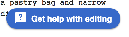 | Actual desktop:  |
Expected mobile: 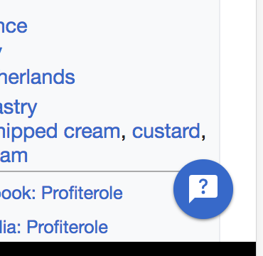 | Actual mobile:  |
Status: Done.
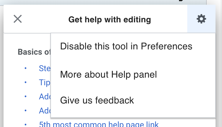
Medium | E. Help panel dialog header icons color and placement
| Expected: (i) Close and Cog icon colors are #54595d; (ii) icons have the same 1em left and right padding from the respective left and right sides of the panel as other elements. | 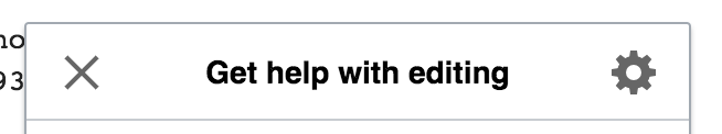 |
| Actual: (i) icons are #000; (ii) Close icon lacks sufficient LHS padding and Cog icon lacks sufficient RHS padding. |  |
Status: In discussion. Concern about proposed color matching VE disabled button state. The padding is really hacky to do via OOUI.
@RHo: OK to accept 'Actual' if it is too hacky to override OOUI, since it is a relatively minor visual impact.
Medium | F. Help panel title text color and all default paragraph text color (throughout help panel)
| Expected: {color: #222} | |
| Actual: {color: #000} | |
Status: Done
Medium | G. Help panel content section heading text color
| Expected: {color: #54595d} | 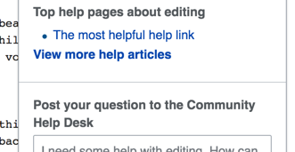 |
| Actual: {color: #000} | 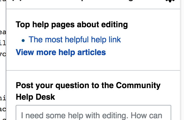 |
Status: Done
Medium | H. Help panel content top articles link list
| Expected: .5em padding below each link list item | 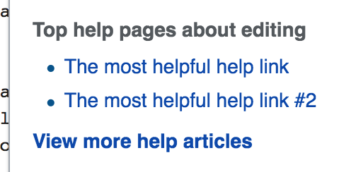 |
| Actual: lacks spacing below each list-item | 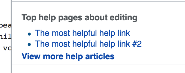 |
Status: Done
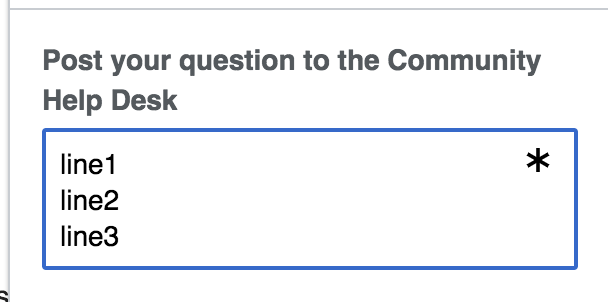
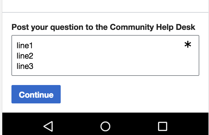
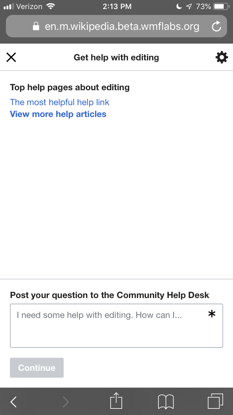
High | I. Height of the text-area input for entering a question
| Expected: height of text area input is 3 rows of text |  |
| Actual: height of text area input is only 2 rows initially, then "jumps" to three lines when user starts inputting text | open full screen to see animated gif:  |
Status: Sort of done. Please have a look at what you see in beta, as it's now a little different.
Looks fine to me on Desktop and Mobile:
Medium | J. Paragraph text style
| Expected: {color: #222; line-height:1.5} |  |
| Actual: {color: black; line-height:1.2} |  |
Status: Patch up for review.
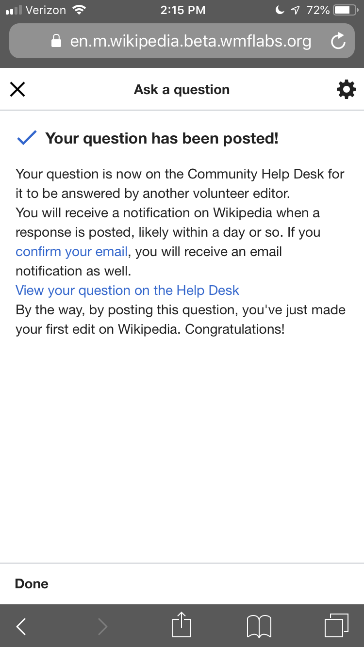
Low | K. Confirmation icon color
| Expected: icon is #14866d (WMF Green |  |
| Actual: icon is #36c | |
Status: Per comments on this task, we agreed to leave it blue.
Low | L. Settings cog background color and positioning of popup
- Popup should be two pixels higher
- Settings cog should have background highlight when open

Status: Done
Desktop version only
Low | L. Slightly wider help panel
Expected: the panel is 22.5em (= 360px) wide
Actual: the panel is slightly narrower at ~300px wide
Status: Not done. AFAICT there's not a clean way to do this with OOUI.
Low | M. Lighter border color on open help panel
| Expected: .mw-ge-help-panel-popup {border: 1px solid #c8ccd1;} |
| Actual: .mw-ge-help-panel-popup {border: 1px solid #a2a9b1;} |
Status: Done.
Mobile version only
High | N. Help panel opens as a full screen
| Expected: Help panel opens as a full screen overlay on mobile | 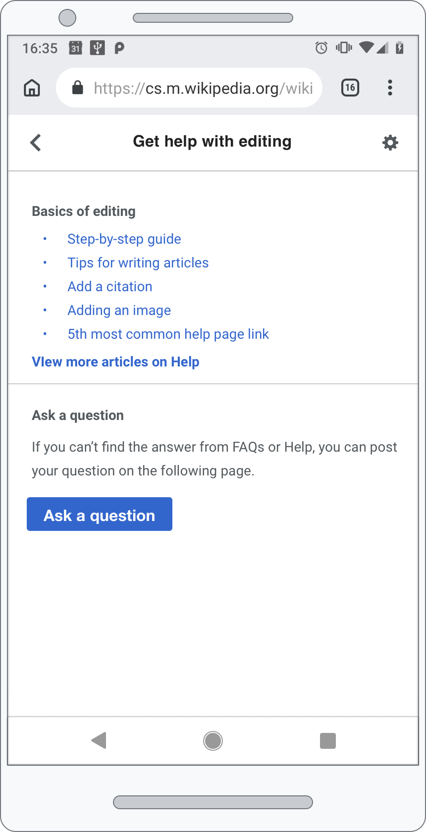 |
| Actual: Help panel opens as a modal | 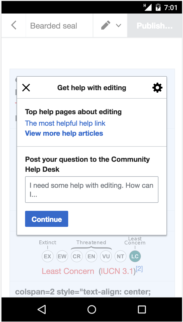 |
Status: Done