Page MenuHomePhabricator

progress bar on mobile devices gets in way with remaining info
Closed, ResolvedPublic2 Estimated Story Points

Assigned To
None
Authored By
tmletzko
Dec 11 2018, 9:59 AM
Referenced Files
F27551352: image.png
Dec 14 2018, 11:05 AM
F27550420: image.png
Dec 14 2018, 10:00 AM
F27550035: image.png
Dec 14 2018, 10:00 AM
F27526158: late-progress-suggestions.png
Dec 13 2018, 12:11 AM
F27526244: IMG_0175.PNG
Dec 13 2018, 12:11 AM
F27517043: 2.png
Dec 12 2018, 2:41 PM
F27517042: 1.png
Dec 12 2018, 2:41 PM

Description

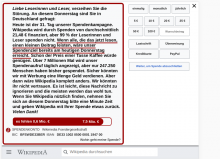
on smaller viewports the progress bar get pretty close to the right aligned text ((noch fehlen..."). we used to have a solution, in which the remaining sum is displayed outside of the bar on mobile. Could we use that for ipads aswell? In case this is too tricky, we have to exlude this message at all.

on ipads the progress bar is being displayed in two rows already, which needs to be adressed right away.
Event Timeline

@tmletzko @kai.nissen:

on smaller viewports the progress bar get pretty close to the right aligned text ((noch fehlen..."). we used to have a solution, in which the remaining sum is displayed outside of the bar on mobile. Could we use that for ipads aswell?

I actually don't think we should use that solution again for mobile devices, the old solution is actually pretty broken in multiple regards:

First, for devices where the progress bar is actually rendered correctly, the progress bar is compressed to relatively little space and because the red area has a min-width, it becomes completely unrepresentative of the actual progress and also does not "feel" like a progress bar anymore:

1.png (824×427 px, 41 KB)

For some aspect ratios / resolutions, the progress bar actually breaks (checked on multiple browsers):

2.png (781×409 px, 37 KB)

Screenshots taken with the last banner of 2017 but the behavior is the same on our current banners.

For iPads, this view might still be acceptable though, so I am not opposed to implementing it. There actually should not be any line break in the progress bar and I actually could only reproduce this issue on my iPad directly and not my desktop-emulated iPad, so this might some finicky thing about mobile Safari which causes the progress bar to break like that. It's a bit of a pain to fix it but I can either work on fixing the current progress bar look for iPads or applying last year's "late-progress" design to the iPad banner now.

For mobile devices, we should maybe look at minor redesigns / sensible changes to make the progress bar work without placing the text on the right-hand side, I just don't think it's sensible for the reasons above.

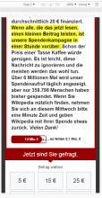
One mobile-friendly solution might be to actually put both texts into the banner at one point instead of placing them outside, I quickly tried this and created a quick test to showcase what I mean:

late-progress-suggestions.png (621×858 px, 121 KB)

This way, the banner will properly represent the progress while retaining its full width. The order of the texts could also be the other way around. We could also quickly consult with UX if necessary.


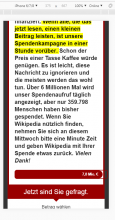
Aside from that, I have fixed the line-break on iPad now (without changing anything else about the iPad banners):

IMG_0175.PNG (1×960 px, 516 KB)

However, the progress bar currently does not properly represent the actual percentage due to the minimum width of the text in the white area of the progress bar.

it is difficult, it always has been. But I do not thing that having the correct relation is a must. If none of us finds a solid solution, we should ask UX.

Right, the --late-progress modifier does not make sense in its current implementation for very narrow screens (i. e. portrait mode of smartphones). We should have a different design for this. Placing the text part below the progress bar, for example.

  1. We put the text out of the banner, one left aligned to it, one right aligned to it. If the banner is far to narrow they will go in different lines (as flexbox magic makes it)
    1. We also could half the size of the barometer, making space for this.
  2. We choose a color for the bar that contrasts well with black (does not work with the red color scheme!)

I would suggest the former, including the making it less high.

I vote for the first suggestion. No need to reduce the height of the progress bar, though.

I vote for the first suggestion. No need to reduce the height of the progress bar, though.

So it is fine to make the banner one line larger?

Here is the mockup:

image.png (156×382 px, 13 KB)

5,4 Mio. € is left alinged, Es fehlen 2,4 Mio € is right aligned.

The color of the 5,4 Mio. € is the same as the bar, as long as the bar is not of a light color, than in should be a darker color variant of the same hue. (For the red color scheme, using the same color would be correct)

If the banner is even smaller than the width of 5,4 Mio. € and Es fehlen 2,4 Mio € combined, the should go to different lines (as via flexbox I suppose), the 5,4 Mio. € on top, then the Es fehlen 2,4 Mio € .

Note that I also tried to adjust the distances in the mockup: It is now based on an 18 pixel grid.

image.png (371×828 px, 53 KB)

I also got rid of the info-i when redoing it. You can leave it in, but I suppose it is better without, design wise.

Thanks @Jan_Dittrich,

The upcoming banners will also start to introduce "Noch 10 Tage", previously this was inside the progress bar on the left. Do you have any recommendations as to where to put that now?

"Noch 10 Tage", previously this was inside the progress bar on the left.

Was the "5,4 Mio €" ditched for this or was it put there in addition?

I suppose in both cases, I would add it to the left-aligned textbox which currently holds "5,4 Mio. €"

Based on additional feedback I would put the "Nur noch 10 Tage" with the "Es fehlen 2,5 Mio. €"

image.png (266×736 px, 30 KB)