Page MenuHomePhabricator

Banner Test # 27 dewik desktop
Closed, ResolvedPublic3 Estimated Story Points

Description

General

Banners are based on control banner of #25.

Test Scope

Please describe the test scope as detailed as possible. When posting banner text, you may also use formatting options to resemble the formatting currently used in banners:

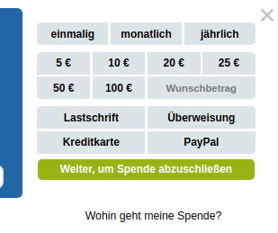
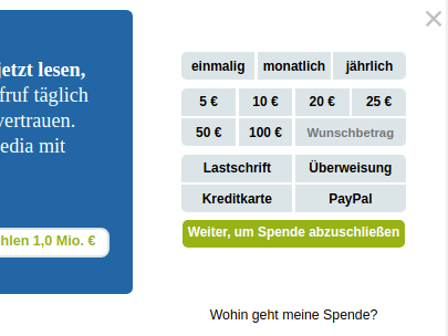
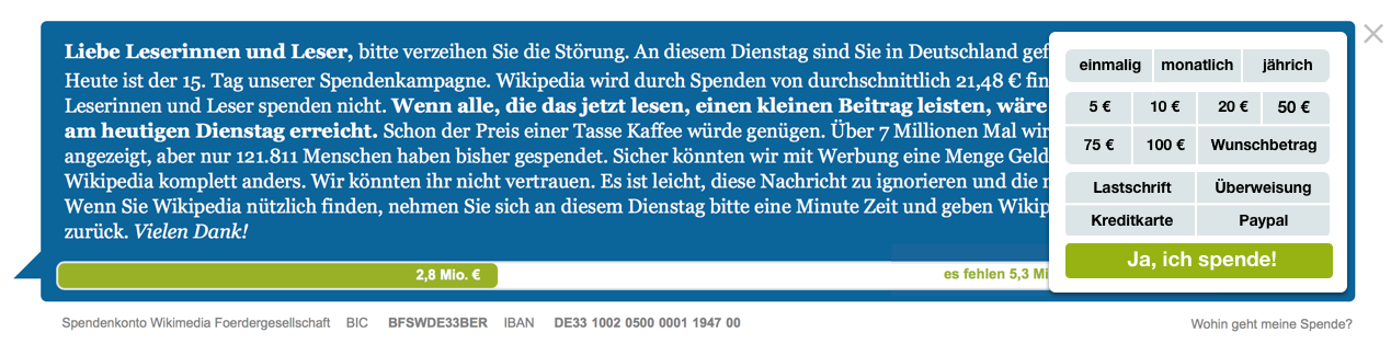
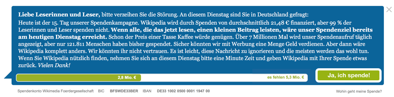
  • we introduce the single button within the blue copy box according to this design

Zitate B onmouseover Copy 21.png (314×1 px, 274 KB)

Zitate B onmouseover Copy 20.png (314×1 px, 300 KB)

Depending on the scope, the following information is needed:

  • the single donate button shall have the label "Weiter, um Spende abzuschließen" , the form pops up when hovering over it (see animation of Atlas-banner). The form will hover above the copy. When clicking somewhere outside the form, the form disappears again. The form on VAR shall have the same form height as CTRL. On smaller viewports, the sinlge buttons move underneath the progress bar.
  • The button(s) should have the same height as the control banner's submit button.
  • In narrower viewports (~800px), the button should be positioned below the progress bar and horizontally centered.

Start Date

  • Wednesday, 19th.

Invisible Placeholder

  • YES. The VAR will be a lot smaller.
  • The banner height difference may be reduced by
    • adding placeholder text to the variant banner in wider viewports.
    • adding a placeholder of the same height of the button in narrower viewports.

Anything from other Tests

  • NO

Event Timeline

This looks like the "next level" of T211955: Banner test desktop dewiki #26, which currently is #26, the number on this ticket does not look right. Also, this might be a duplicate (or parent) of T210586: Mouseover Pop-Up-Form

tmletzko renamed this task from Banner Test # 26 dewik desktop to Banner Test # 27 dewik desktop .Dec 17 2018, 4:05 PM

two remarks:

  • could you please reorder the X-button outside the blue box
  • please already consider the late progress bar since on smaller viewports die text within the progress bar is being overlapped. Suggestion: Would it be a solution that we reorder the "outside-the-progress-bar-pointer" for the remaining sum above the progress bar for smaller viewports? would that solve the height difference on those viewports?

Another remark from me: In the previous test, we inadvertently changed the form width (i. e. the width of the elements inside it). The previous look should be restored in the control banner of this test.

Test 25Test 26
form-width-25.png (259×309 px, 22 KB)
form-width-26.png (304×405 px, 31 KB)
  • please add the late progress bar to CTRL aswell
  • please center the submit button on smaller viewports
  • please change the text color of "es fehlen 1 Mio €" to white
Tim_WMDE moved this task from Doing to Review on the WMDE-Fundraising-Funban-2018 board.
Tim_WMDE subscribed.
Tim_WMDE set the point value for this task to 3.Jan 3 2019, 12:39 PM