Page MenuHomePhabricator

OOUI workarounds required for search prototype
Closed, InvalidPublic

Description

Here's a small dump of search prototype things that I believe require (too much) hacking around what OOUI currently supports.
I don't know whether we want to adjust the design somehow, improve OOUI support to achieve what we have in the design, continue with hacks.
It's definitely not implausible that there is proper support in OOUI for what we want, but that I'm simply unaware of how to accomplish it, so it'd be great to have someone (@Jdforrester-WMF?) look over this first.
Meanwhile, a thorough review of the entire patch by someone with extensive OOUI experience would be most useful - there might be other issues or more room for improvement!


Soo... there are a few things in the search prototype that require a good amount of hacks to make them look the right way with the existing OOUI elements. At least to me, with my limited OOUI experience :)

The main thing would have to be making the search bar appear as 1 element:

search bar dropdown filter.png (253×522 px, 18 KB)
vs
Screenshot 2019-01-02 17.06.49.png (136×1 px, 25 KB)

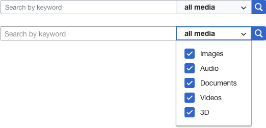
OOUI (at least to my knowledge) doesn't seem to have support to seamlessly blend its widgets together.
HorizontalLayout arranges widgets right next to one another, but there's still margins & borders to separate the elements.
We could override CSS, but if/once things change in OOUI, we'd get unexpected results...

1.mediainfo-search-widget {
2 /* below: hacks to remove border radius & blend them all together */
3
4 .mediainfo-search-input,
5 .mediainfo-search-select-checkboxes-widget {
6 margin-right: 0;
7 vertical-align: top;
8 }
9
10 /* keywords input field */
11 .mediainfo-search-input > .oo-ui-textInputWidget > .oo-ui-inputWidget-input,
12 /* statements input field */
13 .mediainfo-search-input > .oo-ui-widget > .oo-ui-textInputWidget > .oo-ui-inputWidget-input,
14 /* depicts input */
15 .oo-ui-tagMultiselectWidget-handle {
16 border-top-right-radius: 0;
17 border-bottom-right-radius: 0;
18 }
19 /* namespace selection dropdown */
20 .mediainfo-search-select-checkboxes-widget .oo-ui-dropdownWidget-handle {
21 border-left: 0;
22 border-right: 0;
23 border-radius: 0;
24 }
25 /* search button */
26 .mediainfo-search-button.oo-ui-buttonElement-framed.oo-ui-iconElement > .oo-ui-buttonElement-button {
27 border-top-left-radius: 0;
28 border-bottom-left-radius: 0;
29 }
30}

There are a few other places where we're dealing with similar things (e.g. borders between keywords|depicts|other statements tabs & the autocomplete results below) but those are minor compared to the above changes.


While on the topic of the search bar: if we're going to have it top-right, replacing the existing search bar, we might want the OOUI elements to be slightly smaller than they are natively. They're currently quite big...
I'm not aware of any existing method of scaling back the size of OOUI elements, so we'd need some unstable CSS overrides if we'd like to accomplish that:

1.mediainfo-search-widget {
2 height: 30px;
3
4 /* below: a bunch of massive hacks to get the input elements down to 30px... */
5
6 /* keywords input field */
7 .mediainfo-search-input > .oo-ui-textInputWidget > .oo-ui-inputWidget-input,
8 /* statements input field */
9 .mediainfo-search-input > .oo-ui-widget > .oo-ui-textInputWidget > .oo-ui-inputWidget-input {
10 height: 30px;
11 font-size: 0.9em;
12 }
13
14 /* depicts input */
15 .oo-ui-tagMultiselectWidget-handle {
16 min-height: 30px;
17 height: 30px;
18 font-size: 0.9em;
19 }
20
21 /* depicts capsules */
22 .oo-ui-tagMultiselectWidget-handle .oo-ui-tagMultiselectWidget-group {
23 margin-top: 0.15em
24 }
25
26 /* namespace selection dropdown */
27 .mediainfo-search-select-checkboxes-widget .oo-ui-dropdownWidget-handle {
28 min-height: 30px;
29 height: 30px;
30 padding-top: 0;
31 padding-bottom: 0;
32
33 .oo-ui-labelElement-label {
34 line-height: 30px;
35 font-size: 0.9em;
36 }
37 }
38
39 /* search button */
40 .mediainfo-search-button.oo-ui-buttonElement-framed.oo-ui-iconElement > .oo-ui-buttonElement-button {
41 height: 30px;
42 padding-top: 0;
43 }
44}


Another thing: how do we deal with longer depicts input?
By default, OOUI's TagMultiselectWidget element expands down. Are we ok with that? If not, what do we want? (and this will probably incur a lot of work...)
And when all elements are in a horizontal layout, this also causes the other elements (dropdown, search icon) to drop slightly since they're middle-aligned (fixing that so that the other elements remain at the top should be a pretty easy override, though)

Screenshot 2018-12-18 17.50.11.png (220×1 px, 49 KB)


Lastly, it appears that the different kind of OOUI elements we're using there (TextInputWidget for keywords & statements input, TagMultiselectWidget for depicts) have minor visual differences that get annoying when they need to replace one another.
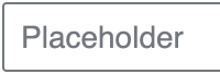
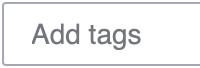
E.g. look at the differences in padding between TextInputWidget's placeholder text & TagMultiselectWidget - if you switch input modes, this is a very noticeable difference.

Screenshot 2019-01-02 17.23.57.png (68×200 px, 8 KB)
vs
Screenshot 2019-01-02 17.23.46.png (68×200 px, 7 KB)

Related Objects

Event Timeline

Restricted Application added a subscriber: Aklapper. · View Herald Transcript
Ramsey-WMF moved this task from Untriaged to Next up on the Multimedia board.

The closest we have at the moment is ActionField, which has styles for combining text inputs and buttons, and dropdowns and buttons. There is no generic mechanism for combining widgets.

image.png (318×735 px, 34 KB)

Another thing: how do we deal with longer depicts input?
By default, OOUI's TagMultiselectWidget element expands down. Are we ok with that? If not, what do we want? (and this will probably incur a lot of work...)
And when all elements are in a horizontal layout, this also causes the other elements (dropdown, search icon) to drop slightly since they're middle-aligned (fixing that so that the other elements remain at the top should be a pretty easy override, though)

Screenshot 2018-12-18 17.50.11.png (220×1 px, 49 KB)

Given the complexity of this combination of widgets, I would suggest you don't try to make it a single compact widget, and just come up with a way to layout individual widgets that gives you more flexibility.

Another thing: how do we deal with longer depicts input?
By default, OOUI's TagMultiselectWidget element expands down. Are we ok with that? If not, what do we want? (and this will probably incur a lot of work...)
And when all elements are in a horizontal layout, this also causes the other elements (dropdown, search icon) to drop slightly since they're middle-aligned (fixing that so that the other elements remain at the top should be a pretty easy override, though)

Given the complexity of this combination of widgets, I would suggest you don't try to make it a single compact widget, and just come up with a way to layout individual widgets that gives you more flexibility.

What exactly do you mean? Do you suggest we should consider a design where the elements don't appear to be one widget, or that there's a better way to structure/layout all of these widgets (than is currently the case and/or with above CSS hacks)?

@Esanders do you know of any better way we could implement the current design, in a way that doesn't require this many CSS overrides? Or should we look into other solutions?

@matthiasmullie Thanks for bringing this to the surface. We could think of a way to have additional options within the library on putting interface elements together, one thing that immediately comes to my mind though is, how do they behave when they need to be wrapped on smaller screens, non desktop-first environments?

We've had a long discussion about such behaviour in T112982 for comparison.

We haven't had the current use case of clinging several widgets (3+) together apart from just a [input/tag input] and [button] requested by designers yet, so the CSS hacks seem to be the best way to move forward for now.

To your comment of different padding of TextInput- and TagMultiselectWidget placeholder, it comes out of the active contents of those inputs. In order to make inputting a tag seamless interaction the placeholder needed to have that padding.

You could consider not to use a placeholder, but a 'helpInline' label in such case.

Also, why does the search bar need to be 30px height vs 32px, that doesn't seem necessary @PDrouin-WMF?

While on the topic of the search bar: if we're going to have it top-right, replacing the existing search bar, we might want the OOUI elements to be slightly smaller than they are natively. They're currently quite big...
I'm not aware of any existing method of scaling back the size of OOUI elements, so we'd need some unstable CSS overrides if we'd like to accomplish that:

OOUI elements scale with the font size (with the exception of icons, which have a minimal size, for some silly reasons). Can you simply wrap the entire thing in <div style="font-size: 80%;"> or something?

@matthiasmullie Yeah, on the TagMultiselectWidget one, given the left-most widget is variable height I don't think there is a complete design for how this should work as a single widget, so it might be easier to use a design that treats them as separate widgets.

The new search methodology is very different and doesn't require these hacks.