As seen in VE:

Currently in OOUI/media:

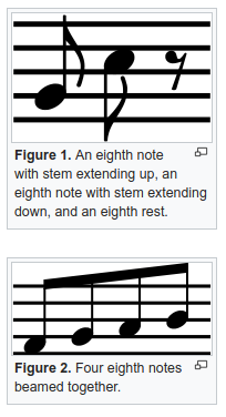
As currently drawn in OOUI this doesn't represent a single musical glyph, but looks like the truncated part of a series of quavers (see illustration from en.wiki below)
| Esanders | |
| Jan 8 2019, 5:51 PM |
| F27915791: image.png | |
| Jan 16 2019, 11:22 PM |
| F27901742: image.png | |
| Jan 15 2019, 8:28 PM |
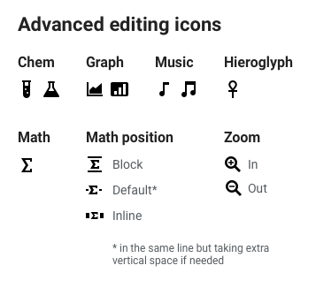
| F23880345: advanced-editing.png | |
| Jan 8 2019, 10:52 PM |
| F27823401: 200px-Utah_Jazz_logo_(2016).svg.png | |
| Jan 8 2019, 6:38 PM |
| F27823009: image.png | |
| Jan 8 2019, 5:51 PM |
| F27823026: image.png | |
| Jan 8 2019, 5:51 PM |
| F27823012: image.png | |
| Jan 8 2019, 5:51 PM |
As seen in VE:
Currently in OOUI/media:
As currently drawn in OOUI this doesn't represent a single musical glyph, but looks like the truncated part of a series of quavers (see illustration from en.wiki below)
| Subject | Repo | Branch | Lines +/- | |
|---|---|---|---|---|
| Update OOUI to v0.30.2 | mediawiki/core | master | +677 -544 | |
| icons: Use complete glyph for 'musicalScore' icon | oojs/ui | master | +2 -2 |
Change 482859 had a related patch set uploaded (by Esanders; owner: Esanders):
[oojs/ui@master] Use complete glyph for musicalScore icon
The current iteration was specifically chosen to minimize details, this needs to go through design review (we're deliberately removing details in other icons like 'tray' or 'globe').
As Volker said, the intention was to make a simplified version of ♪, which is stylized with more straight lines similarly to the case of the Utah Jazz logo, for example:
To anyone who reads musical notation (the target audience here), as opposed to basketball fans, this just looks wrong.
Where is the task for the most recent change (from the VE version to the OOUI version)?
The right one is more acceptable, although it is still uncommon to use stems of different lengths. If you really want to avoid the diagonal beam, you can just put the notes at the same height.
Coming from Design Review, we'll follow last comment to improve readability of 'musicalScore' and go with alternative here…
To clarify, the horizontal beam would require the notes to be at the same height, as the stems should be the same height:

Change 482859 merged by jenkins-bot:
[oojs/ui@master] icons: Use complete glyph for 'musicalScore' icon
Change 486131 had a related patch set uploaded (by Jforrester; owner: VolkerE):
[mediawiki/core@master] Update OOUI to v0.30.2