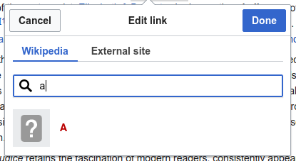
Design appears in Pam's mock-ups:
| Jdforrester-WMF | |
| Feb 8 2019, 6:24 PM |
| F29842228: image.png | |
| Jul 22 2019, 6:18 PM |
| F29842241: image.png | |
| Jul 22 2019, 6:18 PM |
| F29640991: image.png | |
| Jun 25 2019, 4:58 PM |
| F29592400: Screenshot 2019-06-17 11.39.02.png | |
| Jun 17 2019, 9:40 AM |
| F29516082: image.png | |
| Jun 13 2019, 4:45 PM |
| F29515695: image.png | |
| Jun 13 2019, 4:28 PM |
| F29515667: image.png | |
| Jun 13 2019, 4:28 PM |
| F29271077: image.png | |
| May 29 2019, 1:54 PM |
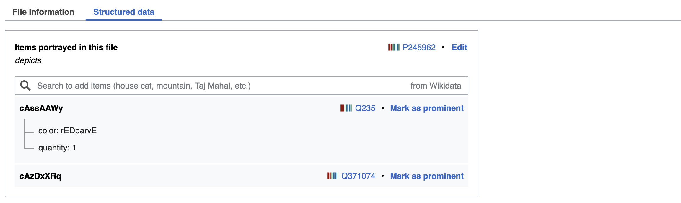
Design appears in Pam's mock-ups:
| Subject | Repo | Branch | Lines +/- | |
|---|---|---|---|---|
| Update OOUI to v0.32.0 | mediawiki/core | master | +429 -270 | |
| Implement frameless mode for TabSelectWidget | oojs/ui | master | +639 -99 |
Change 493282 had a related patch set uploaded (by Cparle; owner: Cparle):
[oojs/ui@master] Added php version of IndexLayout and its dependencies
The above patch is attempting to implement various *Layouts in PHP.
My understanding is that currently infusion means re-generating the entire DOM in JS and replacing it; but with Layouts parts of the DOM need to be preserved, as user content will be appended to them.
It might be possible that we can do this by overriding gatherPreInfuseState on the various layouts, and add user-appended content to the state variable.
You two know much more about infusion, so perhaps you can advise?
No? This is "make a design". That is "make code". We can proceed with the design we don't like once the code works, they're orthogonal.
@Esanders I'll respond on T215645 per @Jdforrester-WMF's comment, looks like the patch was also moved there.
Ping @Ramsey-WMF, @PDrouin-WMF – is changing the design of the tabs still wanted, and is it still a blocker to statements release? It feels like it's no longer being demanded? T216773 doesn't ask for tab styling changes.
@Jdforrester-WMF No tab styling changes are needed. What's on Beta right is good enough for now. Thanks!
Change 512384 had a related patch set uploaded (by Esanders; owner: Esanders):
[oojs/ui@master] Implement frameless mode for TabSelectWidget
Pinging @Volker_E for feedback. What we have on Commons for tabbed navigation has been fine for now, but we should probably discuss this in the next style guide meeting.
Although this task was filed for SDC, we have discussed adding frameless support to the tab widget before, so I'd like to proceed even if not for SDC.
As suggested in the ticket, bottom-aligned the grey bar so that the widget can be used with drop shadows to convey depth when scrolling:
Hey @PDrouin-WMF, I'd be very interested to move this forward, as @Esanders provided a patch that would improve overview and usability of OOUI demos and frameless tabs would play an important role there.
A few design comments,
My proposal, built on top of the mockup in the task description:
Non-focussed, “One tab” is selected
Focussed, “One tab” is selected & focussed

the active (as in interaction-ready, not disabled) element vs selected element treatment seems upside down. The clickable elements should receive Accent50, while the selected one, should be Base10.
That's using the button pattern. In the toolbars it is the reverse with items being black, and blue when active:
For a long menu I'd prefer using colour to accentuate the active element. This is the same approach used by material:
https://material-components.github.io/material-components-web-catalog/#/component/tabs
Volker, I like your furthering of the work.
For SDC, I don't think that treatment would work... I would prefer the full underline to span the max width. Having the tabs rest directly on top of the caption/statement panels diminishes them in terms of purpose. To me, the affordance of being able to switch between the two tabs is greatly reduced.
For the scrolling, I am not sure how that will work in terms of SDC, and I'd like to be able to test the usability of it (users must be able to see the image as much as possible, as well as scroll between either file information content or statements on the page.
From a usability perspective I dislike Material's approach. Specifically when not framed, the only context provided that the other elements might be clickable is the long underline and the active element. That might work better in a mobile context with the placement of frameless tabs on top or at bottom of screen, with a fixed tab bar, in a text-heavy page like Commons I'm convinced it's less wishful.
I think in the screenshot at the top, and my screenshots of the OOUI demo page, it's pretty clear from the layout that the other items are clickable. I think putting progressive blue on simple tab navigation actions is more confusing, especially as it used sparingly elsewhere. Regardless of how you feel about Material, that fact that it is so prevalent will make it a familiar pattern to the user.
Ok, that makes sense. It was a very quick
For the scrolling, I am not sure how that will work in terms of SDC, and I'd like to be able to test the usability of it (users must be able to see the image as much as possible, as well as scroll between either file information content or statements on the page.
You will be able to test it in the OOUI demos first and we are then going to iterate over it together if needed.
How so?
think putting progressive blue on simple tab navigation actions is more confusing, especially as it used sparingly elsewhere. Regardless of how you feel about Material, that fact that it is so prevalent will make it a familiar pattern to the user.
Change 512384 merged by jenkins-bot:
[oojs/ui@master] Implement frameless mode for TabSelectWidget
Change 513020 had a related patch set uploaded (by VolkerE; owner: VolkerE):
[mediawiki/core@master] Update OOUI to v0.32.0
Keeping this open a bit longer to continue discussing the active vs selected question and gathering some feedback by @PDrouin-WMF now:
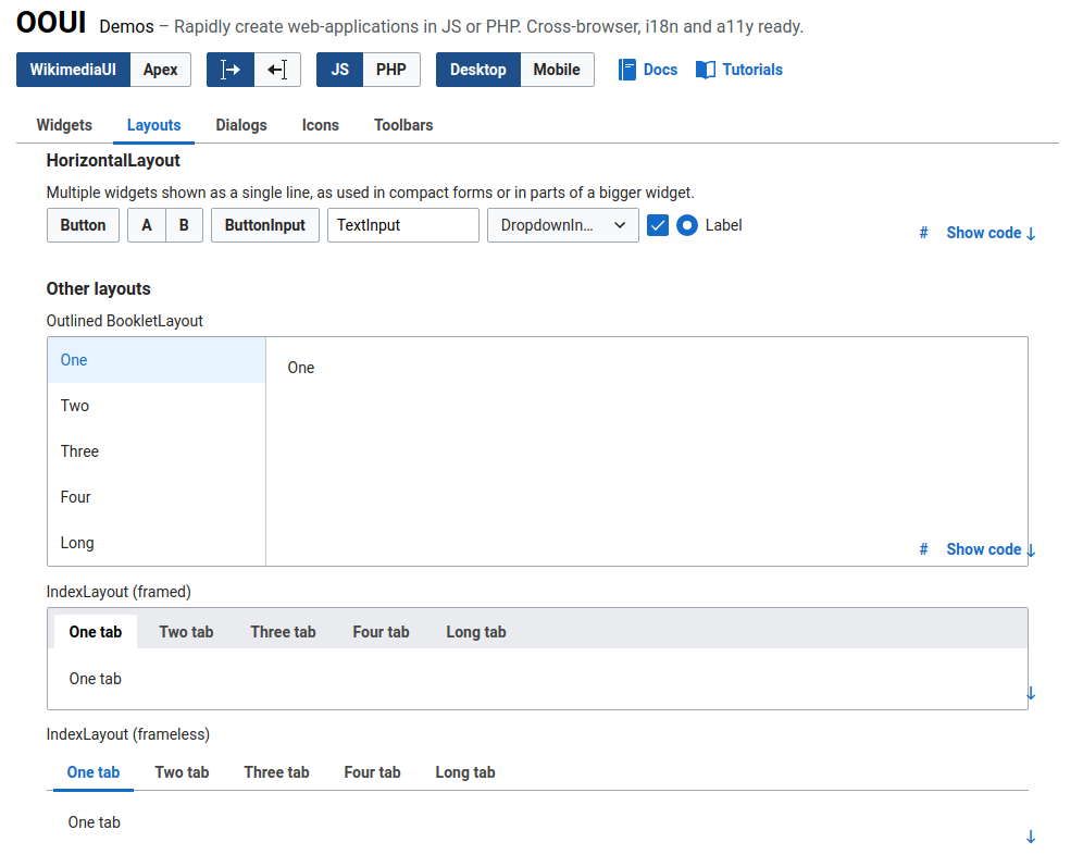
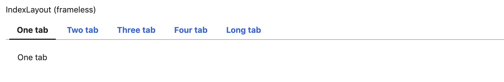
https://doc.wikimedia.org/oojs-ui/master/demos/?page=widgets&theme=wikimediaui&direction=ltr&platform=desktop#widgets-mediawiki-vector-ltr
How so?
There are also plenty of other clickable elements in the UI library that only reveal their interactivity on hover, e.g. SelectWidget options. The familiarity of material design may also be something to do this.
think putting progressive blue on simple tab navigation actions is more confusing, especially as it used sparingly elsewhere.
How is an accent color that stands for interaction confusing to users? In comparison to the toolbars I do understand the comparison, but as we have tabs inside a longer page I don't think it's necessarily the better approach to orient on toolbars as they also feature a framing around them and framing around tools.
I think the overuse of the accent colour confuses the association between the blue colour and a progressive action, thus reducing its effectiveness when used elsewhere, for example in the link inspector it may draw attention away from the done button:

Per our design/dev conversation today, I can take a stab at a "spike" patch to enable frameless tabs and see how it works on the file page. This could happen once work related to Other Statements is out of the way (so maybe in 1-2 weeks from now). If we are happy with how this works we could push to Beta or Test Commons and get some wider user feedback.
It should be a one line patch. Of course, that assumes it works with other hacks/etc. ;-))
You can test it on live by pasting the following in the console:
$('.oo-ui-tabSelectWidget-framed').removeClass('oo-ui-tabSelectWidget-framed').addClass('oo-ui-tabSelectWidget-frameless');
Having experimented with using the frameless mode in our previously framed modes, I'm wondering if there are any cases where the framed styling is still needed. Are we just providing two equally valid styles for the user to choose from?
| "Framed" | "Frameless" |
 |  |
Everything “boxed” comes to my mind, where it's not already in a box, like Special:Preferences. There the framed version seems preferable over the frameless.
The "box" on special preferences seems contrived and superfluous to the #content area, there is literally no content oustide the box.
Also I think frameless version looks fine within boxes (as shown in the link inspector screenshots).
Special:Prefs on frameless:

The question is should we be maintaining two designs if one appears to be sufficient? Where does this lie in relation to other functionally identical widgets (e.g. framed vs frameless buttons, checkbox vs toggle)
Well, we might end up using the frameless version (see T215644#5224283) (which is a closer match to the original design anyway, IIRC)
This thread has become a little long and confusing.
AIUI: we need a decision on whether or not we can use the frameless tabs?
@PDrouin-WMF is probably in best place to provide feedback there, so re-assigning.
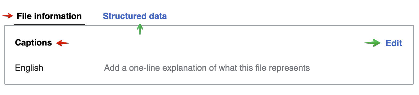
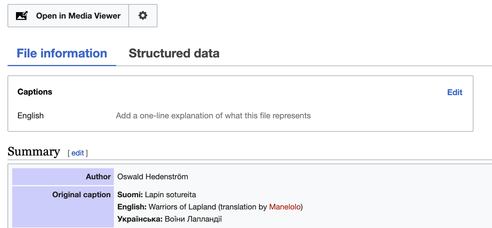
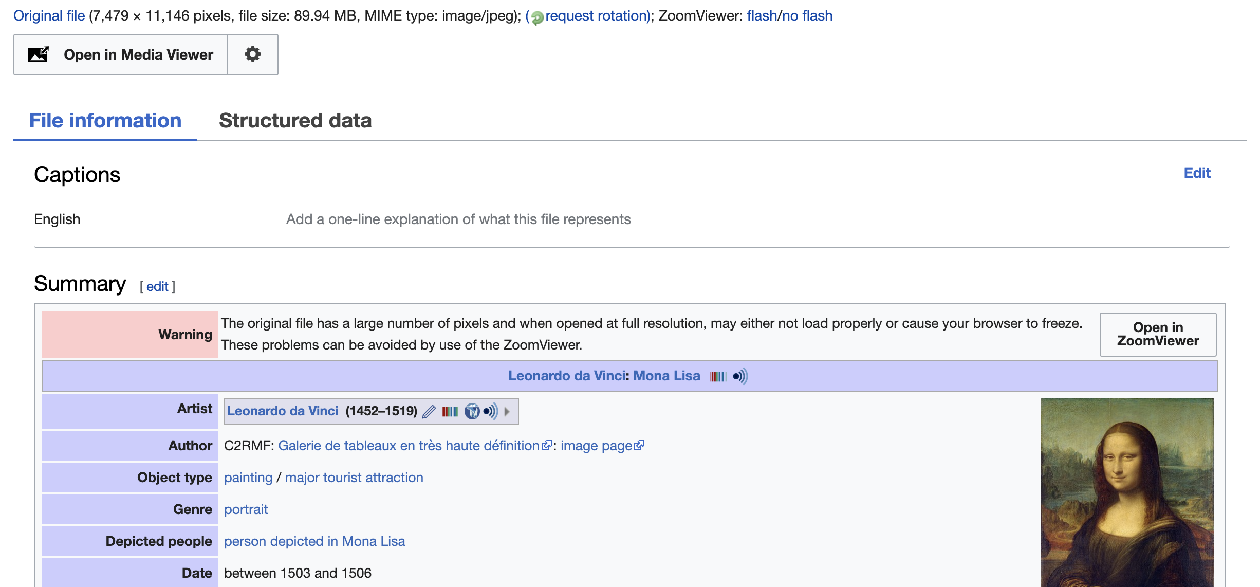
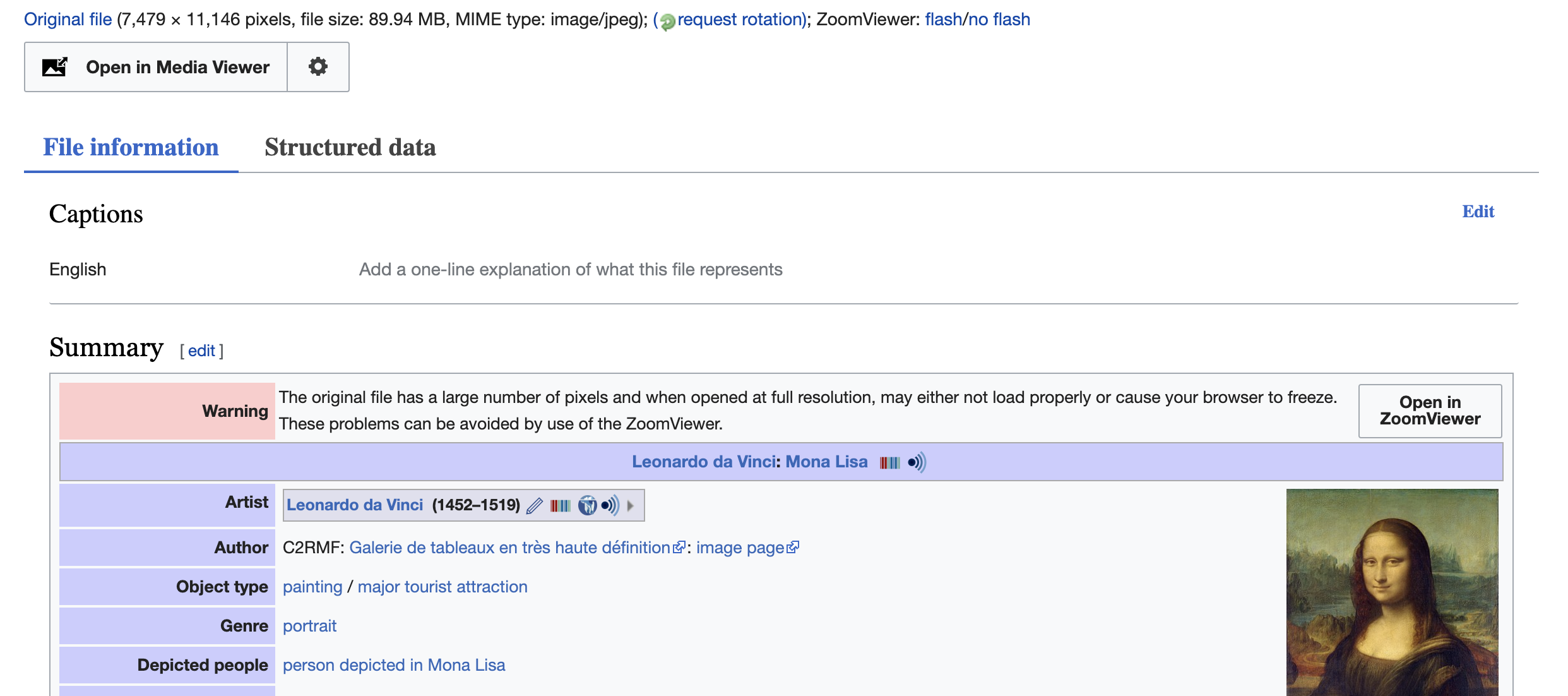
In order to test, just open up any File: page, open up the JavaScript console (option+command+J in Chrome/OSX), paste this, and hit 'return':
$('.oo-ui-tabSelectWidget-framed').removeClass('oo-ui-tabSelectWidget-framed').addClass('oo-ui-tabSelectWidget-frameless');Or here's a screenshot:
@matthiasmullie agreed that this thread has become long/confusing! While you and I are thinking about the impact of a new tab design on Commons, @Volker_E and @Esanders are wanting this to be a widget that can be used elsewhere as well.
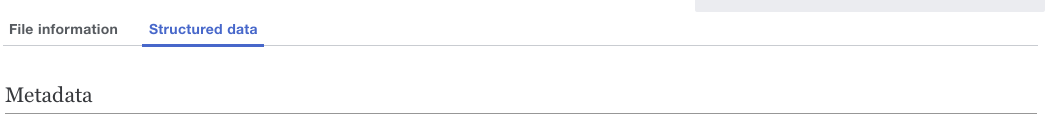
I've tested it on Commons (thanks, Matthias!!) and it works well. Based on how it appears on Commons, I do think that the tab's text size is too small. Currently on Commons, the tab text size for File information/Structured data is the same as Captions/Statements headings (14px), which is working alright but it's not idea.. I think that File information/Structured data should be the same size as Summary (H2 at 21px) to be more clear about the hierarchy of headings and the relationship between them.
What I'm not sure is whether this widget would be customizable in terms of text size and I'd love to hear whether that is possible.
@PDrouin-WMF Yes, font size adaption is very easily achievable. I would be cautious of using the same font-size like h2 though, as sans-serif appears much bigger than serif and is out of place IMO.
Here's with 21px equivalent:
@PDrouin-WMF and myself were discussing forthcoming on this discussion.
In a quick write-up we came up with these two mockups
| sans-serif | serif |
 |  |
Restructuring/refining the layout to make hierarchy clearer to the user by
Closing this as the SD team is comfortable with our current solution and doesn't have time in the near future to revisit. Design system questions around tabs or design updates to this specific feature deserve a new focused ticket as we attempt to clean up the SD teams backlog.