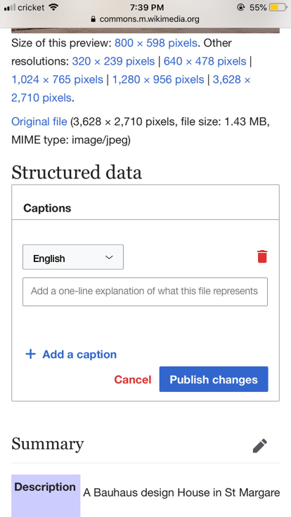
Current Behavior:
- Trash can is placed in line after captions input
Expected Behavior:
- On smaller screen, move trash can to be inline after the language dropdown (just like Upload Wizard). This allows more space for the captions input.

| • PDrouin-WMF | |
| Feb 11 2019, 4:37 PM |
| F28471803: Screen Shot 2019-03-26 at 9.44.12 AM.png | |
| Mar 26 2019, 2:48 PM |
| F28159142: Image-1.jpg | |
| Feb 11 2019, 4:37 PM |
| F28159647: recommended.png | |
| Feb 11 2019, 4:37 PM |
Current Behavior:
Expected Behavior:
Hey! Several of these changes we got for free with the recent CSS design refactor. That work will be visible on mobile production once any of T216773, T216772, or T218707 moves to the verify column.
I suggest at that point revisiting this ticket -- we may be able to close.
Example of new responsiveness from my local dev:
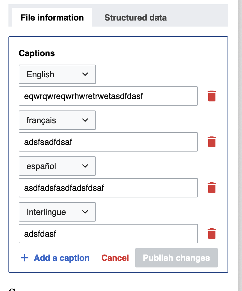
The improvements are wonderful, but I would still like to see the trashcans above the input lines, that way the input field is lengthened a little more. (Input field should align right with the right of the "publish changes" button).
Sounds good!
So remaining work is to adjust the trash can. I've updated the description to reflect this.