Page MenuHomePhabricator

Homepage: design for indicating that the user should check back for pageviews
Closed, ResolvedPublic

Description

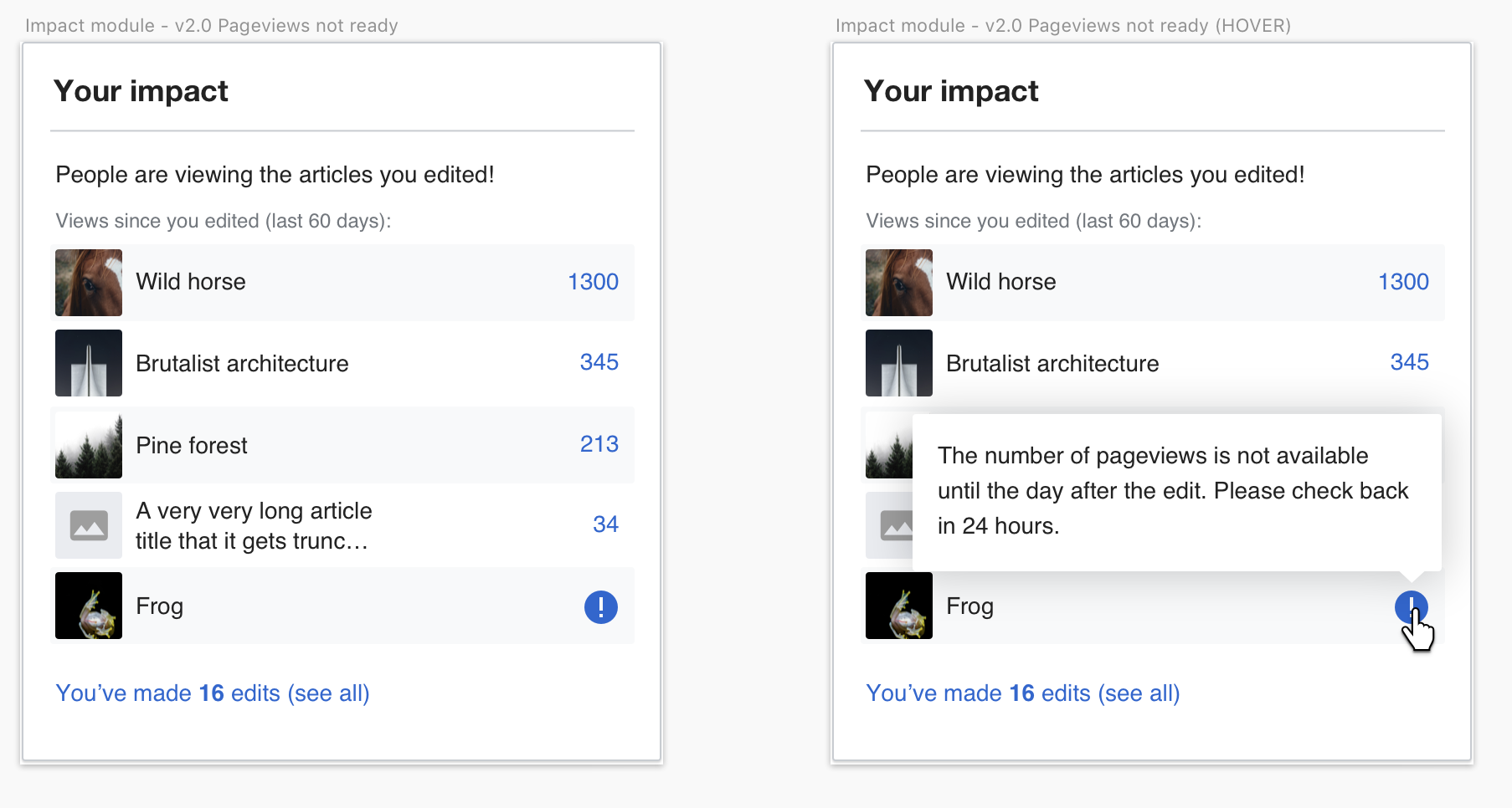
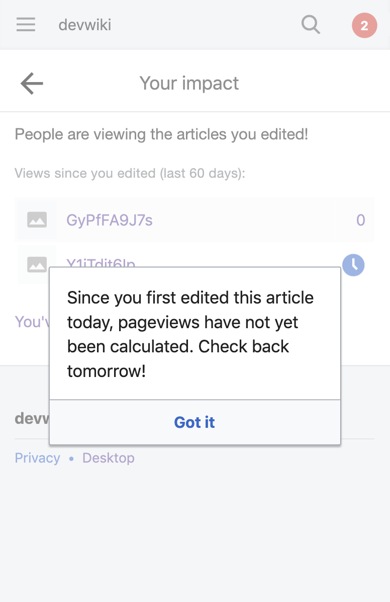
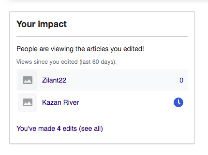
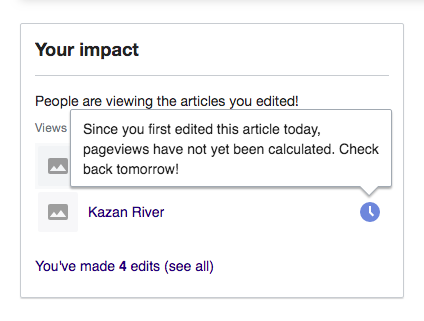
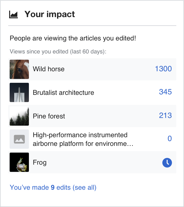
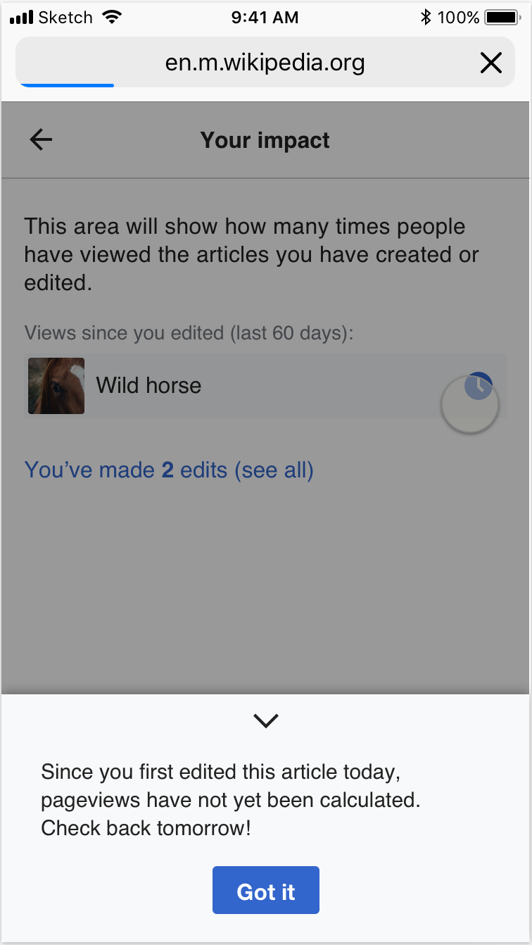
In the impact module, we want to list pages the user has recently edited along with the number of views that page has gotten since the user first edited it. Pageview numbers are not available until the day after the edit (e.g. if an edit is made Monday, then Monday's data is available Tuesday.)

Because of that delay, we want to change the design for when an article has no views.

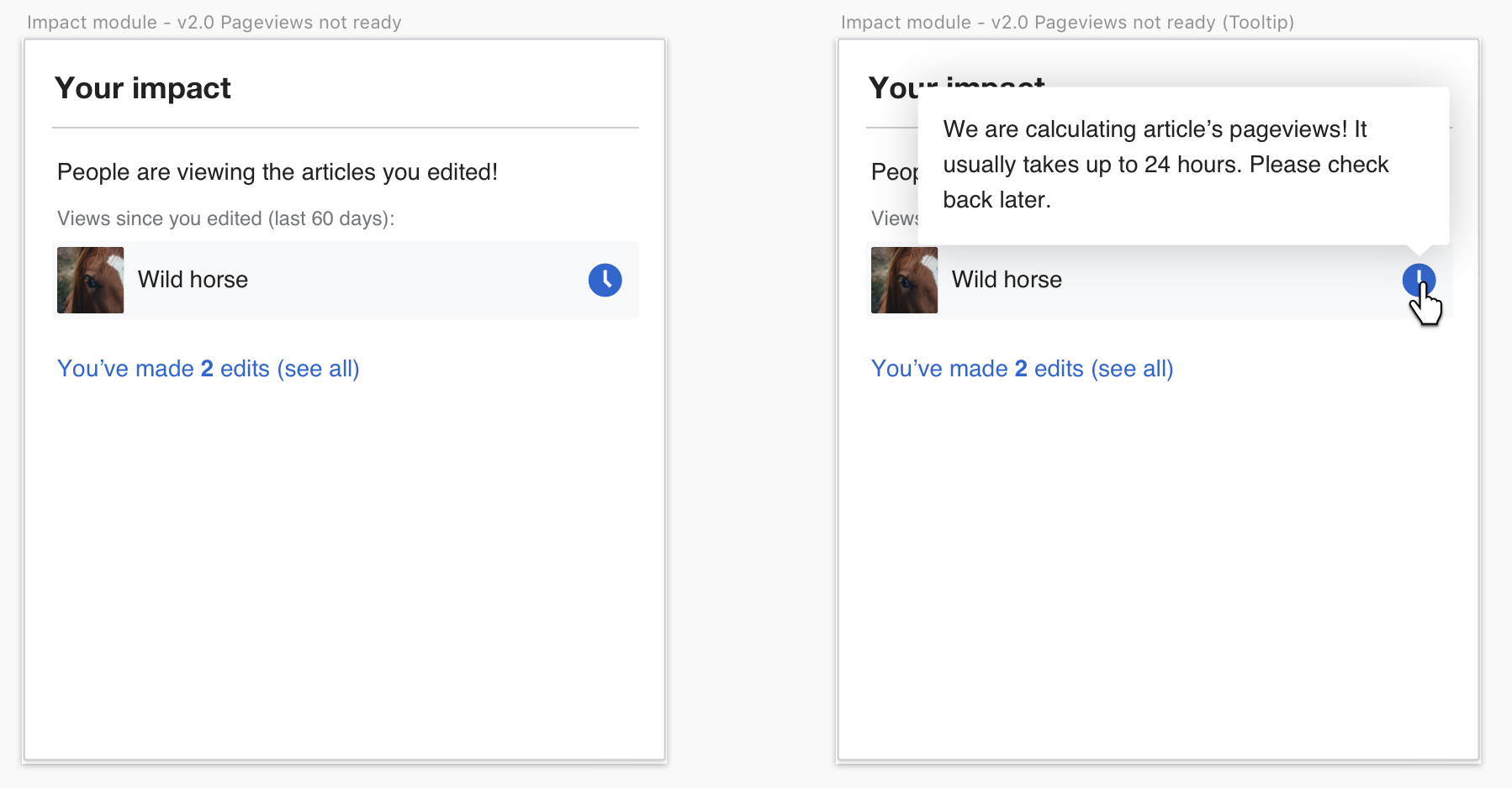
Here is the updated design proposal, a clock icon will be shown instead of the notice icon:

Screenshot 2019-05-16 17.54.59.png (938×1 px, 172 KB)

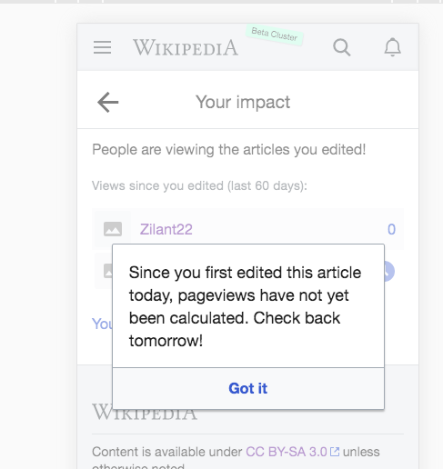
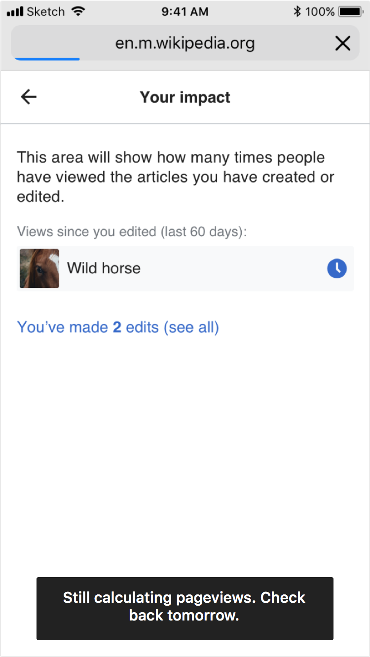
And here is how it would work on mobile:
Screenshot 2019-06-12 09.36.07.png (1×760 px, 127 KB)

Specifications:

  • icon color is same progressive blue color as link color
  • Desktop -- hovering on it will open a popup (same style as page preview popup), clicking on it wouldn't have any action.
  • Mobile - fullscreen version
    • tapping on it will trigger a toast. This tap should be recorded as a click (to be included in T222836).
    • Popup copy reads: "Pageviews have not yet been calculated. Check back tomorrow!"

Event Timeline

There are a very large number of changes, so older changes are hidden. Show Older Changes

An idea I got from a community member today: what about a message "Page views data isn't available now, it should be available within 24 hours" on hovering of the null pageviews rows? What do you think, @Cntlsn and @MMiller_WMF?

Hey @Urbanecm, thanks for your suggestion, it would definitely do the job!
I was also thinking about adding a more visual aspect to it (since tooltips don't work on mobile). I will keep you posted!

Thanks @Urbanecm. @Etonkovidova also suggested a tooltip on T222405.

@Cntlsn -- do you think we should go ahead and just add a tooltip now, and then improve it further later? Or do you almost have a design for the best way to do this?

If we decide to just add a tooltip now, I think the tooltip text would be: "Check back tomorrow for view count".

@MMiller_WMF I would definitely add a tooltip. But I won't close the task, as at least the mobile version would need some other kind of treatment

@MMiller_WMF
Here is my design proposal, while pageviews are not ready a mild notice icon will be shown. It will have the same color as number links, so that the user would be "invited" to hover/click on it.
On Desktop -- hovering on it will open a popup (same style as page preview popup), clicking on it wouldn't have any action.
On Mobile -- tapping on it will open a popup (same style as page preview popup)

Screenshot 2019-05-08 15.30.25.png (966×1 px, 223 KB)

Happy to hear your feedback.

@MMiller_WMF
Here is the updated design proposal, a clock icon will be shown instead of the notice icon.

Screenshot 2019-05-16 17.54.59.png (938×1 px, 172 KB)

Reason for the change:

  • the notice icon could have been misled for an error icon
  • the clock icon convey a clearer meaning, intuitively related to time

Specifications:

  • same blue color as link color
  • On Desktop -- hovering on it will open a popup (same style as page preview popup), clicking on it wouldn't have any action.
  • On Mobile -- tapping on it will open a popup (same style as page preview popup)
  • popup copy reads: "We are calculating article’s pageviews! It usually takes up to 24 hours. Please check back later."

Wording notes:

  • I'm not sure about the copy because I don't exactly understand how it works; task description says "if an edit is made Monday, then Monday's data is available Tuesday", would that mean that if I make an edit at 11:50pm on Monday then the pageviews would be available ten minutes later?
  • I'm not sure about the copy "People are viewing the articles you edited!", what if the pageviews count is 0?

@Cntlsn -- I put your specifications in the task description and updated the copy. Regarding your question about the copy "People are viewing the articles you edited!", I think the answer to that should come from our work to make the impact module clearer to the user in general. I actually don't see a task for that -- is there one?

This task is now ready for development.

@MMiller_WMF

I put your specifications in the task description and updated the copy.

Mockups are up-to-date with latest copy in both InVision and Zeplin

Regarding your question about the copy "People are viewing the articles you edited!", I think the answer to that should come from our work to make the impact module clearer to the user in general. I actually don't see a task for that -- is there one?

That specific copy was not part of the impact module re-design, as it hasn't been pointed out during user test. The design work on the impact module was focusing on its unactivated state: T223221, T223219

Shall we create a new task?
I think it would make sense to solve it in the context of this task.
For instance that copy can have two states:

  • Calculating pageviews / no pageviews -- "This area will show the number of pageviews of articles you have edited."
  • Edited article has Pageviews -- "People are viewing the articles you edited!"

@Cntlsn -- I ticketed the issue of when there aren't pageview numbers yet here (T224526) so that the rest of the issue can be unblocked and developed on.

I think the only thing that's missing is what popup should look like when the user taps the icon in mobile. Could you please add that?

On Desktop -- hovering on it will open a popup (same style as page preview popup), clicking on it wouldn't have any action. Question for engineers: is it easy to instrument this hover?

Yes, no problem with instrumenting that hover.

On Desktop -- hovering on it will open a popup (same style as page preview popup), clicking on it wouldn't have any action. Question for engineers: is it easy to instrument this hover?

Yes, no problem with instrumenting that hover.

@nettrom_WMF, @MMiller_WMF any thoughts about where you want to see the event logging data for opening and closing that tooltip? I was thinking we could stuff it as new actions in HomepageModule. Something like open-nopageviews-tooltip and close-nopageviews-tooltip (or anything else you would prefer). The mobile flag would tell us if the open/close are caused by taps (mobile) or hover (desktop).

Change 514570 had a related patch set uploaded (by Sbisson; owner: Sbisson):
[mediawiki/extensions/GrowthExperiments@master] [wip] Impact: show an icon with tooltips when pageviews is not available

https://gerrit.wikimedia.org/r/514570

@nettrom_WMF -- you can make the call on @SBisson's question of where to put the tooltip interactions.

@nettrom_WMF, @MMiller_WMF any thoughts about where you want to see the event logging data for opening and closing that tooltip? I was thinking we could stuff it as new actions in HomepageModule. Something like open-nopageviews-tooltip and close-nopageviews-tooltip (or anything else you would prefer). The mobile flag would tell us if the open/close are caused by taps (mobile) or hover (desktop).

I think having them as specific actions in HomepageModule makes good sense, great suggestion! Because the behaviour is different between desktop and mobile, I think it will be good to have the action field capture this action and letting us use the is_mobile field to distinguish between desktop and mobile. Tried to see if I could come up with any other suggestions, but I couldn't find anything as elegant as this one.

@SBisson I have added mobile mockups to the task description

On Mobile -- tapping on it will open a popup (same style as page preview popup).

@Cntlsn Did you see that popup in use anywhere so I can look how it's done? I don't know how to trigger page previews on mobile since tapping a link actually navigates to the page.

I think I actually saw something similar in a mockup by @alexhollender. Looping him in so maybe he can tell us if that's actually something already released for mobile.
This is the mockup we're talking about https://phab.wmfusercontent.org/file/data/prox6tif35umw45lnrg4/PHID-FILE-rqv66vibc5iisldmte2g/Screenshot_2019-06-06_19.34.27.png

I can use a standard OOUI alert. This is what it looks like with a tiny bit of configuration.

Screen Shot 2019-06-06 at 2.52.05 PM.png (1×776 px, 112 KB)

To further tweak the style, I think I would have to rebuild it based on a OOUI simple dialog.

Let me know if you think this is acceptable.

Change 514570 merged by jenkins-bot:
[mediawiki/extensions/GrowthExperiments@master] Impact: show an icon with tooltips when pageviews is not available

https://gerrit.wikimedia.org/r/514570

Checked in betalabs
Desktop:

Screen Shot 2019-06-07 at 7.24.12 PM.png (321×430 px, 29 KB)
Screen Shot 2019-06-07 at 7.25.28 PM.png (321×424 px, 34 KB)

Mobile:

Screen Shot 2019-06-07 at 7.26.56 PM.png (516×487 px, 56 KB)

This should go to @Cntlsn for review before going to PM Review. @Cntlsn -- the only thing I see that's weird is that the clock icon is so much bigger than the number. Do you think that's weird?

Thanks @MMiller_WMF
Sizes are actually correct.

I agree that the 20x20 pixels icon makes the numbers fade a bit into the background.
A bigger font-size would definitely make numbers stand out more but we would need to consider the consequences on the way we display bigger numbers (abbreviations etc...)

Example with 16px font-size

Screenshot 2019-06-10 13.45.21.png (860×764 px, 129 KB)

Example with 20px font-size

Screenshot 2019-06-10 13.54.25.png (864×768 px, 131 KB)

@Cntlsn -- please go ahead and make a decision about the number sizes. I am fine with whichever way you decide. Also, this task is in your column for Design Review. So if you find any other issues, you can record them on this task and put the task into In Progress. If not, you can move it to "Needs PM Review".

@Cntlsn my apologies for the late feedback here. Nirzar pointed out to me that we generally use toast messages instead of dialogs on mobile, e.g.

IMG_2768.PNG (1×750 px, 160 KB)

There is also this dialog-like drawer, though it seems like the toast message is more appropriate here.

IMG_2769.PNG (1×750 px, 134 KB)

Thanks @MMiller_WMF and @alexhollender for your input on this.

Font-size: I will file this in a separate task

Mobile popup:
Below is a version of the toast message for the "Calculating pageviews" message.

Screenshot 2019-06-11 14.53.09.png (1×758 px, 136 KB)

I think it might have some readability issues, as it's quite some text with center alignment.

The drawer version looks more readable to me

Screenshot 2019-06-11 15.40.22.png (1×756 px, 136 KB)

But happy to move forward with the most appropriate version.

@MMiller_WMF @SBisson
As pointed out by @Etonkovidova at https://phabricator.wikimedia.org/T224526#5249110, it can feel confusing to show the number 0 in the impact module preview while the system is calculating user's first edit pageviews.

We could improve the experience by also adding the clock icon to the impact module preview, but I would need to double check on the feasibility of the business rule to show/hide the icon:

  • if the user has made their first edit (or a series of edits in their first day), while the system is calculating pageviews we show the clock icon in the module preview in the same place as the number of total pageviews
  • since the clock might refer to more than one edit, the copy will read: "Since you first edited, pageviews have not yet been calculated. Check back tomorrow!"
  • as soon as the edit pageviews (or the pageviews of one of the edits made during their first day) have been calculated, and also when they count 0, the clock in the module preview will be replaced by the current number of pageviews.
  • since the number of pageviews in the module preview will be total progressive count of pageviews of all article edits made by the user, the clock won't be shown in the module preview when a new article, with relative clock icon, is added to the list in the module.

Mockup for the clock icon in the impact module preview

Screenshot 2019-06-11 14.58.55.png (1×522 px, 165 KB)

@Cntlsn I wonder if a shorter message would work?

image.png (1×750 px, 151 KB)

In T216220#5249736, @alexhollender wrote:

@Cntlsn I wonder if a shorter message would work?

image.png (1×750 px, 151 KB)

@alexhollender
Looks great to me, thanks!

Assigning to @MMiller_WMF for review

Thanks @Cntlsn and @alexhollender. Let's leave the scope of this ticket to be about the work that was specified on it so far. We can replace the "0" in the preview with the clock icon after discussion in this new task I created: T225560

If the toast is more adherent to our design standards than the dialog, then I agree we should change to that (sorry about the changing specification here, @SBisson). The text should be: "Pageviews have not yet been calculated. Check back tomorrow!"

I am about to update the task description. This is back in "In Progress".

MMiller_WMF updated the task description. (Show Details)

If the toast is more adherent to our design standards than the dialog, then I agree we should change to that (sorry about the changing specification here, @SBisson). The text should be: "Pageviews have not yet been calculated. Check back tomorrow!"

Mobile toasts can be closed by tapping on them. They can also auto-close after a delay. The two standard delays are "short" (5 seconds) and "long" (30 seconds). Note: if we allow auto-close, they can always be closed by tapping, we can't turn that off. @Cntlsn, @MMiller_WMF let me know how you want it to behave.

Question for @nettrom_WMF, if it is decided that we let them auto-close, do we want to distinguish close vs. auto-close in the HomepageModule schema? If so, do you prefer auto-close as a new action or the close action with auto=true|false in the action_data field.

Change 516776 had a related patch set uploaded (by Sbisson; owner: Sbisson):
[mediawiki/extensions/GrowthExperiments@master] [WIP] Use mobile toast for nopageviews popup

https://gerrit.wikimedia.org/r/516776

@SBisson

Mobile toasts can be closed by tapping on them. They can also auto-close after a delay. The two standard delays are "short" (5 seconds) and "long" (30 seconds). Note: if we allow auto-close, they can always be closed by tapping, we can't turn that off. @Cntlsn, @MMiller_WMF let me know how you want it to behave.

Considering that toast messages on mobile don't look extremely captivating, I would make our toast dismissible only by tapping on it, so that we make it more likely that the user would actually see it.
Talking about the fact that it could be annoying to always have to tap on a toast to dismiss it, I imagine that probably a user would only make it display once, as the content in it is basically informative and won't convey more information over time.

@SBisson @kostajh -- please hold off on this task until we hear more from @Cntlsn, who is talking about it with some other designers.

@SBisson @kostajh -- please hold off on this task until we hear more from @Cntlsn, who is talking about it with some other designers.

Should we move ahead with the shorter text ("Pageviews have not yet been calculated. Check back tomorrow!") or that should wait too?

@SBisson -- that should wait, too. If we stick with the dialog (instead of the toast), we'll want the longer text.

Thought I'd respond to this and make it actionable in case this moves forward:

Question for @nettrom_WMF, if it is decided that we let them auto-close, do we want to distinguish close vs. auto-close in the HomepageModule schema? If so, do you prefer auto-close as a new action or the close action with auto=true|false in the action_data field.

I'd prefer the second option, having them both use the close action and have auto=true|false in the action_data field. We don't have specific questions about this interaction, and I don't see a need to add any. If we implement this interface and start being concerned about users dismissing it quickly, then we have data to answer that question, but before then we'll most likely be focused on how users interact with the other parts of the module.

Change 517122 had a related patch set uploaded (by Sbisson; owner: Sbisson):
[mediawiki/extensions/GrowthExperiments@master] Adding short version of the Impact 'nopageviews' tooltip

https://gerrit.wikimedia.org/r/517122

Change 517122 merged by jenkins-bot:
[mediawiki/extensions/GrowthExperiments@master] Adding short version of the Impact 'nopageviews' tooltip

https://gerrit.wikimedia.org/r/517122

@SBisson @kostajh -- I see this working as desired in Test Wiki on both desktop and mobile. Is this still "In Progress"? Or have we kept it here because we still have open questions on whether it will be a dialog or a toast on mobile?

Is this still "In Progress"? Or have we kept it here because we still have open questions on whether it will be a dialog or a toast on mobile?

Exactly. Do we have a final decision on this? If not we can make a separate task and send it to be backlog.

@MMiller_WMF @SBisson I think two days ago we decided to keep the dialog that was already implemented for mobile, and then eventually iterate when we clarify the desired messages design for mobile, am I missing anything?

Okay, cool. For simplicity's sake, I'll move this to Needs PM Review, and we'll make a new task if we need to switch to toasts.

Change 516776 abandoned by Sbisson:
[WIP] Use mobile toast for nopageviews popup

Reason:
We'll keep the popup on mobile for now.

https://gerrit.wikimedia.org/r/516776

This looks good to me in production. Bug filed separately in T226147.