Page MenuHomePhabricator

Explore new ways to display content instead of showing placeholder images
Closed, ResolvedPublic3 Estimated Story Points

Assigned To
Authored By
scblr
Mar 13 2019, 12:19 PM
Referenced Files
F29639566: Screenshot_20190625-100542.png
Jun 25 2019, 8:17 AM
F29639573: Screenshot_20190625-100700.png
Jun 25 2019, 8:17 AM
F29536523: Screenshot 2019-06-14 at 14.50.57.png
Jun 14 2019, 1:08 PM
F29536557: Screenshot 2019-06-14 at 14.48.22.png
Jun 14 2019, 1:08 PM
F29536450: Screenshot 2019-06-14 at 14.47.15.png
Jun 14 2019, 1:08 PM
F29536472: Screenshot 2019-06-14 at 14.50.01.png
Jun 14 2019, 1:08 PM
F29535754: Screenshot 2019-06-14 at 14.29.18.png
Jun 14 2019, 1:08 PM
F29536435: Screenshot 2019-06-14 at 14.49.06.png
Jun 14 2019, 1:08 PM
Tokens
"Baby Tequila" token, awarded by cmadeo.

Description

Why are we doing this?

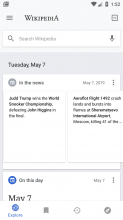
Scrolling through the explore feed made me realize that that there are placeholder images all over the place. I suggest to review all instances of where placeholders are used and think about better ways to present content. Placeholder images leave the impression of an unfinished product and that a lot of content is missing. On iOS, placeholder images are mostly avoided by left-aligning text and spanning it to full-width when there’s no image available.

This task is about listing all places in the app where placeholder images are used and explore possible ways to avoid showing them.

Here’s a random screenshot from today that illustrates the issue:

Suggested solution

I reviewed different parts in the app, here are design suggestions that address most of issues with placeholders. Displaying images on the right in LTR, respectively on the left in RTL, stands at the core of the suggestions.

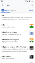
Search

OriginalRedesign
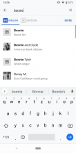
01-search-original.png (1×824 px, 238 KB)
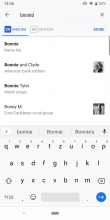
02-search-redesign.png (1×824 px, 236 KB)

Explore feed

Trending
OriginalRedesignLong press an item
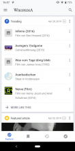
01-trending-original.png (1×824 px, 334 KB)
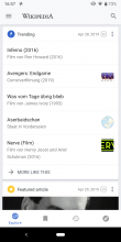
02-trending-redesign.png (1×824 px, 328 KB)
03-trending-redesign-long-press.png (1×824 px, 338 KB)
On this day
OriginalRedesign
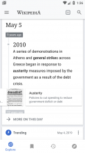
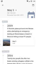
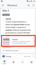
01-on-this-day-original.png (1×824 px, 440 KB)
02-on-this-day-redesign.png (1×824 px, 442 KB)
In the news
OriginalRedesign
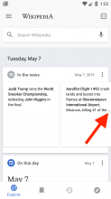
01-in-the-news-original.png (1×824 px, 406 KB)
02-in-the-news-redesign.png (1×824 px, 420 KB)

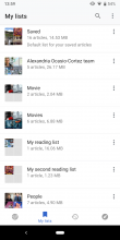
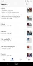
My lists

OriginalRedesignLong press an item
01-my-lists-original.png (1×824 px, 414 KB)
02-my-lists-redesign.png (1×824 px, 408 KB)
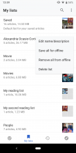
03-my-lists-redesign-long-press.png (1×824 px, 373 KB)
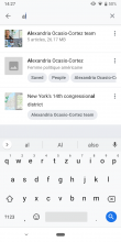
My lists search
OriginalRedesignLong press list itemLong press article item
01-my-lists-search-original.png (1×824 px, 322 KB)
02-my-lists-search-redesign.png (1×824 px, 316 KB)
03-my-lists-search-redesign-longpress-list.png (1×824 px, 303 KB)
04-my-lists-search-redesign-longpress-article.png (1×824 px, 280 KB)
My lists detail page
OriginalRedesignLong press an itemSelecting items
01-my-lists-details-original.png (1×824 px, 708 KB)
02-my-lists-details-redesign.png (1×824 px, 701 KB)
03-my-lists-details-redesign-longpress.png (1×824 px, 534 KB)
04-my-lists-details-redesign-select.png (1×824 px, 454 KB)

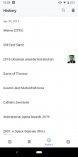
History

OriginalRedesign
01-history-original.png (1×824 px, 201 KB)
02-history-redesign.png (1×824 px, 192 KB)

Article (loading)

OriginalRedesign
01-article-original.png (1×824 px, 391 KB)
02-article-redesign.png (1×824 px, 80 KB)

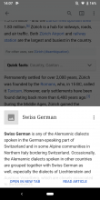
Link preview

OriginalRedesign
01-link-preview-original.png (1×824 px, 325 KB)
02-link-preview-redesign.png (1×824 px, 324 KB)

Event Timeline

Dbrant set the point value for this task to 3.Apr 30 2019, 4:28 PM

FYI @Sharvaniharan, I added the article’s loading state without a placeholder to the card’s description:

Article (loading)

OriginalRedesign
01-article-original.png (1×824 px, 391 KB)
02-article-redesign.png (1×824 px, 80 KB)

Hi @schoenbaechler

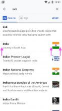
After code change for search:

I have assumed some margins and paddings as I moved the image right. Just wanted a pre-review as I go

search.png (1×720 px, 103 KB)

Hey @Sharvaniharan, thanks for checking back! Looks like you nailed the margins 👏. It’s 16dp left, right and between text and image, right? (see image)

search-1 copy.png (1×720 px, 141 KB)

In T218201#5166478, @schoenbaechler wrote:

Hey @Sharvaniharan, thanks for checking back! Looks like you nailed the margins 👏. It’s 16dp left, right and between text and image, right? (see image)

Yes yes yes!!! whoo hoo! Thanks @schoenbaechler

Point to note... when there is no image for the news card item, that is all the text we can show... 😖 Of course in the example I had to artificially remove the image to show how it would look... but in reality i assume all of the news items not having an image is very borderline..

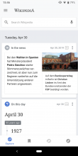
@Sharvaniharan, thanks! I noticed the three dots in “In the news”:

news.png (1×720 px, 103 KB)

when there is no image for the news card item, that is all the text we can show

So there’s no way to show more text here? If that’s the case, we might have to consider using the same layout as for “In the news“:

onthisday.png (1×720 px, 142 KB)

Hi @Sharvaniharan, just noticed another occurrence of placeholders – Link previews:

OriginalRedesign
01-link-preview-original.png (1×824 px, 325 KB)
02-link-preview-redesign.png (1×824 px, 324 KB)

Added it to the task’s description. Sorry for not thinking about it earlier.

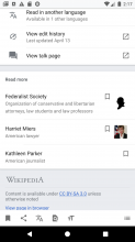
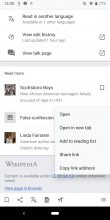
@schoenbaechler I have removed page item view is also used in page bottom content, so when I remove the placeholder image, it looks like this :

no_image.png (2×1 px, 218 KB)

Also... when there are no descriptions and images the item views are too small like this :

small.png (711×400 px, 77 KB)

Should there be a minimum height or is this good?

Do you have any suggestions to how this should look? or is it ok like this?
Thank you :-)

Great catches @Sharvaniharan!


I have removed page item view is also used in page bottom content, so when I remove the placeholder image, it looks like this:

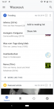
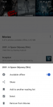
Let’s remove the bookmark icon from this component and move the image to the right. I assume that the use case of bookmarking an article only by seeing a title and description is rather low. Plus, long pressing the item still provides easy access to save the article (Add to reading list).

Screenshot_20190605-120029.png (2×1 px, 231 KB)


Also... when there are no descriptions and images the item views are too small like this :

As long as the item is at least 48px high (which I think it is on that screenshot), then it’s fine to keep the height variable.

@schoenbaechler the news item ellipsis that we discussed this morning, is the only change pending. Otherwise ready for review.

-Update : scratch that... I had updated the extract maxlines to 10 before itself. :-) so fully ready for review.

Thanks for your work on this @Sharvaniharan. I didn’t see any In the news items without an image yet but I guess it’s fine since you showed it to me the other day! However, here are some things to optimize:

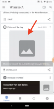
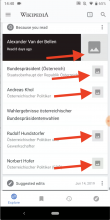
  • 01 Remove this image and replace it with a plain background-color (color-group-21):

Screenshot 2019-06-14 at 14.29.18.png (1×804 px, 635 KB)

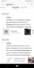
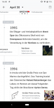
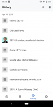
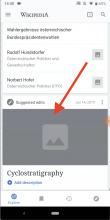
  • 02 Remove placeholder images in Explore feed (when image is not loaded) and replace it with a plain background-color (color-group-21). Please also check the dedicated In the news, On this day, Trending & History views and apply the same specs.

Screenshot 2019-06-14 at 14.47.15.png (1×798 px, 305 KB)

Screenshot 2019-06-14 at 14.49.06.png (1×802 px, 327 KB)

Screenshot 2019-06-14 at 14.50.01.png (1×802 px, 383 KB)

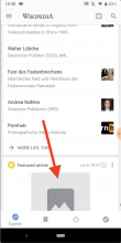
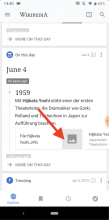
  • 03 Remove placeholder images completely and use the corresponding background-color of the element. Please also check the dedicated In the news, On this day, Trending & History views and apply the same specs.

Screenshot 2019-06-14 at 14.50.57.png (1×798 px, 330 KB)

Screenshot 2019-06-14 at 14.48.22.png (1×802 px, 405 KB)

Hi & thanks @Sharvaniharan, three things and then we’re ready for QA signoff! 🎉

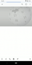
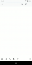
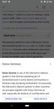
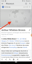
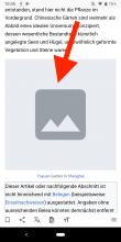
01) On article pages when images are disabled, the placeholder images are still displayed. Please remove it and replace it with a plain background-color (color-group-21):

Screenshot_20190625-100542.png (2×1 px, 234 KB)

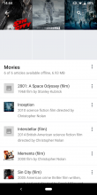
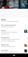
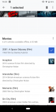
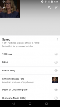
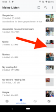
02) In “My lists”, the background color fill of the squares is different to what we defined anywhere else. Please change it to color-group-21.

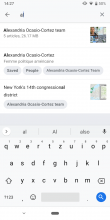
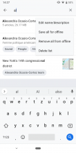
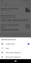
Screenshot_20190625-100700.png (2×1 px, 514 KB)

03) In “On this day”, the thumbnail image disappears at some point after scrolling to the left. Have a look at the Union Army flag in this video that disappears at the end. Can we just keep it visible until users have scrolled past it? (basically the same behavior as at the right edge of the viewport)

https://www.dropbox.com/s/esmoqv9oljvcs6g/disappearing-flag.mp4?dl=0

Thanks for discussing this today morning @schoenbaechler :-) As discussed on call, 1 and 2 will be fixed and I was able to just change background colors conditionally per theme. However, 3 is just how the recyclerview draws with clipped padding.

ABorbaWMF subscribed.

Looks good across a couple of platforms on 2.7.50282-alpha-2019-07-08