Page MenuHomePhabricator

"Next" button cut off when editing
Closed, ResolvedPublic

Assigned To
Authored By
ABorbaWMF
Mar 30 2019, 1:34 AM
Referenced Files
F28687403: Untitled.png
Apr 17 2019, 2:09 PM
F28687195: image.png
Apr 17 2019, 2:09 PM
F28600681: editing-01.png
Apr 10 2019, 9:05 AM
F28600696: reference.png
Apr 10 2019, 9:05 AM
F28600724: Screenshot_20190410-105709.png
Apr 10 2019, 9:05 AM
F28600692: template.png
Apr 10 2019, 9:05 AM
F28578391: Screenshot_20190404-151637.png
Apr 4 2019, 1:18 PM
F28578393: Screenshot_20190404-151653.png
Apr 4 2019, 1:18 PM

Description

Originally from OTRS - https://ticket.wikimedia.org/otrs/index.pl?Action=AgentTicketZoom;TicketID=11026549

Steps -

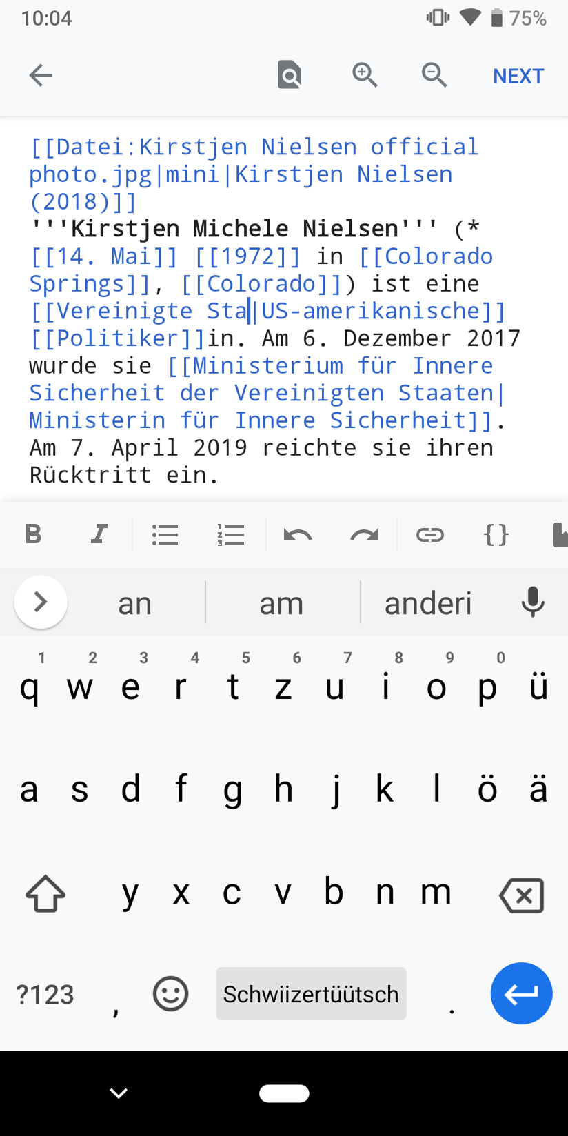
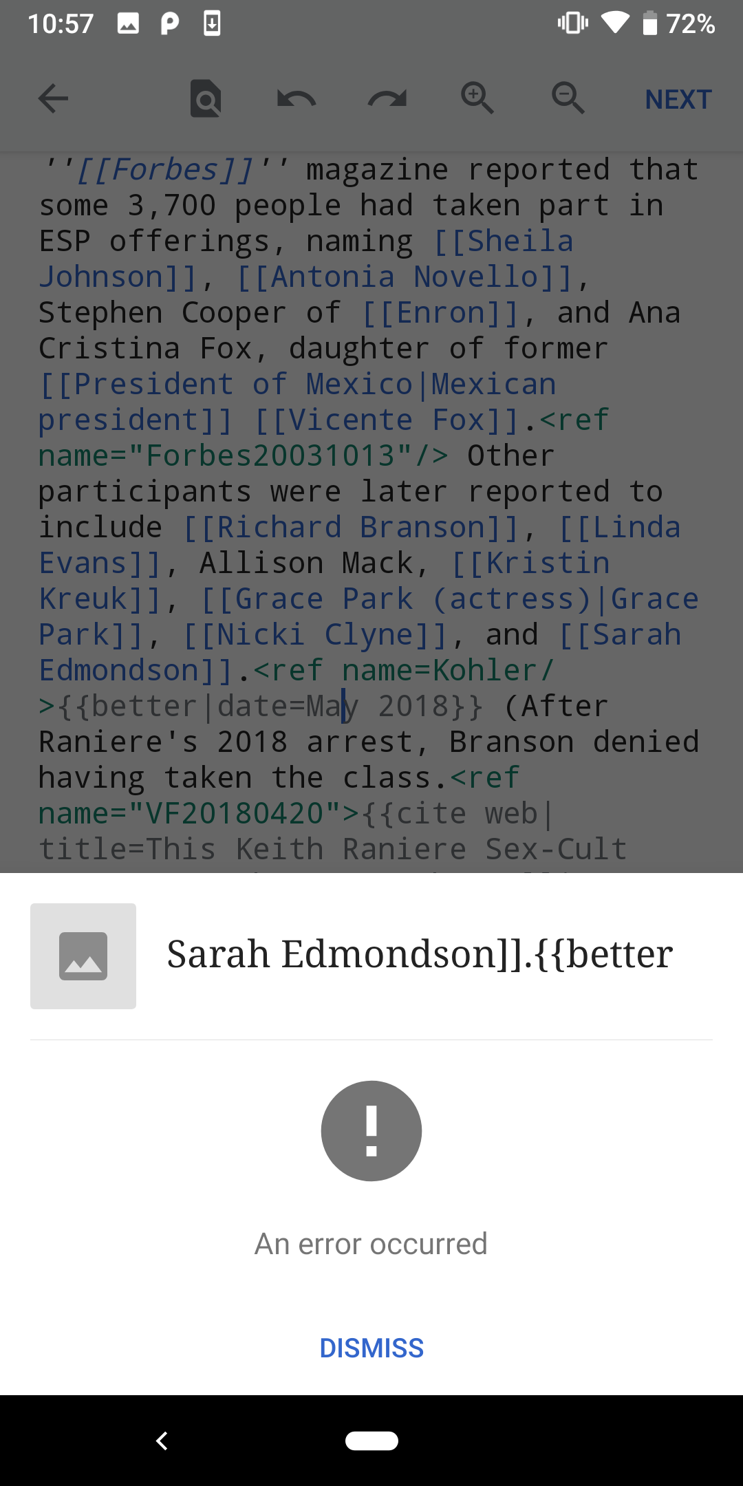
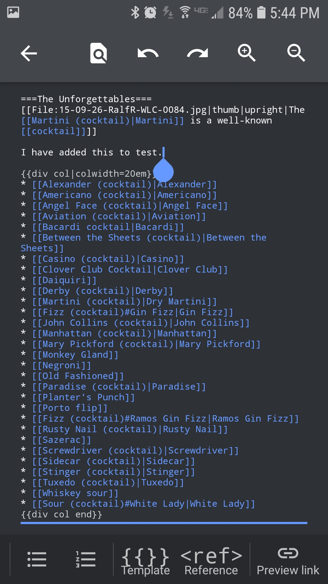
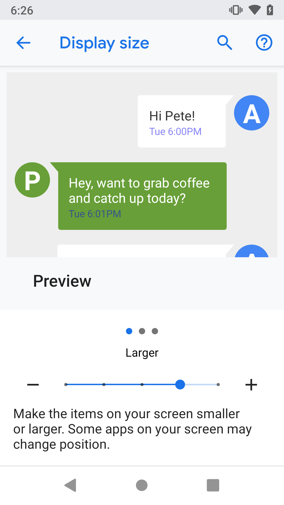
  1. Set the device display settings to larger (Settings > Accessibility > Display Size)
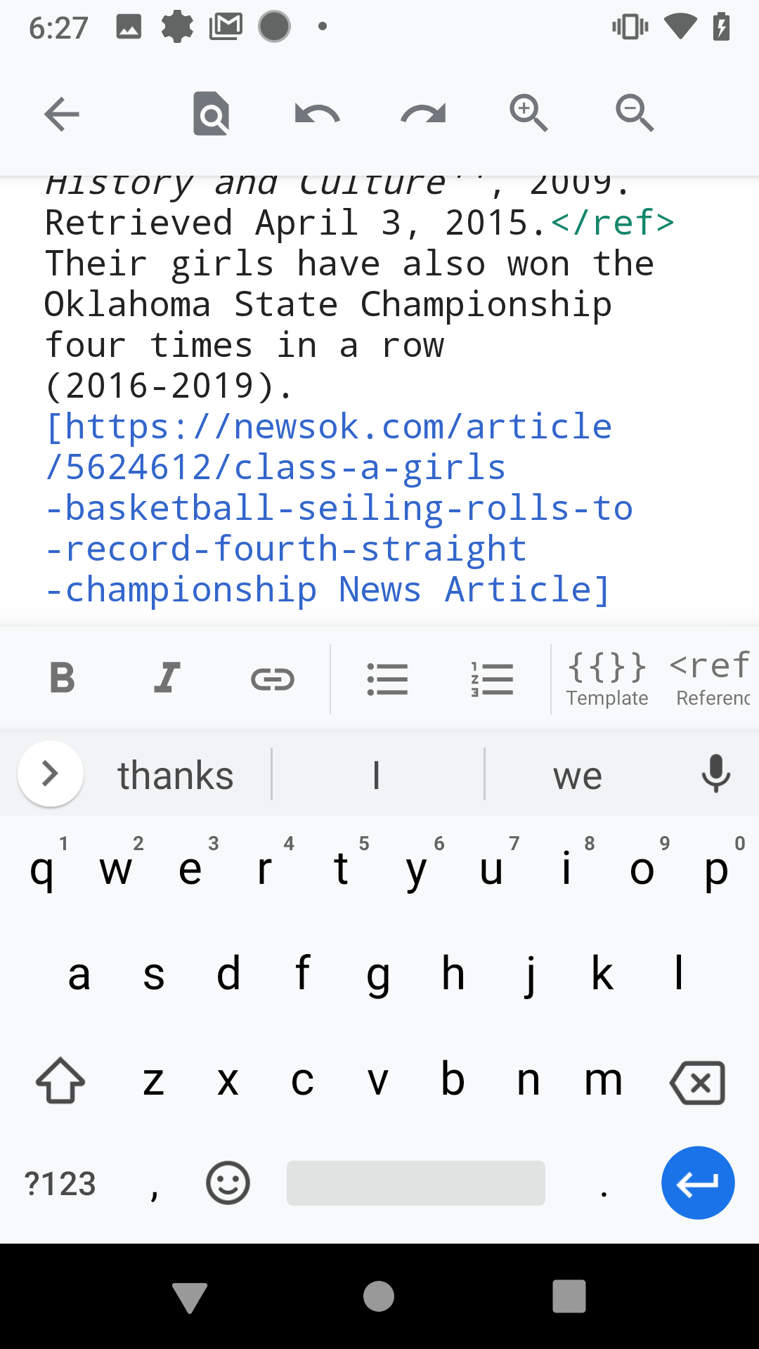
  2. Edit an article
  3. View the Next button

Expected Result
The next button is on screen

Actual Result
The next button is off screen

image.png (1×1 px, 819 KB)

image.png (1×1 px, 837 KB)

Screenshot_20190329-182610.png (1×1 px, 101 KB)

Screenshot_20190329-182730.png (1×1 px, 185 KB)

Event Timeline

Dbrant renamed this task from Setting system display size to larger (accessibility) to "Next" button cut off when editing.Mar 30 2019, 1:23 PM
Dbrant added a subscriber: Kaartic.

I suggest to replace the “Back“ with a “Done“ icon in colorAccent as soon as the textarea is active (user is editing):

default state | textarea active

Pixel 3 Copy 5.png (1×824 px, 375 KB)
Pixel 3 Copy 6.png (1×824 px, 374 KB)
imagine a keyboard ;)

How does that sound @Dbrant @Sharvaniharan or @cooltey ?

@schoenbaechler That seems a little counterintuitive. The left-most icon in the toolbar is almost always the "back" or "negative" action. I'm not sure we should break that pattern in this case.
Perhaps we could move some of the icons from the toolbar to the bottom layer of buttons?

Just a quick FYI @Dbrant, it’s a pattern borrowed from Google Docs on Android:

Screenshot_20190404-151637.png (2×1 px, 138 KB)
Screenshot_20190404-151653.png (2×1 px, 170 KB)

They add an additional floating action button which IMHO is not really needed as long as the textarea is still editable. However, definitely worth to explore some alternatives!

@Dbrant:

Had another, more detailed look at the problem. I think it would make sense to move undo/redo to the bottom layer of buttons. Why? Formatting mistakes while editing on Mobile happen quickly. Having undo/redo in reach for your thumbs makes the edit process more efficient/comfortable.

Here’s how it’s structured:

While looking at the bottom toolbar, I realized that we should use OOUI icons for Template and Reference:

template.png (192×192 px, 4 KB)
reference.png (192×192 px, 2 KB)

Related: Preview link should be set to disabled state (material_theme_border_color from theme guidelines) if not available to prevent ghost taps and this:

Screenshot_20190410-105709.png (2×1 px, 203 KB)

In T219692#5100396, @schoenbaechler wrote:

While looking at the bottom toolbar, I realized that we should use OOUI icons for Template and Reference:

template.png (192×192 px, 4 KB)
reference.png (192×192 px, 2 KB)

@schoenbaechler The first icon is the icon for "Code", not "Template". And the second icon is extremely similar to the material "bookmark" icon, and might cause confusion. Are we sure about those?
And are we sure we want to get rid of the small caption text under those buttons? It could be a useful nudge to explain the button to the user, especially if the icon will no longer be the literal syntax.

Good points, I’m not so sure about these anymore so I did a little bit of research and talked to Carolyn, since the icons I suggested derived from iOS.

The ref icon iOS is using comes from the good old Wikitext editor:

Untitled.png (454×782 px, 57 KB)

And the puzzle piece stands for template in new/old Wikitext editor, as well as VisualEditor

image.png (474×508 px, 23 KB)

But do these puzzle or bookmark icons really help users in understanding what these are for? Do they improve the current state? I don’t think so and agree with you @Dbrant So let’s keep them the way they currently are until we’ll shift our full attention to editing on Android. How does that sound?

Looks good to me on 2.7.280-beta-2019-05-01

I tested the larger and largest sizes and the next button is present.