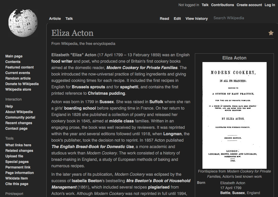
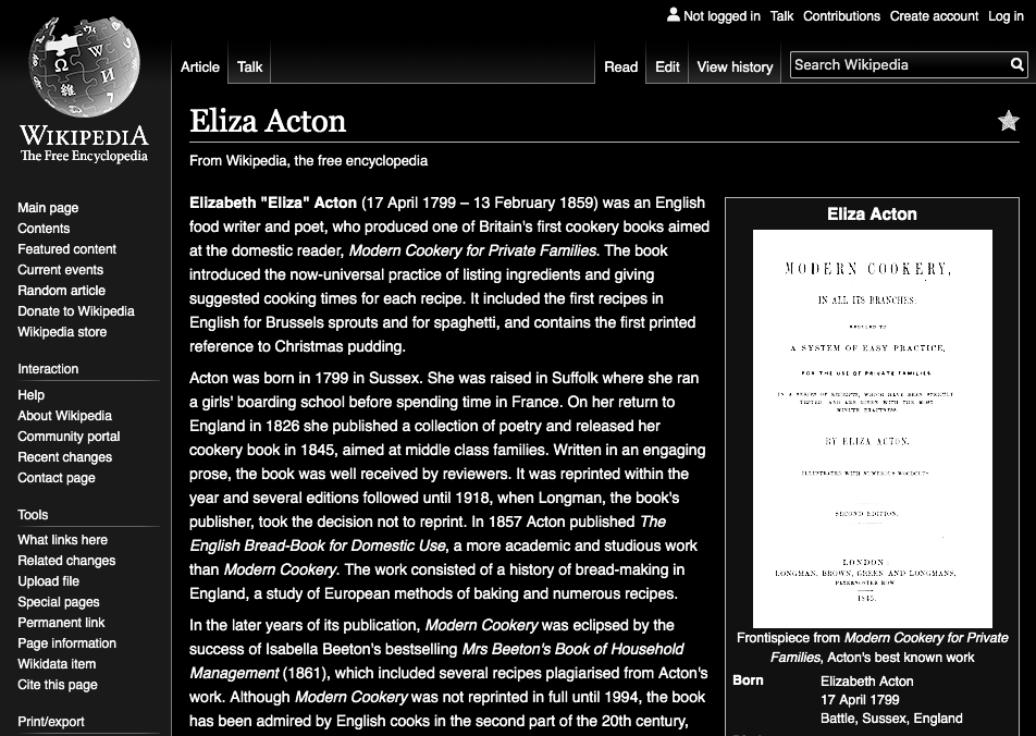
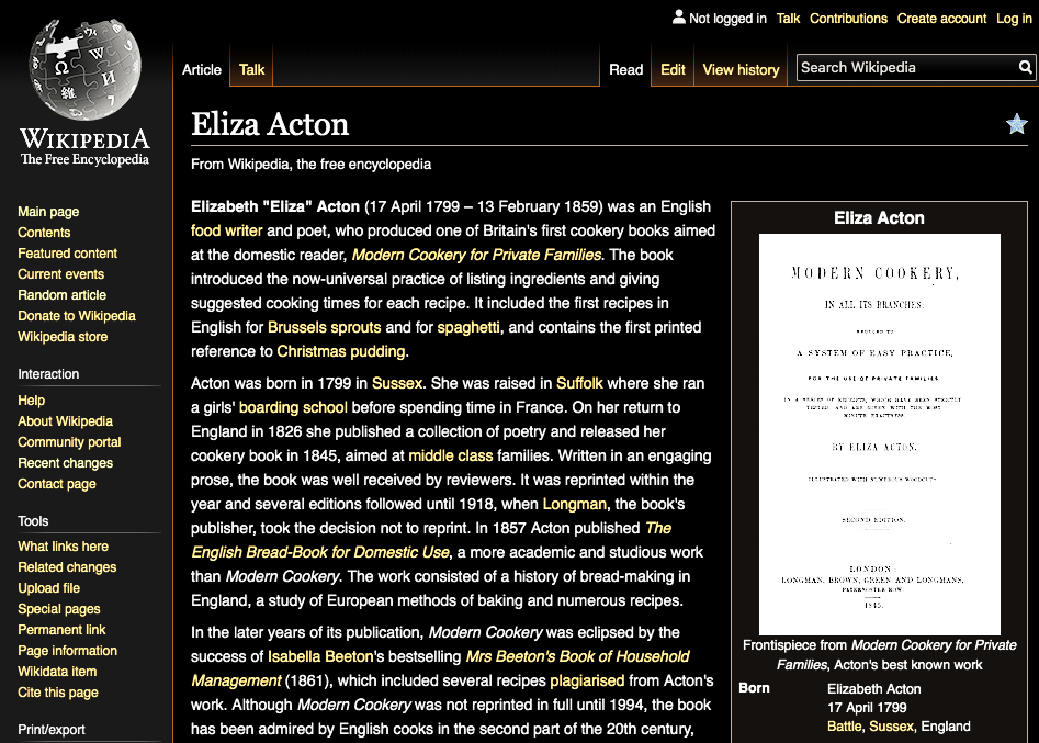
There are various ways to implement a Night Mode scheme on the wikis. See the screenshots below, which capture a few of the schemes offered by Mac extensions.
| "Dark mode for chrome" extension | “Inverted Grayscale,” High Contrast ext | “Inverted Color,” High Contrast ext |
 |  |  |
Obviously the different schemes handle links, background shading, etc. somewhat differently. Which do we want to pursue? The answer will depend largely on two things: what do users prefer, and what's the level of effort involved in the different methods?
Some of the questions that come to my mind relative to this issue:
- This is primarily a reading feature. Is there any research to suggest that certain characteristics (e,g, lower or higher contrast) make reading easier?
- Which scheme is most compatible with accessibility guidelines?
- Can we use the same scheme for all wiki projects (e.g., Wikipedia, Commons, Wikisource, etc.)?
- Does mobile require a different scheme?
- What can we learn from our mobile app experience? And should the mobile web design align with mobile app?
- How much hand-tailoring will we need to do to account for important buttons or whatever that become invisible in Night Mode? Do some schemes require less than others?
The output of this ticket will be a series of studies or mockups that will enable the the team and the users to make a decision about a preferred method and appearance.