Page MenuHomePhabricator

Poor/non-functional experience on mobile [Epic]
Closed, ResolvedPublic

Description

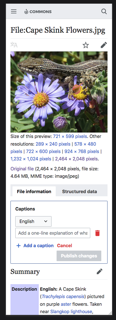
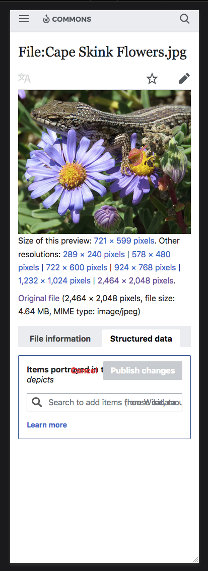
Currently there is not very good support for viewing/editing structured data on mobile devices (or even just using the mobile skin). Captions work but are somewhat wonky-looking, statements don't seem to really work at all.

Below are some screenshots showing the following variations:

  • Captions Panel
  • Statements Panel
  • Panel in reading state
  • Panel in editing state
  • Mobile skin, small screen
  • Mobile skin, large screen
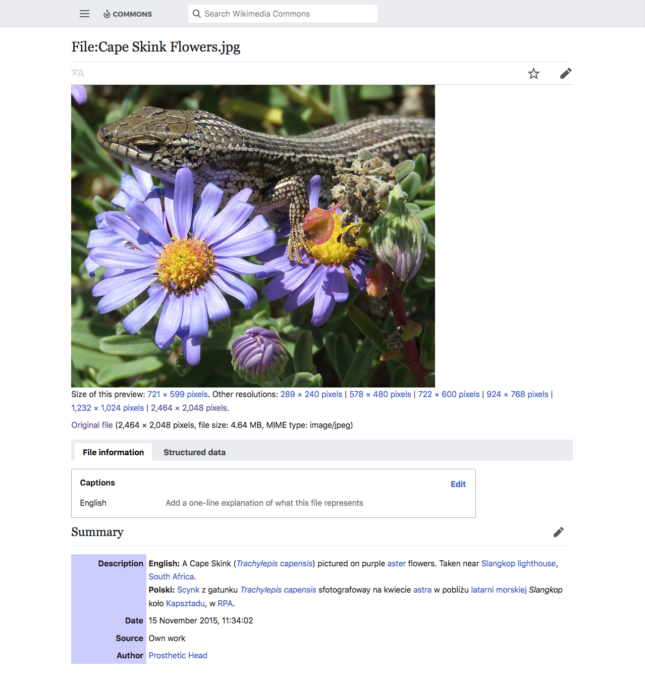
  1. Captions Panel, Reading mode, mobile screen: this seems to be working correctly

Screen Shot 2019-04-23 at 8.43.45 AM.png (1×411 px, 366 KB)

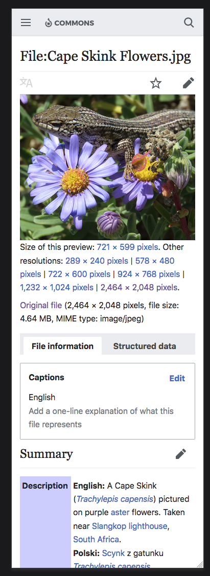
  1. Captions Panel, Edit mode, mobile screen: layout becomes awkward but still functions

Screen Shot 2019-04-23 at 8.43.56 AM.png (1×410 px, 360 KB)

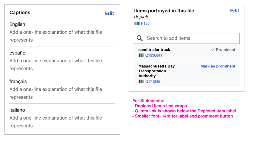
  1. Statements Panel, Reading mode, mobile screen: text collisions harm legibility for labels and inside input element

Screen Shot 2019-04-23 at 8.44.06 AM.png (1×405 px, 336 KB)

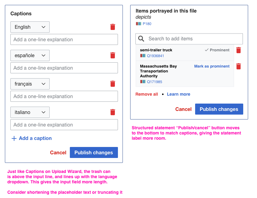
  1. Statements Panel, Edit mode, mobile screen: auto-complete suggestions do not appear, text collisions become more serious (buttons overlap labels), and it's doesn't seem possible to actually submit any data.

Screen Shot 2019-04-23 at 8.44.19 AM.png (1×413 px, 338 KB)

  1. Both panels, both modes, Desktop size (using Mobile skin): The panels should probably stretch to full-width of the container in this case.

Screen Shot 2019-04-23 at 8.51.53 AM.png (1×1 px, 1 MB)

Screen Shot 2019-04-23 at 8.52.03 AM.png (1×1 px, 1 MB)

Event Timeline

Restricted Application added a subscriber: Aklapper. · View Herald Transcript
egardner renamed this task from Poor/non-functional experience on mobile to Poor/non-functional experience on mobile [Epic].Apr 23 2019, 5:04 PM
egardner moved this task from To Do to Blocked on the Structured-Data-Team-Current-Work board.

I've worked on some layout re-ordering to alleviate some of the pain of the current experience.

Read mode

read mode.png (478×839 px, 93 KB)

Captions read mode is fine.

For Depicts/other statements, there are a few changes that need to be made:

  • Depicted items label text should wrap, so it doesn't run into the prominent button
  • Q item link is shown below the Depicted item label (to also prevent overlapping text)
  • Smaller font: 14pt for label and prominent button - the text looks heavy-handed otherwise

Edit mode

edit mode.png (648×839 px, 100 KB)

For captions, there is one small adjustment I've talked about on a previous ticket (can't find it at the moment), where the trashcan should appear above the input line (on the same row as the language dropdown). This not only is in line with the current implementation of Captions on Upload Wizard, but it also gives a little more length to the input field here.

For Depicts/other statements, “Publish/cancel” button moves to the bottom to match captions, giving the statement label more room. In another ticket (T218951) we had been discussing moving the Captions Publish/cancel button to the top to match Statements, but we're doing the opposite instead because it works better on mobile to have Publish/cancel at the bottom and we want to keep things as consistent as possible.

This comment was removed by egardner.

Change 509367 had a related patch set uploaded (by Matthias Mullie; owner: Matthias Mullie):
[mediawiki/extensions/WikibaseMediaInfo@master] Mobile fixes

https://gerrit.wikimedia.org/r/509367

This ticket is about both captions & statements.

There was already another ticket for statements mobile fixes: T221228. I've added the screenshots as acceptance criteria. That one is done.
I created another ticket for the captions mobile improvements: T223432. I've added the screenshots as well.

Both things are now also tracked in other tickets, and I'll close this one.

Change 509367 merged by jenkins-bot:
[mediawiki/extensions/WikibaseMediaInfo@master] Mobile fixes

https://gerrit.wikimedia.org/r/509367