Page MenuHomePhabricator

Improve navigation model
Closed, ResolvedPublic3 Estimated Story Points

Assigned To
Authored By
scblr
Apr 29 2019, 9:27 AM
Referenced Files
F28968750: image.png
May 8 2019, 3:40 PM
F28968622: image.png
May 8 2019, 3:32 PM
F28898021: Screenshot_20190502-105044.png
May 2 2019, 9:34 AM
F28850752: image.png
Apr 29 2019, 10:04 AM
F28851178: nnm-02.png
Apr 29 2019, 10:04 AM
F28851017: nnm-01.png
Apr 29 2019, 10:04 AM
F28851386: nnm-04 copy.png
Apr 29 2019, 10:04 AM

Description

Why are we doing this

01) Daisy’s “Suggested edits“ diary study revealed:

The inconsistent behavior of the W back and phone system back buttons was an almost universal source of grief among users.

02) We’re getting ongoing feedback that the current tab behavior needs to be improved

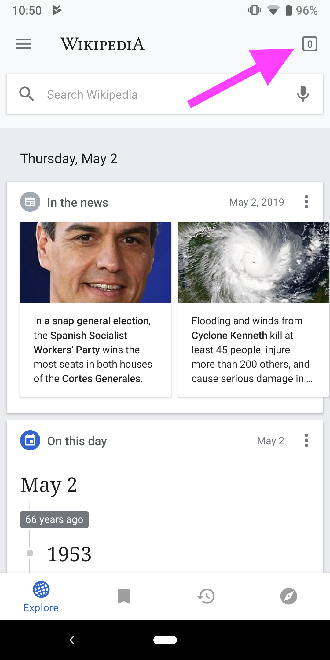
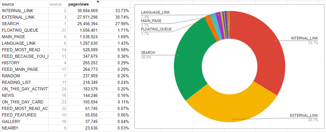
03 Stats revealed that only 1.7% of all users are clicking “Continue reading“. 92.45% of all users browse the app via search, internal or external links. What does this tell us? We should focus on making the reading experience as good as possible (thanks @Dbrant):

image.png (425×1 px, 102 KB)

Plus: “(...) users had strong negative feelings about ‘continue reading’ on explore screen.“ (Source: “Suggested edits“ diary study)

Suggested solution

Prototype: https://sketch.cloud/s/EKE7v/ELwYrOv/play

Main differences:

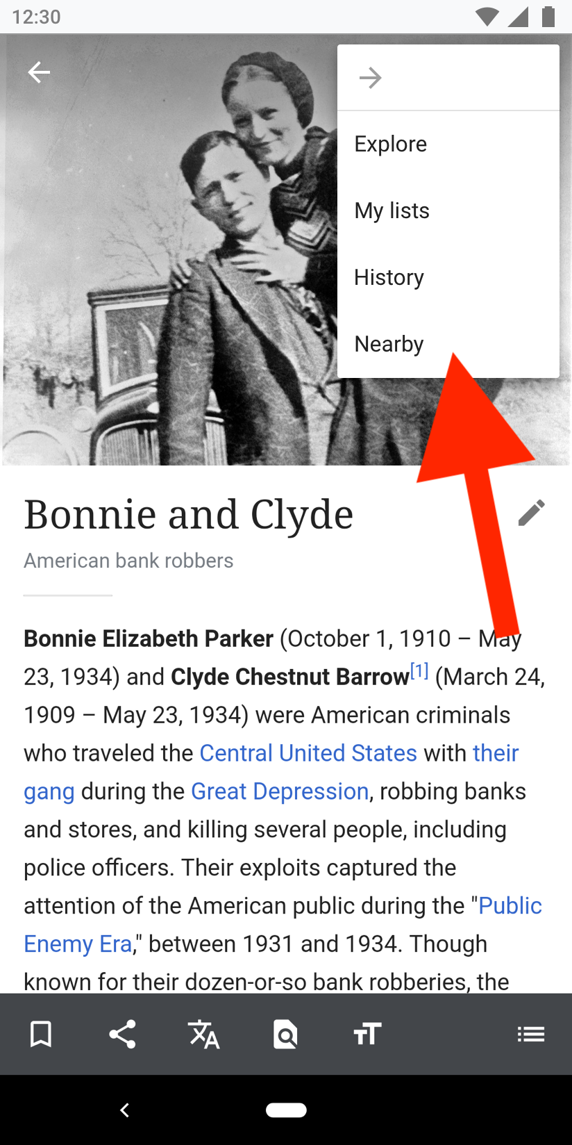
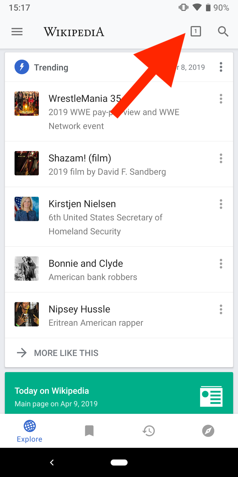
01) Remove “Continue reading“. Instead, a tab button/icon is always displayed in the app bar (consistency across views). Tapping the icon leads users to the view that list all open tabs.

nnm-01.png (1×824 px, 357 KB)

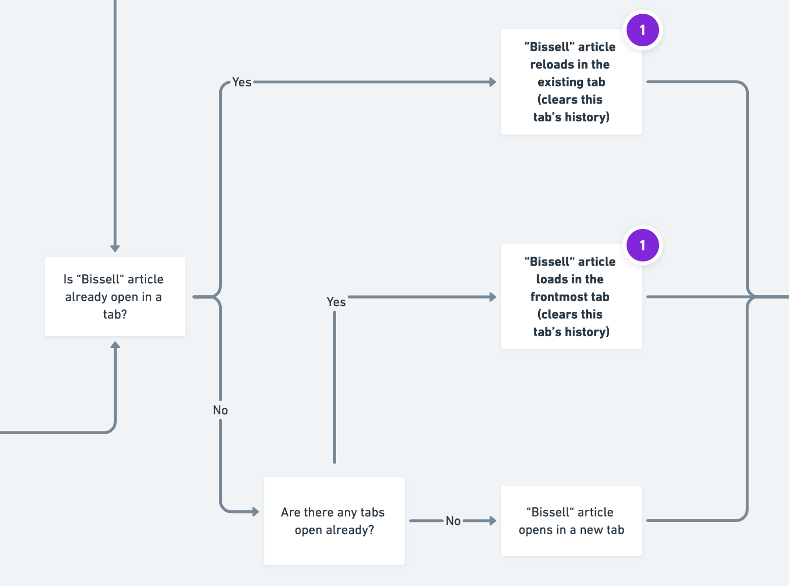
02) Remove “W“ back button completely. Back means back. Two examples:

  • Users tap an article from the explore feed. They tap the back button on the article page (top left). They get back to the explore feed.
  • Users are on an article page (“Bonnie and Clyde“) and they tap on a link on that page (“Central United States“). After reading the “Central United States“ article, they tap back at the top left and get back to the “Bonnie and Clyde“ article.

nnm-02.png (1×824 px, 831 KB)

03) New Information architecture for the overflow menu within articles. (Remove “Open in new tab“ and add main navigation items)

nnm-04 copy.png (1×824 px, 704 KB)

Event Timeline

scblr renamed this task from [EPIC] Improve navigation model to Improve navigation model.Apr 29 2019, 10:04 AM
scblr updated the task description. (Show Details)
scblr added a subscriber: Dbrant.
scblr changed the status of subtask T220187: Optimize current tab behavior from Invalid to Resolved.

This is long overdue! Let me know your thoughts about this one @Charlotte @Dbrant. I’m happy & determined to push this matter forward.

@schoenbaechler - Yes, can talk about this in planning today.

Hey @Dbrant, was just using the dev version. I’m excited since it looks very good so far! I have some early feedback below.


01) An indicator that displays “0“ so prominently in the interface can lead to confusion. A tab icon without number would not be clear enough too.

Screenshot_20190502-105044.png (2×1 px, 594 KB)

Related: the current behavior resets the count by -1 once the back button has been tapped on an article, see this video where it resets it to 0:

https://www.dropbox.com/s/s9204m0hr2lqri0/20190502_110848.mp4?dl=0

Solution: Hide tab icon completely when the tab count is 0 or 1 in the Explore feed and article page. Users are navigating the app in the same tab as long as they don’t actively open a new one (e.g. via search or hyperlink in an article). The app’s back button should not close tabs, it should navigate to the previous screen only.


02) Prevent users from closing/leaving the app in that scenario (what we discussed on Slack yesterday):

  1. Go to an article page
  2. Close the app
  3. Reopen the app
  4. If back button has been tapped, users are leaving/closing the app

Solution: Take users back to the Explore feed instead of closing the app. The system’s back button is taking care of interactions across apps.


Thanks. LMK if we want to jump on a call about it.

01) An indicator that displays “0“ so prominently in the interface can lead to confusion

Ha, good catch! I totally forgot to think about the case of zero tabs. This is now done.
Are we sure we want to hide the button if there is one (1) tab? How will the user get to the page they're currently reading? My newest update makes it so that if there is one tab, clicking the button will go directly to the Page activity, whereas if there's more than one tab, it will go to the Tabs activity. Let me know if this is sufficiently intuitive.
I have also ironed out the Back behavior in the various cases you mentioned.

02) Prevent users from closing/leaving the app in that scenario (what we discussed on Slack yesterday)

...Done!

If you like, you can try updating the navigation branch to the latest, and run the Dev app yourself, even before it's merged.

@Dbrant

Are we sure we want to hide the button if there is one (1) tab? How will the user get to the page they're currently reading? My newest update makes it so that if there is one tab, clicking the button will go directly to the Page activity, whereas if there's more than one tab, it will go to the Tabs activity. Let me know if this is sufficiently intuitive.

Sufficiently intuitive?! It’s brilliant – I love that behavior! 👏 Good instinct about showing the tab when there’s only one, just received the same feedback in design review from @PDrouin-WMF and @Pginer-WMF.


I have also ironed out the Back behavior in the various cases you mentioned.

Ok, just navigated around and it feels very intuitive now!


One more thing: how about leading users to the last view they’ve been when closing the last remaining tab? (similar to when you’d press the tab icon with “0“).

@Dbrant, just noticed a minor thing. All article inks from the Explore feed now open in a new tab. Can we limit that behavior to the first tab only if there’s none before? Thanks.

@Dbrant, all good, except for the two things I mentioned in T222056#5153301 and T222056#5153208.


01) Open article links from the Explore feed in the existing tab.

How to reproduce
Open any article link from the Explore feed.

Problem
Article from the Explore feed opens in a new tab.

Solution
Article should open in the same tab.


02) Lead users to the last view after they’ve closed the last remaining tab.

How to reproduce
In the tab view, close the last tab that’s open.

Problem
Users stay in the tab view with “0” tabs.

Solution
Lead users to the screen they’ve been before (likely the Explore feed). Same behavior as you’d press the tab icon with the “0“ indicator.


Thanks!

02) Lead users to the last view after they’ve closed the last remaining tab.

@schoenbaechler Are we sure this is a good idea? Even if the user removes the last tab, if they stay in the Tab view they can have a chance to "undo" removing the tab, or create a new tab. If we close the tab view immediately when they remove the last tab, they won't be able to do any of the above. Note also that Chrome has this kind of zero-tab behavior.

@Dbrant, thanks for the feedback.

I see your point and realize that it might be too much interaction after closing the tab. I fear a bit that it’s hard to realize that pressing the “0“ tab button takes users back to the screen they’ve been before.

I suggest to update the overflow menu (in tab view) to provide an alternative exit. It’ll also make the tab view more consistent:

  • “Open in a new tab” (exists)
  • “Close all tabs” (exists)
  • “Explore” (add)
  • “My lists” (rename)
  • “History” (add)
  • “Nearby” (add)

How does that sound?

@schoenbaechler Sure, that sounds good. Should we perhaps hide the "0" tab button when there are no tabs left in the Tab screen, as well?

Hmm, I’d keep it @Dbrant, simply because users might tap it based on muscle memory (it takes you back when there are tabs open).

Hey @Dbrant wanted to quickly check back with you about this:

01) Open article links from the Explore feed in the existing tab.

Do you know what I mean by that? Realized that the specifications were a bit vague. I’m not only referring to the situation when you’d have an article already open. I think it should never open a new tab (that should be an active decision) if you come from the Explore feed.. We can start the discussion about adding a a long press option to the links on Explore though (maybe in a separate task).

@schoenbaechler Correct, this is what the latest update will do.

Hey @Dbrant, following up on our conversation this afternoon. I created a flow chart to illustrate the user journey:

https://whimsical.co/YRn3gsVdoiV814FbNTpMGE

It’s almost the same as we had it before the version we reviewed today, except for this part:

image.png (1×1 px, 141 KB)

ABorbaWMF subscribed.

Looks good to me across a few devices and the last couple builds 2.7.280-alpha-2019-05-14