Current (Vector & Monobook)

Proposed:
Vector/WMUI:

Monobook/Apex:

VE toolbars for comparison:


| Esanders | |
| May 13 2019, 6:29 PM |
| F31655052: Screenshot 2020-03-02 at 12.05.11.png | |
| Mar 2 2020, 11:06 AM |
| F31655053: Screenshot 2020-03-02 at 12.05.26.png | |
| Mar 2 2020, 11:06 AM |
| F31651088: Screenshot 2020-02-29 at 17.08.21.png | |
| Feb 29 2020, 4:09 PM |
| F31547996: image.png | |
| Feb 5 2020, 12:59 AM |
| F29051950: image.png | |
| May 14 2019, 4:27 PM |
| F29051874: image.png | |
| May 14 2019, 3:46 PM |
| F29051867: image.png | |
| May 14 2019, 3:46 PM |
| F29051439: image.png | |
| May 14 2019, 12:57 PM |
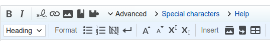
Current (Vector & Monobook)
Proposed:
Vector/WMUI:
VE toolbars for comparison:
| Status | Subtype | Assigned | Task | ||
|---|---|---|---|---|---|
| Resolved | Ladsgroup | T174119 Fix several design features of WikiEditor and CodeEditor to match the general style | |||
| Resolved | Esanders | T223155 WikiEditor uses Apex-like styling in Vector for the toolbar; change this to WikimediaUI-style |
Change 509882 had a related patch set uploaded (by Esanders; owner: Esanders):
[mediawiki/extensions/WikiEditor@master] Use WMUI toolbar styling in Vector
In Vector this is also a usability improvement with expanding the tool click area from 26x26px to 32x32px.
We use the same icons and indicators on WMUI and Apex, so that should be changed on both. However given that this is a compact toolbar (about half the height of the VE one) and the arrows behave slightly differently (rotating to show a tray is open - [except for the heading dropdown]) we can probably leave this for now.
In this screenshot, one can see the light blue borders and gradients used around the content area, sidebar and in the top navigation of Vector. These are the most prominent and visually identifying parts of the skin and they have not changed since their introduction in 2010. While I understand you want to depart from this design (is that right?), we've yet to see that happen. Do we have a roadmap and timeline for that? If so, we may want to coordinate those to coincide.
This toolbar is one of the most prominent interfaces for editors using wikitext every single day, and this change imho simply makes it out of tone with the skin. It is controversial technically, but from a naïve user perspective it seems like it would be more consistent to use the Apex version for this toolbar.
Anyway, looking ahead to the inevitable WMUI:
In the above screenshot, I feel disoriented as a user. The surrounding page frame, the toolbar, the sub toolbar, and the editable text area are all flat white with a black foreground. There is no hierarchy or balance to orient the user (e.g. color or shading). Even in flat designs, this is usually addressed in some way with colours. Are there plans to address that?
To the last part, this has been identified as a shortcoming of current toolbar treatment in WikimediaUI in Vector and MinervaNeue. We've been talking about giving the WMUI toolbar a slight grey too, like the current button treatment, also to align and set it apart from the textarea and unify. But there's no clear timeline to address that yet.
Change 509882 had a related patch set uploaded (by Esanders; owner: Esanders):
[mediawiki/extensions/WikiEditor@master] Use WMUI toolbar styling in Vector
This toolbar is one of the most prominent interfaces for editors using wikitext every single day, and this change imho simply makes it out of tone with the skin.
The content area has always been solid white with no gradients, and the editing toolbar exists within the content area, not the navigation chrome.
Change 570175 had a related patch set uploaded (by Esanders; owner: Esanders):
[mediawiki/extensions/WikiEditor@master] Use caret-style arrow indicator
Change 570177 had a related patch set uploaded (by Esanders; owner: Esanders):
[mediawiki/extensions/WikiEditor@master] Align toolbar styling with Apex
Change 570178 had a related patch set uploaded (by Esanders; owner: Esanders):
[mediawiki/extensions/VisualEditor@master] Match WikiEditor switching widget to Apex toolbar theme
Change 570179 had a related patch set uploaded (by Esanders; owner: Esanders):
[mediawiki/extensions/VisualEditor@master] Use WMUI styled WikiEditor switcher when in Vector
I've separated the Apex & WMUI patches, so the first patch just applies the change from "Current" to "Monobook/Apex".
Change 570175 merged by jenkins-bot:
[mediawiki/extensions/WikiEditor@master] Use caret-style arrow indicator
Change 570178 merged by jenkins-bot:
[mediawiki/extensions/VisualEditor@master] Match WikiEditor switching widget to Apex toolbar theme
Change 570177 merged by jenkins-bot:
[mediawiki/extensions/WikiEditor@master] Align toolbar styling with Apex
Change 570179 merged by jenkins-bot:
[mediawiki/extensions/VisualEditor@master] Use WMUI styled WikiEditor switcher when in Vector
Change 509882 merged by jenkins-bot:
[mediawiki/extensions/WikiEditor@master] Use WikimediaUI toolbar styling in Vector
@Esanders the change in VE uses 34px for the height dimension, but I noticed a small layout change during loading of the edit pages (Vector), and according to my inspector the height should be 32px instead of 34px??? Mistake ? or did we drop a border somewhere ?
Change 575010 had a related patch set uploaded (by TheDJ; owner: TheDJ):
[mediawiki/extensions/VisualEditor@master] Fix dimensions of WE2017 switch to VE
Change 575010 merged by jenkins-bot:
[mediawiki/extensions/VisualEditor@master] Fix dimensions of WE2017 switch to VE
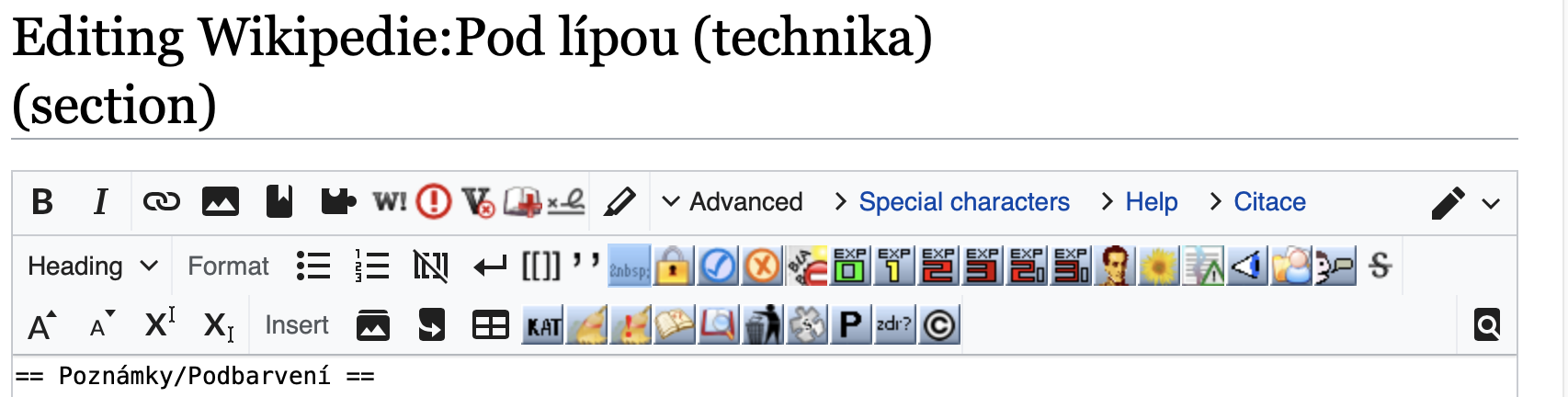
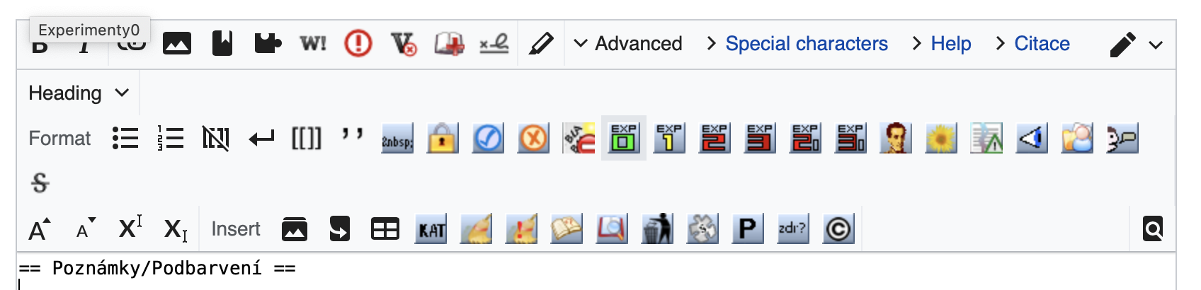
Per Czech Wikipedia Technical Village Pump there is an issue with user scripts/gadgets adding own buttons after these changes. Their positioning and margins/paddings is broken/misaligned.
Note: importScript('Wikipedista:Draceane/vector.js')
Doesn't look problematic to me

please upload screenshots to https://phabricator.wikimedia.org/file/upload/ for comparison
Ah. I think I know what you mean. The 'hit area of buttons used to be 24x24, whereas the spacing was 32x32. It is now 32x32 for both (to increase hitarea and to show hover effect.
That means that if you toss in (pre 2010 style) buttons and expect them to line up in a 24x24 grid (which only ever happened to work by chance), then you will now find them 32x32 aligned.