In analyzing the help panel, we have found that the following percentages of newcomers who see the help panel call to action click to open the help panel:
- Korean: 21%
- Czech: 17%
- Vietnamese: 12%
We hypothesize that these numbers could be increased, potentially by making it clear to newcomers that we want them to open the help panel when they are first trying to edit. In other words, it may be that newcomers don't notice the help panel call-to-action. Or if they notice it, they may think that they don't yet need help -- but we think that if they open it up, see the links or try out the search, they may have a better first experience.
It's important to note that we don't want to annoy the user such that they dismiss the help panel outright. We are looking for the right balance so that users know the help panel is available, are encouraged to use it, but are not impeded by its presence.
Specifications:
- An animation (with same specs as the ones for the two dots highlighting the "link" and "cite" actions of the VE menu bar) draws user's attention to the help panel CTA.
- The animation will only de visible during the first edit session.
- The animation will keep going until the user eventually clicks on it.
Desktop version:

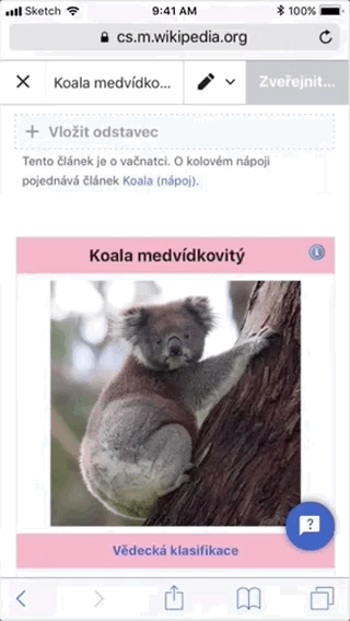
Mobile version: