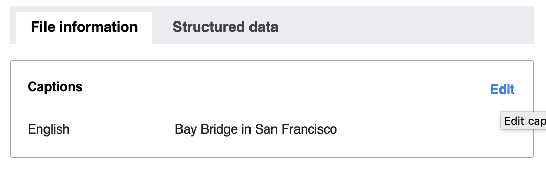
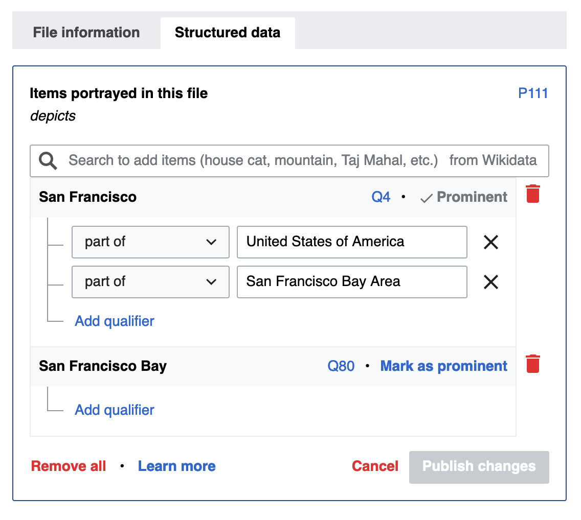
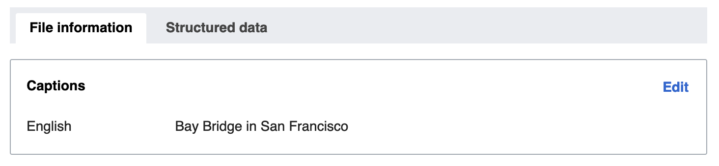
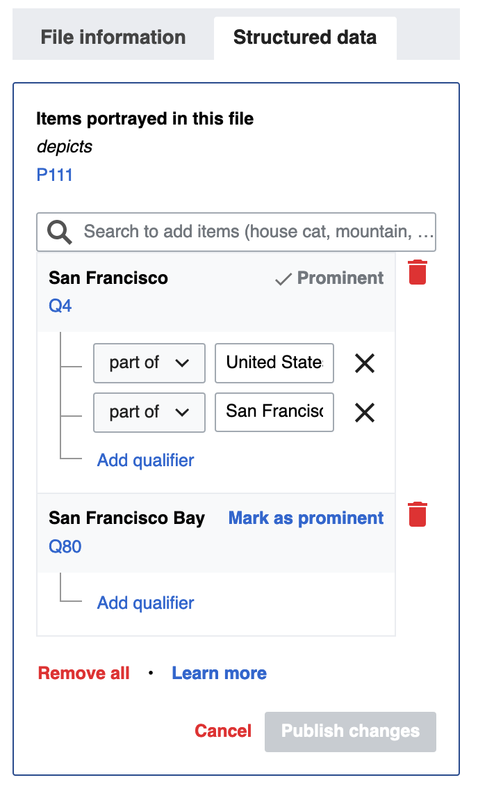
Page MenuHomePhabricator

Captions mobile improvements
Closed, ResolvedPublic

Description

We have this

Screenshot 2019-05-16 11.59.51.png (684×960 px, 62 KB)

We want this

edit mode.png (648×839 px, 100 KB)

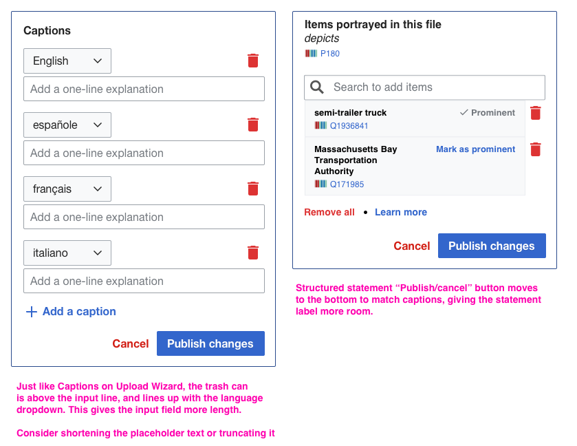
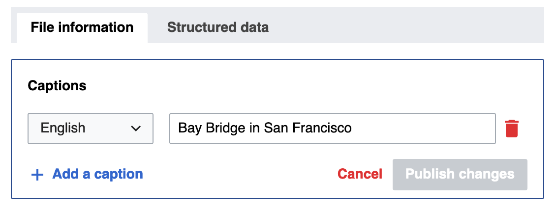
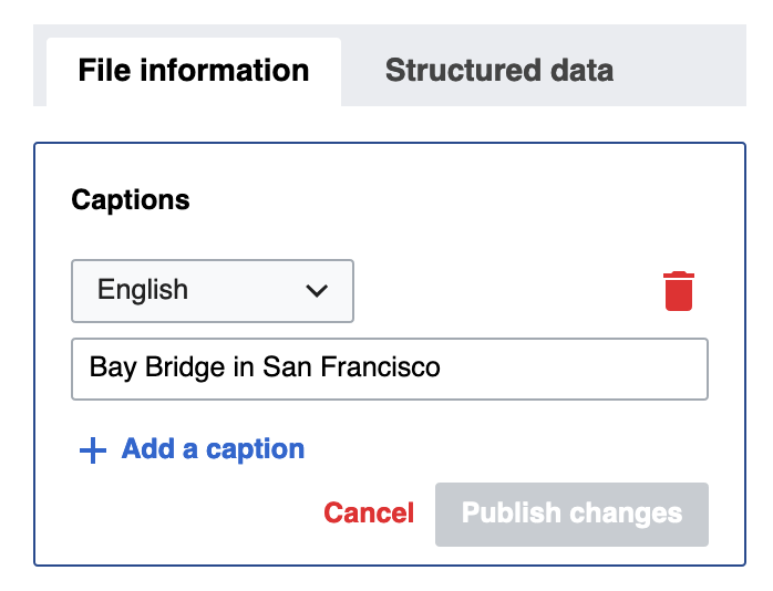
For captions, there is one small adjustment I've talked about on a previous ticket (can't find it at the moment), where the trashcan should appear above the input line (on the same row as the language dropdown). This not only is in line with the current implementation of Captions on Upload Wizard, but it also gives a little more length to the input field here.

Acceptance Criteria

  • Language dropdown & remove icon should be on top line
  • Input field should be below those 2, and fill the entire width

Event Timeline

I think that this is doable with some flexbox tweaking, but the trash-can button will probably need to be appended to the .wbmi-entityview-caption div, as opposed to the child .wbmi-caption-value div as it is now. That would allow you to achieve this:

Screen Shot 2019-05-16 at 2.52.25 PM.png (376×1 px, 36 KB)

Flexbox behavior is highlighted here – the language dropdown, trash can button, and text input are all direct children of .wbmi-entityview-caption in this scenario.

Just to confirm, the layout should remain identical to what we have now at larger sizes, right? I assume that these changes should only be visible below the 720px-wide breakpoint.

Change 510782 had a related patch set uploaded (by Eric Gardner; owner: Eric Gardner):
[mediawiki/extensions/WikibaseMediaInfo@master] Captions mobile improvements

https://gerrit.wikimedia.org/r/510782

Basic patch for this is up. Here's what the Captions panel looks like now at various sizes & states:

  1. Mobile size, read mode:

Screen Shot 2019-05-16 at 3.36.56 PM.png (340×1 px, 38 KB)

  1. Mobile size, edit mode:

Screen Shot 2019-05-16 at 3.37.06 PM.png (476×1 px, 45 KB)

  1. Desktop size, read mode:

Screen Shot 2019-05-16 at 3.37.22 PM.png (340×1 px, 35 KB)

  1. Desktop size, edit mode

Screen Shot 2019-05-16 at 3.37.32 PM.png (452×1 px, 51 KB)

Note: I have not re-arranged the way the footer buttons are arranged yet (that was mentioned in the screenshot but not in the text of this ticket). Should footer layout be updated to match the second image at the top here? If so, do we ever want the cancel/publish buttons to "share" a row with other things – at desktop size, for example – or should they always stack?

I suspect "cancel/publish" should be in the same row as "add a caption" if there's enough space, and drop down below it if the screen becomes too small to fit all
(that's how it's done for statements, with "remove statements/learn more" instead of "add a caption")

Ok, I've updated the patch to make footer behavior consistent between the panels. The footer buttons share a row when there is sufficient space, but stack otherwise. Here's what that looks like now:

Captions panel, sufficient space:

Screen Shot 2019-05-17 at 7.44.10 AM.png (424×1 px, 45 KB)

Captions panel, insufficient space:

Screen Shot 2019-05-17 at 7.44.33 AM.png (534×698 px, 41 KB)

Statements panel, sufficient space:

Screen Shot 2019-05-17 at 7.44.18 AM.png (1×1 px, 125 KB)

Statements panel, insufficient space:

Screen Shot 2019-05-17 at 7.44.41 AM.png (1×688 px, 99 KB)

@PDrouin-WMF care to take a look to double-check?

Ramsey-WMF moved this task from Untriaged to Next up on the Multimedia board.

Thanks for pinging me, @egardner -- agree with the stacking here when there is not enough space. The latest patch looks good!

Change 510782 merged by jenkins-bot:
[mediawiki/extensions/WikibaseMediaInfo@master] Captions mobile improvements

https://gerrit.wikimedia.org/r/510782

Cparle added subscribers: egardner, Cparle.

This has been released to production, so may as well check it there. Example file https://commons.wikimedia.org/wiki/File:Bellura_gortynoides.jpg

I've been testing this and looks fine to me, but would like a 2nd opinion from @Edtadros 😄

Just gonna close this one. It's fine :)