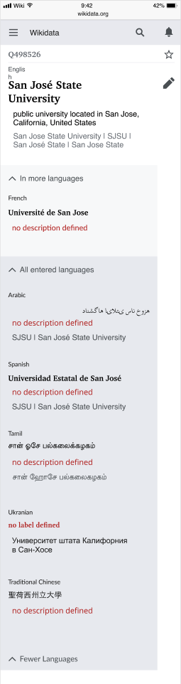
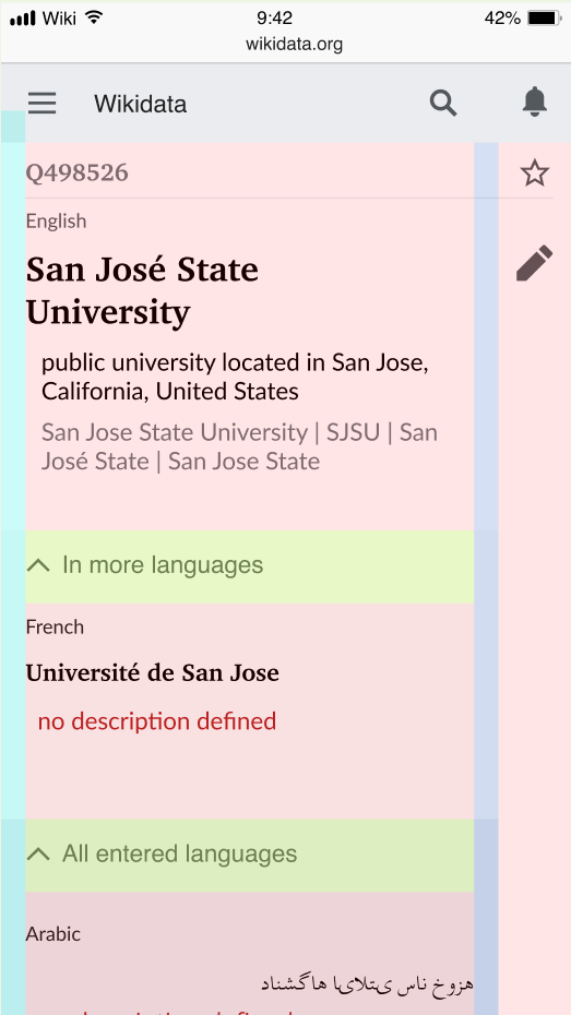
User testing concluded that the separation of language sections was not easily understood - these changes are a reaction to this.
AC
- Background color for "In more languages" is Base90
- Background color for "All entered languages" is Base80
- Content of "main language", "in more languages" and "all entered lanaguages" have a padding on the left with value of 0.5em on all breakpoints (including the headings with the arrows). (Note this AC is not reflected in the mock-ups at the moment of writing it).
- language labels is Base10
- Alias Color is Base20
- position of the expand/collapse arrows are on the left site, left aligned (likewise to the headline)
- the text describing the sections is left aligned with 1 em distance to the arrow, this is valid for all breakpoints
- the text color for the section headlines is base20
- all section have only single arrows
- the arrow color is base20
- white background for input fields
- fix vertical spacing according to Figma mockups
MOCK UP
Firgma File on green background:
https://www.figma.com/file/g86G4bYOcUoIPwEbN041nq/180607_Termbox-Mobile-Sprint?node-id=1741%3A2211
ASSETS